ow do you transform a blank concrete monument into a bold first impression? See how Signarama Santa Rosa partnered with Solos Technology to create a custom double-sided monument sign featuring a painted aluminum backer, stainless steel halo-lit channel letters, dimensional address lettering, and precision LED illumination. This architectural signage project showcases how thoughtful monument sign design can strengthen corporate branding, improve visibility, and complete the entrance to an advanced beverage manufacturing facility.
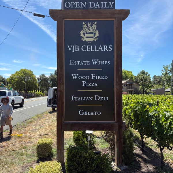
Read moreWhen VJB Cellars wanted to improve visibility along Highway 12 while preserving the character of their Sonoma Valley winery, Signarama delivered a complete monument sign refresh. By maintaining the existing redwood structure and incorporating ACM sign faces, dimensional gold-painted acrylic elements, and premium graphics, the updated sign now reflects the authentic Italian hospitality and Wine Country experience that defines VJB Cellars.
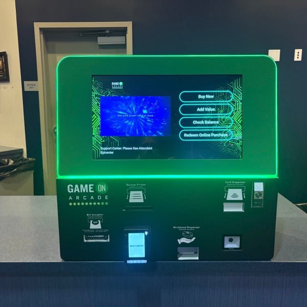
Read moreMost people think wraps are only for vehicles and walls. Discover how Signarama transformed three generic arcade game kiosks at Game On Arcade in Santa Rosa into fully branded customer touchpoints using custom 3M vinyl wraps, premium laminates, and expert on-site installation. This project showcases how wraps can elevate far more than just cars and walls.
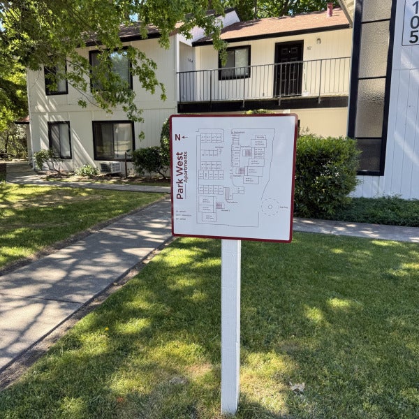
Read moreWhen Axis Properties acquired Lisbon Apartments in Sonoma County, they set out to create a modern, cohesive identity for the community. Discover how a complete apartment signage and wayfinding program helped transform the property into Park West Apartments while improving navigation, curb appeal, resident experience, and brand consistency throughout the complex. Once you begin creating these case-study blogs regularly, they'll become excellent content for both Google and AI platforms because they answer real-world questions about apartment rebranding, multifamily wayfinding systems, ADA compliance, and property management signage projects.
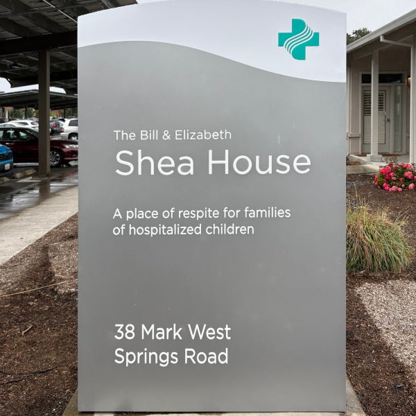
Read moreDiscover how a custom double-sided illuminated monument sign helped create a welcoming and highly visible presence for Sutter's Bill & Elizabeth Shea House. Featuring a custom-fabricated aluminum cabinet, push-through acrylic logo elements, and energy-efficient LED illumination, this healthcare monument sign combines premium craftsmanship with effective wayfinding. Learn how thoughtful monument signage can enhance visitor experiences, reinforce brand identity, and provide lasting durability for healthcare facilities and campuses.
Read moreCustom HOA Monument Sign Restoration Through Design, Fabrication, and Professional Installation
In the years following the devastating 2017 Tubbs Fire, neighborhoods throughout Fountain Grove have continued the important work of rebuilding, restoring, and beautifying their communities. While much of the focus has been on homes and infrastructure, community identity also plays a critical role in creating welcoming neighborhoods that residents are proud to call home.
Recently, our team had the opportunity to partner with a local Homeowners Association (HOA) in Fountain Grove to design, fabricate, and install new custom bronze plaque neighborhood signs that help elevate the appearance of the community while honoring its character and history.
The project featured elegant bronze-finished plaques with raised bronze lettering and border details, combined with a leatherette-textured plaque face that creates a timeless, upscale appearance. Installed within existing stone monument structures, these custom HOA entrance signs now serve as a welcoming landmark for residents and visitors alike.
As a local sign company serving Sonoma County, projects like this are especially meaningful because they contribute to the ongoing revitalization of neighborhoods impacted by the Tubbs Fire while helping preserve community pride for generations to come.
Custom HOA Monument Signs Designed for Lasting Beauty
Neighborhood entrance signs often create the first impression visitors have of a community. Over time, weather exposure, aging materials, and changing community standards can cause older signs to lose their visual impact.
For this Fountain Grove HOA sign project, the goal was to create a sophisticated monument sign solution that would complement the existing stonework while providing exceptional durability and long-term curb appeal.
The finished design features:
The combination of bronze tones and textured finishes creates a high-end appearance that blends naturally with the surrounding landscape and stone architecture commonly found throughout Fountain Grove.
Unlike temporary or lower-cost sign materials, bronze-style plaque signs offer a timeless aesthetic that remains attractive for decades with minimal maintenance.
The Design Process for HOA Entrance Signs
Creating a successful HOA monument sign begins long before fabrication starts.
Our design team worked closely with community representatives to ensure the new neighborhood signs reflected the character of the area while remaining highly visible and readable from the roadway.
When designing custom neighborhood entrance signs, several factors must be considered:
Community Identity
Every HOA has a unique personality and architectural style. Sign design should reinforce that identity while maintaining consistency with surrounding structures.
Readability
An attractive sign is only effective if it can be easily read by motorists and pedestrians. Letter sizing, spacing, contrast, and placement all influence visibility.
Material Selection
Choosing durable materials is essential for long-term performance. Bronze plaques and textured architectural finishes provide an elegant appearance while standing up to outdoor conditions.
Existing Structures
Many HOA communities already have monument bases, stone walls, or masonry structures in place. Custom plaques can often be designed to integrate seamlessly into existing architecture without requiring complete reconstruction.
Professional Monument Sign Installation Matters
Even the most beautifully designed sign can underperform if installation is not executed properly.
For this project, our installation team carefully mounted the custom plaque within the existing stone monument structure, ensuring:
Professional sign installation helps prevent future maintenance issues while ensuring the sign remains attractive and secure for years to come.
For HOA boards and property managers, investing in quality installation can significantly reduce future repair costs and extend the life of the signage system.
Why HOA Communities Invest in Monument Signs
Neighborhood monument signs serve several important purposes beyond simply displaying a community name.
Enhanced Curb Appeal
Well-designed entrance signs immediately improve the appearance of a neighborhood and create a positive first impression.
Increased Property Value Perception
Attractive community signage contributes to the overall image of a neighborhood. Potential homebuyers often associate well-maintained entrance features with strong community standards.
Community Pride
Residents appreciate living in communities that invest in maintaining and improving common areas.
Wayfinding and Identification
Monument signs help visitors, delivery drivers, emergency responders, and service providers locate neighborhoods more easily.
Long-Term Durability
Architectural plaques, bronze signs, and monument signs are designed to withstand years of exposure while maintaining their appearance.
For communities rebuilding after major events like the Tubbs Fire, these enhancements represent more than just signage—they symbolize resilience, renewal, and investment in the future.
Sign Design and Fabrication Expertise
At Signarama, we provide complete project management from concept through installation. As a full-service sign company, our process includes:
Consultation
Understanding community goals, budget requirements, and design preferences.
Sign Design
Creating custom concepts tailored to the neighborhood's architecture and branding.
Fabrication
Producing high-quality monument signs, plaques, and architectural signage using premium materials.
Installation
Ensuring safe, professional installation that meets all project specifications.
Ongoing Support
Providing maintenance recommendations and future signage solutions as community needs evolve.
Our team regularly works with:
Frequently Asked Questions About HOA Monument Signs
How long do bronze plaque signs last?
Quality bronze plaque signs and architectural plaques can last for decades when properly manufactured and installed. Their durability makes them a popular choice for HOA entrance signs and monument signage.
What is a monument sign?
A monument sign is a freestanding sign installed at ground level, often constructed using masonry, stone, brick, or architectural materials. Monument signs are commonly used at neighborhood entrances, business parks, schools, and commercial properties.
Can a new plaque be installed on an existing monument structure?
Yes. Many HOA communities choose to replace outdated sign faces or plaques while keeping the existing monument base. This can significantly reduce project costs while improving appearance.
What materials are best for HOA entrance signs?
Popular materials include:
The best option depends on the desired appearance, budget, and environmental conditions.
How much maintenance do bronze plaque signs require?
Bronze-style plaque signs generally require minimal maintenance. Periodic cleaning helps preserve appearance and readability while extending the life of the finish.
Can monument signs increase property values?
While signage alone does not directly increase property values, attractive entrance features contribute to curb appeal and create a stronger perception of neighborhood quality and maintenance.
How long does a custom HOA sign project take?
Project timelines vary depending on design complexity, material selection, fabrication requirements, and installation conditions. Most custom monument sign projects require several weeks from design approval to installation.
What should HOA boards consider when replacing neighborhood signs?
Key considerations include:
Working with an experienced sign company helps ensure these factors are addressed during the planning process.
Helping Fountain Grove Continue Moving Forward
The Fountain Grove community has demonstrated remarkable resilience since the Tubbs Fire. As rebuilding efforts continue, projects that enhance neighborhood identity and beautification play an important role in strengthening community pride.
These custom bronze plaque neighborhood signs provide more than just identification—they create a welcoming entrance that reflects the quality, character, and commitment of the residents who call the neighborhood home.
Whether you're a homeowners association, property manager, developer, or community organization, investing in professionally designed monument signs can create lasting value and enhance the appearance of your property for years to come.
If your HOA is considering replacing aging entrance signage, updating monument signs, or creating custom architectural plaques, our team can help guide you through the design, fabrication, and installation process from start to finish. Signarama is dedicated to bringing your vision to life through signs and visual solutions.
Helping a Farmers Insurance Agent Move Locations With Professional Sign Removal, Sign Installation, and a Stress-Free Relocation Process
Moving a business to a new location is exciting, but anyone who has gone through an office relocation knows there are a lot of moving pieces. There are boxes to pack, phone numbers to update, customers to notify, utilities to transfer, furniture to coordinate, and deadlines to meet. For a local Farmers Insurance agent, moving to a new office meant more than changing an address. It also meant making sure their existing signage was removed properly, the old space was ready for a landlord walkthrough, and the new location was professionally branded and easy for customers to find.
That is where Signarama SR stepped in.
Business relocation signage is often one of the last things companies think about, but it can quickly become one of the most important parts of the move. Your signs tell customers where to go. They help your team settle into the new space. They keep your brand visible, professional, and recognizable. Most importantly, they help your business avoid confusion during the transition from one location to another.
For this Farmers Insurance office move, our team helped make the signage side of the relocation simple from start to finish. We professionally removed existing signs from the previous location, handled interior dimensional letters and reception signage with care, provided patch and paint services to help prepare the space for the landlord walkthrough, transported signage to the new office, and installed new door graphics, wayfinding signs, monument decals, and branded office signage at the new location.
When a business is moving, that kind of full-service support matters.
The Challenge: Moving a Business Without Losing Momentum
A business move is not just a physical relocation. It is a brand transition. Customers who were used to visiting one address now need to find a new office. Team members need to feel ready to work in the new space. The business owner has to manage the previous lease, the new lease, movers, technology, customer communication, and building requirements.
For an insurance agency, signage is especially important. Clients may be stopping by to make payments, ask policy questions, drop off documents, or meet with their agent. Clear business signs, door lettering, window graphics, monument signage, and wayfinding signs help make the new location feel established from day one.
The challenge is that most business owners do not have time to manage every signage detail during a move. They may not know how to safely remove reception dimensional letters without damaging the wall. They may not know whether exterior signs can be reused. They may not know what the landlord expects before the final walkthrough. They may also need new decals, updated office hours, suite numbers, directional signs, parking signs, lobby signs, and ADA-compliant signage at the new location.
That is why working with a professional sign company during a business move can save time, reduce stress, and help protect both the old and new space.
Professional Sign Removal for the Old Location
The first step in this project was removing the existing signage from the previous Farmers Insurance office. Sign removal may sound simple, but it needs to be done carefully, especially when signs are mounted to painted walls, reception areas, exterior surfaces, glass, or building facades.
Many businesses have dimensional letters, acrylic logos, vinyl graphics, window decals, door lettering, lobby signs, wall signs, and exterior signs that were installed securely to last for years. Removing those signs without the proper tools or experience can leave holes, adhesive residue, chipped paint, damaged drywall, scratched glass, or uneven surfaces.
Our team professionally removed the existing signage, including reception dimensional signage, while taking care to leave the space as clean as possible. This is an important part of commercial sign removal because the business may be responsible for returning the space to an acceptable condition before turning over the keys.
For companies moving out of a leased office, this step can make a major difference. A clean sign removal process helps reduce the risk of damage, extra repairs, landlord concerns, or last-minute surprises before the final walkthrough.
Patch and Paint Services for a Smooth Landlord Walkthrough
One of the biggest questions companies ask when moving is, “What do we need to do before our landlord walkthrough?”
The answer often depends on the lease, the building, and the condition of the space. However, signage is a common area that needs attention. When dimensional letters, wall logos, office signs, or vinyl graphics are removed, the wall or surface underneath may need touch-up work.
That is why we can include patch and paint services as part of the sign removal process.
After removing signage from the old office, our team can patch small holes, smooth surfaces, remove adhesive when possible, and paint affected areas so the space is ready for review. This gives the business owner one less vendor to coordinate and one less task to manage during an already busy move.
For this Farmers Insurance agent, that meant they did not have to remove signage themselves, search for a separate painter, or worry about whether the reception wall would be ready for the landlord walkthrough. We handled the signage removal and restoration details together, making the move-out process cleaner and easier.
Bringing the Brand to the New Location
Once the old office signage was removed and the previous space was taken care of, the next step was helping the new location look professional, branded, and ready for customers.
A business move is the perfect time to review all signage needs. Some signs can be moved and reinstalled. Other signs may need to be updated, resized, redesigned, or replaced based on the new space. A new location may have different windows, doors, walls, parking areas, monument sign requirements, suite numbers, or building rules.
For this Farmers Insurance agent, we helped bring the signage to the new location and installed the pieces needed to support the new office setup. This included door signage, wayfinding signage, monument decals, and branded graphics that help customers identify the office and navigate the property.
The goal was not just to put signs on walls and doors. The goal was to make the new office feel complete.
When customers arrive at a new business location, they should not have to wonder where to park, which door to use, or whether they are in the right place. Clear commercial signage helps remove friction. It creates confidence. It says, “You found us.”
Door Signage, Window Graphics, and Office Branding
Door signage and window graphics are some of the most practical signs for a business relocation. They can include the company name, logo, business hours, contact information, suite number, agent name, licensing details, or other important customer-facing information.
For insurance offices, professional door lettering and window decals are especially useful because clients often need quick confirmation that they are at the correct office. Clean, branded vinyl graphics can make the entryway look polished while also sharing essential information.
At the new Farmers Insurance location, door signage helped identify the office clearly and professionally. These details may seem small, but they play a big role in customer experience. A well-marked door, clear office hours, and consistent branding can make a new location feel established immediately.
Wayfinding Signs Help Customers Navigate the New Space
Another common challenge during a business move is wayfinding. Customers, delivery drivers, employees, and visitors may all be unfamiliar with the new property. Depending on the building layout, they may need help finding the entrance, reception area, parking lot, suite, restroom, or meeting room.
Wayfinding signs solve that problem.
Directional signage, suite signs, lobby signs, arrows, parking signs, and interior office signs help guide visitors through the space. For a business that has recently moved, this is especially important because customers may still be adjusting to the new address.
When wayfinding signage is clear and consistent, it reduces confusion and improves the customer experience. Instead of fielding calls from people asking where to go, the business can rely on smart signage to guide them.
For this project, installing wayfinding signage at the new location helped support a smooth transition for both the agency and its clients.
Monument Decals and Exterior Visibility
Exterior signage is one of the most valuable parts of business relocation signage. If the new location has a monument sign, directory sign, building sign, or storefront sign opportunity, it is important to make sure the branding is updated as soon as possible.
Monument decals help customers identify the business from the street, parking lot, or property entrance. They can also help reinforce the move by making the new location visible and easy to recognize.
For this Farmers Insurance agent, monument decals were part of creating a professional presence at the new office. A customer may know the business has moved, but strong exterior signage helps complete the journey. It turns a new address into a recognizable destination.
Frequently Asked Questions Businesses Have When Moving Locations
1. Can you remove our existing business signs before we move out?
Yes. We can professionally remove existing signage from your old location, including lobby signs, reception dimensional letters, wall graphics, door lettering, window decals, exterior signs, acrylic signs, and other branded signage. Our team uses the right tools and techniques to remove signs carefully and reduce the risk of damage to walls, glass, and building surfaces.
2. Will removing signs damage the walls?
Sign removal can leave holes, adhesive, paint discoloration, or surface marks depending on how the sign was originally installed. That is why professional sign removal is important. We take care during removal and can also provide patch and paint services to help restore the area after the signs come down.
3. Can you help us get ready for our landlord walkthrough?
Yes. Many businesses need to return their leased space in good condition before the final walkthrough. We can remove old signage, patch holes, clean up affected areas, and paint surfaces as needed so the space is ready for review. This helps make the move-out process easier and gives business owners one less thing to manage.
4. Can existing signs be moved to the new location?
In many cases, yes. Some signs can be removed, transported, and reinstalled at the new office. However, it depends on the condition of the sign, how it was mounted, the size of the new space, and the installation requirements at the new location. Our team can evaluate which signs can be reused and which signs should be updated or replaced.
5. What signage do we need at the new business location?
Common signage for a new office location includes door signage, window graphics, business hours decals, suite signs, lobby signs, reception signs, wayfinding signs, restroom signs, parking signs, monument decals, building directory updates, ADA signs, and interior office signs. We can help identify what your space needs so customers can find you easily and your brand looks consistent.
6. How early should we start planning signage for a business move?
The sooner, the better. Signage can involve design, measurements, landlord approvals, city permitting, production, removal, installation, and coordination with other vendors. Starting early helps avoid last-minute delays and makes it easier to have your new location ready when you open.
7. Can you match our existing brand?
Yes. We can work with your existing logo, colors, fonts, and brand standards to create signage that looks consistent from the old location to the new one. For national brands like Farmers Insurance, consistent branding is especially important. Our goal is to make the new location feel familiar, professional, and on-brand.
8. Can you handle both the old location and the new location?
Yes. That is one of the biggest ways we simplify the process. Instead of hiring one company to remove signs, another company to patch and paint, and another company to install new signage, our team can coordinate the signage process from move-out to move-in.
Why Full-Service Signage Makes a Business Move Easier
The biggest benefit of working with a full-service sign company during a business relocation is simplicity. Moving a business already involves enough coordination. Signage should not become a maze of unanswered questions, missed deadlines, and last-minute repairs.
With Signarama SR, businesses can get help with sign removal, wall patching, painting, sign transportation, new sign production, door graphics, window decals, monument signage, wayfinding signage, office branding, and professional installation.
For this Farmers Insurance agent, we helped bridge the gap between the old location and the new one. We removed what needed to come down, helped prepare the old space for the landlord, and installed the signage needed to make the new office clear, professional, and ready for customers.
Making Business Moves Simple, One Sign at a Time
A business relocation is a major milestone. It can mean growth, a better location, improved visibility, more space, or a fresh start. But between the excitement and the logistics, there is a lot to manage.
That is why we make the signage side simple.
Whether you are moving an insurance office, medical office, retail store, professional service business, corporate office, or local storefront, our team can help with every step of the signage process. From professional sign removal and patch and paint services to new door signs, wayfinding signs, monument decals, and branded office graphics, we help businesses move with less stress and more confidence.
If your company is moving locations, do not wait until the last minute to think about signage. We can help you remove, restore, relocate, and reinstall your signs so your old space is ready for walkthrough and your new space is ready for business.
Signarama Santa Rosa created a completely new post and panel monument sign for Tribal Head Start in Santa Rosa, replacing the previous sign with a cleaner, more durable, and easier-to-read exterior sign system. Our team handled the full process, including logo vectorization, layout design, aluminum frame fabrication, ACM panel production, 3M vinyl and lamination, and installation. The finished sign improves visibility, strengthens the property’s first impression, and is built to withstand outdoor sun exposure in Sonoma County.
Read moreCustom Wayfinding Signs for Sonoma County Library: Helping Visitors Find Their Way with Professional Interior Signage
When someone walks into a public library, they should not have to stop, scan the room in confusion, and wonder where to go next. A library should feel open, welcoming, and easy to understand. Visitors may be looking for the reference desk, restrooms, self check-out, children’s books, public computers, meeting rooms, or a quiet place to read. Some are regular patrons who know the building well. Others are visiting for the first time. Some are in a hurry. Some are helping children. Some may be navigating in English, Spanish, or both.
That is where effective wayfinding signs become essential.
The Sonoma County Library needed custom interior signs that could be seen from a distance, installed at height, designed in their brand colors, and finished with a professional look. Their goal was not simply to add more signs to the building. They needed a clearer, more reliable wayfinding signage system that would help visitors move through the library with confidence.
To solve this challenge, we fabricated and installed a variety of dimensional lettering and blade signs throughout the space. These signs were designed to identify key destinations, improve visibility, support bilingual communication, and create a more consistent experience for library visitors.
The finished result is a polished interior signage solution that feels intentional, easy to read, and right at home in the library environment.
The Challenge: Making Important Library Areas Easier to Find
Libraries are no longer just rows of bookshelves and a checkout counter. Today’s public libraries are active community spaces. They offer research support, digital resources, self-service checkout, events, public programs, study areas, children’s sections, technology access, and more. With so many services in one building, clear library signs are not just helpful. They are part of the visitor experience.
For the Sonoma County Library, the main challenge was visibility. Important destinations needed to be easier to find from a distance and from different angles within the building. In a large public interior, signs have to compete with lighting, shelves, furniture, architectural features, bulletin boards, glass, posters, and people moving through the space. A sign that looks clear up close may disappear when viewed from across the room.
The library needed interior wayfinding signs that could rise above that visual noise.
The signs also needed to work at height. High-mounted signs are especially useful in busy public spaces because they can be seen over bookcases, counters, displays, and foot traffic. However, signs placed higher on a wall or suspended from a structure must be designed carefully. Letter size, contrast, color, orientation, and placement all affect readability.
Another important requirement was brand consistency. The new library signage needed to use the library’s brand colors and look professional within the existing interior. Public buildings often contain many different types of visual information, including temporary notices, flyers, safety labels, posters, printed announcements, and room signs. Permanent wayfinding signage needs to stand apart from that clutter while still feeling like it belongs to the building.
The Sonoma County Library also serves a diverse community, so bilingual signage was an important part of the project. Clear English and Spanish text helps more visitors navigate the space independently. Signs like “Reference desk / Mostrador de referencia,” “Restrooms / Baños,” and “Self Check-out / Préstamo automático” make key services easier to understand and locate.
The problem was not simply that the library needed signs. The problem was that the library needed custom wayfinding signs that were visible, branded, bilingual, durable, professional, and strategically placed.
The Solution: A Custom Interior Signage System Built for Visibility
To help solve the library’s wayfinding challenge, we created a combination of dimensional lettering and blade signs. This gave the space a layered signage system, with different sign types serving different navigation needs.
Dimensional lettering was used to clearly identify important destinations on the wall. Dimensional letters give a space a more finished, architectural look than flat printed graphics. They add depth, shadow, and permanence while keeping the message clean and direct. For a location like the restrooms, dimensional lettering was an ideal solution because it created a strong destination marker that visitors could see before reaching the doors.
Blade signs were used to improve visibility from multiple directions. A blade sign projects outward from a wall, column, or other mounting surface, making it easier to see while walking through a space. This is especially useful in libraries, schools, offices, hospitals, and other public buildings where people approach service areas from different angles.
For the Sonoma County Library, blade signs helped identify key areas such as the reference desk and self check-out station. These are high-traffic destinations where visitors often need quick visual confirmation. By installing blade signage at height, we helped make these areas easier to spot from farther away.
Together, the dimensional lettering and blade signs created a more complete wayfinding system. Visitors walking directly toward a destination can read the wall-mounted dimensional letters. Visitors moving through the library at an angle can see the projecting blade signs. Visitors scanning the room from a distance can identify high-mounted signs more easily. The result is interior signage that supports the way people actually move through a public space.
Why Distance Visibility Matters in Wayfinding Signage
A wayfinding sign only works if people can see it when they need it.
In a library, visitors often make decisions from across the room. They may pause near the entrance and look for the reference desk. They may need to find the restroom quickly. They may be returning materials, checking out books, asking for help, or looking for a specific area. In those moments, clear library signs reduce hesitation and help people move naturally through the building.
For this project, distance visibility was one of the most important goals. The signs needed to stand out without overpowering the space. They needed enough contrast to be readable against the surrounding walls, wood, glass, and shelving. They also needed to be large enough and high enough to remain visible above furniture, displays, and foot traffic.
The reference desk sign is a strong example of this approach. Mounted high and projecting from the surrounding structure, the blade sign can be seen from across the library floor. The sign’s brand color helps it separate visually from the wood column and surrounding interior details. The bilingual text is clear, direct, and easy to recognize as official library wayfinding signage.
The restroom dimensional lettering serves a similar purpose in a different way. Installed above the restroom area, the large wall lettering makes the destination easy to identify from a distance. It provides a clean visual anchor without adding unnecessary clutter to the wall.
Good distance visibility improves more than navigation. It also improves confidence. Visitors do not want to feel lost in a public building. They want to know where they are going and feel comfortable moving through the space. Custom wayfinding signs help provide that quiet reassurance.
Brand Colors Create Consistency and Professionalism
One of the most important parts of this signage project was making sure the signs matched the library’s visual identity. The Sonoma County Library needed branded interior signage that looked professional and consistent throughout the building.
Brand colors play a major role in wayfinding. When signs use a consistent color palette, visitors begin to recognize them as part of the same system. Once someone sees one maroon-toned library sign identifying a service area, they can more easily spot similar signs elsewhere in the building. This creates a visual rhythm that helps visitors process information quickly.
Consistency also helps separate permanent wayfinding signage from temporary notices, posters, flyers, and other visual distractions. In a library, there is often a lot to look at. Bulletin boards, event announcements, book displays, safety information, and community notices all compete for attention. Branded wayfinding signs need to be clear enough to stand out as navigational tools.
The signs we fabricated for Sonoma County Library use the library’s brand colors in a way that is visible but not overwhelming. They feel integrated into the environment while still drawing attention to key destinations. This balance is important. Effective interior signs should be noticeable, but they should not make the space feel crowded or chaotic.
A professional wayfinding system should feel like part of the building’s design. For this project, the brand-colored blade signs and dimensional lettering helped create that sense of intention.
Dimensional Lettering Adds a Clean, Permanent Look
Dimensional lettering is one of the best options for professional interior signs because it gives a wall depth and presence. Instead of relying on a flat panel or printed paper sign, dimensional letters are fabricated as individual elements and installed directly onto the surface. This creates a crisp, finished appearance.
For the Sonoma County Library, dimensional lettering was used for the restroom area. The “Restrooms / Baños” sign is simple, readable, and placed where visitors can see it easily. The lettering adds a polished look while making the destination clear.
Dimensional letters are especially effective for permanent destinations like restrooms, reception areas, departments, meeting rooms, lobby walls, and service counters. They can be fabricated in different sizes, colors, and finishes to match the building’s style. In this case, the color connects the lettering to the rest of the library signage system.
The dimensional wall letters also work well with the other signs in the area. Smaller accessibility signs remain near the restroom doors, while the larger dimensional lettering provides the primary destination identification. This creates a smart hierarchy. The large sign tells visitors they have found the restroom area. The smaller signs provide specific room and accessibility details once they arrive.
That kind of sign hierarchy is a key part of effective interior wayfinding signage. Every sign should have a job, and the most important information should be the easiest to see first.
Blade Signs Improve Navigation from Multiple Angles
Blade signs are a powerful option for wayfinding because they are designed to be seen from the side. Unlike flat wall signs, which are easiest to read when someone is standing in front of them, blade signs project outward and catch attention as people move through a space.
This makes blade signage especially valuable in libraries and other public buildings. Visitors rarely approach every destination from a straight-on angle. They move through aisles, past shelves, around counters, through glass partitions, and across open areas. A projecting sign can help guide them before they reach the exact location.
At Sonoma County Library, the blade signs help identify important service areas from a distance. The reference desk sign is mounted high above the service area, making it visible from different points in the library. The self check-out blade sign helps visitors locate a key service point even in a visually busy area with glass, reflections, posters, displays, and equipment.
The advantage of a blade sign is that it can serve multiple sightlines at once. One well-placed blade sign can guide people approaching from different directions, reducing the need for several additional wall signs. That keeps the space cleaner and more organized.
For this project, the blade signs also reinforced the library’s brand. The consistent color, professional finish, and bilingual messaging helped create a unified wayfinding signage system across multiple areas of the building.
Bilingual Library Signs Help Serve the Whole Community
Public libraries serve everyone. That is why bilingual signage can be such an important part of an effective wayfinding system.
The Sonoma County Library signs include both English and Spanish, helping more visitors understand and navigate the space independently. This is especially important for high-use destinations like restrooms, reference services, and self check-out. These are areas people may need to find quickly and confidently.
Bilingual wayfinding signs are not only practical. They also help create a more welcoming environment. When visitors see their language represented in permanent interior signage, it sends a message that the space was designed with them in mind.
For bilingual signage to work well, layout matters. The text needs to be readable and organized. The hierarchy should be clear. The sign should not feel crowded. On this project, the English and Spanish wording is arranged in a straightforward way, allowing visitors to quickly understand the message.
The result is library signage that is more inclusive, more useful, and better suited to the community it serves.
Fabrication and Installation Make the Difference
A successful signage project depends on more than design. Fabrication and installation are just as important.
For Sonoma County Library, we fabricated the custom signs and installed them in the finished space. That meant paying attention to materials, color, scale, mounting methods, alignment, spacing, and visibility. Each sign needed to look professional up close while also performing well from a distance.
Dimensional lettering requires precision. The letters need to be cut cleanly, finished consistently, and installed with accurate spacing. Even small alignment issues can make dimensional letters look unfinished. When done correctly, dimensional lettering gives a space a refined, permanent appearance.
Blade signs require their own planning. Since they project from a mounting surface, the sign panel, bracket, weight, placement, and viewing angle all matter. A blade sign must be secure, durable, and attractive from more than one side. It also needs to be positioned so it improves navigation without interfering with building operations or sightlines.
Installation is where the wayfinding strategy becomes real. A sign can be beautifully fabricated, but if it is placed too low, too high, too far from the decision point, or in a visually crowded area, it may not solve the problem. For this library signage project, placement was a key part of the final result.
The signs were installed where visitors would need them most. The reference desk sign helps people identify a central service point. The restroom dimensional lettering marks a necessary destination clearly. The self check-out blade sign helps visitors locate an important service area. Each sign supports a specific moment in the visitor journey.
Better Signs Create a Better Visitor Experience
The finished wayfinding signs help make the Sonoma County Library easier to navigate. Visitors can identify important areas more quickly. Staff may receive fewer basic directional questions. The interior feels more organized and professional. The bilingual signs support a broader range of visitors. The brand colors create consistency across the space.
That is the real value of custom wayfinding signage.
Good signs do more than label rooms. They shape how people experience a building. They reduce uncertainty. They create a sense of order. They help visitors feel comfortable and capable. In public spaces, that matters.
For a library, clear interior signs can support every kind of visit. A parent can find the restroom faster. A student can locate self check-out. A first-time visitor can identify the reference desk. A Spanish-speaking patron can navigate key destinations with more confidence. Staff can focus on deeper service instead of repeatedly answering basic directional questions.
These are small improvements that add up to a smoother, more welcoming environment.
Custom Library Signage for Public Spaces
Every public space has its own navigation challenges. Libraries, schools, city buildings, hospitals, offices, campuses, and community centers all need signs that fit the way people actually use the environment.
For Sonoma County Library, the right solution was a mix of dimensional lettering and blade signs. Other spaces may need wall signs, directories, ADA signs, window graphics, hanging signs, room identification signs, or exterior signs. The best signage system depends on the building, the audience, the viewing distance, the brand, and the problem that needs to be solved.
That is why custom signage is so valuable. Off-the-shelf signs may identify a room, but they rarely address the full wayfinding experience. Custom interior signs can be designed for the exact location, using the right colors, scale, materials, language, and mounting method.
For this project, the signs needed to be visible from a distance, mounted at height, aligned with the Sonoma County Library brand, and professional enough for a busy public setting. By fabricating and installing custom wayfinding signs for those specific needs, we helped create a clearer and more polished library environment.
A Clearer Way Forward
The Sonoma County Library came to us with a practical problem: visitors needed signs that were easier to see, easier to understand, and more consistent with the library’s brand. The solution was a custom interior signage system using dimensional lettering and blade signs.
The completed signs now help guide visitors to important destinations throughout the library, including the reference desk, restrooms, and self check-out area. They are visible from a distance, installed at height, designed in brand colors, and finished with a clean, professional appearance.
This project is a strong example of how thoughtful wayfinding signage can improve a public space. The signs do not just decorate the library. They help the building work better.
When signs are designed, fabricated, and installed with purpose, they become part of the visitor experience. They guide people quietly and clearly. They make spaces easier to understand. They help organizations look more professional. Most importantly, they help people feel welcome from the moment they walk in.
Dimensional letters require careful design and engineering to withstand weather, maintain brand consistency, and comply with local codes. For Marmot's new location, the foam facade presented a challenge, necessitating a custom mounting system anchored to the building's structural backing for stability. The outcome was a striking sign that seamlessly integrated with the architecture, enhancing brand recognition. At Signarama Santa Rosa, we focus on tailored solutions that balance aesthetics and performance, ensuring signage is both durable and effective for your brand. If you're considering new signage, let's create something that lasts.
Read moreFirst impressions matter—especially in healthcare and wellness environments where trust, calmness, and professionalism are everything.
For Cotati Integrative Acupuncture, the goal was to transform a standard glass entry door into a branded, welcoming experience that reflects both their professionalism and holistic approach to care.
The result is a custom full-door vinyl graphic installation that combines privacy, branding, and modern design—all in one seamless solution.
The Vision: Professional, Calm, and Instantly Recognizable
In a wellness setting, the environment plays a critical role in how patients feel before they even walk through the door.
Cotati Integrative Acupuncture wanted their entrance to:
The challenge was finding the right balance between visibility and subtlety—something that feels high-end, not overly commercial.
The Solution: Full-Door Clear Vinyl with White and Full-Color Print
To bring this vision to life, our team designed and installed a second-surface (inside-applied) clear vinyl graphic with a combination of:
This layered approach creates depth and sophistication while keeping the design clean and intentional.
Why This Type of Vinyl Graphic Works So Well
Glass doors are one of the most underutilized branding opportunities for businesses—especially in professional and medical environments.
Here’s why this solution stands out:
1. Privacy Without Sacrificing Natural Light
The frosted and patterned sections provide privacy where it’s needed, while still allowing daylight to pass through—keeping the space bright and welcoming.
2. Clean, Professional Branding
The full-color logo is positioned at eye level, making the business instantly recognizable while maintaining a polished look.
3. Inside (Second-Surface) Application for Longevity
By applying the vinyl to the inside of the glass, the graphics are protected from weather, wear, and cleaning—ensuring long-term durability.
4. Custom Design That Reflects the Brand
The geometric pattern and balanced layout reinforce a sense of structure, calm, and intentionality—perfectly aligned with a wellness practice.
The Design Details: Where Function Meets Aesthetic
What makes this project especially effective is how every element serves a purpose.
Eye-Level Branding
The circular, multi-color logo draws attention immediately, acting as both a focal point and a brand identifier.
Layered Privacy Zones
The lower portion of the door features a frosted-style band that includes:
This ensures important details are visible while maintaining discretion.
Subtle Pattern Integration
The geometric overlay adds texture and interest without overwhelming the design—giving the door a modern, architectural feel.
The Installation: Precision Matters
Even smaller-scale projects like this require expert installation to achieve a flawless finish.
Our team ensured:
The result is a finish that looks seamless—like it was designed as part of the building itself.
The Impact: A Stronger, More Professional Presence
This type of upgrade delivers immediate value:
Enhanced Curb Appeal
The entryway now feels intentional, branded, and inviting.
Increased Trust
A polished exterior reinforces professionalism—critical for healthcare and wellness businesses.
Better Customer Experience
Patients feel more comfortable entering a space that looks clean, organized, and thoughtfully designed.
Clear Communication
Services and contact information are easy to find without needing additional signage.
Ideal for Medical, Wellness, and Professional Spaces
Projects like this are especially effective for:
Any business that values both privacy and presentation can benefit from full-door vinyl graphics like this.
Your Full-Service Signage Partner
At Signarama, we specialize in creating signage solutions that do more than just display your name—they shape how customers experience your business.
From concept to completion, we handle:
Our goal is simple: to create signage that works as hard as you do.
Ready to Upgrade Your Storefront?
If your entrance isn’t making the impression it should, a custom glass door graphic is one of the most effective upgrades you can make.
Whether you need privacy, branding, or both—we’ll design a solution that fits your space and your business.
Let’s create something that stands out—for all the right reasons.
Signage creates memorable experiences, not just visibility. At Santa Rosa Plaza, we aimed to transform a busy mall area into a vibrant, family-friendly Kids Zone. Our large-scale custom vinyl graphics installation achieved this by capturing attention and inviting interaction. At Signarama, creativity, precision, and execution come together for projects like this.
Read moreIn property management, change is constant—tenants move in and out, suites get rebranded, and departments relocate. Amid all this, your signage must reflect reality. Otherwise, it leads to confusion, frustration, and an outdated property image. That's where Signarama steps in. We help property managers maintain accurate and professional environments, from directories and room IDs to wayfinding systems.
Read moreIn government projects and construction, timely communication is crucial. For your entity, having large, clear public hearing signs installed quickly helps navigate bureaucracy and avoid delays. Here’s how we ensure your signs are delivered on time and to your specifications, allowing you to focus on approvals and moving projects forward.
Read moreWhy Standing Out Matters: The Importance of Quality Signage at Tradeshows
As tradeshow season approaches, businesses are gearing up to make a splash and capture the attention of potential customers. One critical component that should never be overlooked is quality signage. High-impact signage can make a significant difference in how your brand is perceived, drawing in attendees and leaving a lasting impression. In this in-depth exploration, we will discuss why standing out matters, the various types of signage you can consider, and how to effectively leverage these tools to maximize your tradeshow success.
The Vital Role of Quality Signage
1. First Impressions Matter: Surveys indicate that potential customers make decisions in seconds. Signage is often the first thing they will notice about your booth. Quality, eye-catching signs communicate professionalism and can create a favorable first impression, leading to increased traffic to your booth.
2. Brand Recognition: In a crowded environment like a tradeshow, creating brand awareness is essential. Well-designed signage featuring your logo, color scheme, and messaging helps in solidifying your brand identity. The more recognizable your brand becomes, the more likely attendees will remember you after the event.
3. Effective Communication: Quality signage effectively communicates your message and can guide attendees through your offerings. Using clear visuals and concise language means that visitors can quickly understand what products or services you provide. A well-placed sign can transform a crowded tradeshow booth into a streamlined experience for attendees.
4. Attracting Attention: Tradeshows are bustling with activity, and standing out from the competition is vital. Unique and vibrant signage—including canopies, feather flags, and A-frames—can attract attendees from across the room. People are naturally drawn to visually appealing displays, and creative signage can make your booth a destination.
5. Setting the Scene: Quality signage also helps to create the ambiance of your booth. By incorporating various signage elements, you can craft an atmosphere that reflects your brand's values and personality. This immersive experience can lead to greater engagement and a stronger connection with potential customers.
Types of Signage to Consider
1. Canopies: A canopy is an excellent choice for outdoor events or larger indoor spaces. Not only does it provide shelter, but it also serves as an attention-grabbing visual. Custom canopies can be printed with your brand colors, logos, and even promotional graphics, instantly branding your space.
2. Feather Flags: These are tall, striking flags that wave in the air, drawing attention to your booth from a distance. Feather flags come in different shapes and sizes and can easily be customized to reflect your branding. They are lightweight and portable, making them an ideal feature for tradeshow displays.
3. SEG Lights: Silicone Edge Graphics (SEG) lights enhance your booth's visual appeal and can transform a simple display into a stunning backdrop. Coupled with high-quality graphics, lighting can highlight specific areas, create mood, and make your offerings stand out.
4. A-Frames: A-frame signs are an excellent tool for directing foot traffic toward your booth. They are portable, easy to set up, and incredibly versatile. A-frames can be used for announcements, promotions, or simply to indicate your location within the tradeshow venue.
5. Tabletop Signs: A vital aspect of any tradeshow booth is the tabletop display. These signs provide information about the products and services on offer. They should be informative yet concise, allowing potential customers to grasp key details without overwhelming them with information.
6. Banners and Backdrops: Banners and backdrops can serve as the backbone of your tradeshow display. These large-scale visuals can make a bold statement and set the tone for your entire exhibit. Consider investing in retractable banners that are easy to transport and set up, allowing for maximum flexibility.
7. Digital Signage: Incorporating digital signage can elevate your tradeshow presence. With videos, animations, and dynamic messaging, digital signs can engage attendees in a way that static signs simply cannot. The interactive nature of digital displays can be used for product demonstrations, promotional videos, and even customer testimonials.
Crafting Your Signage Strategy
To maximize your tradeshow success, it’s essential to have a comprehensive signage strategy in place. Here are several steps to consider:
1. Define Your Objectives: What do you want to achieve at the tradeshow? Whether it’s generating leads, promoting a new product, or increasing brand awareness, having clear objectives will guide your signage decisions.
2. Know Your Audience: Understanding your target audience is crucial. What messaging and visuals will resonate with them? Conducting market research can help you tailor your signage to meet their preferences and interests.
3. Design Matters: Work with professional designers or utilize design software to create eye-catching signage. Ensure that your designs are visually appealing and align with your brand identity. High-quality graphics, typography, and color schemes can significantly enhance the effectiveness of your signage.
4. Keep It Simple: Avoid cluttering your signage with too much information. Focus on key messages that communicate your value proposition succinctly. The use of bullet points, icons, and large fonts can help convey messages quickly and clearly.
5. Placement is Key: Consider where each element of your signage will be placed within your booth. High visibility areas are critical for attracting attention. For instance, place your banners at eye level and position your A-frames strategically at the entrance to your booth.
6. Test and Iterate: Don’t be afraid to test different designs and layouts. If possible, set up your booth before the event to see how everything looks together. Make adjustments based on what you observe, ensuring that your signage effectively communicates your branding and messaging.
7. Include Call to Action: Always include a clear call to action in your signage. Whether it’s encouraging attendees to visit your website, providing a QR code, or inviting them to a special offer, having a CTA can drive engagement and follow-up after the event.
8. Use High-Quality Materials: Finally, invest in high-quality materials for your signage. The durability and visual appeal of your signs can reflect on your brand as a whole. Quality signs that withstand wear and tear will ensure that your message remains impactful throughout the tradeshow.
The ROI of Quality Signage
Investing in quality signage can have tangible benefits for your business. Here’s how effective signage can provide a solid return on investment (ROI):
1. Increased Foot Traffic: With eye-catching signage, more attendees are likely to visit your booth. Improved traffic can lead to more interactions, engagement, and ultimately, conversions.
2. Higher Engagement Rates: Engaging visuals stimulate interest and discussion. The better your signage captures attention, the more likely attendees will stay longer and interact with your team.
3. Enhanced Brand Awareness: Quality signage helps to reinforce your brand identity, leading to increased brand recall. Attendees who recognize your brand are more likely to engage in future business.
4. Cost-Effective Marketing: Compared to other marketing efforts, tradeshow signage can be a cost-effective way to reach a large audience. When designed and produced effectively, signage can serve for multiple events and campaigns, further extending its value.
5. Generating Leads: Ultimately, quality signage can directly contribute to lead generation. By attracting and engaging potential customers, you create opportunities for follow-up conversations, which can translate to sales.
Final Thoughts
As the tradeshow season gets underway, it’s crucial to understand the significance of standing out with quality signage. From canopies and feather flags to digital displays and A-frames, an array of signage options exists to capture attention and communicate your message effectively.
Investing in high-quality signage not only elevates your brand but can yield impressive results in terms of increased traffic, engagement, and lead generation. By crafting a solid signage strategy, you can ensure your presence at tradeshows is impactful and memorable.
Do not wait until the last minute to order your new signage! Plan ahead, collaborate with talented designers, and select the best materials to differentiate your booth from the competition. Remember, in the world of tradeshow marketing, your success hinges on how well you can capture attention, convey your message, and convert interest into lasting relationships.
As you prepare for the tradeshow season, make quality signage a priority—it’s an investment that can pay dividends in the form of new connections, leads, and ultimately, sales. With quality signage, you will not only stand out but will also make your mark in the bustling world of tradeshow exhibitions.


Contact the team at Signarama Santa Rosa, CA
707-523-0606Signarama Santa Rosa, CAWith the latest technologies and a wide range of available materials, there really is no end of choice and quality in the manufacturing of Signarama Signage. Images and logos belong to their owners and do not imply Signarama’s endorsement—shown only as examples of our work. Visit our corporate section to see more about: