Signarama Santa Rosa, CA
Your local team for quality signs in Sonoma, Marin, Napa and Lake Counties


LEVEL UP at Epicenter: Custom Wall Graphics Designed From Scratch
Nov 2, 2026 by Matthew Vella
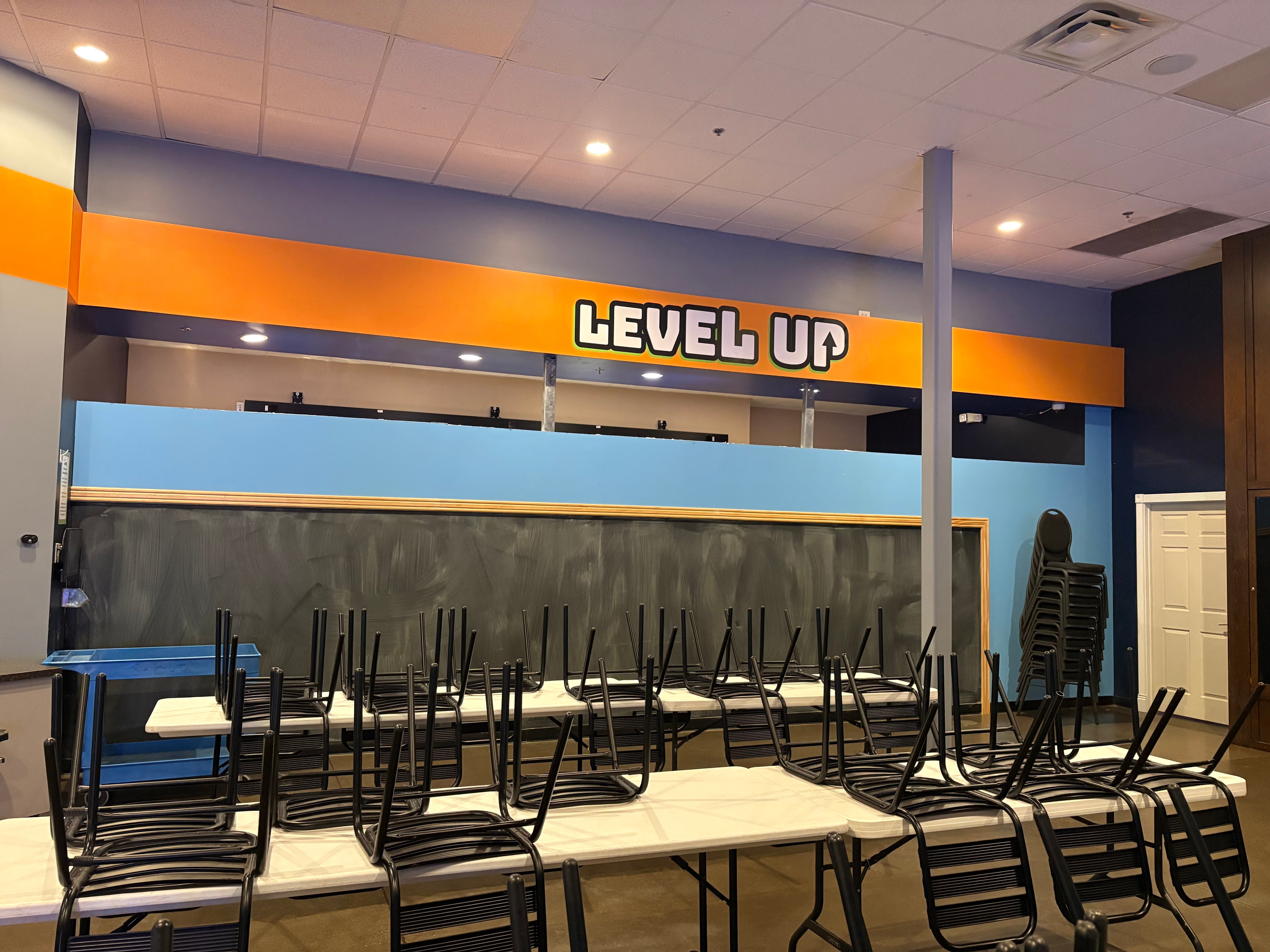
Epicenter gave us the words “LEVEL UP” and the freedom to decide what they should look like.
There was no supplied artwork to reproduce and no prescribed font or color palette. For this custom wall-graphics project in Santa Rosa, the starting point was the message itself.
Our approach was to make the lettering express what it says. Bold letterforms establish the words, while an upward arrow built into the “P” turns part of the lettering into a visual explanation.
Signarama Santa Rosa developed the design from scratch, printed and contour-cut the graphic in-house, and installed it at Epicenter on Coffey Lane. The project stayed with our team from the original concept through the finished application.
Starting With the Words, Not a Supplied Logo
Some projects arrive with completed artwork and detailed instructions. This one began with an open creative brief.
Epicenter had the wording and a location for the graphic, but left the visual direction to our team. The project notes specifically recorded that the customer had no set color or font and was open to a fun, unique approach.
That freedom put the emphasis on design. We were not matching an existing LEVEL UP logo or simply enlarging a file. We needed to give those two words a visual character of their own.
The phrase provided a useful starting point. “Up” already suggests direction, so the design could communicate through both language and shape. Instead of adding a separate illustration beside the words, we brought that idea into the lettering.
The finished graphic keeps the message short while giving it a distinctive detail to discover.
Letting the Lettering Explain the Message
The upward arrow inside the “P” is the central design idea.
It is part of the word rather than an extra symbol sitting above or beside it. A viewer can read “UP” and see the direction at the same time.
The rest of the lettering supports that idea. Light-colored letter interiors sit within a substantial dark outline, with a green accent visible along the lower edges. The outline defines the individual characters against the orange wall, while the offset accent gives the artwork a layered appearance.
That apparent depth is a graphic effect. The project uses printed vinyl, not fabricated raised letters.
Rounded corners and heavy letterforms give the words a playful quality. The message does not need a long description or a second line of explanation; its visual treatment carries the idea.
For us, that is the distinctive part of this project: the wording became the basis of the design, rather than something added after the design was finished.
Working With the Existing Orange Wall
The graphic was created for a specific part of Epicenter’s interior: the long orange band above the back-wall area.
The finished photo shows the lettering within that band, with the orange surface continuing around it. Blue and gray surfaces elsewhere in the room provide the surrounding context.
Rather than introducing a large rectangular background, the graphic follows the shape of the lettering. The existing wall therefore remains part of the composition.
This choice gives the design a clear boundary without covering the entire surface. The dark outline separates the pale letters from the orange, and the green accent adds another color without becoming a large background of its own.
The result is a focused addition to the room. The signage project did not need to replace the surrounding finishes to establish a visible message.
It also shows why the location matters to the artwork. The graphic was not designed for an unspecified wall; it was developed with this existing horizontal area in mind.
Printing and Contour Cutting In-House
Once the design was developed, our team carried it through production in-house.
The material specification called for 3M 40C printed vinyl with 3M 8510 matte laminate, along with contour cutting and pre-mask for installation.
Printing reproduced the light lettering, dark outline and green accent as part of the graphic. Contour cutting followed the outer shape of the artwork, rather than leaving it as a rectangular printed panel.
Those production choices connect directly to what is visible in the finished photo. The wall remains exposed around the lettering, and the graphic’s own outline defines its shape.
The matte laminate was part of the specified finish. We kept the production approach focused on the actual application: a printed interior vinyl graphic with a distinctive outline.
For this project, design and production were handled by the same local team. We developed the artwork and then printed and cut the physical graphic that would be installed at Epicenter.
Completing the Installation at Epicenter
Our installers applied the graphic on site at 3215 Coffey Lane in Santa Rosa.
The installation instructions called for centering it on the long orange section of the back wall. That placement gave the lettering a defined position within the existing architecture rather than treating the whole room as an open canvas.
The completed photo shows the relationship between the graphic and the space below it. The words sit above the blue partition and framed dark wall surface, with the orange band providing their immediate background.
Our involvement included this final stage as well as the artwork and production. Epicenter did not receive a loose graphic to arrange and install independently; our team handled the application.
We designed it, printed it, contour-cut it and installed it.
That is the scope of this project—not a complete room renovation, but a finished piece of custom interior signage.
Another Side of Our Partnership With Epicenter
This project adds a different creative role to our work with Epicenter.
For the Red Eye Barbecue signage update, Epicenter supplied production-ready artwork for the monument and restaurant-door graphics. Our role there centered on producing and installing the new identity.
LEVEL UP called for something different: original creative development as well as production and installation.
The two projects illustrate different ways we can support the same customer. Sometimes the artwork is already established. Sometimes the customer has the message and wants help deciding how to present it.
Here, the opportunity was to start with the words and develop their appearance from the ground up.
The relationship did not require every project to have the same scope. It allowed us to respond to what this particular graphic needed.
A Focused Project With an Original Idea
LEVEL UP is not a full-wall mural or a collection of different signs. It is a single message applied to one part of an existing interior.
Its character comes from a few connected decisions: the bold lettering, the arrow within the “P,” the dark outline, the green accent and the way the cut graphic sits against the orange wall.
The final result demonstrates what the project set out to do visually. The words describe an idea, and the artwork reinforces it.
For a business with a phrase, room name or message in mind, this is a useful example of where the creative process can begin. A complete art file is not always the starting point.
In this case, Epicenter supplied two words. Our team turned them into an original graphic and carried that design through to installation.
Frequently Asked Questions
Did Signarama Santa Rosa design the LEVEL UP graphic?
Yes. We developed the artwork from scratch. Epicenter supplied the wording without a prescribed font, color palette or visual direction, giving our team the freedom to create the design.
What is the idea behind the arrow in the lettering?
An upward arrow is incorporated into the “P” in “UP.” It makes the word communicate visually as well as verbally, so the direction becomes part of the lettering rather than a separate illustration.
Is this a dimensional-letter sign or a vinyl wall graphic?
It is a printed, contour-cut vinyl wall graphic. The dark outline and green offset accent create a layered visual effect; they are part of the artwork rather than separate fabricated letters.
What materials were specified for the project?
The project specified 3M 40C printed vinyl with 3M 8510 matte laminate. The production scope also included contour cutting and pre-mask for installation.
Did Signarama handle production and installation?
Yes. Our team designed, printed and contour-cut the graphic in-house, then installed it on the orange back-wall section at Epicenter in Santa Rosa.
Do I need finished artwork before discussing a custom wall graphic?
No. This project started with wording and an intended location, not supplied artwork. Bring your message, any existing brand guidelines and photos of the surface, and our team can discuss the creative and production requirements.
Have a Message That Deserves Its Own Design?
You may already know what you want your wall to say without knowing what the finished graphic should look like.
Signarama Santa Rosa can help develop the idea and discuss printing, cutting and installation as one project.
Whether you have finished artwork or a starting phrase, share the message and the space with our team.
Contact Signarama Santa Rosa to plan your next custom wall graphic.

Signarama Santa Rosa, CA
contact
Signarama Santa Rosa, CA