Signarama Santa Rosa, CA
Your local team for quality signs in Sonoma, Marin, Napa and Lake Counties


Merry Edwards Winery Custom Signage & Rebrand | Signarama Our Work
Aug 17, 2026 by Matthew Vella
From the Wine Label to the Property: Creating a Cohesive Branded Experience for Merry Edwards Winery & Vineyards
When a recognizable brand moves into an established property, changing the name on the building is only the beginning.
Merry Edwards Winery & Vineyards took over the former Domaine Anderson location in Sonoma County and needed to make the property unmistakably their own. That meant carrying the Merry Edwards identity across a wide range of signs—from the first roadside impression to exterior building identification, directional signage, tasting room graphics, and interior branding.
For Signarama, the project became an exercise in something we do every day but rarely get to demonstrate at this scale: taking an established two-dimensional brand and translating it into a complete physical environment.
Merry Edwards provided the brand standards. From there, our team worked to determine how those standards should translate across different materials, sizes, locations, viewing distances, and existing architectural elements.
Some details even required us to go directly back to the product itself.
To accurately reproduce an important brand color, we worked from a Merry Edwards wine label to develop the appropriate color match for the signage.
The result is a signage program that feels cohesive throughout the property without feeling repetitive—and, importantly, feels like it belongs there.
A New Brand in an Established Winery Environment
Taking over an existing property creates a different signage challenge than starting with a blank building.
The former Domaine Anderson property already had its own architecture, landscape, sign structures, materials, and visual character. Merry Edwards needed to introduce its branding without creating signage that felt disconnected from those surroundings.
That meant we weren't simply asking:
“How do we make a Merry Edwards sign?”
We were asking:
“How should the Merry Edwards brand live on this particular property?”
Those are very different questions.
Brand standards establish important elements such as logos, typography, colors, and visual identity. But a brand guide can't anticipate every physical environment where that identity will eventually appear.
A roadside directional sign has different requirements than a tasting-room feature sign.
An exterior building sign has to work against architecture and landscaping.
A small directional sign needs to communicate quickly.
Interior branding is viewed much more closely and becomes part of the guest experience.
Our job was to take the established Merry Edwards identity and consistently translate it across all of those applications.
Color Matching from the Wine Label
One of the details behind this project illustrates just how far signage production can go beyond simply opening an artwork file and pressing print.
Color matters tremendously to brand consistency.
And when the product itself is as carefully presented as a bottle of wine, the signage surrounding that brand should feel like it belongs to the same visual family.
For this project, we needed to accurately reproduce one of the Merry Edwards brand colors. Part of that process involved working directly from their wine label to establish the color we needed to carry into the signage.
It's a small detail that most visitors will never consciously notice.
That's also the point.
When brand colors are right, they don't call attention to themselves. The sign simply feels correct.
When they're noticeably wrong, even someone who can't explain why may recognize that something feels inconsistent.
That attention to color became one of the many details helping connect the physical property back to the Merry Edwards brand guests already recognize.
Preserving the Look of Wood—Without Simply Recreating the Old Sign
One of our favorite problem-solving details came from a roadside sign.
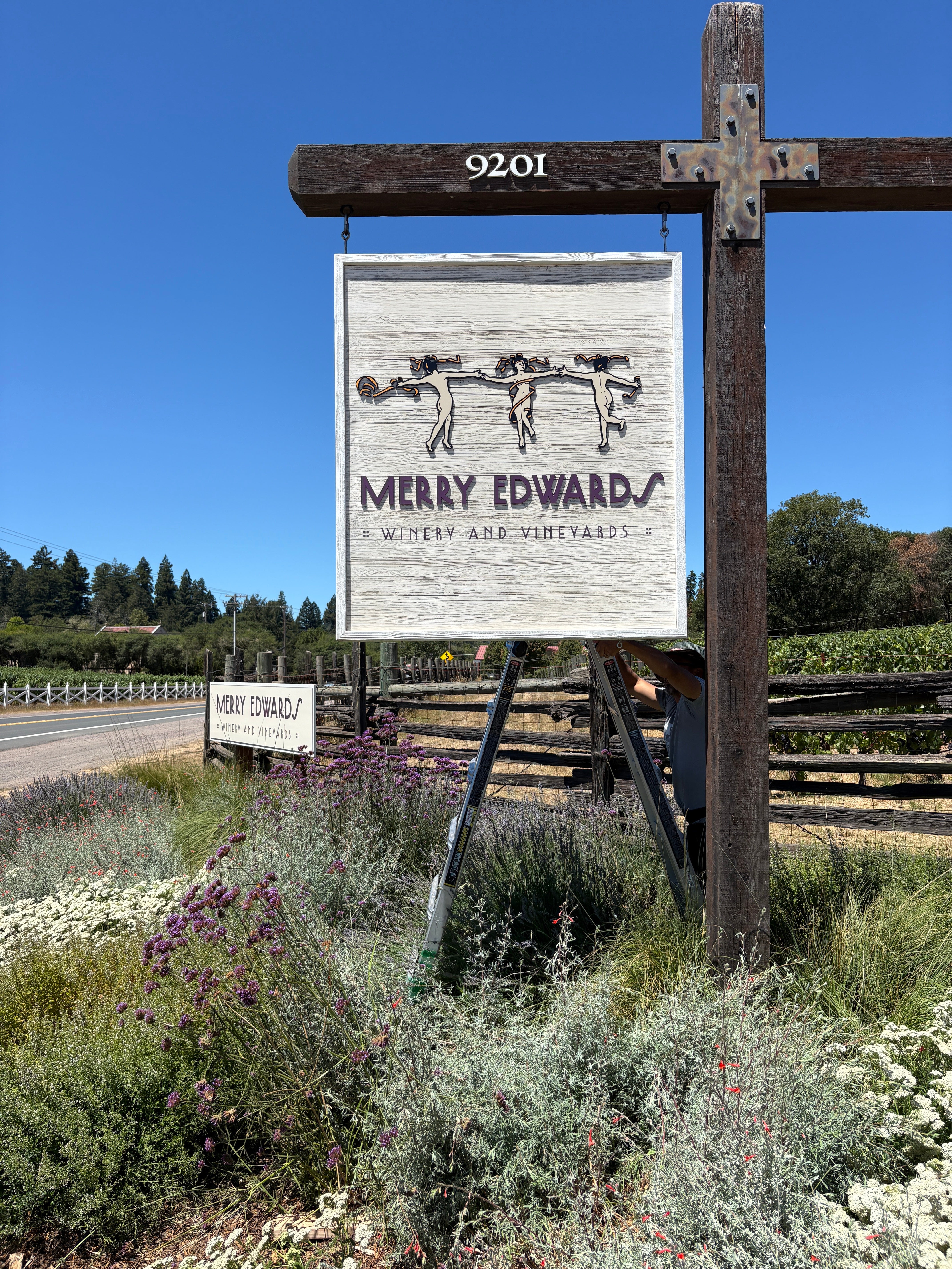
The previous signage incorporated the appearance of wood, and that visual worked naturally within the winery setting. Simply replacing it with a flat, generic background could have created a sign that technically communicated the new brand but lost some of the property's established character.
Instead, we found a way to preserve that visual connection.
Our team captured a high-resolution photograph of the existing wood so its grain, variation, and natural appearance could become part of the new sign graphics.
That wood imagery was then reproduced as part of the printed sign treatment.
The project documentation specifies premium printed 3M vinyl with protective gloss laminate applied to ACM for roadside signage, providing a modern sign construction while allowing the visual character of the wood to remain part of the design.
It's a good example of the difference between replicating a material and preserving its visual character.
Sometimes the best solution isn't to discard everything that came before.
It's to determine which elements still work, preserve what contributes to the environment, and integrate the new brand thoughtfully.
Adding Dimension to the Merry Edwards Identity
Flat graphics weren't the only component of the project.
Dimensional elements were also incorporated into major branded signage, giving the Merry Edwards identity physical depth and presence.
That distinction becomes especially important on signs intended to function as permanent architectural features.
A dimensional logo interacts with light differently throughout the day. Shadows change as the sun moves. Letterforms physically separate from the background. What begins as artwork on a computer screen becomes an object within the environment.
That transformation is part of what makes custom signage interesting.
We aren't simply reproducing a logo.
We're determining how that logo should exist in three-dimensional space.
The project incorporated fabricated and dimensional components alongside printed graphics, ACM substrates, premium vinyl and laminates, painted elements, and existing structures to create the overall signage package.
Each method had a different purpose, but everything needed to ultimately feel like part of the same brand.
Guiding Guests Through the Property
A winery signage program isn't only about identification.
It also has to work.
Visitors arriving at a property need to know they've reached the right destination. They need to understand where to enter, where to park, where tastings are located, and how to move through an unfamiliar environment.
That's where wayfinding becomes part of the guest experience.
The Merry Edwards project included multiple directional and identification applications throughout the property, including roadside and entrance signage, tasting-related signage, directional signs, fence-mounted signs, open-and-closed messaging, A-frame graphics, door graphics, and other supporting signs.
Each piece serves a relatively simple purpose by itself.
Together, they create a system.
Good wayfinding should reduce the number of moments when a visitor has to stop and wonder:
“Am I going the right way?”
For wineries and hospitality-driven businesses, that's particularly important because signage is part of the transition from traveling to the property to actually experiencing it.
The guest experience begins before someone reaches the tasting room.
Bringing the Brand Into the Tasting Room
Once guests arrive, the role of signage changes.
Outside, signs often need to identify, direct, and inform.
Inside, signage can become part of the architecture and atmosphere.
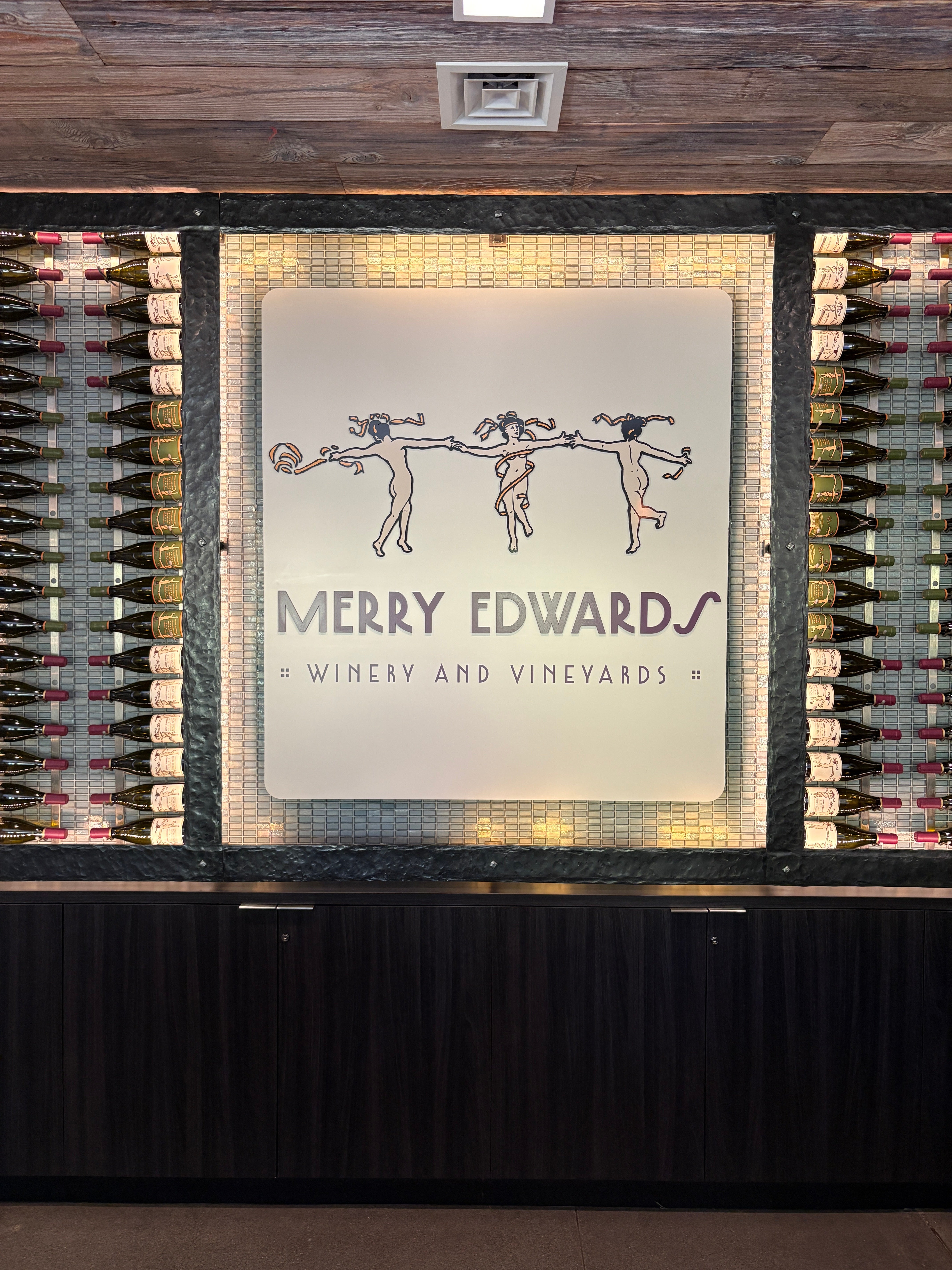
The Merry Edwards identity carries into the tasting-room environment through branded feature signage that works with the property's existing mix of wood, metal, glass, lighting, and wine displays.
One of the strongest interior installations places the Merry Edwards Winery & Vineyards identity directly within an illuminated wine-display feature.
Rather than competing with the interior design, the sign becomes part of it.
That's an important consideration for wineries, restaurants, hospitality businesses, and other experience-driven environments.
Interior branding shouldn't always look like something that was added after the room was finished.
The strongest installations feel intentional—as though the sign and the environment were designed to exist together.
The Merry Edwards tasting-room signage accomplishes exactly that.
Consistency Doesn't Mean Making Every Sign the Same
One of the most interesting aspects of a property-wide signage project is maintaining consistency across signs that perform completely different jobs.
The large exterior building identification doesn't need to look identical to a directional sign.
A roadside sign doesn't need to be constructed exactly like an interior feature sign.
An A-frame doesn't need the same visual hierarchy as an entrance sign.
Trying to make every sign identical can actually make a wayfinding system less effective.
Instead, consistency comes from maintaining the recognizable components of the brand while allowing each sign to perform its specific function.
Throughout the Merry Edwards project, the recurring identity, typography, colors, and visual treatments create that connection.
The signs belong to the same family.
But each one has its own job.
A Project That Touched the Entire Signarama Team
One of the things we're proudest of about this project isn't a particular sign.
It's the teamwork behind all of them.
A comprehensive signage program moves through many hands before the finished product appears on a property.
It begins with the customer.
Merry Edwards brought their established brand, standards, goals, and knowledge of how they wanted the property to represent them.
Then comes design.
Brand standards have to be translated into actual signs. Artwork needs to fit specific dimensions. Colors need to be reproduced accurately. Existing structures need to be considered. Different applications need to remain visually connected.
Then production turns those concepts into physical objects.
Materials are selected. Graphics are printed and laminated. Substrates are prepared. Dimensional elements are fabricated. Components are finished and assembled.
Finally, installation brings everything together at the property.
Each sign has to end up where it belongs, installed correctly and functioning as intended.
For the Merry Edwards project, that collaboration extended all the way from the client through our design, production, and installation teams.
That full-team effort is one of the things that makes the finished property especially rewarding for us.
Signage as Part of a Rebrand or Property Transition
The Merry Edwards project also illustrates something important for businesses taking over an existing location.
A property transition doesn't necessarily mean everything that existed before needs to disappear.
Sometimes there are architectural elements worth preserving.
Sometimes an existing sign structure can be incorporated into the new program.
Sometimes the surrounding environment suggests materials or visual treatments that should influence the new signage.
And sometimes—as with the wood appearance incorporated into the roadside sign—the best solution combines an element of the existing property with a completely new branded execution.
The objective isn't merely to cover up the previous identity.
It's to make the new identity feel established.
That requires looking at the property as a whole rather than treating each sign as an isolated order.
From a Bottle to a Building
There is something especially satisfying about seeing a brand move from a small physical reference—in this case, even something as specific as a wine label—to an entire environment.
A label may fit in your hand.
A building sign may span many feet.
A directional sign may have only seconds to communicate with a driver.
An interior feature sign may be viewed from only a few feet away.
Those applications couldn't be more different in scale, yet customers should still recognize the same brand in every one of them.
That's what environmental branding is ultimately about.
It takes the identity people associate with a company or product and extends it into the spaces they physically experience.
For Merry Edwards Winery & Vineyards, that meant establishing their identity throughout a property that previously represented another winery.
Our role was to help make that transition feel complete.
The Finished Result
Today, guests arriving at the property encounter Merry Edwards branding throughout their experience.
They see it approaching the property.
They encounter it at the entrance.
It helps guide them once they arrive.
It identifies important destinations.
And when they enter the tasting environment, the brand continues inside.
No single sign accomplishes all of that.
The strength comes from the system.
We're proud of the consistency achieved throughout the property, the problem-solving that went into details like the reproduced wood appearance and color matching, and especially the collaboration that made the entire project possible.
From the Merry Edwards team to our design department, through production and ultimately installation, this project was truly a team effort.
And that's one of our favorite kinds of projects.
Because great signage isn't simply about putting a name on a building.
It's about making a brand feel like it belongs there.
Planning a Rebrand, New Location, or Property-Wide Signage Project?
Whether you're moving into an existing property, refreshing an established location, or developing an entirely new branded environment, signage should be considered as a complete system.
Signarama can help businesses translate their brand across exterior identification, dimensional signage, directional and wayfinding signs, interior branding, window and door graphics, post-and-panel signs, custom fabricated signage, and complete property signage programs.
From design and material selection through production and installation, our team can help carry your brand consistently from the first impression to the final destination.
Contact Signarama to start planning your next signage project.
Frequently Asked Questions About Winery & Property Signage
What types of signage did Signarama create for Merry Edwards Winery & Vineyards?
The project included a coordinated mix of exterior identification, dimensional branding, roadside and directional signage, tasting room signage, door and fence graphics, A-frame signage, and other wayfinding elements throughout the property. The goal was to create a consistent Merry Edwards brand experience from arrival through the tasting room.
How do you keep signage consistent with an established brand?
We start with the customer's existing brand standards and translate those standards into materials and production methods appropriate for each sign. For the Merry Edwards project, that process included working from their established branding and even color matching from a wine label to help maintain consistency across the property.
Can existing sign structures be reused during a property rebrand?
In many cases, yes. Existing structures can sometimes be incorporated into a new signage program rather than replaced completely. For Merry Edwards, one particularly creative solution involved photographing the appearance of existing wood and reproducing that wood grain as a printed graphic, allowing the new signage to retain some of the property's established visual character.
What is the difference between dimensional signage and printed signage?
Printed signage applies graphics to a substrate, while dimensional signage adds physical depth through raised letters, logos, or other fabricated elements. A comprehensive signage program may use both methods depending on the location, viewing distance, architecture, budget, and desired appearance.
Why is wayfinding signage important for wineries and hospitality properties?
Wayfinding helps guests understand where to enter, park, check in, find the tasting room, and move confidently through an unfamiliar property. Effective wayfinding isn't just functional—it contributes to the overall guest experience and can reinforce the property's brand at the same time.
Can Signarama handle an entire property rebrand instead of just one sign?
Yes. A property-wide signage project can include exterior identification, directional and wayfinding signs, dimensional logos, interior branding, window and door graphics, post-and-panel signs, and other custom signage. Planning these elements as a coordinated system helps create a more consistent brand experience across the property.
Do you provide design, production, and installation for custom signage?
Yes. Projects like Merry Edwards involve collaboration across the entire process, including design, material and production decisions, fabrication, and installation. Having those stages work together is especially important on multi-sign projects where consistency needs to carry across different applications.
Can custom signage be designed to complement an existing property?
Absolutely. Good signage doesn't have to look like it was simply added to a building or landscape. Materials, colors, dimensions, mounting methods, existing architecture, and the surrounding environment can all be considered so the finished signage feels appropriate for both the brand and the property.


Signarama Santa Rosa, CA
contact
Signarama Santa Rosa, CA