Signarama Santa Rosa, CA
Your local team for quality signs in Sonoma, Marin, Napa and Lake Counties


COR Yoga+ Studio Signage in Santa Rosa: From Storefront to Studio
Sep 28, 2026 by Matthew Vella
COR Yoga+ Studio Signage in Santa Rosa: From Storefront to Studio
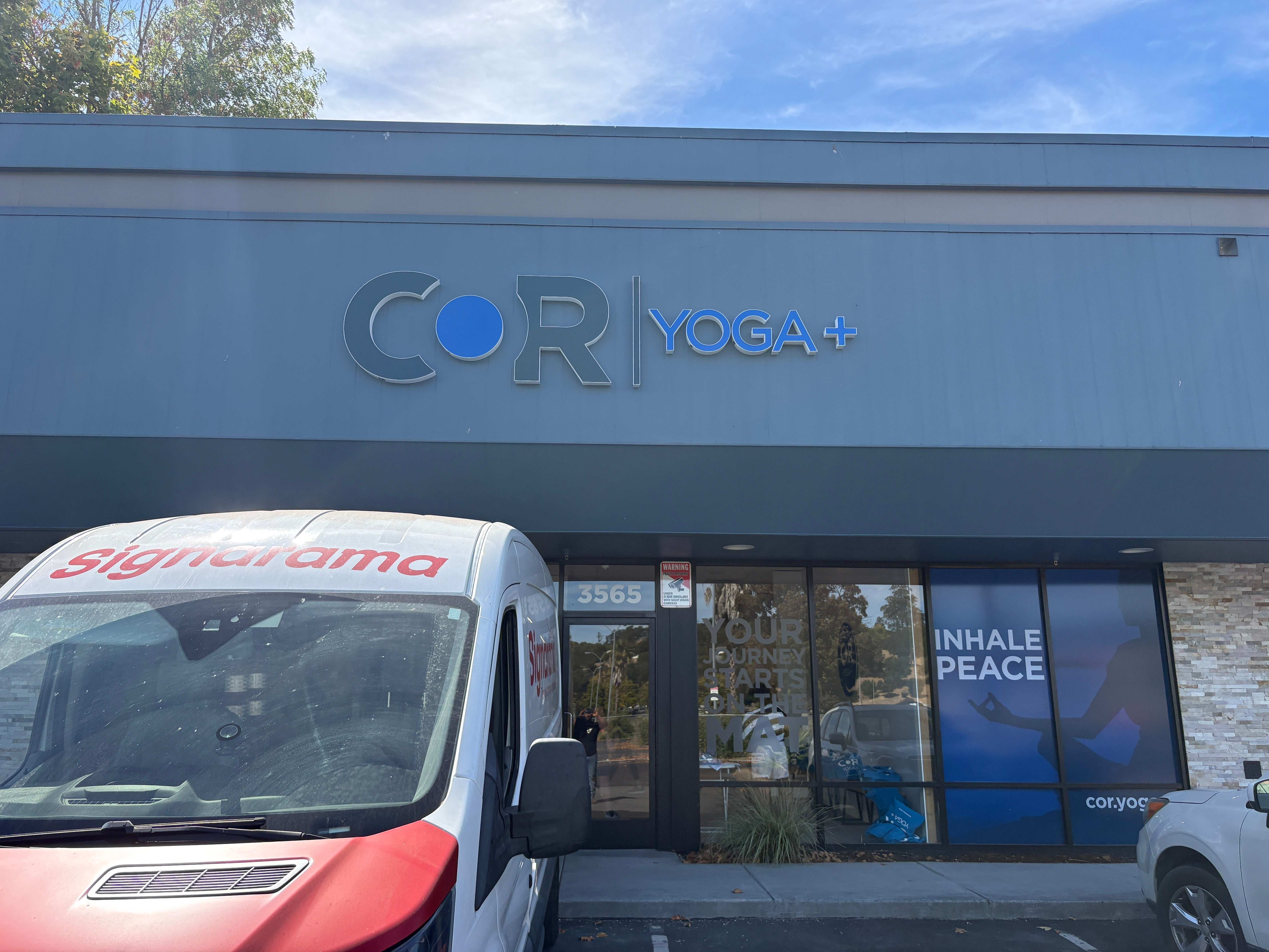
Before you reach the reception desk at COR Yoga+, the storefront is already introducing the studio.
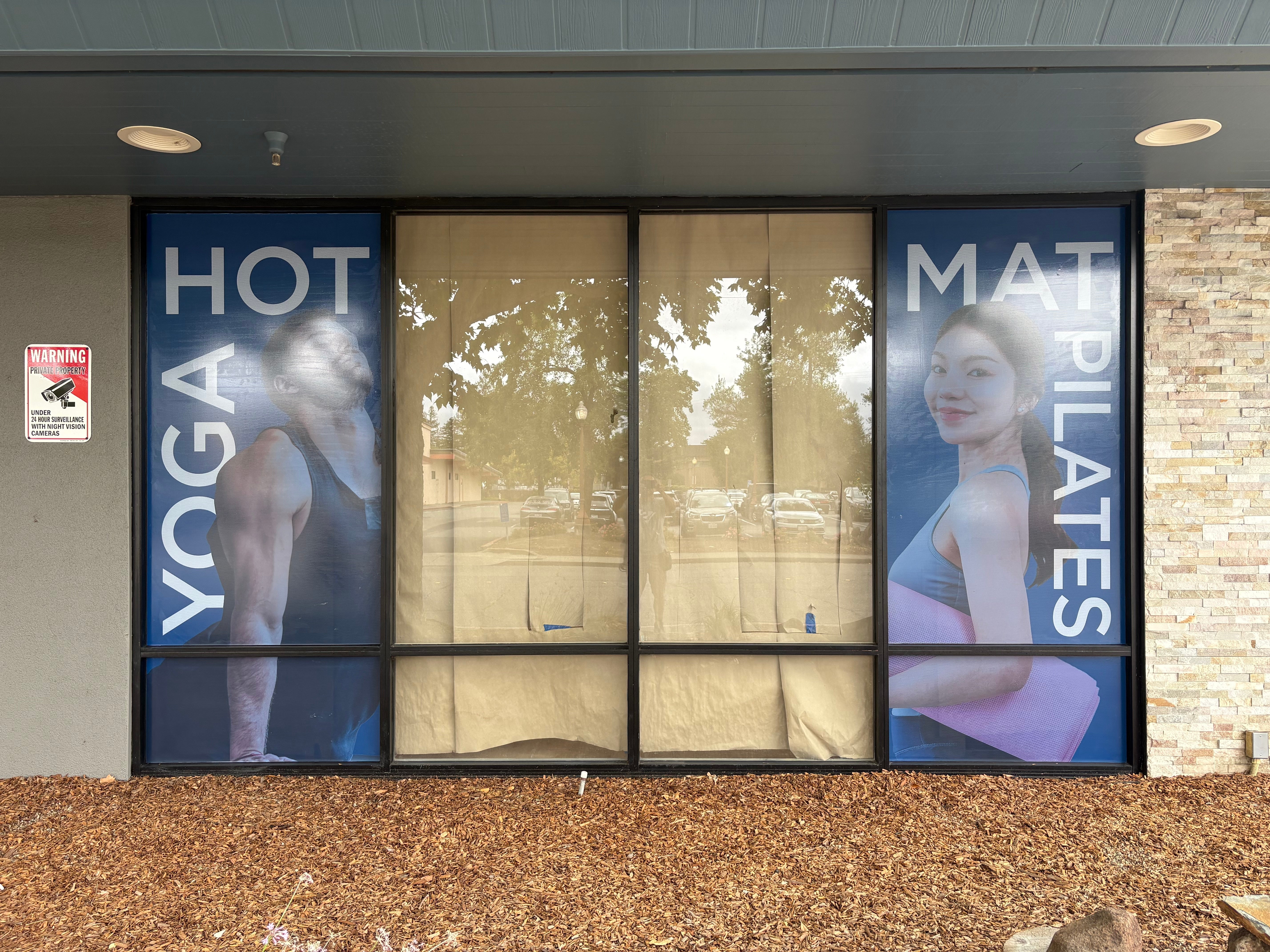
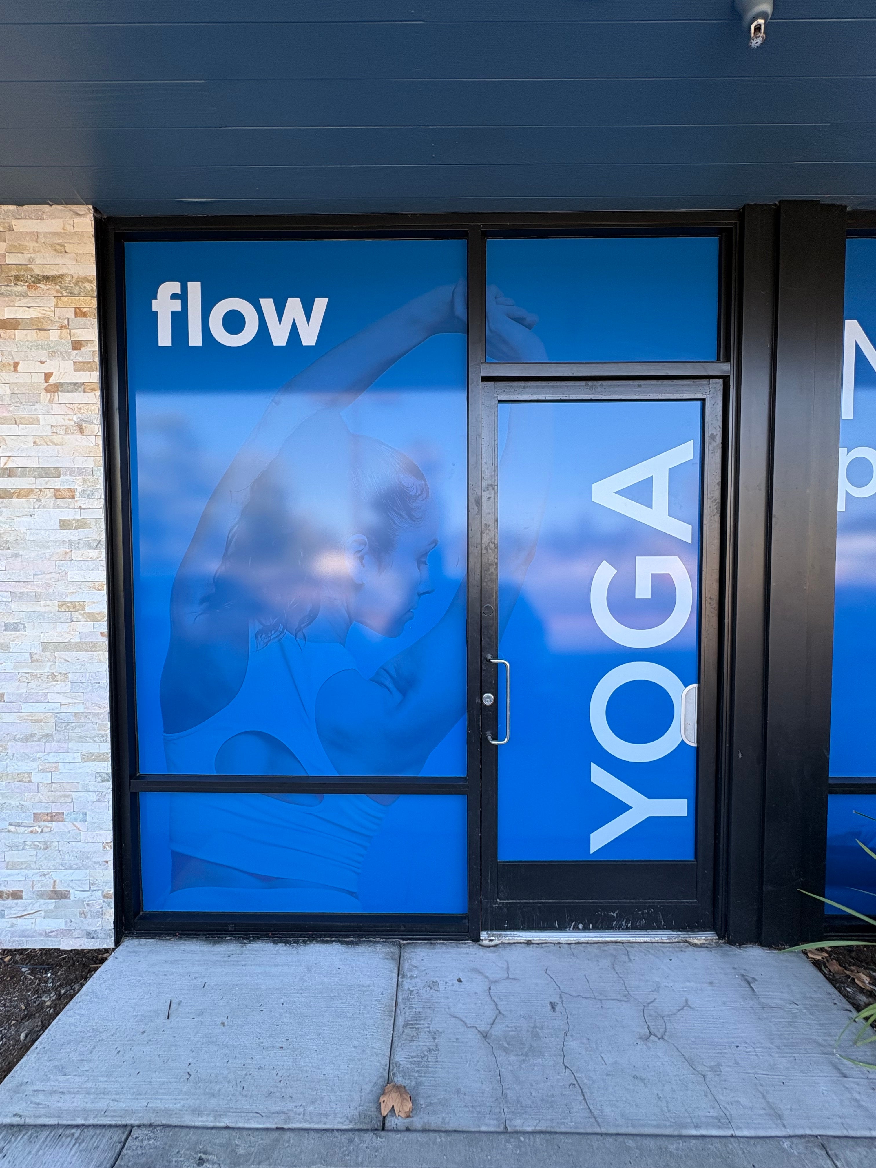
“HOT YOGA” and “MAT PILATES” appear across tall window graphics. Blue-toned imagery carries through neighboring glass panels, alongside messages such as “flow” and “INHALE PEACE.” Above the entrance, a large exterior logo identifies the business.
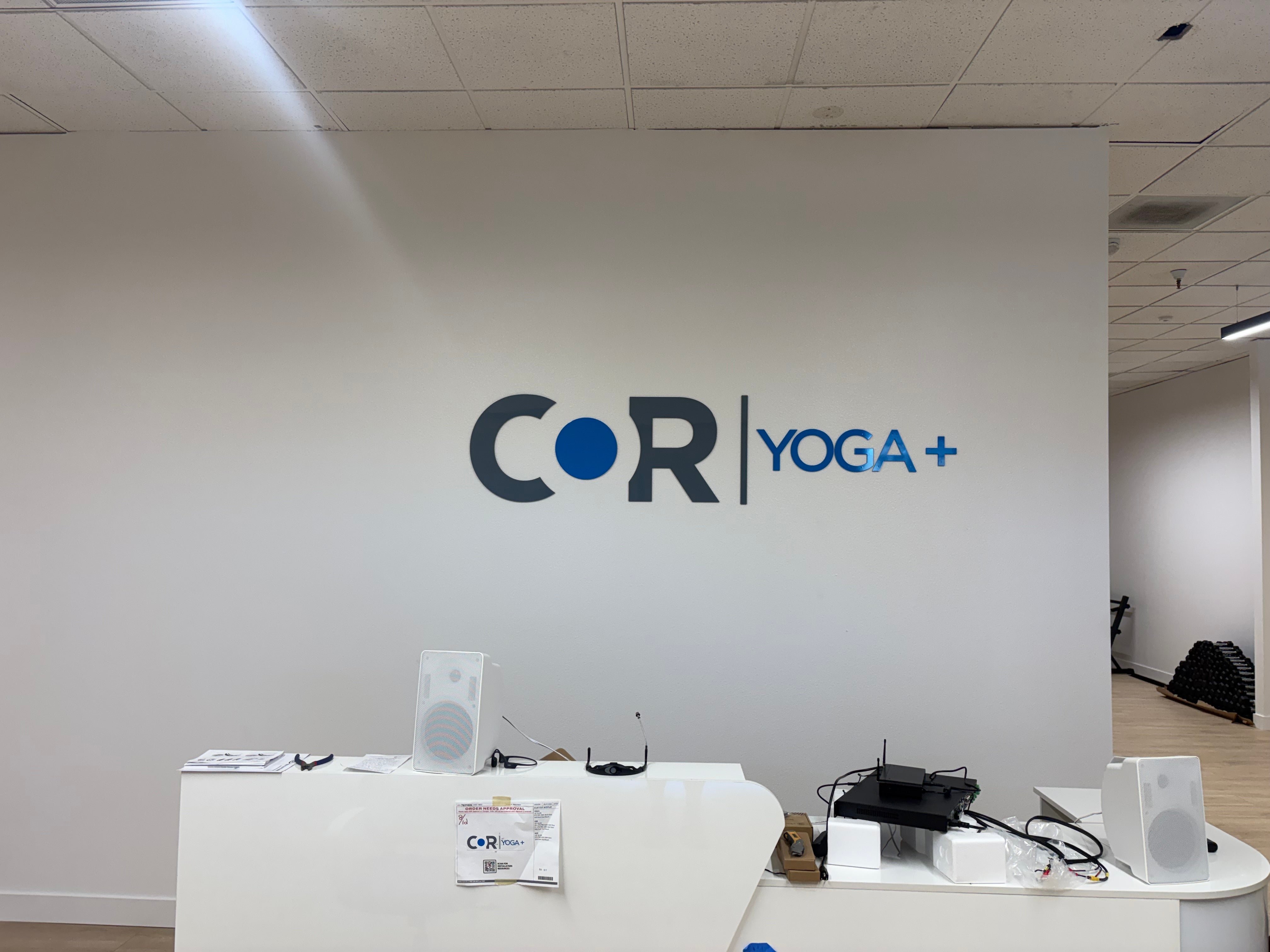
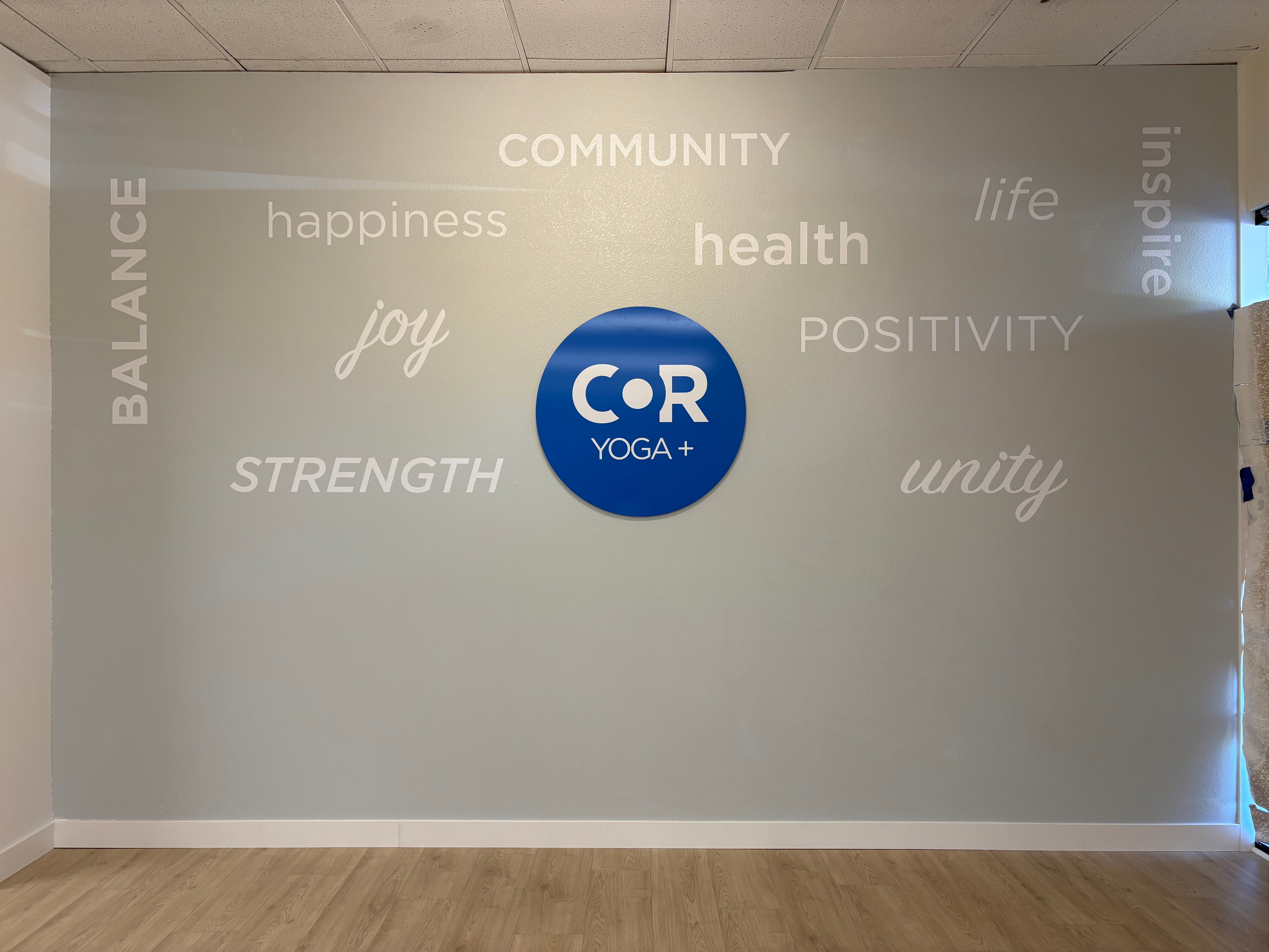
Inside, that same blue appears in the reception logo and a circular wall sign surrounded by words including “COMMUNITY,” “STRENGTH” and “BALANCE.”
For this studio-signage project at 3565 Industrial Drive in Santa Rosa, Signarama Santa Rosa brought together exterior identification, window graphics, dimensional interior signs and wall lettering within one facility-sign package. The project scope also included permit drawings and installation.
The interesting part is how differently the brand appears on each surface while remaining recognizable throughout the space.
One Studio, Several Different Signage Roles
The photographs show three distinct layers of communication.
The building sign establishes the studio’s name above the storefront. The window graphics introduce yoga and Pilates through photography and large lettering. Inside, the reception logo and word wall carry the identity into the studio environment.
Each element has a different format and viewing context. The exterior logo spans a broad section of the facade. The window artwork fits individual panes and doors. The reception sign is a horizontal dimensional logo, while the feature wall uses a circular sign surrounded by separate words.
The package connects those applications without simply repeating the same sign at different sizes.
An Exterior Logo Scaled for the Building
The exterior COR Yoga+ logo sits above the entrance, centered within the building’s horizontal fascia.
Its composition gives the larger COR lettering and blue circular element room to stand out, with the vertical divider and “YOGA +” completing the identity to the right. In the daytime photograph, the dimensional construction is visible against the gray-blue building surface.
The exterior sign was specified at 159 inches wide by 36 inches high, with three-inch-deep returns, stud mounting and LED illumination. That makes the overall sign more than 13 feet wide—a substantial difference in scale from the interior logos.
The exterior and reception versions share the same recognizable arrangement, but the physical specifications differ. The exterior uses fabricated channel-letter construction; the reception logo uses quarter-inch acrylic.
That distinction is important to the project. Maintaining a consistent identity does not require using the same construction method on every surface.
Window Graphics That Introduce the Studio’s Offerings
At pedestrian level, the windows tell a more detailed story.
The graphics combine people practicing or preparing for movement with large, uncomplicated wording. “HOT YOGA” and “MAT PILATES” identify the activities. Other sections use “flow” and “INHALE PEACE” to create a different tone alongside the service information.
The shared blue treatment connects these panels even though the photographs, words and arrangements change.
One section places tall photographic graphics at opposite ends of a window group. Another carries imagery across a large pane, the smaller glass below it and the area beside a door. Vertical “YOGA” lettering makes use of the door’s narrow proportions.
These are not identical rectangles with a logo placed in the middle. The artwork responds to the actual divisions in the storefront.
Working With the Glass Layout
The window-graphics specifications reflect that variety.
The order lists tall panels measuring 80.5 inches high in several widths, smaller lower panels measuring 20 inches high, and a separate door-sized graphic. It also includes a frosted-vinyl element.
Those dimensions help explain the finished appearance: the graphics were planned as individual pieces for different areas of glass.
The black window frames remain visible between the images. Rather than disguising those divisions, the compositions work within them. The photographs show different approaches to the lettering, too—horizontal words where there is width to use, and vertical wording on narrower surfaces.
For a business with a long storefront, this project offers a useful visual example: the windows can communicate several messages while still sharing a consistent color treatment and overall identity.
A Dimensional Logo Behind Reception
Inside, the reception area takes a quieter approach.
The COR Yoga+ logo is positioned on a light wall behind the desk. There is no surrounding photograph or large printed background. The letters, blue circular element and vertical divider define the composition themselves.
The reception sign was specified as painted quarter-inch acrylic, measuring 79 inches long by 18 inches high, with flush stud mounting.
The photograph shows how this version relates to the exterior sign without competing with the rest of the room. Both use the horizontal logo arrangement, but the reception version is scaled for an interior wall.
It also creates a clear contrast with the storefront graphics. Outside, photography and large service wording fill selected windows. At reception, the brand stands on its own.
That change in presentation gives each area its own character while retaining the same identity.
A Circular Logo at the Center of the Word Wall
The feature wall uses another version of the COR Yoga+ branding.
A blue circular sign becomes the focal point, with white lettering arranged across the surrounding gray wall. The words include “COMMUNITY,” “happiness,” “health,” “joy,” “POSITIVITY,” “STRENGTH” and “unity,” along with vertical treatments for “BALANCE” and “inspire.”
The combination of uppercase lettering, lowercase words and script styles gives the wall variation without introducing another color palette.
The circular logo was specified as a 36-inch acrylic sign made from quarter-inch material, finished with a printed graphic and 3M 8510 matte laminate. The surrounding word wall was listed separately as cut-vinyl lettering.
This is an important construction detail: the wall is not one large printed mural.
The logo is a separate physical sign, and the words are individual vinyl elements applied around it. The painted wall remains visible between every piece.
Two Different Elements Working Together
The circle and the lettering play different visual roles.
The blue sign has a defined edge and a concentrated block of color. The white words spread across the wider wall, using open space rather than filling it with a continuous graphic.
The photograph shows how these elements balance each other. The logo provides a central point of recognition, while the words extend the composition across the room.
For this project, the feature wall is also where the branding moves beyond the business name. The selected words become part of the interior presentation, giving visitors something different to read from the activity names on the windows.
Different Sign Forms, a Connected Identity
The strongest visual connection across the photographed work is the repeated use of blue, white and dark gray.
On the storefront, blue creates a background for photographs and service lettering. At reception, it becomes a smaller accent within the horizontal logo. On the feature wall, it fills the circular sign.
The shapes change, but the identity remains recognizable.
The project also uses several different production approaches: fabricated exterior lettering, printed window graphics, painted acrylic and cut-vinyl wall lettering. The specifications treat these as separate products rather than asking one material or format to serve every purpose.
That is what gives the finished package its variety. A window graphic, a dimensional reception logo and a word wall do not need to look identical to belong together.
Supporting Elements Beyond the Main Photos
The broader facility-sign order included more than the building, windows and interior walls shown here.
It also listed two acrylic monument-sign faces, a door-vinyl package and 100 four-inch circular decals. These smaller items appear in the project scope, although they are not all shown in the supplied installation photographs.
Their inclusion illustrates the range of formats involved in the project—from the large exterior identity down to small-format graphics.
The main photographs focus on the most prominent applications. Together, they show how the studio name, activity messaging and interior graphics relate across the property.
Planning for Installation as Well as Appearance
The work order included permit drawings, aerial-lift installation for the exterior logo, and field installation for window and interior graphics.
Those are different installation situations within the same project.
The exterior lettering occupies an elevated position on the building. The window graphics fit a series of separate glass surfaces. Inside, the reception logo and feature-wall elements require their own positioning and attachment arrangements.
The photos show the signage in place during the project, including installation-stage views of the reception area and interior wall. They are useful for seeing the work itself without implying that every part of the studio fit-out was complete when the pictures were taken.
The documented scope brings the physical installation into the story alongside the artwork and sign construction.
What Connects the Finished Signage?
Viewed together, the project photos show a progression.
The exterior sign identifies the studio. The windows introduce the activities. The interior graphics continue the brand inside.
The reception logo does not try to communicate everything displayed on the windows. The word wall does not duplicate the exterior sign. Each element contributes something specific.
That is the most useful takeaway from the COR Yoga+ project: a coordinated signage package can give different surfaces different jobs while maintaining a recognizable identity.
For studio owners considering their own space, these photographs offer practical examples of that approach. A broad fascia, narrow glass door, tall window and open interior wall each call for a different composition.
At COR Yoga+, those variations are connected by the logo, color treatment and recurring graphic elements.
Frequently Asked Questions
What signage was included in the COR Yoga+ project?
The facility-sign package included an illuminated exterior logo, window graphics, a circular acrylic wall logo, cut-vinyl word-wall lettering and a dimensional reception logo. The broader order also included monument faces, door vinyl, circular decals, permit drawings and installation.
Where was this studio-signage project installed?
The project location was COR Yoga+ at 3565 Industrial Drive in Santa Rosa, California. The photographs show the building sign, storefront graphics, reception logo and interior feature wall.
Was the exterior logo specified as an illuminated sign?
Yes. The exterior logo was specified with LED illumination, fabricated channel-letter construction and three-inch-deep returns. Its listed overall dimensions were 159 inches wide by 36 inches high. The supplied exterior photograph shows its daytime appearance.
What was the interior reception logo made from?
The reception logo was specified in painted quarter-inch acrylic, measuring 79 inches long by 18 inches high, with flush stud mounting. The finished photo shows the horizontal COR Yoga+ identity on the wall behind reception.
Was the word wall one large printed graphic?
No. The project combined a separate 36-inch circular acrylic logo with cut-vinyl lettering arranged around it. The background wall remains visible between the words and the central sign.
How were the window graphics adapted to the storefront?
The project specifications listed several panel sizes for tall windows, smaller lower panes and a door-sized application. The photographs show artwork and lettering arranged within these different glass sections rather than one repeated layout.
Did the project include installation and permit drawings?
Yes. The scope included permit drawings, aerial-lift installation for the exterior logo, and field installation for window and interior graphics. These were listed as project services alongside the signs themselves.
Bring Your Studio’s Identity Into the Space
Whether you are planning signage for a yoga studio, Pilates studio, fitness facility or another customer-facing business, consider how the exterior, windows and interior will work together.
Signarama Santa Rosa can help you explore building signage, window graphics, dimensional logos and wall lettering as parts of a coordinated project.
Share your logo, site photos and the messages you need to communicate. We can discuss an approach suited to the different surfaces throughout your location.
Contact Signarama Santa Rosa to plan your studio-signage project—from the storefront to the space inside.


Signarama Santa Rosa, CA
contact
Signarama Santa Rosa, CA