Your Consultative Signs and Graphics Partner for Eastside Businesses


Signs That Reduce Customer Anxiety: Practical Examples for Businesses
Oct 1, 2026 by Signarama Redmond

79% of Americans say too many signs from a business can create confusion, according to Morningstar’s September 2026 research. That creates a practical challenge: customers need guidance, but a crowded space can leave them with even more questions. The most useful signs that reduce customer anxiety answer a customer’s next question, in the place where they need the answer.
Customers may wonder where to enter, whether they’re in the right line, how a process works, or what to do next. Clear, well-placed signs can make those moments easier to navigate. They don’t need to cover every wall. A few focused messages can guide people while keeping the space welcoming.
This article looks at common points of uncertainty during a customer visit and shares sign examples for different situations, from finding the right place to understanding what happens next. You’ll also learn how to choose concise, reassuring wording and review signs for clarity without adding visual clutter. Signs and graphics can help customers feel more informed as they move through your space.
Key Takeaways
Notice the moments in a customer visit when people may hesitate or be unsure what to do next.
Use signs that reduce customer anxiety to answer a specific question and guide customers toward their next action.
Place signs along the customer journey, from arrival and check-in to payment or asking for help.
Review existing signs for clear wording, a welcoming tone, visibility, and an obvious next step.
Start with a customer need, then consider whether signs and graphics can communicate the answer without adding clutter.
Table of Contents
How Signs That Reduce Customer Anxiety Address Uncertainty
A customer who pauses at the entrance may be wondering whether they’ve come to the right place. Someone near a counter might not know whether to wait, check in, or ask for help. These small moments of uncertainty can make a visit feel less comfortable than it needs to be.
Signs that reduce customer anxiety make the next action, location, or expectation easier to understand. They can help customers arrive, find a destination, wait, make a choice, or request assistance. Useful signs reduce uncertainty by making the next step explicit. This connects with wayfinding principles, which help people orient themselves and move through a space.
Signs can guide and reassure, but they can’t replace attentive staff or a clear service process. If instructions or the process itself are confusing, adding more signs may not solve the underlying problem. Treat signage as one practical part of a customer-friendly experience, alongside helpful human support.
What makes a sign feel reassuring rather than overwhelming?
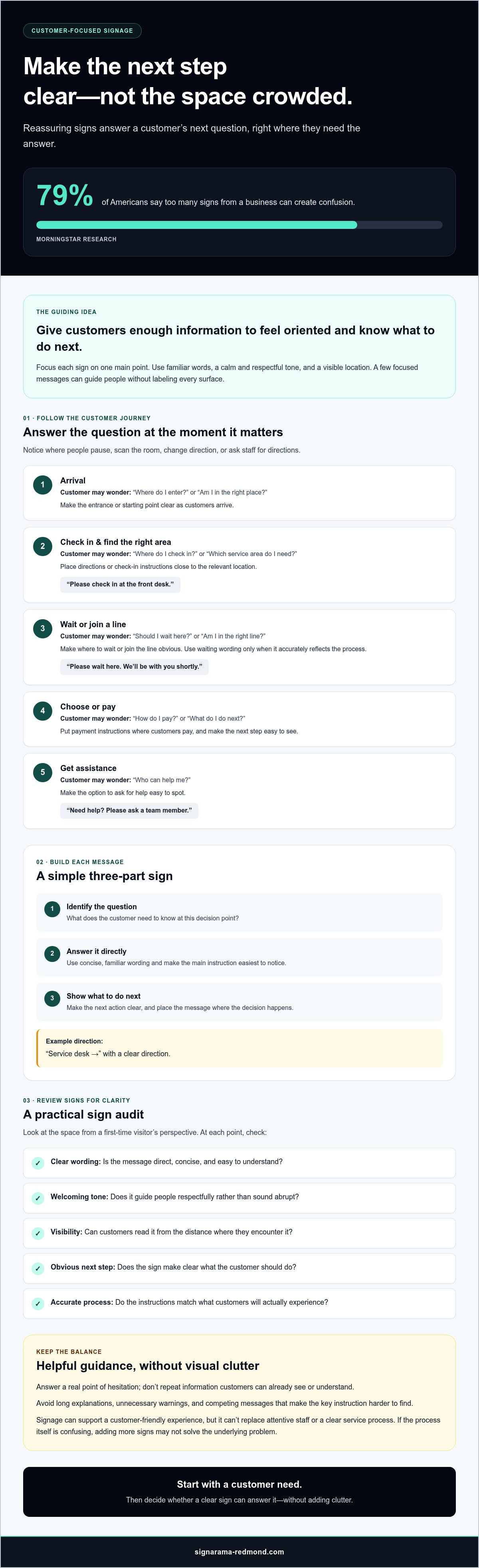
A reassuring sign gives people useful information without forcing them to sort through competing messages. Focus each sign on one main point, use familiar words, and keep the tone calm and respectful. “Please check in at the front desk” is more direct than a long explanation of what may happen after arrival. If customers may need help, make that option easy to spot.
Where can customers feel uncertain during a visit?
Look at the space from a first-time visitor’s perspective. Is it clear where to enter, check in, or begin? Notice where people pause, scan the room, change direction, or ask staff for directions. These behaviors can reveal unanswered questions. A sign is most useful when it addresses a real point of hesitation, rather than repeating information customers can already see or understand.
Map the visit in sequence: arrival, finding the right area, waiting, choosing, and getting assistance. At each point, ask what a customer needs to know to continue. A directional sign might identify a service area, while a short notice could explain where to wait. Signs and graphics can communicate these answers in the space, but the message should match the process customers will actually encounter.
The aim isn’t to label every surface. It’s to give customers enough information to feel oriented and know what to do next. That distinction helps businesses offer useful reassurance without crowding the space with instructions.
How Customer-Focused Signage Makes the Next Step Clear
Once you know where customers may hesitate, build each sign around a simple sequence: identify the question, answer it directly, then show what to do next. A person looking for check-in shouldn’t have to interpret a slogan or search the room for clues. They need a clear instruction where they’re deciding what to do.
A helpful sign combines a clear message, a visible location, and an obvious next step. Make the main instruction easiest to notice. Use a prominent heading for the key information, then include only the details needed to complete the action. This visual hierarchy helps customers understand the message at a glance.
How should signs answer customer questions?
Start with questions customers are likely to ask: Where do I go? Should I wait here? How do I pay? What happens next? Put the answer close to the relevant decision point. For example, place a check-in message near the check-in location and make payment instructions easy to see where customers pay. These examples can be adapted to your business; they aren’t a script every business needs to follow.
Check-in: “Please check in at the front desk.”
Waiting: “Please wait here. We’ll be with you shortly.” Use only if it accurately reflects the process.
Directions: “Service desk →” with a clear direction.
Assistance: “Need help? Please ask a team member.”
How do wording and placement affect reassurance?
Direct, friendly wording tells customers what to do without sounding abrupt. “Please join the line here” is more helpful than “Line” or “Wait.” Likewise, “Ask us for help” feels more welcoming than a warning that customers shouldn’t proceed without permission. Make the message readable from the distance at which customers encounter it, whether they’re approaching an entrance or standing at a counter.
Resist putting every possible instruction on one sign. Long explanations, unsupported promises, and unnecessary warnings can make the key message harder to find. If an instruction depends on staff availability or a particular process, check that it reflects what customers will actually experience. Signs and graphics should make the process easier to follow, not suggest something the business can’t deliver.
Use this approach to review customer-facing messages: does each one answer a real question, appear where the answer is needed, and make the next action clear? If you’ve identified a gap, discussing the message and placement with a provider of business signs and graphics may help you consider a suitable way to communicate it.
Customer Anxiety Sign Examples: Compare Signs by Visit Stage
The right message depends on what customers are doing and what they need to know at that moment. Use these examples as starting points, then adapt the wording to your layout, service process, and tone. A sign should guide customers, not imply that every business needs the same set of messages.
Customer moment | Likely question | Sign example | Placement |
|---|---|---|---|
Arriving | Is this the right entrance? | “Welcome. Please enter here.” | At the customer entrance or where visitors choose a door. |
Checking in | Where should I start? | “Please check in at reception.” | Near the reception point, visible as customers enter. |
Finding a service area | Where do I go for help? | “Customer service →” | At a corridor, junction, or other point where customers choose a direction. |
Waiting | Should I wait here? | “Please wait here. A team member will assist you.” | Where customers are expected to pause, if this matches the process. |
Browsing or choosing | Can I ask someone a question? | “Questions? Please ask a team member.” | Near the relevant display, service area, or decision point. |
What signs help customers feel comfortable when they arrive?
Arrival messages can welcome visitors and clarify the first action. In an office, a sign near the entrance might direct guests to reception or show where to wait. Place it where people can see it before they have to guess which way to go. For visitor-facing workplace examples, see professional office signs in Redmond.
What signs help during waiting, browsing, or choosing?
At a service point, explain the next step or how to get assistance. If customers need information before entering, a window message can answer a practical question, such as where to begin or which entrance to use. Keep it short enough to read from outside. For examples related to exterior-facing messages, explore custom window decals for Redmond businesses.
Use signs that reduce customer anxiety to address specific moments of uncertainty, not to fill every available surface. Check that each message matches the actual process and is visible where customers need it. A welcoming entrance message won’t help if the check-in point remains hard to find, so consider the full visit, from arrival through the next decision.
How to Audit Signs for Customer Anxiety and Confusion
A useful signage audit starts with observation, not assumptions. Walk through the business as a first-time visitor would, following the customer journey from arrival to departure. Note where you pause, look around for direction, or aren’t sure what to do. These hesitation points can show where a sign may be missing, unclear, or poorly placed.
Walk the journey. Follow the route customers actually take. Check entrances, decision points, waiting areas, and service counters.
Record questions and hesitation. Write down what isn’t obvious and where it happens. Ask staff which questions customers regularly raise and where those conversations occur.
Review each sign in context. Check whether the message is clear, respectful, visible from where it’s needed, and easy to connect with the next action. Make sure it doesn’t compete with other important information.
Try a simpler version. Compare the current message with a shorter alternative that answers one customer question. Remove repeated instructions or details that don’t help someone act.
How can a business spot confusing sign gaps?
View the space from a visitor’s perspective, not from the spot where staff usually stand. A direction that seems obvious to employees may be unclear to someone unfamiliar with the layout. Compare your observations with staff feedback. Repeated questions about the same location can point to a gap worth reviewing. Also check whether signs are easy to notice without obscuring other useful messages.
How should a business improve a sign without adding clutter?
Choose one unanswered customer question and write one direct response. If a sign gives several instructions, keep the essential one and move other necessary details closer to the decision point where they apply. For example, a direction may work better at a corridor junction than on a general information board. If placement is part of your review, this overview of professional sign installation in Redmond may be a useful reference.
Before changing signs and graphics, gather staff observations and the questions customers ask. This grounds revisions in real situations, though it doesn’t guarantee a particular result. After a change, keep listening for uncertainty and review whether the message remains accurate as the customer process evolves.
If you’ve identified a sign or placement that needs attention, discuss signs and graphics with Signarama Redmond as one possible next step.
Plan Signs That Reassure Customers and Fit Your Business
Good signage planning starts with a customer question, not a decision to add another sign. Identify what people need to know, write a clear answer, and choose a location where they can use it. The goal is a connected experience: each message should fit the space and help customers move through their visit with less guesswork.
Review your signs and graphics when customers regularly ask the same questions, staff notice people hesitating, or a change to your space or service process makes existing directions less useful. Signs that reduce customer anxiety should reflect the actual experience, so check that every message is accurate and customers can follow the instruction as written.
What information should you prepare before discussing signage?
A little preparation can make a signage conversation more focused. Note where customers need guidance and what questions come up at each point. Include details about the intended audience and the space, along with existing signs or placement constraints that could affect the message.
List recurring customer questions and where they arise.
Describe the audience and the areas customers move through.
Write down the main message each sign needs to communicate.
Note existing signs, visual clutter, or location limits to consider.
Then choose examples from this article that seem relevant, such as an arrival direction or a message explaining where to ask for help. Treat them as planning prompts, not as a fixed package or an assumption that a particular sign type is available.
When should you ask a signage professional for input?
Consider asking for input when messages need to work together across several customer touchpoints, or when you’re unsure how a sign’s wording and location will work in the space. Bring your observations and ask how message, placement, and visibility can be considered together. Signarama offers signs and graphics, so a conversation may help you explore options for the needs you’ve identified.
Ready to discuss your sign needs? Contact Signarama Redmond to start a conversation about signs and graphics for your business.
Make Every Customer Visit Easier to Navigate
Customer confidence can grow from small moments of clarity. A sign that answers a real question, appears where it’s needed, and points to a clear next step can make a visit easier to manage. The most effective signs that reduce customer anxiety support the customer journey without overwhelming the space or standing in for attentive staff.
Start by noticing where visitors pause, search, or ask for directions. Then review whether your signs use direct, welcoming language and make the next action easy to understand. A simple audit can help you focus on genuine information gaps instead of adding messages customers don’t need.
Every business and customer journey is different, so choose messages and placements that fit your space and the way people use it. If you’ve identified an opportunity to improve how your business communicates with signs and graphics, discuss your sign needs with Signarama Redmond.
Thoughtful guidance can help customers feel more at ease, one clear next step at a time.
Frequently Asked Questions
Can signs really reduce customer anxiety?
Yes, clear signs can reduce uncertainty by showing customers where to go, what to expect, or how to get help. They can make a visit easier to navigate, especially for first-time visitors, but they can’t guarantee that every customer will feel calm. The message needs to match the real process, and signs work best alongside attentive staff and clear service steps.
What should a sign say to make customers feel welcome?
A welcoming sign pairs a friendly greeting with useful direction. For example, “Welcome. Please check in at reception” acknowledges the visitor and gives them a first step. Choose words that fit your business and avoid language that feels abrupt, overly formal, or unclear. If customers need to ask for help, say where or whom to approach, provided that instruction reflects how your business operates.
Where should reassuring signs be placed in a business?
Place a sign where a customer needs its information, ideally before they have to make a decision or ask for directions. That could be near an entrance, at a reception point, beside a queue, or at a junction where people choose which way to go. View the message from the customer’s approach and check that it’s visible without obscuring other important information.
How do you make signs clear without adding too many?
Start with a real customer question and give it one direct answer. Prioritize the most important instruction, remove details repeated elsewhere, and place supporting information near the point where it’s needed. Before adding a sign, check whether an existing message can be revised or moved. A sign should resolve a specific uncertainty, not restate something customers already understand.
Can wayfinding signs help customers feel more confident?
Yes, wayfinding signs can help customers understand where they are and how to reach a destination. Use familiar names for areas, clear directions at decision points, and consistent wording throughout the route. For example, if one sign points to “Reception,” later signs should use that same label rather than an unfamiliar alternative. Directions should reflect the actual layout and remain easy to follow.
What types of businesses can use signs to reduce customer confusion?
Any business where customers need to find a location, follow a process, or make a choice may find signs useful. Retail shops might clarify where to pay, while offices could guide visitors to reception. Restaurants, clinics, and other customer-facing services may use signs to explain where to wait or ask for assistance. The right messages depend on each business’s space, customers, and actual procedures.
How can I tell whether customers find my signs helpful?
Look for practical clues: do customers still ask the same directional question, pause at the same decision point, or overlook the sign? Ask staff to note recurring questions and invite customers to share whether instructions were easy to follow. Check whether each sign is visible from the customer’s approach and remains accurate. Use these observations to decide what to clarify, move, simplify, or remove.


Signarama Redmond, WA
Summer Hours (July - August) - MON-THUR: 8.00AM - 6.30PM, FRI - SUN: CLOSED
contact
Signarama Redmond, WA