Your Consultative Signs and Graphics Partner for Eastside Businesses


How to Make a Small Retail Space Look Bigger with Signs: 5 Visual Strategies for 2026
Sep 20, 2026 by Signarama Redmond
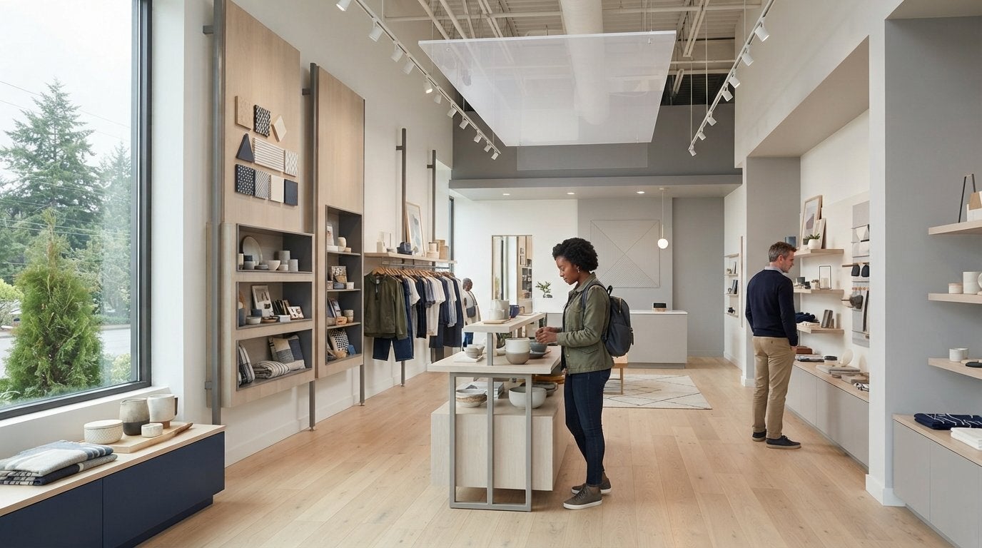
Did you know that 52% of consumers say cluttered or poor signage actually deters them from shopping? For many local shop owners in Redmond, the struggle to balance essential information with a limited floor plan is a daily challenge. You likely feel the frustration of a cramped customer flow or worry that your storefront looks too busy from the street. It's a common pain point, but your signage doesn't have to contribute to the clutter. In fact, the right graphics can act as visual architecture to open up your shop.
You're about to learn exactly how to make a small retail space look bigger with signs by using strategic design and placement. We will explore five expert-led visual strategies for 2026 that transform tight corners into airy, inviting environments. From leveraging vertical sightlines to using transparent acrylics, this guide provides a roadmap to improve customer dwell time and create a high-end feel. Let's look at how a collaborative approach to your store's layout can turn your small space into a major destination.
Key Takeaways
Learn how to leverage vertical planes and ceiling-mounted graphics to create an optical illusion of architectural height.
Discover how to make a small retail space look bigger with signs by using transparent substrates that maintain open sightlines throughout your shop.
Master the art of consolidating visual noise into sleek, multi-purpose fixtures that improve customer flow and reduce spatial anxiety.
Explore techniques for adding perceived depth to shallow walls using standoff hardware and layered dimensional graphics.
Understand how partnering with a local collaborator ensures your custom signage is both high-impact and compliant with Redmond's 2026 zoning codes.
Table of Contents
The Psychology of Space: How Signs Influence Perception
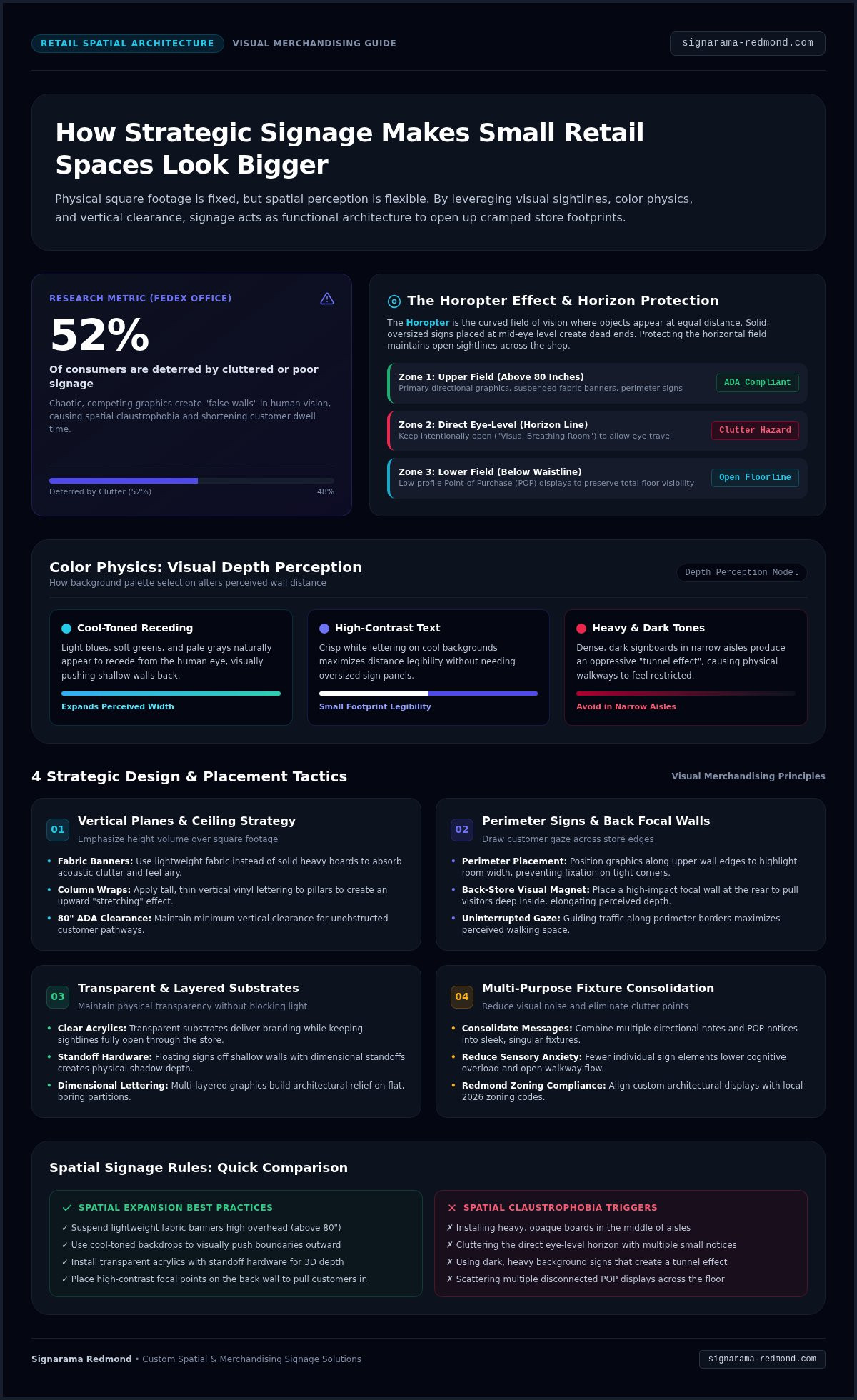
Your store's physical footprint might be fixed, but how a customer perceives that footprint is entirely flexible. Understanding the science behind how to make a small retail space look bigger with signs begins with human biology. Specifically, we look at the "Horopter" concept, which is the curved field of vision where objects appear at the same distance from the eye. When you place multiple small, competing signs within this field, you create "false walls" that trick the brain into thinking the room is smaller than it actually is. Research from FedEx Office shows that 52% of consumers are deterred by cluttered or poor signage, often because it makes the environment feel chaotic and tight.
Effective visual merchandising relies on maintaining clear sightlines to make a floor plan feel expansive. The biggest mistake boutique owners make is installing oversized, opaque signs in the middle of a shopper's path. These solid blocks of material act as visual dead ends. Instead, we recommend a "less is more" philosophy. By reducing the number of individual signs and focusing on high-quality, strategic placements, you prevent the sensory overload that leads to "spatial claustrophobia."
Color Theory for Spatial Expansion
Color choice isn't just about branding; it's a tool for depth perception. Cool-toned backgrounds, such as light blues, soft greens, or pale grays, naturally appear to recede from the viewer. When you use these shades for your interior graphics, you effectively push the walls "back" visually. Conversely, heavy or dark signs in narrow aisles can create a tunnel effect that feels restrictive. To maintain readability without needing a massive sign, we use high-contrast lettering. Crisp white text on a cool-toned background allows for a smaller physical footprint while ensuring your message is perfectly clear from a distance.
The Eye Level Illusion
To keep a shop feeling airy, you must protect the "horizon line" of your store. If signs are cluttered at direct eye level, the space feels crowded. We suggest placing primary directional graphics either above 80 inches or below the waistline to open up the middle visual field. This strategy allows a customer's gaze to travel across the entire store uninterrupted. When designing point-of-purchase (POP) displays, keep them low to ensure floor visibility remains high. Visual breathing room is the intentional use of empty space around graphics to ensure a customer's eye can move freely through the store without feeling trapped by information.
Utilizing Vertical Signage to Draw the Eye Upward
Most retailers focus their attention on the floor plan, but the vertical plane is your most valuable asset when learning how to make a small retail space look bigger with signs. By drawing the eye toward the ceiling, you emphasize the volume of the room rather than its limited square footage. Verticality creates an illusion of height that makes even the most compact boutique feel grander. Adhering to the principles of effective visual displays involves creating a strong focal point; in a small shop, that focal point should often be high on the wall or suspended from above.
Perimeter signage is another essential tool for spatial expansion. By placing graphics along the upper edges of your walls, you guide the customer's gaze around the entire room. This movement prevents the eye from settling on a single "cramped" corner and instead highlights the full width of the space. Strategic wall graphics can also create a "focal wall" at the back of the store. This design choice acts as a visual magnet, drawing visitors deeper into the shop and making the distance from the front door feel more significant than it is. If you're unsure where to start, our team can help you design a layout that maximizes every inch of your vertical space.
Hanging Banners and Ceiling Graphics
The "Ceiling Strategy" uses suspended elements to fill the upper void of a room without consuming floor area. It's vital to choose lightweight materials like fabric banners. Fabric adds a soft texture that absorbs sound and feels airy, whereas heavy, solid boards can feel oppressive in tight quarters. To ensure a professional look, we often apply the same high-quality design standards found in trade show displays Redmond businesses use to stand out in crowded halls. Remember to maintain a minimum vertical clearance of 80 inches for all hanging signs to comply with ADA standards and keep walkways clear.
Column Wraps and Vertical Wall Graphics
Structural columns often feel like obstacles, but they're actually perfect branding opportunities. Wrapping these pillars in tall, thin vinyl lettering or vertical patterns creates a "stretching" effect that makes ceilings appear higher. We find that the clean, organized techniques used for office signs Redmond professionals prefer work exceptionally well in retail backrooms and dressing areas too. By using vertical stripes or elongated typography, you transform a physical barrier into a design element that expands the room's perceived boundaries. This holistic approach ensures your branding stays consistent while solving your spatial challenges.
Creating Depth with Transparent and Layered Signage
While verticality helps the eye move upward, transparency allows the eye to travel deeper into your store. Discovering how to make a small retail space look bigger with signs often requires thinking about what the eye sees beyond the message itself. Opaque materials act as visual roadblocks; they tell the brain that the room ends exactly where the sign begins. By switching to transparent or translucent substrates, you remove those artificial boundaries and keep the shopper's focus moving through the entire floor plan.
One of the most effective techniques is the "Ghost Sign" effect. By using clear acrylic signs with minimal text, you provide essential information while keeping the background visible. This transparency ensures that even a large sign doesn't feel like it's "eating" the room. For an even more dramatic expansion, try placing see-through graphics directly onto mirrors. This doubles the perceived depth of a shelf or display area, making a narrow aisle feel twice as wide. You can also add physical depth with dimensional lettering. When 3D letters are mounted with standoffs, they cast natural shadows on the wall. These shadows trick the human eye into interpreting a flat, shallow wall as a recessed, expansive surface.
The Power of Perforated Window Film
Natural light is the most important factor in making any small space feel large. Standard opaque window graphics can block that light, making your shop feel like a cave. Perforated window film solves this by allowing sunlight to flood your interior while still projecting a massive, high-impact brand image to the street. It provides one-way visibility, which is a significant benefit for small storefronts on busy Redmond streets; customers inside feel a sense of privacy without feeling boxed in. Integrating these films with other custom window decals creates a professional exterior that draws foot traffic without sacrificing your store's airy feel.
Acrylic and Glass Signage Solutions
Acrylic is a versatile material for any boutique looking to maximize space. We often recommend "floating" signs using metal standoffs, which hold the sign 0.5 to 1 inch away from the wall. This gap creates a sense of airiness and prevents the graphic from feeling "pasted" onto the surface. If you need to divide your store into sections, consider using etched glass effects on clear panels. This allows you to partition departments or dressing areas without building solid walls that shrink the room. Combining vinyl lettering with layered acrylic creates a high-end, multi-dimensional look that establishes your brand as a premium destination, regardless of your actual square footage.
Reducing Visual Noise with Multi-Purpose Signage
Visual noise is the primary cause of spatial claustrophobia in compact boutiques. When a customer enters a shop filled with dozens of small, competing paper signs, their brain processes the environment as cluttered rather than curated. A study from One Door and GlobalData Retail found that 73.4% of consumers feel frustrated when retail layouts feel cramped or difficult to navigate. Learning how to make a small retail space look bigger with signs often involves a ruthless consolidation of information into unified, professional displays.
One effective strategy is the "Double-Duty" sign. Instead of having separate tags for pricing, brand stories, and product features, you can combine these into a single sleek shelving header. This approach removes the need for dozens of small labels that eat up visual real estate. You can also replace bulky floor stanchions or directional stands with high-durability floor graphics. These vinyl applications provide clear direction without physically encroaching on your aisle clearance. By removing physical barriers, you allow for a smoother customer flow that makes your square footage feel much more generous.
Strategic Wayfinding to Open Floor Space
Physical barriers are the enemy of a small floor plan. If you use pedestal frames to guide traffic, you're actively shrinking your walkable area. Floor graphics are a superior alternative because they guide the eye and the feet without taking up a single inch of three-dimensional space. We also recommend wall-mounted "blade" signs for departmental identification. These signs sit high on the wall and don't protrude into walking paths, keeping the "middle" of the room clear. Simplifying the path to the register with these subtle cues reduces the crowded feeling that often leads to abandoned carts.
Digital Signage and Dynamic Displays
Digital signage is the ultimate space-saver for modern Redmond retailers. A single high-definition screen can replace a rotating cast of messy chalkboards, posters, and window flyers. This technology allows you to change your messaging based on the time of day, keeping your content relevant without adding physical bulk. Because one screen can cycle through ten different messages, you eliminate the visual "weight" of multiple static displays. If you're ready to declutter your storefront, our team can help you design a consolidated signage system that maximizes your impact while minimizing your footprint.
Partnering with Signarama Redmond for Custom Spatial Solutions
Transforming a compact storefront requires more than just a creative eye; it needs a partner who understands the technical nuances of spatial design. At Signarama Redmond, we position ourselves as a competent collaborator for small retail owners. We don't just print graphics. We work with you to analyze your floor plan and determine how to make a small retail space look bigger with signs through strategic placement. Our team provides an all-in-one solution that reduces your stress by managing every detail from the initial concept to the final delivery.
Our collaborative approach ensures your signage works in harmony with your architecture. We focus on a holistic lifecycle for every project, providing professional execution that local businesses depend on. Whether you are in Redmond, Bellevue, or anywhere across the greater Eastside, we offer the expertise needed to turn a cramped shopping experience into a high-end brand environment. By choosing a local partner, you gain access to a team invested in your success and the growth of our shared community.
The Redmond Retail Advantage
Local expertise is vital when navigating municipal requirements and regional retail trends. Our team has a deep understanding of the Redmond Zoning Code (RZC 21.44). We know that interior signs located more than three feet from a window are often exempt from city permits, allowing for more creative freedom inside your shop. Local businesses trust us because we provide:
Expert knowledge of local retail navigation habits and consumer expectations.
A commitment to community growth, supporting local farms, non-profits, and veteran-owned businesses.
Tailored strategies that have helped boutique shops visually expand their floor plans by up to 15% through better sightline management.
From Concept to Professional Installation
In a small retail environment, there is no room for error. A sign that is slightly off-center or poorly sized can make a room feel lopsided and cluttered. This is why professional sign installation Redmond services are essential. Our installers ensure every graphic is perfectly leveled and securely mounted to maintain a clean, high-end look. We use high-quality materials, including the same durable vinyl found in vehicle wraps Redmond businesses use for long-term outdoor exposure. This focus on durability means your interior graphics will remain crisp and professional for years to come. Ready to transform your store? Schedule a consultation with our Redmond sign experts today!
Elevate Your Storefront for 2026 and Beyond
Strategic signage is a powerful tool that transforms physical limitations into brand opportunities. By leveraging vertical sightlines and utilizing transparent acrylics, you can effectively remove the visual boundaries that make a shop feel cramped. Consolidating your messaging into sleek, multi-purpose displays reduces the sensory overload that often deters shoppers. Mastering how to make a small retail space look bigger with signs ensures your customers feel comfortable and engaged from the moment they walk through your doors.
Our local Redmond team is here to act as your competent collaborator in this transformation. We provide a full-service experience that covers everything from the initial design concept to professional installation. You can trust our durable, high-quality materials to provide a premium feel that lasts. Don't let a small footprint limit your business growth. Transform your small retail space with a custom signage consultation! We look forward to helping you create an airy, inviting shopping experience that reflects the true quality of your brand.
Frequently Asked Questions
What is the best sign color to make a room look bigger?
Cool-toned backgrounds like light blue, soft green, or pale gray are the most effective for expanding a space. These colors naturally recede from the viewer's eye, which helps "push" the walls back visually. When you combine these receding colors with high-contrast lettering, you ensure readability without needing a larger, more intrusive sign. This strategy is a key part of how to make a small retail space look bigger with signs while maintaining a professional brand image.
Can I use window graphics if my shop is very small and dark?
You definitely can, provided you use perforated window film. This material allows natural light to enter your shop, which is the most critical factor in making a small area feel expansive. While standard opaque vinyl blocks the view and creates a dark environment, perforated graphics project your brand to the street while keeping the interior bright. It’s a smart way to maximize your marketing without sacrificing the airy feel of your storefront.
How do I avoid 'visual clutter' with my retail signage?
To prevent visual noise, you should consolidate multiple small messages into unified displays. Instead of using several paper signs, try a single digital screen or a permanent acrylic sign with a clean layout. Always prioritize "visual breathing room" by leaving intentional empty space around your graphics. This approach reduces sensory overload, making your shop feel organized and spacious rather than cramped and chaotic for your customers.
Are digital signs worth it for a small retail space in Redmond?
Digital signs are an excellent investment for small Redmond boutiques because they act as major space-savers. A single high-definition screen can cycle through dozens of messages, effectively replacing a rotating collection of posters and chalkboards. This reduces the physical "weight" of your signage and allows you to update promotions instantly. It keeps your store looking modern and fresh without cluttering your valuable floor or wall real estate.
Do I need a permit for interior signs in Redmond, WA?
In most cases, you don't need a permit for interior signage. According to the Redmond Zoning Code (RZC 21.44), interior signs and point-of-purchase displays located more than three feet from a window are exempt from city sign permits. This gives you significant creative freedom to redesign your interior layout. If you plan to install large-scale window graphics facing the public right-of-way, it is always best to check with a local expert first.
How can floor graphics help with store layout in tight spaces?
Floor graphics are a superior alternative to bulky physical barriers like stanchions or sign stands. They guide customer flow through narrow aisles without occupying any three-dimensional space. By applying high-durability vinyl directly to the floor, you keep your walkways clear and prevent bottlenecks. This is a practical strategy for how to make a small retail space look bigger with signs by maximizing every inch of walkable square footage.
What materials are best for 'transparent' signage?
Clear acrylic and edge-polished glass are the most effective materials for creating a sense of depth. These transparent substrates allow sightlines to pass through the sign, which prevents the room from feeling "closed in." We often recommend mounting these materials with metal standoffs to create a floating effect. For a more affordable option, etched glass vinyl can provide a high-end partitioned look without the bulk of a solid wall.
How often should I update my retail signs to keep the space feeling fresh?
You should review your signage quarterly to ensure it remains relevant and effective. While your primary brand signs are built for long-term durability, updating secondary graphics every season keeps the environment feeling fresh for repeat customers. Regular updates help prevent "sign blindness," where shoppers stop noticing your messages. This proactive approach ensures your small space always feels dynamic and well-managed, which reflects positively on the quality of your merchandise.


Signarama Redmond, WA
Summer Hours (July - August) - MON-THUR: 8.00AM - 6.30PM, FRI - SUN: CLOSED
contact
Signarama Redmond, WA