Your Consultative Signs and Graphics Partner for Eastside Businesses


Common ADA Sign Placement Mistakes and How to Avoid Them
Nov 18, 2026 by Signarama Redmond
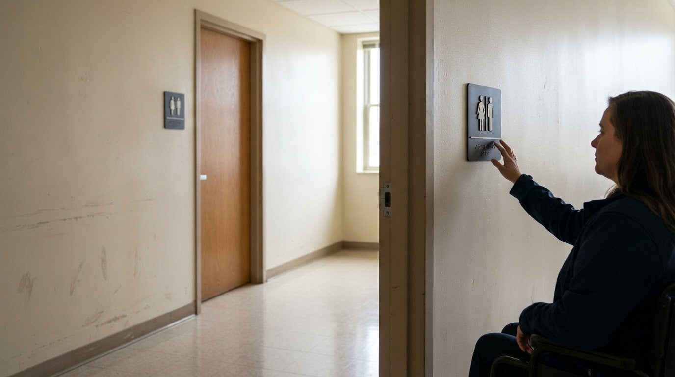
A sign can follow the right specifications and still be hard to find if its location changes from one doorway to the next. The common ADA sign placement mistakes to avoid include incorrect mounting height, insufficient space around pictograms and Braille, and inconsistent placement. According to the U.S. Access Board, ADA signs should be mounted 48 to 60 inches from the ground, and tactile signs at a single door belong alongside it on the latch side.
It’s easy to focus on signs one at a time, but accessible wayfinding depends on how they work together throughout a space. This article covers common ADA sign placement mistakes to avoid, including errors with height, clearance, and the arrangement of pictograms, text, and Braille. It also explains how consistent placement can make room identification and directional information easier to find. Review signs as part of one connected system, rather than making a separate decision at every doorway.
Key Takeaways
Use the required mounting range as a starting point, then consider whether the sign is easy to approach and read.
Plan pictogram, text, and Braille as one layout so each element is clear and distinct.
Review character sizing and other details that can make a sign difficult to read or understand.
Keep sign locations predictable throughout a facility to make wayfinding more intuitive.
Table of Contents
1. WHAT IS THE MOST COMMON ADA SIGN MOUNTING HEIGHT?
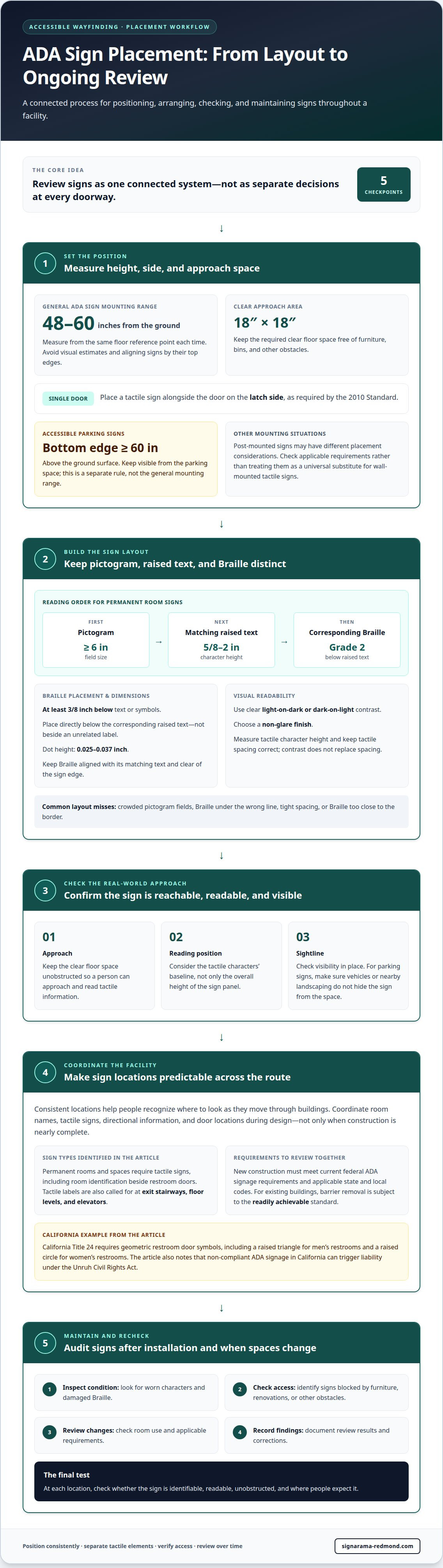
Mounting a tactile sign too high or too low can make its information difficult to locate and read. According to the U.S. Access Board, ADA signs should be mounted 48 to 60 inches from the ground. Apply this range consistently, and measure each sign from the same floor reference point. Don’t rely on visual estimates or align signs by their top edges.
Height is only one part of the placement. According to the U.S. Access Board, tactile signs need at least 18″ × 18″ of clear floor space. Keep that area free of furniture, bins, and other obstacles so a person can approach the sign and read its tactile information. At a single door, the 2010 Standard requires a tactile sign alongside the door on the latch side, according to the U.S. Access Board.
Limited wall space? Post-mounted signs may have different placement considerations, so check the applicable requirements before choosing their position. That arrangement has its own placement conditions, so don’t treat it as a universal substitute for wall-mounted tactile signs. Keep the sign accessible and its approach area clear.
Accessible parking signs follow a separate height rule: their bottom edge must be at least 60 inches above the ground surface. Check that the sign remains visible from the parking space, rather than hidden by vehicles or nearby landscaping. This parking measurement is not interchangeable with the general mounting range for ADA signs.
For a reliable installation, mark the intended position, check the measurement, then assess the approach and sightline. Set the sign’s reading position by considering the tactile characters’ baseline, not just the panel’s overall height. A matte, non-glare finish can also help maintain legibility in different lighting. These practical checks help prevent height, clearance, and visibility problems from being overlooked.
2. Pictogram field size and separation from text or Braille
A crowded pictogram field can make room information harder to scan. The U.S. Access Board requires pictogram fields to be at least 6 inches in size. For permanent room signs, keep raised text and Braille below the pictogram field. This arrangement separates the graphic from its wording and tactile elements.
Tactile ADA signs require Grade 2 Braille, according to the U.S. Access Board. Place Braille directly below the corresponding raised text, not beside an unrelated label. The U.S. Access Board also requires Braille on tactile signs to sit at least 3/8 inch below text or symbols. Measure that gap after mounting, since tight spacing can make the elements difficult to distinguish by touch.
Grade 2, also called Grade II, Braille uses contractions and short-form words. The U.S. Access Board requires Grade 2 for tactile signs. Dot dimensions matter, too: ADA sign Braille dots must be 0.025 to 0.037 inch high. Keep the Braille aligned with its matching text, and leave clear space between Braille, other content, and the sign edge. Frequent errors include placing Braille too close to a border or under the wrong line.
For tactile characters, the U.S. Access Board gives a height range of 5/8 inch to 2 inches. Visual text should use clear light-on-dark or dark-on-light contrast and a non-glare finish. These choices help separate sign content from its background under varied lighting. Avoid treating contrast as a substitute for correct tactile spacing: each feature serves a different reader need.
Before production, review the full layout in reading order: pictogram, matching raised text, then Braille. This simple sequence helps catch incorrect spacing before signs are mounted. If the layout needs refinement, ADA sign design can support clear, coordinated sign elements.
3. What Are the Most Common ADA Signage Mistakes?
Common errors include missing tactile information, poor character sizing, inconsistent placement, and signs that become hard to read. Tactile characters on ADA signs should be between 5/8 inch and 2 inches high, according to the U.S. Access Board. A compliant sign also needs clear visual contrast and readable characters, not just the right mounting height.
Which signs need tactile characters and Braille? Under the ADA Standards, permanent rooms and spaces require tactile signs, including room identification signs beside restroom doors. The cited standards also call for tactile labels at exit stairways, floor levels, and elevators.
New construction must meet current federal ADA signage requirements and applicable state and local codes. Existing buildings have a different consideration: barrier removal is subject to the readily achievable standard. State and local accessibility codes may add requirements alongside federal standards. For example, California Title 24 requires geometric restroom door symbols, including a raised triangle for men’s restrooms and a raised circle for women’s restrooms.
Plan signage during design, rather than leaving placement decisions until construction is nearly complete. On complex commercial projects, owner's advisory firms such as Hodge Construction Management & Consulting can help teams coordinate regulatory details and accessibility requirements across contractors early on. An early review can coordinate room names, tactile signs, directional information, and door locations. At each doorway, account for the latch-side placement rule covered earlier. During a practical review, check whether each sign is identifiable, readable, and located where people expect it.
Schedule periodic signage audits after installation. Look for worn characters, damaged Braille, blocked signs, and changes to room use or applicable requirements. Even a sign that met requirements when installed can become difficult to use if furniture or renovations obstruct it.
Placement mistakes can affect access and create compliance concerns. In California, non-compliant ADA signage can also trigger liability under the Unruh Civil Rights Act. Record review findings and corrections, and assess federal, state, and local requirements together. This process helps maintain usable signage for people with disabilities throughout the facility.
4. Consistent sign placement
Consistent locations help people recognize where to look as they move through buildings. Treat room identification and directional signs as parts of one visual wayfinding system, not isolated pieces. For a tactile sign at a single door, the 2010 Standard requires placement alongside the door on the latch side under section 703.4.2, according to the U.S. Access Board.
Use a clear placement pattern across similar spaces. For example, position restroom identification signs consistently at their doors, and place directional signs at predictable decision points. At double doors, tactile signs typically go on the inactive leaf, or on the right-hand leaf when both leaves are active. A consistent pattern means people do not have to search at every doorway.
Consistency also applies to design. Use repeatable contrast, visual hierarchy, and finish choices so visitors can recognize sign types throughout the facility. A directional sign that changes color or location without a clear reason can weaken the wayfinding system. Coordinate room names and directional messages, especially when several signs guide people along the same route.
Plan the system on a floor plan before mounting signs. Mark each location, note the information the sign provides, and apply the same placement logic across building areas. Then review the route from a visitor’s point of view: can they find the next sign at each decision point? This can reveal gaps between a doorway sign and nearby directional information.
For ADA compliance, consistent placement supports usability, but it doesn’t replace sign-specific requirements. Check each tactile sign’s required location and keep visual information legible. If a facility needs a coordinated sign plan, get help planning consistent sign placement across its spaces.
Signarama Redmond, WA: Signs
Signarama Redmond provides signs and graphics for facilities planning new signage or updating existing wayfinding. Once you’ve mapped sign locations and identified the information each sign needs to communicate, coordinated signs can help carry that plan throughout the space.
Consider Signarama Redmond when room identification, directional information, or graphics need to work together as a consistent visual system. Share the planned locations and messages to guide the project discussion. Clear requirements help align signage with the facility’s layout and wayfinding needs.
For a new project or an update to existing signs, contact Signarama Redmond to discuss your signage needs.
Make the Next Sign Decision Count
Make sign planning part of your next facility update. Review visitor routes between entrances, corridors, service areas, and rooms to catch common ADA sign placement mistakes to avoid before renovations or changes to room use begin.
Organize sign locations and messages on a floor plan before work starts. This gives your team a shared reference and helps you address common ADA sign placement mistakes to avoid as the facility evolves. Treat each update as a chance to make the environment easier to understand.
Talk with Signarama about your sign project to discuss common ADA sign placement mistakes to avoid and take the next step toward a more thoughtfully planned facility.
Frequently Asked Questions
What Are the Most Common ADA Signage Mistakes?
Common mistakes include signs that are hard to find, read, or distinguish from their backgrounds. For example, a directional sign may point people toward a corridor but appear only after they have turned. Review each sign from the approach a visitor actually takes, including sightlines around corners and nearby visual clutter. Checking the route can reveal problems that inspecting signs individually may miss.
Does Accessible Signage Have ADA Requirements?
Yes. Requirements depend on what a sign communicates and where it is used. Permanent room identification signs generally need tactile information, while directional signs follow visual requirements. A sign directing people from an inaccessible entrance should identify the nearest compliant entrance. Distinguish these purposes in the sign plan: a directional message and a room-identification message may need different content and treatments.
How Can You Prevent These Mistakes?
To avoid common ADA sign placement mistakes, create a sign schedule before production. List each sign’s location, purpose, message, and intended audience, then map the locations against visitor routes. Review the schedule when room names or circulation paths change. During a site walkthrough, compare installed signs with the plan and note blocked views, confusing decision points, or messages that no longer match their destinations.
What Are ADA Restroom Sign Requirements?
Restroom doors need tactile room identification signs. For a single door, the U.S. Access Board says the 2010 Standard requires the tactile sign alongside the door on the latch side. Also assess the approach space: it must remain outside the door-swing arc between the closed position and a 45-degree open position. A door that blocks the sign’s approach can undermine access.
What Is the Most Common ADA Sign Mounting Height?
The U.S. Access Board states that ADA signs should be mounted 48 to 60 inches from the ground. Treat this as the general sign-height range, not a rule for every sign type. For accessible parking signs, the bottom edge must be at least 60 inches above the ground surface. Distinguish these measurements in installation notes so teams don’t apply an interior sign rule to parking.
Where Are ADA Signs Required?
Tactile signs are required for permanent rooms and spaces, including restroom room identification. Other locations include exit stairways, floor levels, elevators, and areas of refuge. Directional signs also matter when an entrance is inaccessible: they should point to the nearest compliant entrance. Map these locations against visitor routes so destinations, exits, and alternate accessible paths are clearly identified.

Signarama Redmond, WA
Summer Hours (July - August) - MON-THUR: 8.00AM - 6.30PM, FRI - SUN: CLOSED
contact
Signarama Redmond, WA