Your Consultative Signs and Graphics Partner for Eastside Businesses


Avoiding Cheap Signs That Hurt Brand Perception: A Practical Business Guide
Oct 4, 2026 by Signarama Redmond

What if the sign meant to save your business money is the very thing that makes customers hesitate? A sign is often a first impression, so avoiding cheap signs that hurt brand perception means looking beyond the initial quote to how well the finished piece represents your business.
It’s reasonable to compare prices, especially when proposals describe materials and production in different ways. But a low upfront cost can come with trade-offs in readability, visual consistency, durability, or project scope. If those details are hard to compare, it’s easy to choose an option that doesn’t feel like your brand or needs attention sooner than expected.
This guide explains how to spot sign choices that can weaken a professional impression and assess options using visual, practical, and lifecycle criteria. You’ll learn what to review in a design proof, how to compare proposals beyond the bottom line, and how to weigh durability and potential rework. A clear brief helps you choose signs and graphics that present your business consistently and help customers understand who you are.
Key Takeaways
Assess whether a sign’s design, readability, finish, and setting support the impression you want your business to make.
Review proofs for clear visual hierarchy, accurate spelling, strong contrast, and consistency with your brand.
Compare sign proposals against the same written brief, including scope, materials, and installation responsibilities.
Use a practical checklist to move from defining your audience and goal to reviewing the final proof.
Make avoiding cheap signs that hurt brand perception easier by focusing on overall value, not just the lowest initial quote.
Table of Contents
How inexpensive signs can change customers’ perception of your brand
Which sign-quality factors matter more than the lowest quote?
How to compare sign options without mistaking cheap for good value
A practical checklist for choosing signage that supports your brand
Work with a signs-and-graphics partner to protect brand perception
How inexpensive signs can change customers’ perception of your brand
A sign is often a customer’s first physical interaction with your brand. Before anyone steps inside, its appearance can signal what kind of experience to expect. That makes concern about avoiding cheap signs that hurt brand perception understandable, but price alone doesn’t determine whether a sign feels professional. A lower-priced option can be a good fit, while a more expensive one can miss the mark if its design or presentation doesn’t suit the business.
A brand-damaging sign conflicts with the impression a business wants to create or the identity it presents elsewhere. Brand-consistent signage is legible, visually aligned with the business, and clear enough to help customers form the intended impression. This connects to corporate identity, the way an organization presents itself publicly. A sign is one visible expression of that identity, not a separate design decision.
What makes a sign feel inconsistent with a brand?
Customers may notice when sign colors, typography, tone, or proportions don’t match the brand’s other materials. A refined, understated identity can feel at odds with crowded lettering or loud colors. A friendly, energetic business may seem less approachable if its sign feels formal or hard to read. These mismatches can make the overall presentation feel less coherent, even if customers can’t pinpoint why.
Hypothetical example: Imagine a business whose website uses calm colors, simple type, and a welcoming tone. If its storefront sign squeezes in several fonts and competing messages, the sign may suggest a different personality. The issue isn’t necessarily the sign’s price. It’s the gap between the brand promise and what people see in person.
Which first impressions can business signage influence?
Readability and visual order affect whether people can quickly notice a sign and understand its message. When a business name, key information, and supporting details compete for attention, the main point can get lost. Clear hierarchy helps the viewer know where to look first. Consistency across signs and other brand materials can support recognition and contribute to a sense of trust and professionalism, without guaranteeing a particular customer response. For businesses coordinating their environmental branding with custom promotional products, working with specialists like BRAND NEW Promotions | Top Promo Supplier in North Texas can help maintain that same cohesive look across every customer touchpoint.
Context matters. A sign designed to catch the attention of passing traffic has a different job from one guiding visitors inside. The audience, viewing distance, surroundings, and purpose all affect what looks appropriate. Ask: does this sign suit the people it needs to reach, the place where they’ll see it, and the impression the business wants to leave?
Which sign-quality factors matter more than the lowest quote?
A useful comparison looks beyond the number at the bottom of a proposal. Design fit, readability, finish, setting, durability, and intended use all affect whether a sign does its job and presents the business well. The Sign Research Foundation’s research on consumer perceptions examines how signage can shape people’s judgments of businesses, reinforcing why visual execution deserves attention alongside cost.
Sign-quality checklist: Does the design fit the brand? Is the message easy to read? Does the finish suit the setting? Are materials appropriate for the location and expected use? Does the sign serve its purpose without unnecessary extras?
How can you assess design and readability before production?
Review the proof or mockup at a size and viewing distance that resemble real conditions. A design that looks clear on a large monitor may be harder to read from across a room or street. Check that the business name or primary message stands out. Secondary details should remain readable without competing for attention.
Compare the proof with existing brand materials. Look for consistent colors, typography, and logo treatment, then inspect spelling and contrast. A polished layout can still miss the mark if a logo is altered or the text blends into its background. For organizations seeking consistent color reproduction and quality across all their branded print collateral, visit Linemark.
How should materials and finish fit the sign’s purpose?
There’s no single best material for every sign. A suitable choice depends on where the sign will be used, its exposure to the elements, how often it will be handled, and how long it’s expected to serve its purpose. Consider the finish, too. It should support a clear presentation and make sense for the setting, rather than adding visual effects that distract from the message.
For window graphics, consider how the design will appear on glass and how it fits the window’s role in the space. This guide to choosing sign materials offers a starting point for considering window decal options.
Separate essentials from optional extras
Control scope without compromising the basics. Treat legibility, accurate branding, suitable materials, and a finish that fits the setting as core requirements. Decorative effects or additional design elements may be optional if they don’t improve clarity or support the sign’s purpose. Signarama makes signs and graphics to support a coherent brand presentation. Explore Signarama’s signs and graphics.
How to compare sign options without mistaking cheap for good value
A fair comparison starts with the same brief for every option. If proposals cover different sign purposes, sizes, locations, or design requirements, their totals aren’t directly comparable. The lowest quote isn’t automatically poor value. Assess each option against the same needs, then consider how well it supports your brand and intended use over the project’s life.
What should a sign proposal comparison include?
Use a consistent checklist to make differences visible. Note what each proposal includes, and flag details that are missing or unclear instead of assuming they’re covered.
Purpose and dimensions: Does the sign serve the same function and fit the intended location?
Design alignment: Does the artwork follow the same brand references and design requirements?
Readability: Is the main message clear for the audience and viewing conditions?
Materials and finish: Are the specified choices suitable for the sign’s use?
Artwork preparation: Does the scope include preparing or adapting brand artwork?
Installation: Does the proposal explain what installation work is included, if applicable?
Unclear specifications don’t prove that an option is inferior; they make a fair comparison harder. Proposals for similar signs may differ in artwork preparation or installation responsibilities. Use consistent assumptions and identify those differences before weighing the options. If installation scope matters, review what professional sign installation in Redmond can involve.
How can a lower-cost option create extra work later?
A lower-cost option may fit the brief perfectly. Still, consider follow-up work as a possibility, not a certainty. Outdated logos, incorrect colors, or unclear artwork in a proof may lead to revisions before production. A sign that doesn’t suit its setting or intended use could also require correction or replacement later.
Look at the whole project rather than treating one line item as its full value. Does the proposal address the sign’s purpose, brand alignment, and practical requirements? Are responsibilities clear? A well-defined scope helps you understand what you’re choosing and reduces the chance of comparing different assumptions as if they were equivalent.
For avoiding cheap signs that hurt brand perception, keep the brief and brand references consistent across options. Signarama’s signs and graphics bring these elements together in a coordinated presentation.
A practical checklist for choosing signage that supports your brand
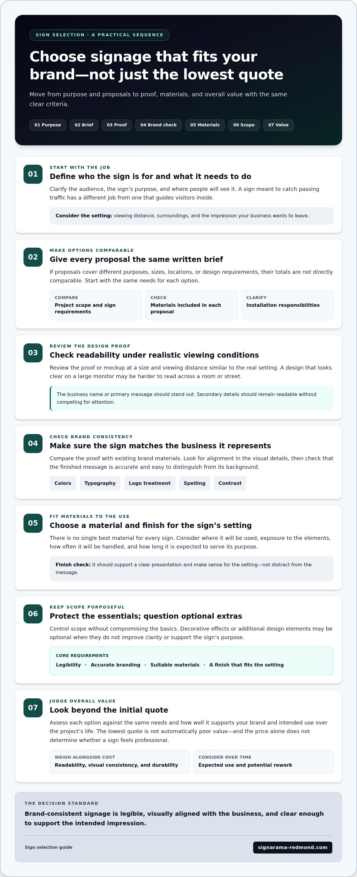
A written brief gives every sign option the same starting point. It helps keep decisions focused on who the sign needs to reach, what it needs to communicate, and how it should represent the business. That makes avoiding cheap signs that hurt brand perception a practical process, not just a question of choosing a higher-priced option.
How do you turn a brand goal into a sign brief?
Work through these steps before reviewing designs or proposals:
1. Define the audience. Identify who needs to notice or use the sign, such as passing visitors, customers entering the space, or people looking for a particular area.
2. Set the goal. Write down the primary message and the action you want the sign to support, such as finding an entrance or recognizing your business.
3. Describe the intended impression. Choose a few qualities the sign should convey, like welcoming, modern, or dependable. Use these as a design guide, not as extra copy that must appear on the sign.
4. Record the location and conditions. Note placement, viewing distance, lighting, and what customers see before and after encountering the sign. Consider whether it needs to attract attention, guide people, or provide information along their journey.
5. Gather brand references. Bring together current logos, color references, and typography guidance so the design can be compared against the same visual standards.
6. Compare options against the brief. Use the same requirements for each option, including purpose, placement, message, and brand fit. This makes differences easier to evaluate fairly.
What should you review before approving a sign?
Review the final proof at a realistic scale and consider how it will look where it’s meant to appear. Check spelling, visual hierarchy, contrast, logo treatment, and consistency with the brand references. Make sure the main message is easy to find, supporting details suit the viewing conditions, and the proposed placement makes sense for the customer journey.
Then compare the proof with the agreed brief. Does it reflect the intended purpose and impression? Does the design fit the setting and the scope you evaluated? Resolve mismatches before approval rather than relying on assumptions. For related project guidance, see the sign-making process from design to installation.
Planning a sign project with a signs-and-graphics partner can bring the goal, brand references, and practical requirements into one coherent direction. Plan your sign project with Signarama.
Work with a signs-and-graphics partner to protect brand perception
Choosing a sign is easier when the visual design and practical purpose are considered together. Signarama makes signs and graphics for businesses seeking a coherent brand impression. A clear project brief gives the work a shared reference, from the sign’s message and location to the brand impression it should create. That focus keeps decisions grounded in what the sign needs to do, rather than adding details that don’t serve the goal.
How can a collaborative process keep signs aligned with your brand?
Start with the essentials: the audience, sign purpose, location, primary message, and desired impression. Add current brand assets, such as logos and color references, so the intended identity is clear. These details give design decisions a consistent point of reference and help reduce ambiguity as the sign takes shape.
Review the proposed design against that brief. Does the message remain clear? Does the presentation feel consistent with the brand? Does the sign suit its setting and role? If you’re looking at project imagery, consider the sign in context, including its placement and relationship to the surrounding environment.
What is a useful next step for a business planning new signs?
Gather a few practical details before planning your project:
The sign’s goal and intended audience
Its planned location and viewing conditions
Current logos, color references, and other brand assets
Key requirements, such as the message, intended use, or placement considerations
These notes establish a shared starting point for exploring signs and graphics that fit both your brand and practical needs. They also give you a consistent basis for reviewing ideas as the project develops. This thoughtful approach is central to avoiding cheap signs that hurt brand perception: choose based on how well the sign supports the identity you want customers to recognize, not on price alone.
Ready to discuss a sign project? Talk with Signarama about your sign project.
Choose signage that reflects your business with confidence
A strong sign choice isn’t simply the least expensive one. It’s the option that fits your brand, communicates clearly in its intended setting, and meets the practical needs of the project. A consistent written brief and careful review of proposals help you compare options fairly and reduce uncertainty before approving a design.
Keep the essentials in view: check legibility and brand alignment, consider the sign’s location and use, and compare each proposal against the same scope. Avoiding cheap signs that hurt brand perception means evaluating overall fit and value, not assuming that a low quote is automatically a poor choice or that a higher one is always better.
When you’re ready to plan signage for your business, bring together your goal, location, audience, and brand references. Signarama makes signs and graphics to help you bring those pieces together. Discuss your business sign project and take the next step toward signage that represents your business consistently and professionally.
Frequently Asked Questions
Is a cheap sign always bad for a business?
No. A lower-priced sign can be a good fit if its design, materials, finish, and visibility meet the business’s needs. Price alone doesn’t determine quality or value. Compare options against the same requirements, including where the sign will be placed and what it needs to communicate. The key question is whether the chosen sign supports the impression you want customers to have and performs its intended job.
Can a low-quality sign hurt brand perception?
It can, particularly if poor readability, inconsistent branding, or an unsuitable finish clashes with the experience a business wants to present. The effect depends on the audience, location, and purpose of the sign. As part of avoiding cheap signs that hurt brand perception, consider how each sign fits with other customer touchpoints, such as the business’s logo, colors, and overall visual style.
How can I tell whether a business sign is good quality?
Assess readability, visual hierarchy, brand consistency, and suitability for the sign’s location. Check whether the specified materials and finish fit its intended use, then review a proof at a realistic size and viewing distance rather than judging it only on a screen. Compare the project scope, too, so you understand what each option includes. These checks give you a clearer picture than price or appearance alone.
What happens if a business sign does not match the brand?
A mismatch can make a business’s presentation feel inconsistent or leave the sign’s intended message unclear. First identify what feels out of place: it might be the colors, typography, logo treatment, scale, placement, or readability. For an update or replacement, gather current brand references and use a written brief to guide the design. Reviewing the sign in its setting can reveal issues that aren’t obvious on a screen.
Should I choose the lowest quote for business signs?
Not automatically. First check whether each proposal covers the same sign purpose, design requirements, materials, finish, and installation scope where applicable. A lower quote may reflect a different project scope, while a higher quote isn’t automatically better. Compare each option with your priorities and the impression you want the sign to create. Clear, consistent requirements make it easier to judge value fairly.
How do I choose a sign that looks professional and fits my brand?
Start by defining the audience, location, sign purpose, and impression you want to create. Gather current brand assets, including your logo and color references, then consider viewing distance, lighting, and the sign’s role in the customer journey. Compare material and finish choices with the project conditions, and review a proof at a realistic scale before approval. A clear brief helps keep decisions consistent from design through final review.

Signarama Redmond, WA
Summer Hours (July - August) - MON-THUR: 8.00AM - 6.30PM, FRI - SUN: CLOSED
contact
Signarama Redmond, WA