Your Consultative Signs and Graphics Partner for Eastside Businesses


Avoid Sign Designs That Look Dated in Five Years: A Practical Guide
Sep 29, 2026 by Signarama Redmond

The sign most likely to feel current five years from now may not be the one with the newest look. Avoiding sign designs that look dated in five years starts with a simple idea: trends can add personality, but clear messaging and a strong connection to your brand have longer staying power.
It’s reasonable to worry that a fashionable color, font, or graphic could feel stale before the sign has served its purpose. It can also be hard to know which choices will endure, especially if your brand may evolve. A future-ready sign doesn’t need to predict every change. It needs to communicate clearly now and leave room for thoughtful updates later.
This guide offers a practical process for weighing visual choices, keeping your sign legible and recognizably on-brand, and planning for changes in your business. You’ll learn how to distinguish lasting design fundamentals from short-lived trends, assess how and where the sign will be used, and identify what may need to adapt. A clear brief and well-chosen priorities make it easier to compare concepts and decide what works for your sign.
Key Takeaways
Define what your sign needs to do, who it needs to reach, and where people will see it before choosing visual details.
Use a side-by-side review to test design choices for brand fit, readability, adaptability, and future review needs.
Follow a step-by-step concept check that accounts for viewing conditions, brand consistency, and possible business changes.
For avoiding sign designs that look dated in five years, focus on choices that serve your brand rather than simply following a trend.
Revisit your signage when your branding, services, audience, or the sign’s purpose changes.
Table of Contents
Trend-Led or Timeless Sign Design? Compare Choices Before You Commit
Plan for Change: Keep Your Sign Relevant as Your Business Evolves
Why Some Sign Designs Look Dated, and What You Can Control
It’s reasonable to wonder whether a sign chosen today will still feel right in five years. Visual trends move on, and businesses can change their identity, audience, or priorities. No design can be guaranteed to look current indefinitely. The practical goal is to ground design choices in your brand and the sign’s purpose, rather than relying on details that feel fresh only right now.
Enduring design serves the brand’s message; temporary styling serves the moment. That distinction helps when avoiding sign designs that look dated in five years. It doesn’t mean every sign should look plain or avoid personality. It means decorative choices should support recognition and communication, not compete with them.
What makes a sign feel tied to a particular moment?
Trend-heavy colors, effects, layouts, or type choices can date quickly when they dominate a design without a clear reason. Imagine a hypothetical café choosing a sign covered in a fashionable gradient, layered shadows, and a highly stylized typeface. Those details might suit the café’s identity today, but if its brand shifts toward a quieter, more established feel, the sign may no longer fit.
That’s different from simply disliking a style. A design can be outside your personal taste and still represent the brand well. Ask: does this choice match the business’s identity, make the message easy to understand, and suit the setting where people will see it? If it conflicts with those needs, it may be a poor fit, not just a matter of taste.
Which parts of a sign should stay recognizable?
Review the elements customers rely on to identify and understand the business: its name, core identity, essential message, and the sign’s legibility. These elements don’t all need to remain unchanged forever. Consider them together so a future update doesn’t unintentionally make the business harder to recognize.
Consistency across a sign, website, storefront graphics, and other customer touchpoints helps people connect each interaction with the same business. This doesn’t require every item to look identical. Shared identity cues should feel intentional and coherent. There’s no universally timeless color, font, or layout; the right choice depends on the brand, audience, viewing context, and message.
For a useful foundation, review fundamental design principles such as typography, composition, and color. Then assess how each choice supports your specific sign. A sign provider can discuss your brand goals, intended use, and which elements may need flexibility as the business evolves.
How to Build Lasting Sign Design Around Brand Fundamentals
A durable sign begins with a clear brief, not a favorite font or color. Before comparing design ideas, define who needs to notice the sign, where they’ll see it, what the setting is like, and what the sign must communicate. A sign meant to identify a business from a distance has different priorities from one intended to explain an offer up close.
Then connect those needs to your brand. Consider what customers should recognize immediately and which visual cues already appear across your brand materials. These fundamentals create a practical test for each design choice: does it support recognition and the sign’s main job, or is it included mainly because it’s fashionable?
Clarity gives a sign staying power, while recognizable brand cues give it character. Restraint doesn’t mean generic. A distinctive color combination, symbol, or type treatment can make a sign memorable when it reflects the brand and doesn’t obstruct the message. To avoid sign designs that look dated in five years, prioritize what helps people identify and understand the business, then use decorative details selectively.
Choose typography and layout for clarity over novelty
Assess the sign from the distance and angle at which people are likely to view it. Type that seems readable on a screen may be too small or tightly spaced in its intended setting. Contrast between text and background also affects how quickly key information stands out. Give the business name and essential message a clear visual order so secondary details don’t compete for attention.
A small, purposeful type system is often easier to manage than a mix of decorative styles. That doesn’t mean one typeface works for every brand. Choose lettering that fits the business, then check that its shapes, spacing, and size remain easy to read in the sign’s actual viewing context.
Use color and imagery with a clear brand rationale
Start with the colors customers already associate with the business, then consider how they’ll appear in the sign’s viewing environment. A limited, coherent palette can make future adjustments more straightforward because fewer colors need to be reconciled with evolving brand materials. The goal isn’t to avoid expressive color; it’s to choose color for a reason that will still make sense if a trend fades.
Apply the same test to imagery. Does it clearly relate to the business and remain understandable at the sign’s intended viewing distance? Does it feel consistent with other brand materials? If the image needs explanation or distracts from the name, reconsider its role.
Before settling on a direction, write down the audience, setting, main message, and brand cues the sign should preserve. Sharing that brief with a potential sign partner can help focus a conversation about design requirements and future adaptability.
Trend-Led or Timeless Sign Design? Compare Choices Before You Commit
Timeless doesn’t mean plain. A sign can be distinctive and visually engaging without depending on a style that may soon feel out of step. The useful question is whether each choice supports the business or simply borrows attention from a current trend. Use this comparison to weigh the difference before committing.
Review point | Durable design reasoning | Trend-first decision-making |
|---|---|---|
Brand fit | Choices reflect the business’s identity and feel consistent with its other materials. | A popular look is adopted even if it doesn’t match the brand’s character. |
Readability | The name and main message remain clear in the sign’s intended setting. | Effects or decorative details compete with the information people need to read. |
Adaptability | Core identifiers remain recognizable if secondary details change. | The whole design relies on a fashionable treatment that may be difficult to retain through a brand update. |
Likely review needs | Revisit the sign when the brand, audience, or purpose changes. | Reconsider the design when the trend fades, even if the business itself hasn’t changed. |
Trends can still earn a place in a sign. Use them selectively when they suit the audience, strengthen the message, and don’t undermine legibility or recognition. A vivid accent or current graphic treatment may add personality, but it shouldn’t carry the entire identity. That balance is central to avoiding sign designs that look dated in five years.
Which design choices are easier to refresh later?
Separate core identifiers, such as the business name and key brand cues, from secondary decorative details. Depending on the sign format, those secondary elements may be easier to adjust independently. Options vary, so ask the sign designer or provider what can be changed and what would require a broader revision. Don’t assume a component is replaceable without checking.
How can a trend support rather than control the design?
Test the trend against the brand’s audience, purpose, and existing visual identity. If it works as a restrained accent while the essential message remains clear, it may be worth considering. Then ask: Would this sign still work if the trend faded? If the answer is no, the trend may be controlling the design rather than supporting it.
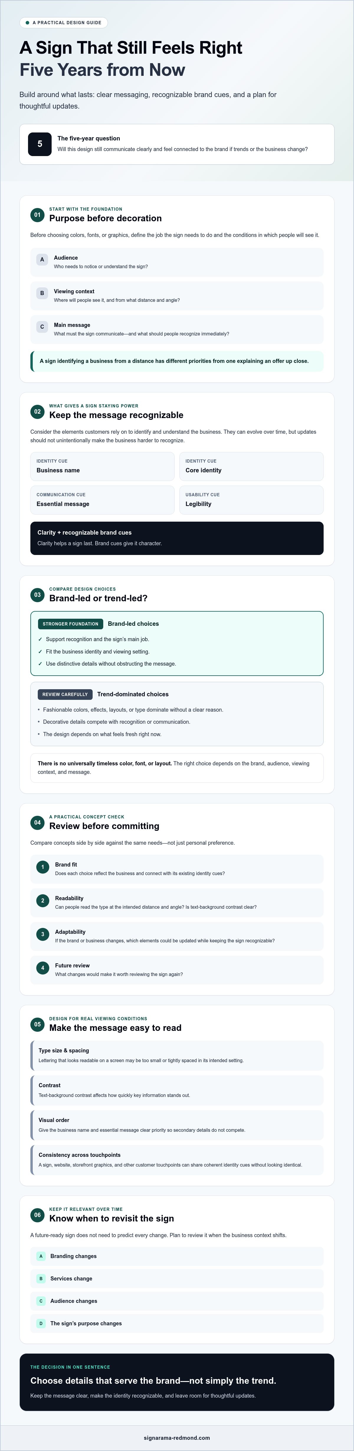
A Step-by-Step Review to Reduce the Risk of Dated Signage
A structured review helps you assess more than whether a concept looks appealing on screen. Work through the sign’s purpose, intended audience, viewing conditions, brand fit, and capacity to adapt. This gives decision-makers a shared basis for feedback and supports avoiding sign designs that look dated in five years.
Define the sign’s job. Write down what people should notice, understand, or do after seeing it. Keep the primary message focused on that purpose.
Describe the audience and setting. Consider who will see the sign, where they’ll encounter it, and how much time they may have to read it.
Check brand consistency. Compare the concept with the business’s name, identity, and other brand materials. Look for a clear connection, not necessarily an identical appearance.
Test future relevance. Ask whether the core message and identity are likely to remain useful. Identify decorative details that could be adjusted if priorities or branding change.
Gather audience feedback. Show the concept to people who represent the intended audience, not only the people approving it. Ask what they notice first and what they understand the sign to communicate.
Review the final concept in context. Check legibility, surroundings, and coordination with the intended sign location before approval.
Run a five-year relevance check before approving the concept
Imagine the business has changed some services or updated its brand. Would the sign’s name and central message still make sense? If the design depends heavily on a current visual trend, ask whether the sign would remain clear and recognizable without it. Note which secondary details might be revised later, but keep expectations realistic: what can be changed depends on the sign format and should be confirmed with the provider.
Review the design in its real setting
A concept can read well on a screen but feel different at its intended viewing distance. Consider the surrounding architecture, lighting, and nearby visual clutter. If possible, review a representation of the sign in its planned setting and ask someone unfamiliar with the concept to describe what they notice first. Confirm site-specific constraints with the appropriate local professional before final approval.
Design plans and installation requirements should be considered together, rather than treated as unrelated decisions. For more context on that coordination, see this professional sign installation guide. Discussing your brand goals and intended sign use with a potential sign partner can also help clarify which details need review before a project moves forward.
Plan for Change: Keep Your Sign Relevant as Your Business Evolves
Future resilience doesn’t mean designing a sign that will never need an update. It means knowing which parts express your lasting identity and having sensible moments to check whether the sign still fits. Avoiding sign designs that look dated in five years is a practical planning task, not a promise that your brand will stay unchanged.
Review your signage when something meaningful shifts, such as a rebrand, a change in services or audience, or a new purpose for the sign. There’s no universal inspection or replacement schedule. Let changes in your business and the sign’s role guide when a review makes sense.
Create a simple sign review plan
Keep a short record of why the design was approved. Note the essential message, brand references, and choices that support recognition. Then list the changes that should prompt a review, such as a new brand identity, a different customer group, or a change in how the space is used. This record gives future decision-makers context for updates instead of leaving them to rely on memory or personal preference.
Some business graphics serve different purposes alongside signs. For example, custom window decals for Redmond businesses offer a related point of reference when considering how graphics contribute to a business’s visual identity. The right choice depends on the specific use and should be discussed with a provider.
Bring a clear brief to a sign-design conversation
Share who the sign is for, what it needs to communicate, where it will be viewed, and which brand requirements matter most. Ask which design elements are central to recognition and which might be adaptable later. For a related example of signage in a workplace context, see professional office signs in Redmond.
Before moving ahead, discuss your goals and constraints with a sign provider, including how the sign will be used and what may change in the future. Confirm which design, production, or installation services are available rather than assuming they’re included. A clear conversation can help you plan a sign that serves your business now and gives you a sound basis for future review.
Make Your Next Sign Decision with Confidence
A sign that lasts isn’t one that never changes. It’s one built around a clear purpose, recognizable brand cues, and choices that can be reviewed as your business evolves. To avoid sign designs that look dated in five years, focus on what helps people identify your business and understand your message, then treat trends as optional accents rather than the foundation.
Before approving a concept, consider who will see it, where it will appear, and whether it fits your current brand. Keep a record of why key choices were made, and revisit the sign when your identity, services, audience, or its purpose changes. That gives future updates a useful starting point.
Ready to talk through your goals and constraints? Discuss your sign goals with the Signarama Redmond team. Start by sharing what the sign needs to communicate, where it will be used, and which brand elements should remain recognizable.
Frequently Asked Questions
What makes a sign design look dated?
A sign can feel dated when it relies heavily on short-lived visual trends or no longer fits the business’s brand, audience, or setting. Age alone doesn’t make a sign look outdated. A well-used sign may still work if it’s legible, relevant, and suited to its purpose. Review whether people can read it easily, recognize the business, and understand the message. Don’t assume one style will suit every business.
How do I design a sign that will still look good in five years?
Start with the sign’s purpose, intended audience, and established brand identity. Give the main message a clear place in the design, choose readable typography, and create a visual hierarchy that guides the eye. Use current trends only if they reinforce the brand rather than carry the entire concept. No designer can guarantee a sign will remain fashionable, but these fundamentals can reduce avoidable redesign and support avoiding sign designs that look dated in five years.
Can a trendy sign design still be timeless?
Yes. A trend can work if it supports the brand without weakening clarity or recognition. For example, a business might use a current visual detail as an accent while keeping its name, essential message, and familiar identity cues consistent. Before approving the concept, consider whether it would still communicate effectively if that detail became less popular. If the design depends on the trend to be recognizable, reconsider how much weight it carries.
What colors are least likely to make business signage look dated?
No color palette is universally timeless. Color choices depend on the brand, audience, setting, contrast, and the sign’s purpose. Start with established brand colors where they suit the sign, then check how the combinations read in the intended environment. Compare them with the business’s existing materials so the sign feels connected to its identity. Avoid choosing colors only because they’re fashionable; a popular palette may not fit every brand or location.
Should I avoid design trends completely when creating a business sign?
No. Trends can help a sign feel current, but they shouldn’t replace a clear message or recognizable brand identity. Evaluate each trend against the intended audience, viewing setting, and expected role of the sign. A restrained accent may be easier to reconsider later than a concept built entirely around a temporary visual style. Keep the essential information clear, and make sure the trend supports rather than competes with the brand.
How often should a business update its signs?
There’s no single update schedule that suits every business or sign. Review signage when the brand, services, audience, sign purpose, or surrounding context changes. A review doesn’t automatically mean replacement. If the sign remains clear, accurate, and consistent with the business, it may not need redesign simply because time has passed. Consider whether it still serves its intended role before deciding that an update is necessary.
Can existing signs be updated instead of replaced?
Possibly, but it depends on the sign’s format, condition, design, and the changes you need. Some updates may be practical, while others may call for a different solution. Don’t assume a particular modification is available without checking. Ask a sign professional to review the existing sign and explain the options for your situation. Share what needs to change, what should remain recognizable, and how the sign is currently used.


Signarama Redmond, WA
Summer Hours (July - August) - MON-THUR: 8.00AM - 6.30PM, FRI - SUN: CLOSED
contact
Signarama Redmond, WA