


Pylon vs. Monument Signs for Danbury Commercial Properties
Aug 5, 2026 by Signarama Danbury
A freestanding sign should help people identify a property early enough to locate and enter it safely. That can be difficult when a Danbury building sits behind a parking area, landscaping, neighboring structures, or a multi-tenant development. In those settings, the choice often comes down to a pylon sign or a monument sign.
Pylon signs elevate the sign face on one or more supports. Monument signs sit lower and use a broad base connected to the ground. Both formats can identify a business, organize tenant names, or mark a larger property. The better choice depends on the road approach, surrounding obstructions, intended message, and applicable Danbury regulations.
Pylon Signs and Monument Signs: The Core Difference
The main differences are height and the sign’s visual relationship to the property.
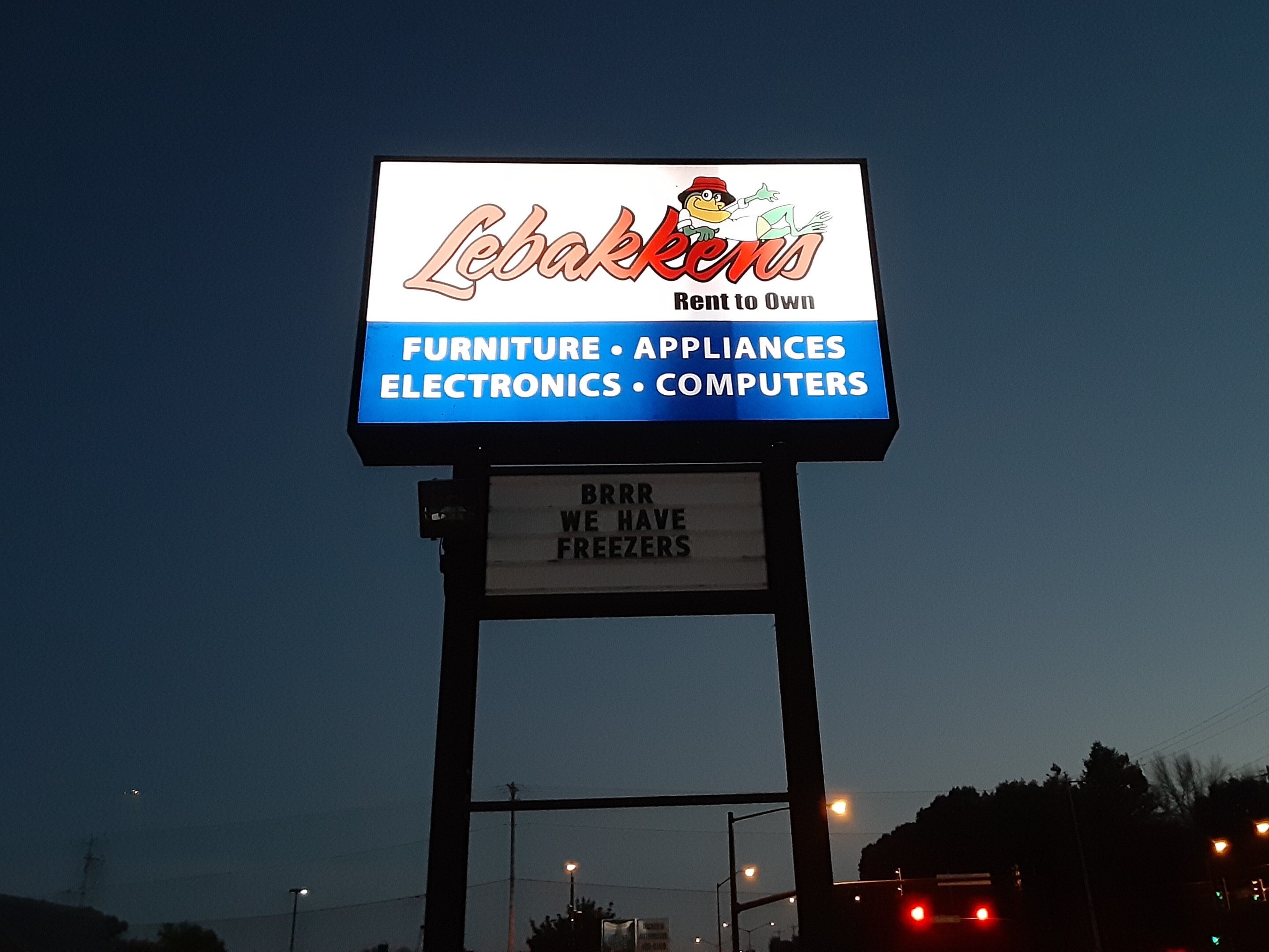
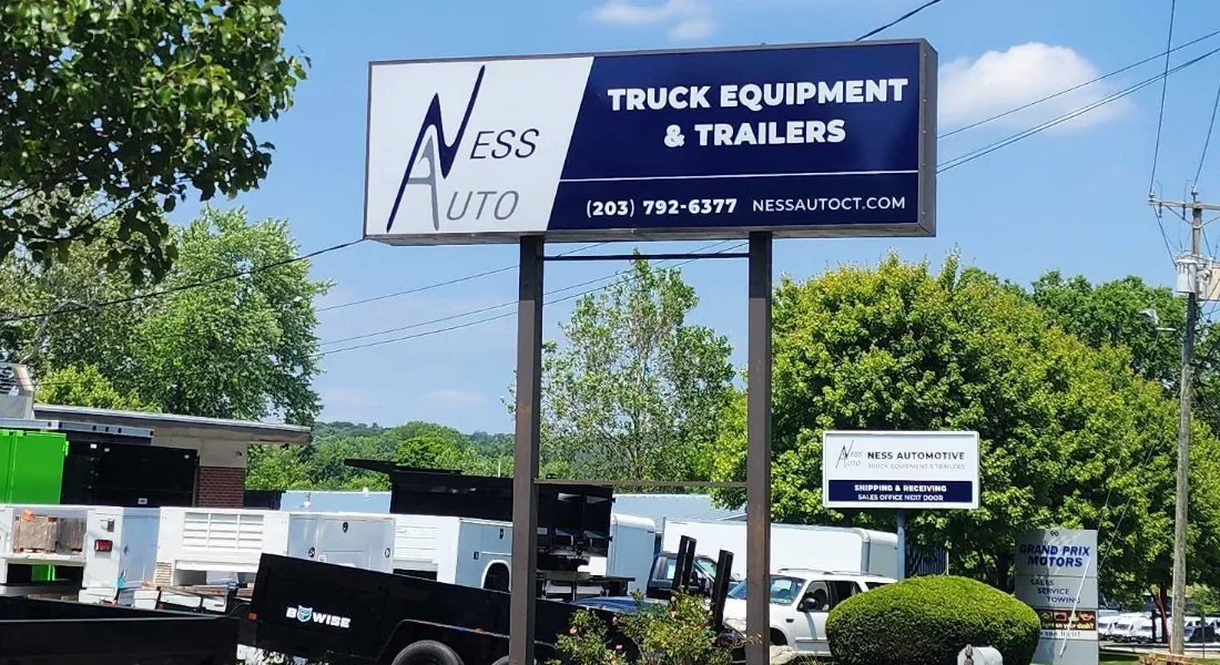
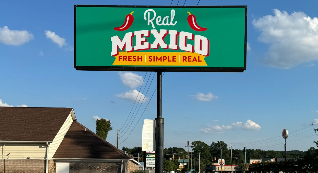
A pylon sign uses height to display a message above common roadside obstructions. Its panel may sit on a single support, between two supports, or within a covered structural frame. Motorists may see the elevated sign face before they reach the driveway.
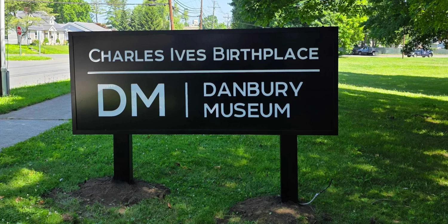
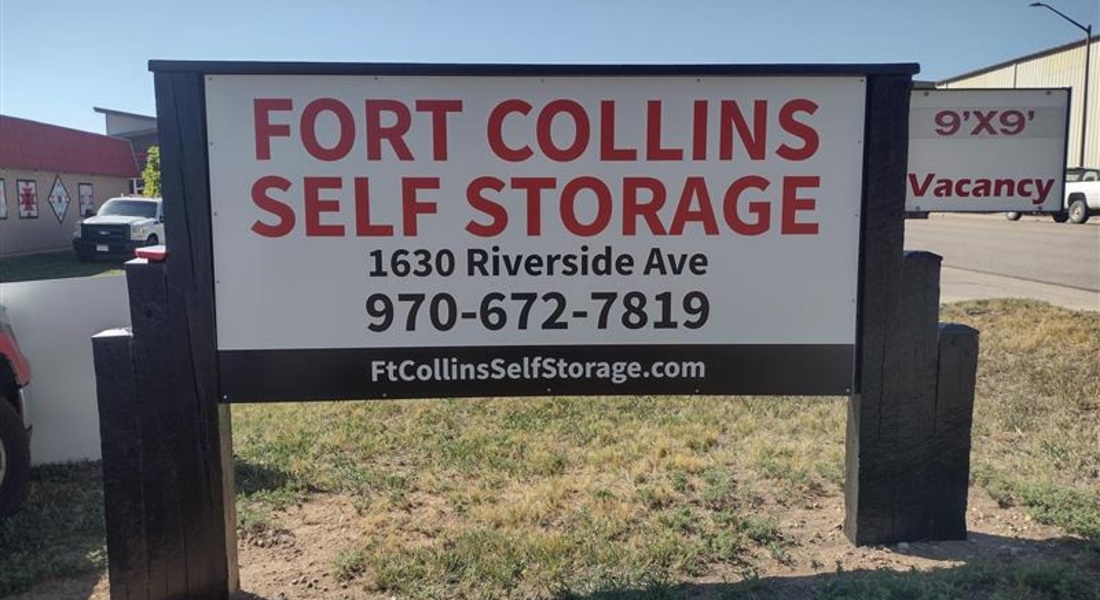
A monument sign creates a lower, more architectural presence near an entrance. Its base can complement the building through compatible colors, shapes, and finishes.
Neither category automatically produces a better sign. A tall structure with too many panels can be hard to read, while a well-positioned monument sign can work better on a slower road with a short setback and open views.
Quick Comparison for Danbury Property Owners
Use this comparison as a starting point, then confirm the choice through a site review and zoning check.
Pylon signs may make more sense when:
The building sits far back from the road.
Drivers approach at a speed that allows only a short viewing window.
Parked vehicles, grade changes, or nearby structures block lower sightlines.
A shopping plaza or multi-tenant property needs several readable tenant panels.
The sign must identify the property before the entrance becomes visible.
Monument signs may make more sense when:
The entrance is close to the road and easy to see.
The property needs a lower, coordinated architectural feature.
A campus, office property, healthcare facility, or school wants a formal entrance marker.
The sign carries a short name, address, or limited tenant list.
Surrounding views remain open at the height of the proposed sign.
When Pylon Signs Work Best
Roadside Properties With Long Setbacks
Commercial buildings along busy Danbury corridors do not always sit near the street. Deep parking, a wide lawn, or another building can separate a business from traffic. Pylon signs create an earlier visual cue, giving drivers more time to recognize the destination and turn.
A viewer in motion cannot process a directory, slogan, service list, and contact details at once. Strong roadside designs prioritize the property name or anchor tenant, then include only what supports identification.
Plazas and Multi-Tenant Centers
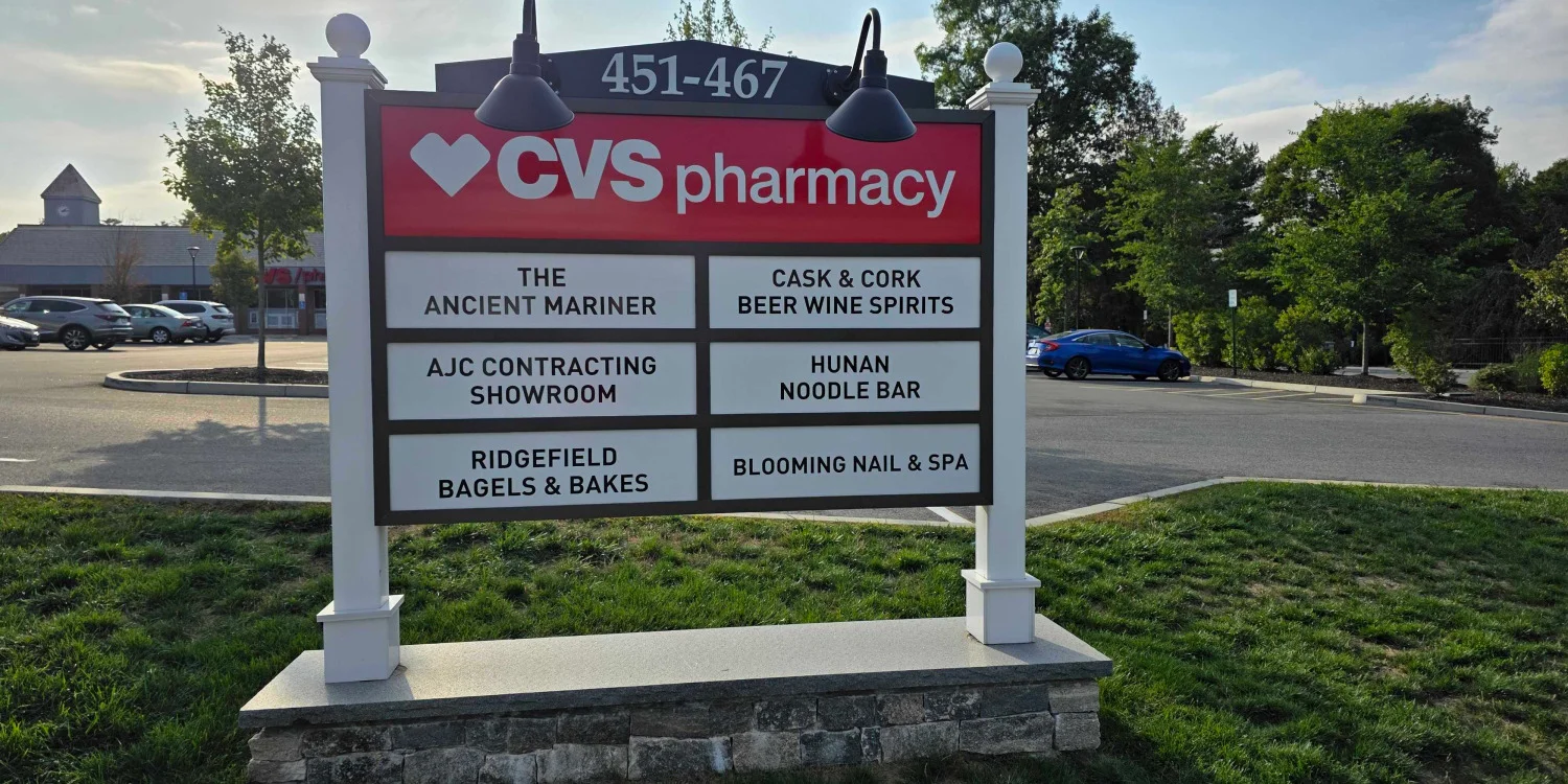
A pylon structure can give several businesses one organized roadside presence. Equal panel sizes may suit similar tenants, while a larger anchor panel can create hierarchy. Consistent spacing, letter height, contrast, and logo treatment create a unified directory.
Plan for tenant turnover, too. A panel system with individually replaceable sections can reduce the need to redesign the entire display. Reserve space for realistic tenant names, not just short placeholders.
Sites With Lower-Level Obstructions
Snowbanks, shrubs, parked vehicles, and grade changes can obstruct lower sightlines. Additional height may help, but the sign must remain visible from the approach lanes, and its supports should not compete with the message. A site survey can evaluate these viewing angles before production.
When Monument Signs Work Best
Campuses and Professional Properties
Monument signs often suit office campuses, schools, medical properties, nonprofit facilities, and corporate entrances. A base designed to complement the building can make the sign feel like an integrated part of the property.
For a campus with several destinations, let the entrance sign identify the property. Separate wayfinding signs can guide visitors to buildings, parking, deliveries, or departments.
Properties Near the Road
When the building and driveway are visible, added height may provide little value. A monument sign near the entrance can confirm arrival, especially on lower-speed approaches with clear sightlines.
Properties That Need a Strong Architectural Match
Designers can use a monument sign’s size and form to reflect a building’s geometry, colors, or finishes. The message should remain the focal point. If textures, borders, plantings, or materials reduce the available letter space or contrast, the sign may become harder to read.
How Property Type Changes the Decision
Retail Plaza
Start with the tenant count, viewing distance, and road approach. Pylon signs can organize multiple tenant names for earlier recognition. Monument signs can work well for a smaller plaza with fewer tenants and open sightlines. Establish a clear hierarchy before incorporating different logo sizes and formats.
Business or Medical Campus
A monument sign often works when the campus name matters more than individual occupants. A taller format may help when the campus sits well back from a busy road. Use separate wayfinding signs instead of forcing navigation details onto one face.
Standalone Roadside Business
Compare the setback with the driver's viewing window. A pylon sign may help when parking or neighboring development hides the building. A monument sign may be enough when the facade, driveway, and sign remain visible together.
Multi-Tenant Commercial Property
Determine how many panels passing drivers can reasonably read, which tenants require priority, and how future updates will be handled. A taller sign offers more display area only if local limits and the viewing environment support it. Adding more names does not always make the sign more useful.
Six Steps for Choosing the Right Freestanding Sign
1. Map the Approach
Review the property from every traffic approach. Note traffic flow, turning lanes, curves, slopes, trees, parked vehicles, and neighboring signs. Determine whether a first-time visitor can recognize the sign early enough to prepare for the entrance.
2. Measure the Available Viewing Time
Estimate where the sign first becomes visible and where the driver must turn. A short viewing window calls for fewer words, stronger contrast, and a clear visual hierarchy. Obstructed lower sightlines may favor a pylon sign.
3. Rank the Information
Separate what drivers need from what they can learn elsewhere. The property name, anchor brand, key tenants, and street number may deserve priority. Service lists and long messages often reduce readability.
4. Check the Site and Zoning Constraints
Confirm the zoning district, street frontage, property lines, required setbacks, existing signage, underground conditions, sight triangles, and allowable sign area before finalizing a concept.
5. Compare Realistic Concepts
Compare both options at scale and in relation to the road, landscaping, building, and parking. For directories, use sample names with realistic lengths.
6. Plan Production and Installation Details
Finalize materials, supports, footings, panel construction, colors, and access for future updates. Coordinate site preparation and installation before production to reduce late changes.
What Danbury Sign Rules Mean for Early Planning
Danbury's Zoning Regulations generally classify pylon and monument signs under the broader category of freestanding signs. Standards for freestanding sign area, height, spacing, and street frontage may vary depending on the property's zoning district and the type and scale of the development.
Sign permit applications typically require details such as dimensions, colors, materials, graphics, location, support structures, connections, footings, and existing on-site signage. Because requirements vary by property and regulations may change, review the current standards during the planning process.
Design Choices That Improve Either Format
Build a Clear Hierarchy
Give the most important identifier the most prominent position. On multi-tenant signs, consistent panel standards help prevent competing names from weakening the overall display.
Protect Readable Letter Space
Borders, logos, and architectural details consume valuable space. Evaluate the usable lettering area, not just the overall size of the sign face. Simple typography and adequate spacing improve recognition.
Use Contrast Deliberately
Letters must stand out clearly from the background in changing daylight and weather conditions. Colors with similar values may look refined on a screen but blend together outdoors.
Coordinate Landscaping
Plants can frame a monument sign, but their mature height and seasonal growth must be considered. Maintain a clear visibility zone around the sign. For pylon signs, consider whether tree canopies could obstruct the elevated sightline.
Design for Change
Tenant directories and branding can change. A modular panel plan can make updates manageable while preserving spacing and color consistency.
Common Mistakes to Avoid
Choosing height without checking the driver's actual sightline.
Treating the sign face as a place for every available message.
Using tenant panels that are too small for realistic business names.
Letting landscaping hide a monument sign after plants mature.
Ignoring existing signs when calculating placement and sign allowances.
Finalizing artwork before reviewing Danbury requirements and site conditions.
Using the main property sign as a complete wayfinding directory.
The goal is a sign that communicates quickly, complements the property, and helps visitors locate the entrance safely.
Frequently Asked Questions
Are pylon signs the same as pole signs?
The terms often overlap because both describe freestanding signs with elevated sign faces. A pylon sign may use one pole, two poles, or a covered structural frame. Local regulations may classify both formats under the broader term “freestanding sign.”
Can a monument sign list multiple tenants?
Yes, when the available sign area, local rules, and viewing distance support a readable layout. This works best with a limited tenant count and enough time to scan the list.
Which option is better for a shopping plaza?
A pylon sign often suits a deep setback, several tenants, or blocked lower sightlines. A monument sign may suit a smaller center near the road. Let the site conditions decide.
Which sign is easier to read from the road?
Either format can be readable when it is properly designed and positioned. Pylon signs elevate the message for longer-distance visibility, while monument signs provide entrance identification at shorter distances. Letter size, contrast, word count, placement, traffic speed, and surrounding obstructions also affect readability.
Should a campus use one large sign or several smaller signs?
Campuses may benefit from one primary identification sign plus coordinated wayfinding signs for internal destinations. This approach keeps the roadside message simple.
Plan the Right Sign for Your Danbury Property
The right choice starts with the property, not a catalog. Signarama can evaluate visibility, organize the required information, and plan business signs that suit commercial properties in Danbury, CT. The team can also develop the design, produce the sign, and coordinate installation.
If you are comparing outdoor signs for a plaza, campus, roadside business, or multi-tenant property in Danbury, CT, speak with a local sign company that understands commercial signage planning.
Contact Signarama Danbury to discuss your signage needs and start planning your sign project.


Signarama Danbury, CT
contact
Signarama Danbury, CT