

How to Make Your Vehicle Lettering Stand Out on the Road in Danbury, CT
Apr 23, 2025 by Signarama Danbury
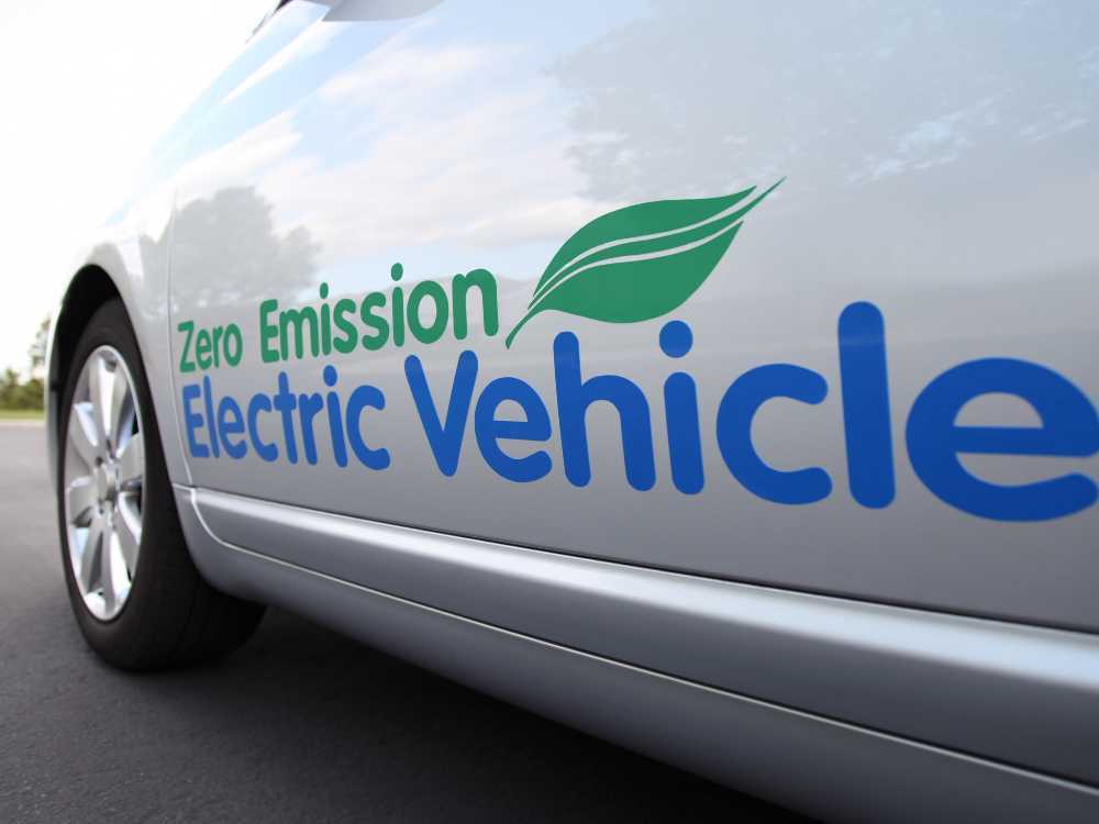
Danbury roads are always busy—people heading to work, running errands, or passing through town. For local businesses, that means there’s a great chance to get noticed with well-designed vehicle lettering. It’s not just about putting a name on a van or truck—it’s about making a strong impression while moving or parked. Done right, it can help a business look professional, build trust, and stay top of mind. Here are some simple, effective ways to help vehicle lettering stand out on the road in Danbury, CT.
1. Choose Bold, Readable Fonts
Choosing the right font is one of the most important design decisions when it comes to vehicle lettering. On the road, businesses only have a few seconds to capture the attention of drivers and pedestrians. A font that is too thin, ornate, or small can easily be overlooked, making the entire design ineffective.
Prioritize Clarity Over Style
Although unique or decorative fonts might seem appealing at first glance, they often reduce the readability of the message. Clear communication should always come before visual flair in vehicle lettering.
Use Sans-Serif Fonts: Sans-serif fonts such as Arial, Helvetica, and Futura are commonly used in signage because they feature clean, straight lines that are easier to read from a distance and while in motion.
Avoid Script Fonts: Fonts that imitate handwriting or calligraphy may look stylish up close, but they become difficult to read quickly, especially when the vehicle is moving or when viewed from an angle.
Stick to Bold Weights: Fonts in bold weights make each letter stand out more clearly. They offer better contrast against most vehicle colors and remain visible even in bright daylight or low-light conditions.
Make the Font Size Work for the Road
Font size must be large enough to ensure the lettering is legible from a distance, especially in areas with fast-moving traffic or crowded parking lots. The size should also be appropriate for the type and size of the vehicle being lettered.
Size Letters for Distance: As a general rule, each inch of letter height provides roughly 10 feet of readability. For example, a 6-inch-tall letter can be seen clearly from up to 60 feet away. This helps ensure that people have enough time to read the message before passing by.
Scale for Vehicle Type: A large van or box truck offers more surface area and allows for larger text without appearing crowded. On smaller cars or SUVs, the font should still be readable without overwhelming the design or taking up too much space.
Adjust for Speed Zones: Vehicles that regularly travel on highways or major roads in and around Danbury should feature larger text, since other drivers have less time to read it while moving at higher speeds.
Avoid Overly Complicated Font Choices
When it comes to vehicle lettering, simplicity enhances effectiveness. Fonts should work with the overall design, not distract from it. Overly complicated fonts or special effects can make the lettering harder to read, especially in less-than-ideal conditions.
Limit Font Styles: Using more than two font styles in one design can create visual confusion. Limiting font variations helps the message stay clean and organized.
Skip Special Effects: Effects like drop shadows, glows, or gradient fills may look interesting on a computer screen but often reduce visibility once applied to a vehicle. These effects can distort the shape of the letters or cause glare under sunlight.
Test Before Finalizing: Before finalizing a design, it’s helpful to print a sample and view it from various distances. This allows the business owner or designer to see how the font performs in real-world conditions, including lighting, angle, and motion.
2. Use High-Contrast Colors
One of the most important design elements for vehicle lettering is color contrast. High-contrast colors make lettering easier to see and read, especially from a distance or while the vehicle is in motion.
Why Contrast Matters
Color contrast affects how quickly and clearly people can read the lettering. Without good contrast, even well-designed graphics can go unnoticed.
Stronger Visibility in Motion: When a vehicle is moving, people have just a few seconds to glance at the lettering. High contrast helps the message get seen faster and remembered more easily.
Better Performance in Low Light: Strong contrasts, especially when combined with reflective materials, make lettering more visible during early mornings, late evenings, or rainy conditions.
Improved First Impressions: Clean, easy-to-read lettering shows professionalism. Poor contrast can make the design look unfinished or hard to understand, which can leave a weak impression on potential customers.
Color Combinations That Work
The right color pairings can make a big difference in how easily someone can read the vehicle lettering from across a parking lot or while driving by.
Black on Yellow: This pairing is widely recognized for high visibility. It stands out strongly and is often used on utility and service vehicles because it is easy to read quickly.
White on Dark Blue: This combination gives a sharp, professional appearance and is commonly used by corporate or local business fleets. The white lettering pops against the darker tone.
Red on White: Bright and energetic, this pairing is ideal for businesses that want to stand out boldly, such as food delivery or promotional services.
Consider the Vehicle's Base Color
Matching the lettering to the color of the vehicle itself is essential. The background color can either enhance or reduce the readability of the design, depending on how it's used.
Neutral Vehicle Colors: For white, gray, or silver vehicles, darker shades like black, navy, or red will offer better contrast and make the lettering pop.
Darker Vehicle Colors: On vehicles that are black, navy, or dark gray, bright colors like white, yellow, or light gray work best to improve visibility.
Bright-Colored Vehicles: When the vehicle is red, green, or another bold color, it's best to use high-contrast neutral lettering such as black or white to keep the message readable.
3. Keep the Message Simple
A clean and simple layout helps vehicle lettering stand out more effectively. In a fast-moving environment like the roads of Danbury, CT, people often only have a few seconds to glance at a vehicle.
Focus On the Essentials
Only the most important details should be included. Every element on the vehicle should answer one question: "What does this business do, and how can someone get in touch?"
Business Name: The name of the business should be the most prominent text on the vehicle. It should be easy to spot from a distance and help build brand recognition over time.
Type of Service: A short phrase describing the service or specialty helps viewers immediately understand what the business offers. For example, “Residential Roofing” or “Mobile Dog Grooming” quickly communicates value.
Phone Number: Display a single, easy-to-read phone number in a bold font. Avoid listing multiple numbers to reduce confusion and visual clutter.
Website or Social Handle: A clean URL or business handle gives people a way to learn more. It should be short, memorable, and not contain unnecessary extensions or slashes.
4. Incorporate Branding Elements
Vehicle lettering is more than just a label on a car or truck—it’s a reflection of the business. For companies in Danbury, CT, using strong branding elements on vehicles can boost visibility, build trust, and increase recognition within the community.
Use Core Branding Elements
Every element on the vehicle should work together to represent the brand clearly and professionally. These components create a lasting impression when the vehicle is on the road or parked in a visible location.
Logo Placement: The business logo should be placed prominently on both sides and the rear of the vehicle, ensuring visibility from all angles. A well-designed logo helps people quickly recognize the brand, even in passing traffic.
Tagline Usage: A clear and short tagline helps explain the business or its services in just a few words. When included in the vehicle lettering, a tagline reinforces what the business stands for and what it offers.
Brand Colors: Using brand-specific colors helps connect the vehicle to the company’s identity. When the same colors are used across signs, websites, uniforms, and vehicles, it creates a strong visual link in people’s minds.
Maintain Design Consistency Across All Materials
The vehicle lettering should reflect the same design standards as the company’s other marketing materials. This reinforces the brand and builds trust over time.
Font Matching: Fonts used on the vehicle should match those used in the business’s printed and digital materials. Using the same font helps create a clean, unified look that customers can easily associate with the brand.
Message Alignment: The language on the vehicle should reflect the business’s core messaging. Whether the brand voice is professional, friendly, or straightforward, it should be consistent across all platforms, including vehicle signage.
Design Flow: The layout and spacing of the text, logos, and images should feel organized and easy to read. A consistent and well-balanced design creates a more professional appearance and makes the information easier to understand quickly.
5. Ensure Proper Placement And Sizing
Proper placement and sizing of vehicle lettering are essential for making sure a business message is seen clearly while on the road. In a busy area like Danbury, CT, where vehicles are constantly in motion and competing for attention, it’s important that lettering is both well-positioned and readable from a distance.
Strategic Lettering Placement
Choosing the right spots on the vehicle can improve how often people notice the lettering and how well they remember the message. Placement should be based on how people view the vehicle in different situations—whether it’s parked, moving, or sitting in traffic.
Side Panels: The side doors and panels are among the most visible areas of any vehicle. These sections are often eye-level and give plenty of space for larger lettering, logos, and contact information. They are especially effective in traffic or when the vehicle is parked on the street.
Rear Window or Tailgate: This area is key for visibility when other drivers are directly behind the vehicle. Clear lettering here ensures the message can be read while waiting at red lights, in traffic jams, or in parking lots.
Doors and Fenders: These smaller areas are great for simpler elements like a company logo, slogan, or social media handle. They provide extra visibility from side angles and help reinforce brand identity.
Size for Easy Visibility
The size of vehicle lettering should always match how and where the vehicle will be seen. Lettering that is too small can be missed, while text that is too large can appear crowded or unprofessional.
Use Lettering That Matches Viewing Distance: For example, 1-inch tall letters can typically be read from about 10 feet away. If the goal is to reach drivers 30 to 50 feet away, 3- to 5-inch letters are usually a better fit. This is especially important on roads with higher speed limits.
Prioritize Key Details in Size: The business name or primary service should be the largest part of the design. Contact details like phone numbers or websites should still be large enough to read at a glance but do not need to dominate the space.
Keep Proportions Balanced: Text should fit comfortably within the available space without stretching or crowding. Balanced proportions help maintain a clean, professional look that’s easy on the eyes.
6. Use Reflective or Vinyl Materials
Vehicle lettering should do more than display a business name—it should remain visible and professional-looking under all types of road and weather conditions.
Benefits of Reflective Vinyl
Reflective vinyl offers excellent visibility when lighting is limited, which can be especially helpful for service vehicles or businesses that operate during early mornings, late evenings, or in poor weather conditions.
Enhanced Nighttime Visibility: Reflective vinyl bounces light from headlights and street lamps, making the lettering easy to read even in darkness. This can help other drivers quickly identify the vehicle, which is especially useful in high-traffic or poorly lit areas.
Safety and Awareness Boost: Because reflective materials increase visibility, they also enhance safety on the road. Drivers are more likely to notice the vehicle and recognize it as a business or service provider.
Great for 24/7 or Emergency Services: Businesses that operate around the clock—like towing companies, plumbing services, or roadside assistance—can benefit from reflective vinyl by ensuring their branding is always visible and readable.
Why Vinyl Is a Reliable Choice
Vinyl remains one of the most popular materials for vehicle lettering because it offers durability, style, and long-term value. It provides a clean, smooth surface that holds up well to everyday wear and tear.
Weather Resistance: Quality vinyl materials are designed to handle changing weather conditions. Whether it’s hot summer sun, heavy rain, or snowy winters in Danbury, vinyl lettering stays intact without cracking or fading.
Low Maintenance: Vinyl is easy to clean and does not require special care. A simple wash keeps the lettering looking fresh and professional, which helps maintain the vehicle's appearance over time.
Polished, Professional Look: Vinyl lettering has a crisp and finished appearance. It can be cut into precise shapes and letters, giving businesses a sharp, well-branded presence on the road.
7. Work With a Local Professional in Danbury, CT
Choosing a local expert can make a big difference when it comes to effective vehicle lettering. Professionals based in Danbury, CT, like Signamara, understand the area’s unique needs and can offer personalized service that national companies often can’t match.
Benefits of Hiring a Local Signage or Graphics Expert
Working with a local specialist like Signarama brings several practical advantages. These experts are not only nearby but also bring valuable insights into what works best for vehicles on the roads of Danbury.
Faster Communication and Turnaround: Local businesses are easier to reach, whether it's for initial planning, revisions, or installation timelines. This means a smoother process from start to finish.
On-Site Support: Many local providers offer in-person consultations. They can physically see the vehicle and recommend the best placement and design options for maximum visibility.
Customized Designs for the Community: Local professionals understand what catches the eye in Danbury. They can tailor colors, font sizes, and styles to match the preferences of local audiences and traffic patterns.
Support From Local Professionals
Danbury, CT, has specific traffic patterns, weather conditions, and even signage regulations that affect how vehicle lettering should be done.
Knowledge of Local Signage Rules: Certain lettering sizes, placements, or materials may be regulated. Local pros are familiar with these rules and help businesses stay compliant.
Understanding of Regional Road Conditions: From winter snow to bright summer glare, Danbury roads come with unique challenges. Local experts choose materials and finishes that can withstand local weather and keep the lettering visible.
Experience With Local Traffic Flow: Knowing which parts of a vehicle get the most attention in Danbury traffic helps in making smart design choices. For example, rear vehicle lettering may be more impactful due to stop-and-go driving in busy areas.
Frequently Asked Questions
What’s the difference between vehicle lettering and a wrap?
Vehicle lettering typically involves applying cut-out vinyl letters and graphics to specific areas, while a wrap covers large portions or the entire vehicle with a printed design. Lettering is more minimalist and focuses on text and simple logos, while a wrap can include full-color images, patterns, and detailed artwork. Wraps are more comprehensive and often used for creating a completely new look, while lettering is ideal for displaying key information and branding in a more subtle way.
Can vehicle lettering be removed or replaced?
Vehicle lettering can usually be removed when needed. While the adhesive is strong enough to keep the letters in place, it can be loosened with the right tools and a little heat. Once removed, the vehicle surface can be cleaned to remove any remaining residue. If you want to change the lettering or update your design, new vinyl can be applied after the old lettering is taken off.
How long does it take to get vehicle lettering done?
The timeline can vary depending on the complexity of the design, but for most simple lettering jobs, it only takes a few hours. If you’re adding more detailed graphics or multiple colors, it might take a bit longer. Once the design is finalized, the actual application process is fairly quick. Scheduling an appointment and having the vehicle ready at the shop can streamline the process.
Does vehicle lettering need special care or maintenance?
Not much—basic car washing and routine cleaning are usually all that’s needed. Avoid harsh chemicals or abrasive tools that could damage the vinyl letters. Sticking to gentle cleaning methods helps keep the lettering looking sharp and professional. It’s also a good idea to check for any peeling or lifting edges and have them addressed promptly to maintain a clean appearance.
How do I choose a good vehicle lettering provider?
Start by researching local shops or online services that specialize in vehicle graphics. Look for companies with strong reviews, a portfolio of past work, and good customer service. Ask questions about their design process, materials, and installation methods. A reputable provider will be transparent about costs and provide a clear timeline for completing the job.
Get Noticed With Custom Vehicle Lettering That Works!
Let Signarama bring your brand to life on the roads of Danbury, CT. Whether it’s a single work van or a full fleet, clear and professional vehicle lettering can help your business stay visible where it matters most. Our team understands what works in Danbury, CT—from local traffic patterns to weather-resistant materials—and we design with purpose. Signarama is ready to help create bold, clean, and effective lettering that turns heads and builds trust wherever you go.
Contact Signarama now!

Signarama Danbury, CT
contact
Signarama Danbury, CT