


How to Choose the Best Color For Business Signs in Brookfield, CT
Apr 26, 2024 by Signarama Danbury, CT
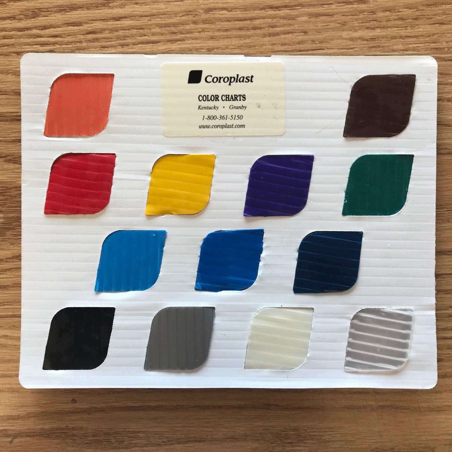
Item 1 of 1
Choosing the right color for your business signs is more than a matter of aesthetics. It's a strategic decision that influences how your brand is perceived and can significantly impact customer engagement.
The Psychology of Color in Marketing
Colors play a significant role in influencing consumer perceptions, emotions, and behaviors. Understanding the psychology behind different colors can help marketers leverage their impact to effectively convey brand messages and evoke desired responses from their target audience.
Red
Red is associated with energy, excitement, and urgency. It grabs attention and stimulates the senses, making it an ideal choice for brands seeking to create a sense of urgency or encourage impulse purchases. However, it can also evoke feelings of danger or aggression if used excessively.
Blue
Blue is often linked to trust, reliability, and professionalism. It instills a sense of calm and confidence in consumers, making it a popular choice for finance, healthcare, and technology brands. Blue is also associated with stability and security, making it a reassuring choice for conservative brands.
Green
Green is closely tied to nature, growth, and health. It symbolizes freshness, vitality, and eco-friendliness, making it appealing to wellness, organic, and environmental brands. Green represents wealth and prosperity, particularly in finance and luxury industries.
Yellow
Yellow is associated with optimism, warmth, and creativity. It grabs attention and promotes feelings of happiness and cheerfulness. Brands often use yellow to convey a playful and energetic image, making it popular in the entertainment, food, and childcare industries.
Orange
Orange combines the energy of red with the cheerfulness of yellow. It is associated with enthusiasm, creativity, and friendliness. Orange is attention-grabbing and is often used to create excitement or fun. It is commonly seen in industries like food, sports, and technology.
Pink
Pink is often associated with femininity, romance, and sweetness. It evokes feelings of tenderness, nurturing, and compassion. Brands targeting a predominantly female audience often use pink to convey a sense of empathy and understanding.
Understanding Your Brand Identity
Your brand identity is more than just a logo or a color scheme—it encompasses the essence of your brand, including its values, personality, and positioning in the market. Understanding and defining your brand identity is crucial for establishing a strong and memorable presence in the minds of consumers.
Defining Your Values
Start by identifying the core values that your brand stands for. These values serve as the guiding principles that shape your brand's actions and decisions. For example, a sustainable fashion brand may prioritize environmental responsibility and ethical sourcing, while a luxury brand may emphasize exclusivity and craftsmanship.
Establishing Your Personality
Consider the personality traits that best reflect your brand's character. Is your brand playful and whimsical or serious and professional? Understanding your brand's personality helps humanize it and connect with your target audience on a deeper level. For instance, a youth-oriented brand may adopt a fun and energetic personality, while a financial institution may project a more serious and authoritative image.
Identifying Your Target Audience
Know who your target audience is and what motivates them. Conduct market research to understand their demographics, preferences, and pain points. Tailor your brand identity to resonate with your target audience, addressing their needs and aspirations. For example, a fitness brand targeting millennials may embrace a modern and dynamic identity, while a luxury skincare brand may exude sophistication and elegance.
Crafting Your Brand Story
Your brand story is the narrative that communicates your brand's history, values, and mission. It humanizes your brand and fosters emotional connections with your audience. Use storytelling techniques to engage and inspire your audience, highlighting what differentiates your brand and why it matters. For instance, a heritage brand may draw upon its rich history and tradition to evoke a sense of nostalgia and authenticity.
8 Factors to Consider When Choosing Sign Colors
Selecting the right colors for your business signs is crucial for effectively communicating your message, capturing attention, and creating a memorable brand identity. Here are several key factors to consider when choosing sign colors:
1. Brand Identity and Personality
Your sign colors should reflect your brand identity and personality. Consider the emotions and associations you want to evoke in your audience. For example, vibrant colors like red or orange may convey energy and excitement, while cooler tones like blue or green may convey calmness and reliability. Aligning your sign colors with your brand's values and personality helps reinforce your brand identity and strengthen brand recognition.
2. Contrast and Visibility
Contrast is essential for ensuring your business signs are easily readable and stand out. Choose colors with sufficient contrast to ensure text and graphics are legible, even from a distance. High-contrast combinations, such as black text on a white background or white text on a dark background, are often the most effective for maximizing visibility and readability.
3. Legibility and Readability
Legibility refers to the ease with which text or graphics can be distinguished from their background, while readability refers to the ease with which the content can be understood. Select colors that enhance legibility and readability by avoiding color combinations that may cause visual strain or make text difficult to read. For example, avoid using similar hues together or placing text over busy backgrounds that may distract from the message.
4. Cultural and Psychological Associations
Colors carry cultural and psychological associations that can influence how they are perceived by different audiences. Consider the cultural context in which your business signs will be displayed and how certain colors may be interpreted by your target audience. For example, red may symbolize luck and prosperity in some cultures, while it may signal danger or urgency in others. Understanding these associations can help you choose colors that resonate with your audience and convey the desired message.
5. Environmental Factors
Take into account the environmental conditions in which your business signs will be displayed. Consider how natural light, artificial lighting, and surrounding colors may affect the appearance of your sign colors. For outdoor business signs, choose vibrant and visible colors in various lighting and weather conditions, such as sunlight, rain, or snow. Additionally, consider how your sign colors will complement or contrast with the architectural features of the surrounding environment.
6. Brand Differentiation:
Your business signs should differentiate your brand from competitors and attract attention in a crowded marketplace. Choose colors that set your brand apart and make a bold statement. Consider incorporating unique or unexpected color combinations that capture attention and leave a lasting impression on viewers. Your business signs can help reinforce brand recall and drive customer engagement by standing out from the competition.
7. Long-Term Considerations:
Consider the long-term implications of your sign colors, particularly if you plan to use them across various marketing materials and platforms. Choose timeless and versatile colors, ensuring they remain relevant and effective over time. Avoid trendy or fad colors that may quickly become outdated, and opt for colors with enduring appeal and adaptability across different applications.
8. Test Different Colors Before Finalizing Business Signs
Testing different colors before finalizing your business sign can be done through digital mock-ups and small-scale physical prototypes. Digital tools allow you to visualize your sign in various colors and settings, providing a cost-effective way to experiment with different options. Consider creating small prototypes of your sign in the chosen colors and observing them under different lighting conditions and distances for a more accurate representation. This testing phase ensures the final sign achieves the desired impact and visibility. During this process, consulting with professionals like Signarama can also provide valuable insights and recommendations.
Combining Colors: Dos and Don'ts
Choosing the right color combinations is essential for creating visually appealing and effective business signs. Here are some dos and don'ts to keep in mind when combining colors:
Dos:
1. Consider Color Harmony
Choose colors that complement each other and create a sense of harmony. Harmonious color combinations, such as analogous or complementary colors, can enhance the visual appeal of your business signs and create a cohesive look. For example, pairing blue with green or orange with red can create a pleasing contrast while maintaining balance.
2. Use the 60-30-10 Rule
Follow the 60-30-10 rule to create a balanced color scheme. This rule suggests allocating 60% of the space to a dominant color, 30% to a secondary color, and 10% to an accent color. This distribution helps create a visual hierarchy and prevents the colors from overwhelming each other.
3. Test for Readability
Ensure that your color combinations are readable and legible, especially for text-heavy business signs. Test your color choices under different lighting conditions and backgrounds to ensure optimal visibility. High-contrast combinations, such as black text on a white background or vice versa, are often the most readable.
4. Ensure Accessibility
Consider the accessibility of your color choices for all viewers, including those with color blindness or visual impairments. Use color contrast tools to check the readability of your business signs and make adjustments as needed to ensure inclusivity.
Don'ts:
1. Avoid Clashing Colors
Avoid using colors that clash or create visual discordance. Clashing color combinations can be jarring to the eye and detract from the overall impact of your business signs. Be cautious when combining complementary colors, as they may create too much contrast if not balanced properly.
2. Steer Clear of Too Many Colors
Limit the number of colors used in your business signs to avoid overwhelming the viewer. Too many colors can create visual clutter and confusion, making it difficult for the audience to focus on the intended message. Stick to key colors that effectively convey your brand identity and message.
3. Watch Out for Color Blindness
Be mindful of color blindness when choosing color combinations for your business signs. Approximately 8% of men and 0.5% of women have some form of color blindness, making it essential to use easily distinguishable colors for all viewers. Test your color choices using online color blindness simulators to ensure accessibility for all.
4. Don't Sacrifice Legibility for Aesthetics
While aesthetics are important, prioritize legibility when choosing color combinations for text-based business signs. Avoid light text on a light background or dark text on a dark background, as these combinations can be difficult to read, especially from a distance. Opt for high-contrast combinations that maximize readability and visibility.
5 Trending Color Combinations for Business Signs in 2024
Several exciting color combinations are emerging as popular choices for business signs. These trending color palettes reflect current design trends and consumer preferences, helping businesses stand out and make a lasting impression. Here are some of the trending color combinations for business signs in 2024:
1. Soft Neutrals with Vibrant Accents
Soft neutrals, such as beige, taupe, and gray shades, provide a sophisticated backdrop for business signs. Paired with vibrant accent colors, such as coral, teal, or mustard yellow, these neutral tones create a striking contrast that catches the eye. This versatile combination can be adapted to various industries, from retail to hospitality.
2. Earthy Tones with Metallic Accents
Earthy tones, such as moss green, terracotta, and sandy beige, evoke a sense of warmth and connection to nature. When paired with metallic accents like copper, gold, or bronze, these earthy hues take on a luxurious and modern feel. This combination adds a touch of elegance to business signs and works well for upscale brands and boutique establishments.
3. Pastel Palette with Bold Pops of Color
Pastel colors, including soft shades of lavender, mint green, and baby blue, create a gentle and inviting atmosphere. When combined with bold pops of color, such as hot pink, electric blue, or neon green, these pastel hues add a playful and modern twist to business signs. This combination is perfect for businesses targeting a youthful and trendy audience.
4. Monochromatic Scheme with Textured Elements
Using varying shades of a single color, a monochromatic color scheme creates a cohesive and sophisticated look for business signs. Adding textured elements, such as brushed metal, wood grain, or embossed patterns, enhances visual interest and depth. This combination adds a touch of elegance and refinement to the business signs, making it ideal for professional services and upscale establishments.
5. High-Contrast Black and White
Classic black and white never go out of style and remain a timeless choice for business signs. The high-contrast combination of black text or graphics on a white background ensures excellent readability and visibility. This sleek and minimalist approach is perfect for businesses looking to convey a sense of professionalism and simplicity.
FAQ
How Does Lighting Affect the Color of My Business Sign?
The type of lighting can dramatically affect how the colors of your business signs are perceived. Natural daylight will show the truest color, while artificial lighting can alter the appearance. For instance, LED lights may make colors appear brighter, while fluorescent lighting can wash out colors or give them a greenish tint. When selecting colors, consider where your business sign will be displayed and the type of lighting it will be under. This consideration ensures the colors remain consistent with your brand and are visible under all conditions.
Can the Color of My Business Sign Impact Its Maintenance Needs?
Yes, the color of your business sign can influence its maintenance requirements. Light-colored business signs may show dirt and wear more quickly than darker business signs, requiring more frequent cleaning to maintain their appearance. Additionally, some colors can fade more rapidly when exposed to direct sunlight for extended periods, necessitating sooner updates or replacements. Opting for UV-resistant materials and finishes can help mitigate these issues, preserving the vibrancy and effectiveness of your sign over time.
Are There Any Colors That Should Generally Be Avoided for Business Signs?
While there's no one-size-fits-all answer, as the effectiveness of colors can depend on context and industry, some general guidelines can help avoid potential pitfalls. For example, extremely bright or neon colors might be too glaring for some applications, potentially deterring rather than attracting attention. Similarly, very pale or subdued colors may lack the necessary visibility and impact, especially from a distance or in bright lighting conditions. Additionally, colors that clash with your brand identity or have negative cultural associations with your target audience should be cautiously approached. Ultimately, the key is to choose colors that enhance readability, align with your brand, and resonate positively with your intended customers.
Is It Necessary to Follow Industry-Specific Color Norms for Business Signs?
While not strictly necessary, adhering to industry-specific color norms can help customers quickly identify the nature of your business. For example, green often denotes health and wellness, making it popular for spas and health food stores. Deviating from these norms isn't inherently bad and can help differentiate your business, but it's essential to do so thoughtfully. Using unconventional colors can make your business stand out, but ensure the chosen hues still align with your brand identity and values.
How Can Seasonality Affect My Choice of Colors for Business Signs?
Seasonal changes can influence consumer behavior and preferences, affecting the ideal colors for your business signs. For instance, brighter, more vibrant colors may be more appealing in spring and summer, reflecting the energy and renewal of these seasons. In contrast, warmer, richer colors might resonate more during the fall and winter months. If your business is seasonal or planning a temporary marketing campaign, consider aligning your sign colors with the season to increase relevance and customer engagement. However, ensure these seasonal choices still align with your overall brand identity to maintain consistency.
Elevate Your Brand with the Perfect Colors - Contact Signarama Today!
Selecting the right color for your business signs in Brookfield, CT, is a nuanced decision that impacts brand perception and customer engagement. You can carefully consider color psychology, brand identity, and environmental factors to create business signs that truly stand out. Signarama is here to guide you through every step of this process, from color selection to the final design, ensuring your business signs capture the essence of your brand. Ready to make an impact with your business signs? Contact us at Signarama today.

Signarama Danbury, CT
35 Eagle Rd
Danbury Connecticut 06810
Opening Hours:
Monday
8:00 am - 4:00 pm
Tuesday
8:00 am - 4:00 pm
Wednesday
8:00 am - 4:00 pm
Thursday
8:00 am - 4:00 pm
Friday
8:00 am - 4:00 pm
contact
Signarama Danbury, CT
CLIENTS WE HAVE WORKED WITH: