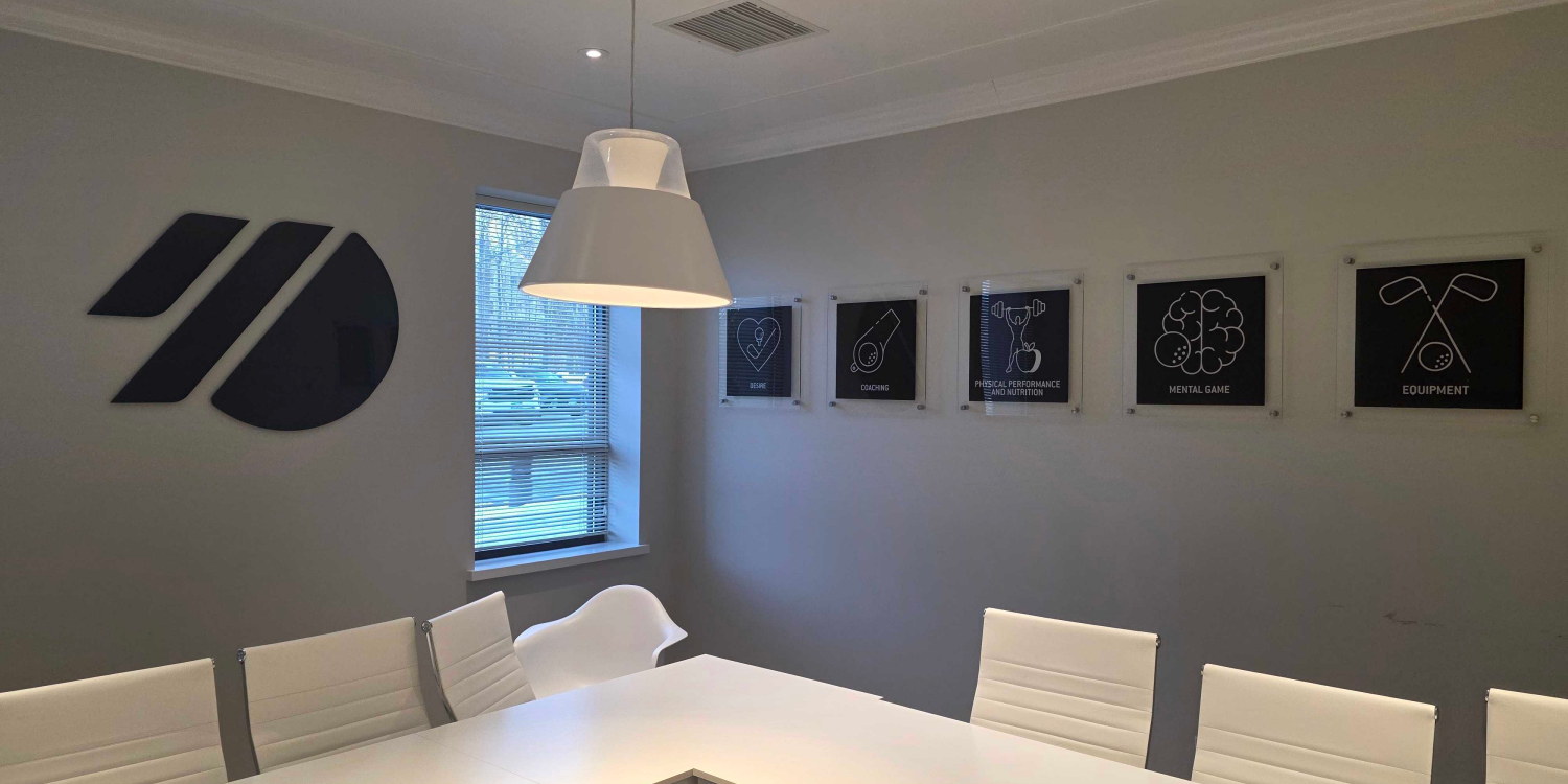



How to Design Custom Storefront Signs That Fit Your Danbury Business
Sep 11, 2026 by Signarama Danbury

A storefront sign creates first impressions, guides customers, and sets expectations. In Danbury, CT, custom storefront signs help businesses stand out across diverse commercial areas.
Effective design requires more than just placing a logo over a door. It must support the brand, ensure real-world readability, complement the building, and account for fabrication and installation. Success depends on balancing visual appeal with practical factors like materials, scale, contrast, and site conditions.
This guide details how to approach custom storefront sign design and outlines the essential planning steps for Danbury businesses.

Why Custom Storefront Signs Matter
Customers often notice a storefront sign before they notice window displays, promotional graphics, or other exterior details. That makes the sign one of the most visible parts of a company’s physical brand.
A well-planned sign can support several business goals at once. It can make the location easier to identify, reinforce brand recognition, improve consistency across physical and digital touchpoints, and create a more professional exterior appearance.
For new businesses, a storefront sign may also help introduce the brand to the surrounding area. For established businesses, updated signage can help modernize the location without changing the entire facade.
What Should You Consider When Designing a Custom Storefront Sign?
Start With Brand Consistency
Storefront signs should be a natural extension of your brand. Before choosing the size or materials, identify the key brand elements to include, such as the business name, logo, colors, typography, and any approved tagline.
Focus on the elements that create instant recognition rather than overcrowding the design. The sign should also stay consistent with your website, social media, printed materials, company vehicles, and interior graphics.
Avoid stretching or altering the logo to fit a sign. If space is limited, use an approved alternate layout or simplified version to maintain a clean, professional appearance.
Design for Real-World Readability
A storefront sign may look clear on a screen but become difficult to read from a sidewalk, parking lot, or moving vehicle. Readability should guide the layout, lettering, colors, and message.
Use a Clear Visual Hierarchy
The business name or primary logo should be the most prominent element. Short supporting information can be included, but too many competing details make the sign harder to scan.
Choose Legible Letterforms
Decorative fonts may work within a logo, but thin strokes, tight spacing, and elaborate scripts can lose clarity at a distance or from an angle.
Create Strong Contrast
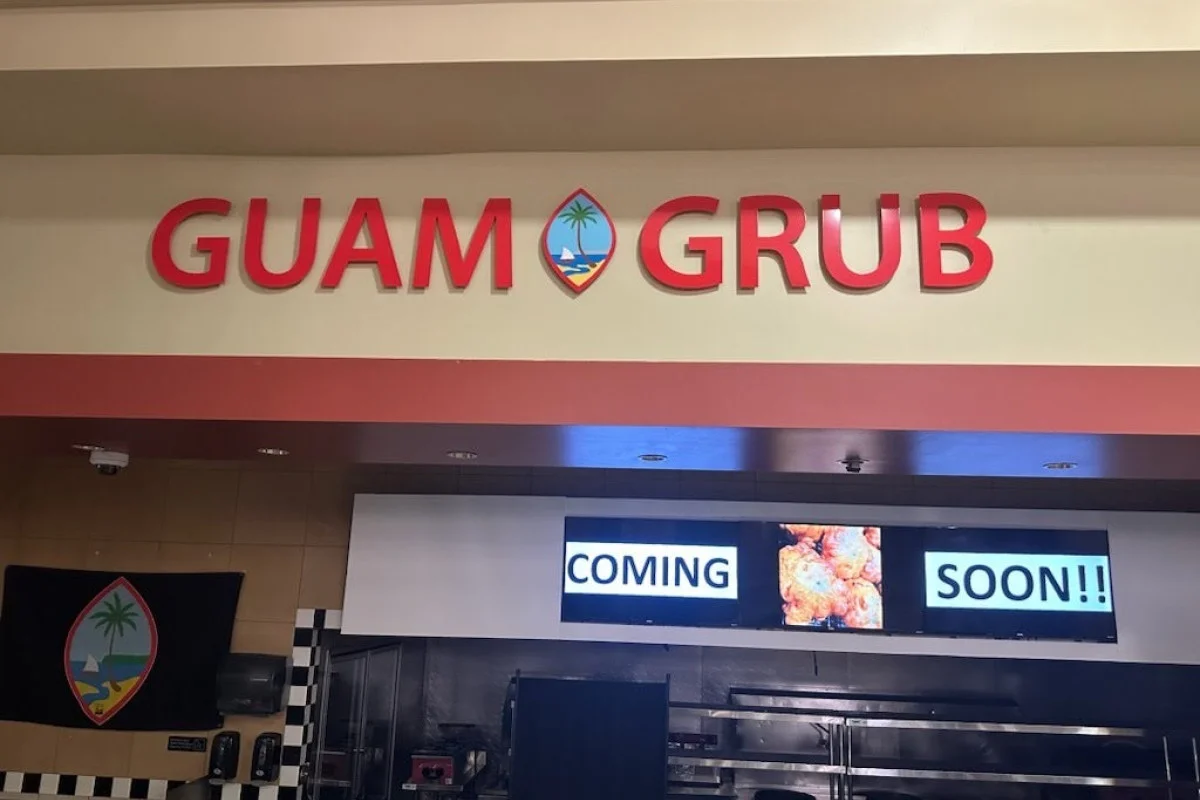
Lettering should stand out clearly from the building surface or sign background. Consider the wall color, nearby signage, shadows, landscaping, and surrounding architecture. A contrasting panel, border, or background can improve visibility.
Keep the Message Focused
A storefront sign should identify the business, not function like a brochure. Long service lists, phone numbers, website addresses, and promotional messages can overcrowd the design.
Additional information can appear on window graphics, door decals, banners, or other supporting signs.
Consider the Building and Sign Placement
The design should respond to the specific storefront. Building dimensions, mounting surfaces, traffic direction, setbacks, and surrounding features can all affect sign visibility.
Evaluate the Available Sign Area
Measure the usable space rather than relying only on photos. Windows, awnings, trim, seams, architectural details, and landlord requirements may limit placement.
Accurate measurements help determine dimensions that fit the building without appearing too small or crowded.
Think About Viewing Angles
A wall-mounted sign may work well for customers approaching from the front but may be less visible from the side.
Consider where customers first see the storefront, how far away they are, and whether trees, buildings, vehicles, or other signs block the view.
Coordinate With Other Exterior Graphics
The main sign should work with window graphics, door lettering, business hours, directional signs, and temporary banners. These elements should follow a consistent visual system rather than compete for attention.
Compare Materials Based on Appearance and Use
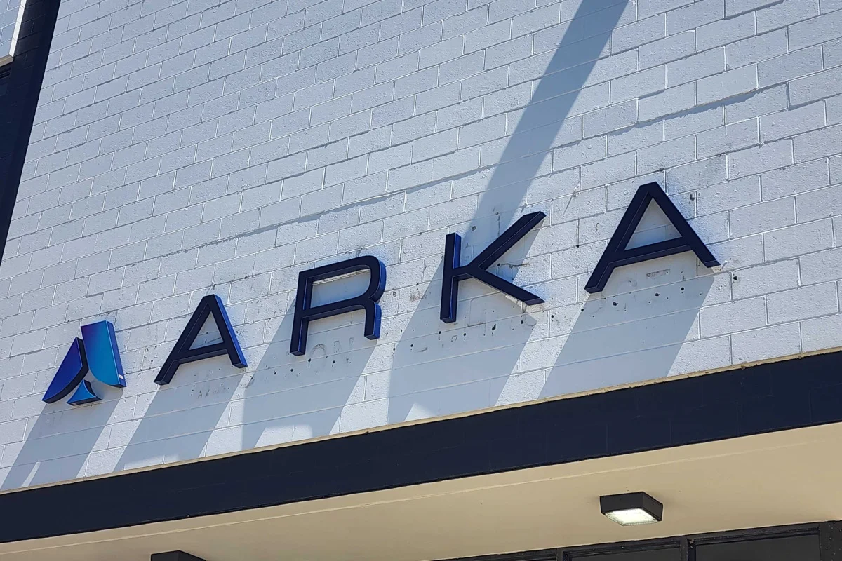
Material selection affects the sign’s appearance, depth, weight, durability, and installation requirements. The right choice depends on the brand, building surface, exposure conditions, and budget.
Dimensional Letters and Logos
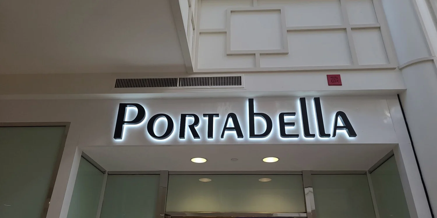
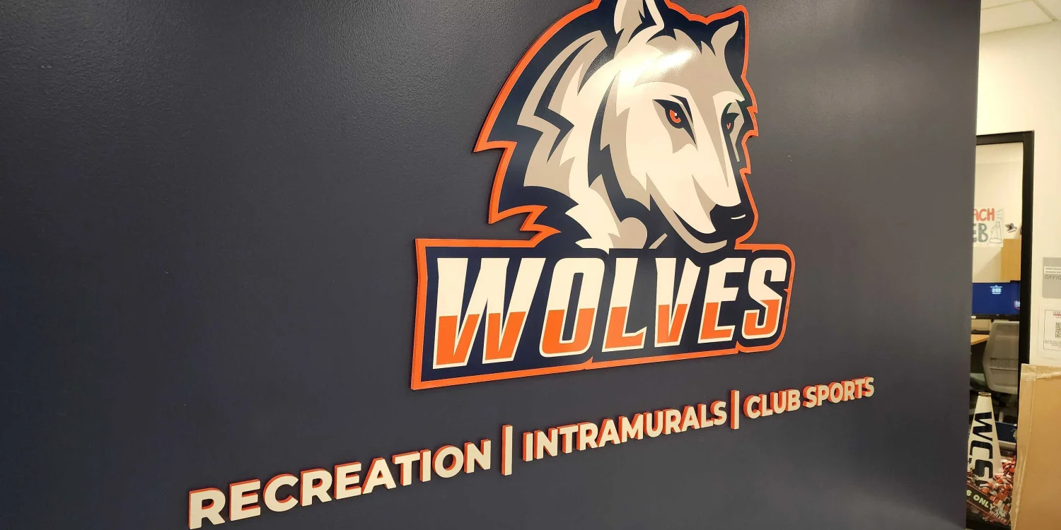
Dimensional lettering adds depth and creates a polished architectural appearance. Materials and finishes can be selected to suit the building and brand style.
Panel Signs
Panel signs place the design on a defined background. They can improve contrast, organize multiple elements, and separate the sign from a visually busy facade.
Printed Graphics and Applied Lettering
Applied graphics can work well on windows, doors, sign panels, and selected storefront surfaces. They are useful for reproducing detailed colors, gradients, and brand imagery.
Wood-Look, Metal-Look, and Specialty Finishes
Specialty finishes can support a traditional, industrial, modern, rustic, or upscale appearance.
However, the finish should still support readability and brand consistency. Decorative materials should enhance the message rather than distract from it.
How to Design Custom Storefront Signs Step by Step
A structured process helps prevent design revisions, production problems, and placement issues later in the project.
Step 1: Define the Sign’s Primary Job
Decide what the sign must accomplish. Most storefront signs primarily identify the business, but some also need to clarify a service category, distinguish one entrance from another, or improve visibility within a larger property.
This decision helps determine how much information belongs in the design.
Step 2: Gather Accurate Brand Files
Provide vector logo files when available, along with approved colors, fonts, and brand guidelines. Low-resolution images copied from websites can create production limitations and may not scale cleanly.
Accurate source files allow the design team to preserve logo proportions, colors, and details.
Step 3: Document the Site
Collect measurements and clear photographs of the storefront, surrounding facade, and approach views. Note the wall material, available mounting area, obstructions, and nearby signs.
A site review helps connect the design concept to real installation conditions.
Step 4: Choose a Sign Format
Select a format that suits the brand and building. Options may include dimensional letters, logo elements, panels, applied graphics, or a coordinated combination.
The format should reflect the intended appearance, available space, mounting surface, and visibility needs.
Step 5: Build the Layout Around Readability
Set the primary name or logo first. Then add only the supporting information that viewers need. Test contrast, spacing, proportions, and legibility at reduced size to simulate distance.
The strongest storefront sign design usually communicates one clear message quickly.
Step 6: Review Production and Installation Details
A design is not finished until it can be produced and installed. Confirm dimensions, materials, colors, mounting method, placement, and any property requirements before approval.
This stage helps ensure the final artwork is installation-ready rather than merely visually appealing.
Step 7: Approve a Final Proof
Review spelling, logo details, colors, dimensions, and placement carefully. Confirm that the proof reflects the intended final sign. Once production begins, changes may require new materials or additional work. A thorough proofing process protects the quality of the final result.
What Common Mistakes Should You Avoid When Designing a Storefront Sign?
Adding Too Much Information
Trying to include every service, phone number, website, or marketing message can make a storefront sign difficult to read. A simple, focused design is often more effective.
Prioritizing Style Over Readability
Decorative fonts, low-contrast colors, or complex backgrounds may reduce visibility. The design should remain clear from typical viewing distances.
Overlooking the Building
A sign should complement the building's size, architecture, and available mounting space. Ignoring these factors can make the finished sign feel out of place.
Skipping Production Planning
Design decisions should consider how the sign will be fabricated and installed. Early planning helps prevent unnecessary revisions and production challenges.
Forgetting Overall Signage Consistency
The storefront sign should work alongside window graphics, door lettering, and other exterior signs. Maintaining a consistent visual style creates a more professional appearance.
How Do You Choose the Right Type of Storefront Sign?
Match the Sign to Your Building
The building's architecture, available mounting space, and storefront layout all influence which sign type is the best fit. Choosing a format that complements the property helps create a more cohesive appearance.
Prioritize Your Visibility Goals
Consider how customers approach your business and where they first see the storefront. Some sign types are better suited for long-distance visibility, while others are designed to reinforce branding at the entrance.
Select a Style That Fits Your Brand
The sign should reflect your business's overall image. Modern, traditional, or professional brands may each benefit from different materials, finishes, and sign styles.
Support the Main Sign With Window Graphics
Window graphics can add branding, privacy, or business information without overcrowding the primary storefront sign. They work best as a complementary element rather than a replacement.
Consider Awning Graphics When Appropriate
Businesses with fabric awnings may incorporate branding directly onto the awning surface. This approach can reinforce visibility while maintaining a coordinated storefront design.
Frequently Asked Questions
What information should a storefront sign include?
Most storefront signs should include the business name and logo. A short descriptor may help when the name does not clearly explain the business type. Additional details should only appear when they remain readable and serve a clear purpose.
How large should storefront lettering be?
The appropriate size depends on viewing distance, placement height, available facade space, letter style, and surrounding conditions. Measurements and site photos help determine proportions that fit both the building and the viewing environment.
How can a business make its storefront sign easier to read?
Use clear lettering, strong contrast, sufficient spacing, and a focused message. Avoid thin fonts, crowded layouts, excessive details, and colors that blend into the facade.
Should storefront signage match the company’s website and marketing materials?
Yes. Consistent logos, colors, typography, and visual style help customers recognize the business across physical and digital channels. Consistency also creates a more credible and organized brand presentation.
What files are needed to begin a storefront sign project?
Vector logo files are ideal because they can scale without losing quality. Brand guidelines, color references, font information, storefront photos, and accurate measurements also support the design process.
Plan Your Custom Storefront Sign in Danbury, CT
Effective custom storefront signs require integrating branding, readability, materials, production, and installation planning from the beginning. This collaborative approach prevents crowded layouts, low contrast, inappropriate materials, and poor building fit.
Signarama partners with local businesses to design cohesive storefront signage. Our team assists with storefront evaluation, practical design, material choice, production-ready art preparation, and installation coordination.
Contact Signarama Danbury to discuss your signage needs and begin planning your custom storefront sign.


Signarama Danbury, CT
contact
Signarama Danbury, CT