


What Are the Main Types of Storefront Signs for Businesses?
Sep 9, 2026 by Signarama Danbury
A storefront sign is often the first branded element a customer notices. Before someone enters a business, the sign communicates the company name, visual identity, and sometimes the type of service offered. In a commercial area such as Danbury, CT, customers may only have a few seconds to see, read, and remember that message.
The challenge is that storefront signs are not one-size-fits-all. Some mount flat against a building. Others project outward, use dimensional lettering, or turn windows into branded surfaces. The right choice depends on viewing distance, traffic direction, building architecture, landlord rules, local sign requirements, and the brand’s visual style.
This guide explains the main types of signs for storefronts, where each works best, and how to compare options before starting a sign project.
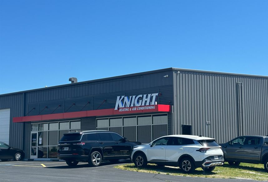
Why Storefront Signs Matter
A storefront sign does more than identify a business. It helps customers confirm they have reached the correct location, makes the property easier to navigate, and supports consistent brand recognition.
Effective storefront signs usually perform three essential functions:
They make the business name easy to recognize.
They remain readable from the main viewing angle.
They fit the building while still reflecting the brand.
Poor planning can weaken all three. Letters that are too small disappear at a distance. Low-contrast colors reduce legibility. A detailed logo may become difficult to understand when enlarged for a facade. These problems often begin when a business selects a sign style before evaluating the site.
The Main Types of Storefront Signs
Different storefronts create different visibility challenges. A professional office in a multi-tenant property has different needs from a restaurant facing a busy road or a boutique on a pedestrian-oriented street.
Flat Panel Signs
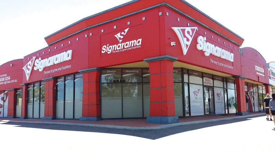
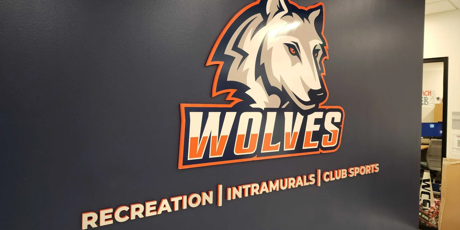
A flat panel sign uses a printed or applied graphic mounted to a storefront or building facade. It displays a business name, logo, and branding in one clean design. Flat panels work well for businesses with detailed logos or limited mounting space. Keep the layout simple so the storefront sign remains easy to read.
Dimensional Letter Signs
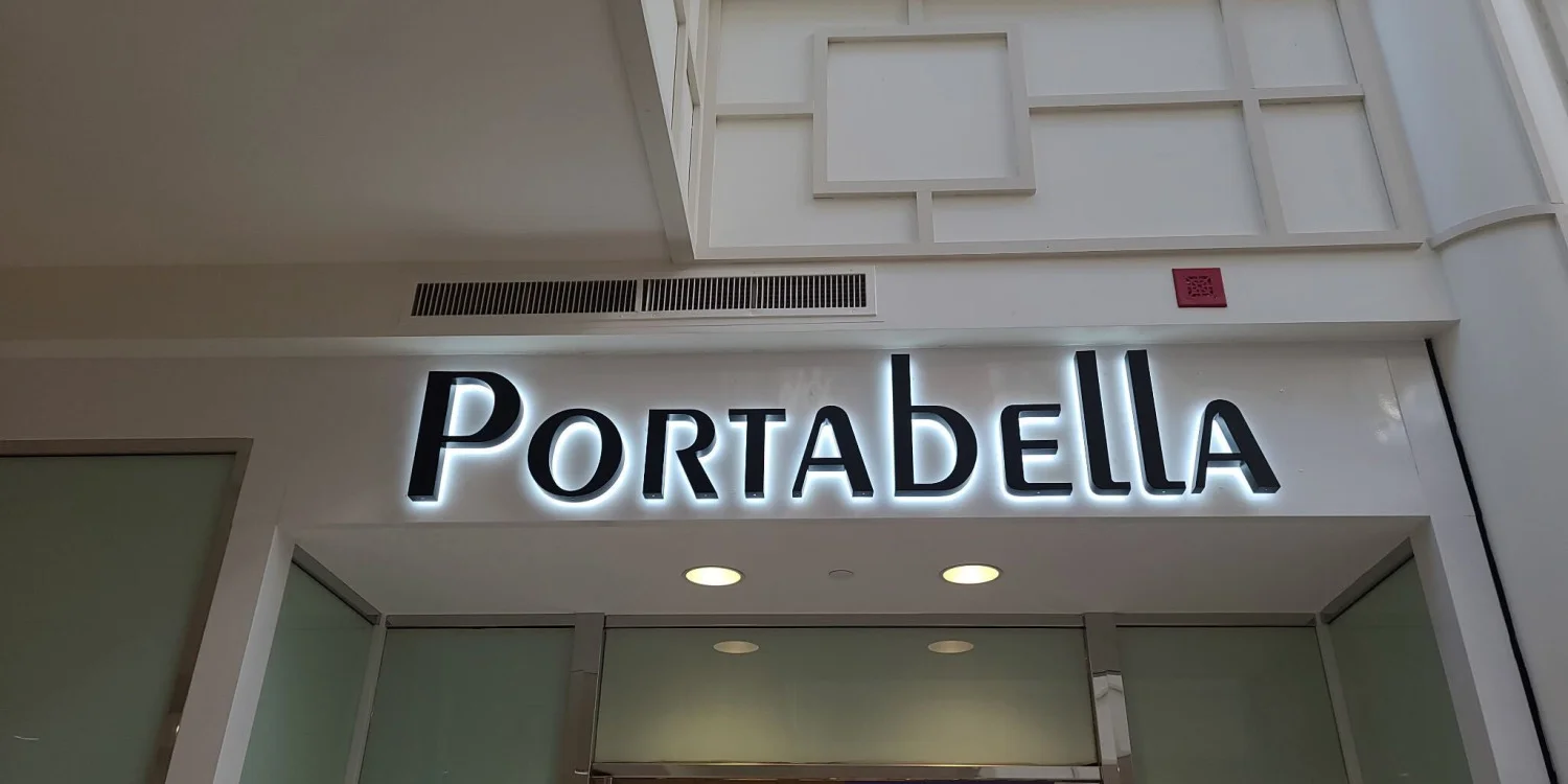
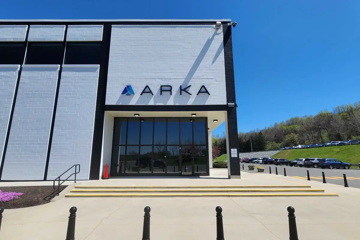
Dimensional letter signs use raised letters or logos to create depth and a polished appearance. They are popular for offices, retailers, restaurants, and service businesses seeking a clean, professional storefront sign. Simple fonts, proper spacing, and the right mounting surface help maximize readability.
Individual Cut Letters
Individual cut letters are mounted directly to the storefront to create a clean, architectural look. They work best for businesses with simple logos and bold typography. Proper spacing and sizing are essential, especially for longer business names.
Blade and Projecting Signs
Blade and projecting signs extend perpendicular to the building, making them easier to see from sidewalks and streets. They are ideal for pedestrian-friendly areas and shopping centers. Placement should account for clearance, visibility, and local sign requirements.
Awning Signs and Graphics
Awning signs combine branding with shade and weather protection. They work well for restaurants, boutiques, salons, and similar businesses. A short business name or logo with strong color contrast creates the best visibility.
Window Graphics and Vinyl Lettering
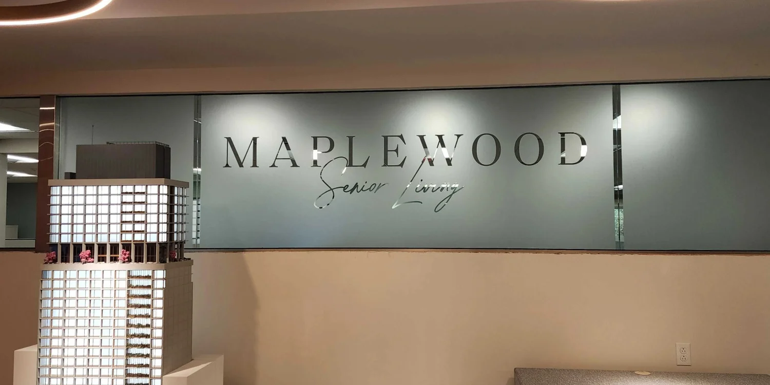
Window graphics and vinyl lettering transform storefront glass into branded advertising space. They can display logos, business hours, services, privacy films, and promotions. A balanced design maintains visibility while preserving natural light and an open storefront appearance.
Door Graphics and Decals
Door graphics and decals provide important entrance information, including logos, business hours, suite numbers, and accessibility details. They complement the primary storefront sign and should emphasize the most important information with clear, readable text.
Monument and Property Entrance Signs
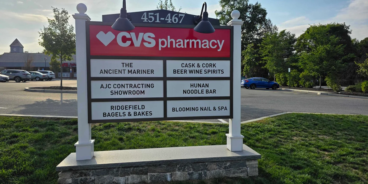
Monument signs identify businesses at property entrances, office parks, shopping centers, and medical campuses. They improve visibility for buildings set back from the road and can display one or multiple tenants with a clear hierarchy.
Post-and-Panel Signs
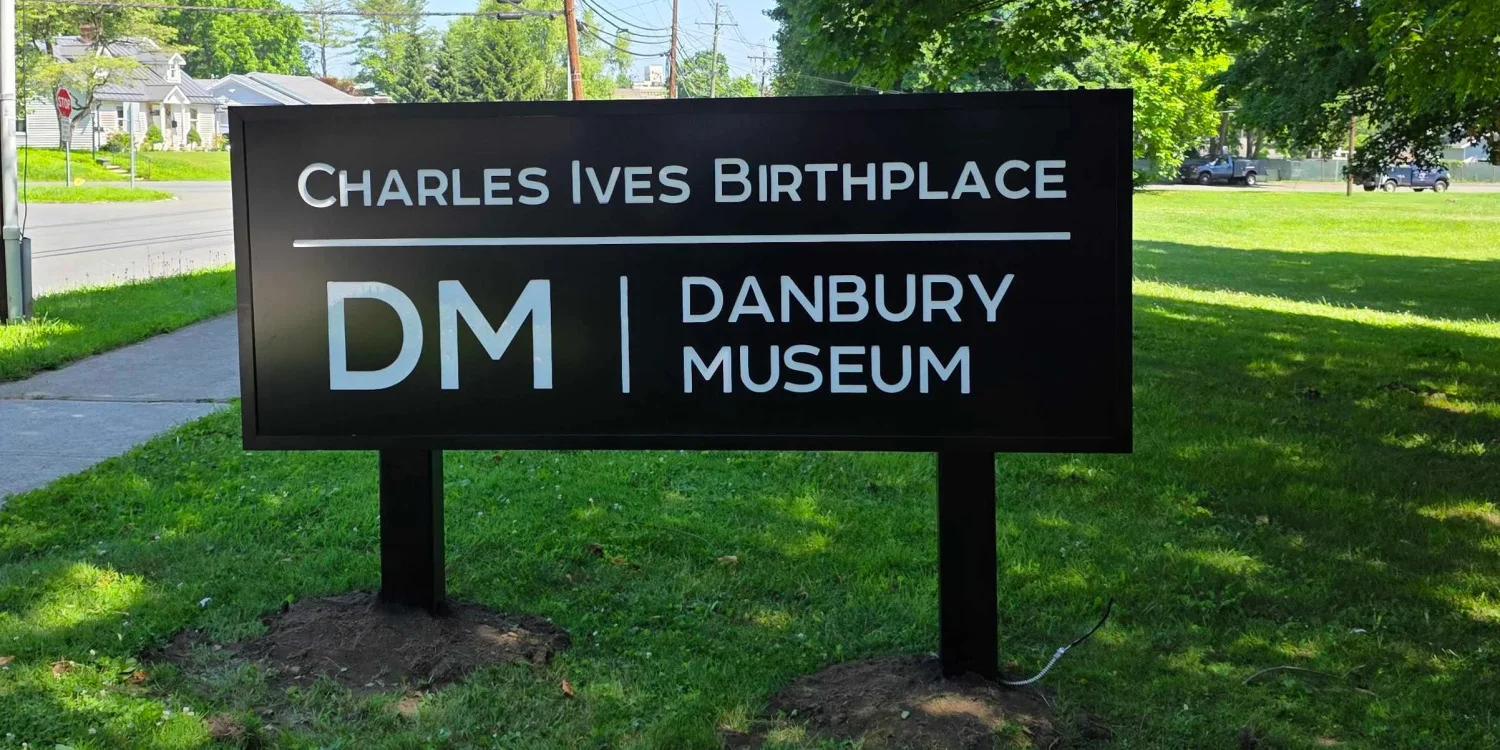
Post-and-panel signs use vertical posts to support a sign face and improve roadside visibility. They are commonly used for offices, commercial properties, and construction sites. Proper sizing and placement help maximize readability from a distance.
Temporary Banners
Temporary banners are ideal for grand openings, promotions, renovations, and special events. They provide flexible visibility without replacing permanent storefront signs. Keep the message short, mount the banner securely, and remove it after the promotion ends.

Which Materials Are Commonly Used for Storefront Signs?
Aluminum
Aluminum is a popular storefront sign material because it is lightweight, durable, and resistant to corrosion. It works well for many exterior sign applications and provides a clean, professional appearance.
Aluminum Composite Material (ACM)
ACM panels feature a lightweight core with aluminum surfaces, creating a smooth finish for printed graphics and branding. They are commonly used for flat panel storefront signs due to their durability and versatility.
Acrylic
Acrylic offers a polished, modern appearance and is often used for dimensional lettering, logo panels, and interior signage. Its smooth surface helps create crisp branding and a professional finish.
PVC
PVC is a lightweight material that can be fabricated into letters, logos, and sign panels. It is commonly selected for projects that require a clean appearance while remaining easy to customize.
High-Density Urethane (HDU)
HDU is a rigid material known for its ability to achieve textured and carved finishes. It is often chosen when businesses want a more decorative or architectural storefront sign.
Metal
Metal storefront signs provide a durable and professional look for many commercial properties. Different metal finishes can complement a variety of architectural styles while supporting long-term performance.
Vinyl Graphics
Vinyl graphics are applied directly to windows, doors, or sign panels to display logos, business information, and promotional messaging. They offer a flexible option for branding and can be updated as business needs change.
How to Choose the Right Storefront Sign
Choosing the right sign involves more than selecting a style that looks attractive. Use the following steps to match the sign to the site and customer experience.
Step 1: Identify the Main Viewing Direction
Determine where most customers first see the business. A wall sign works well when people face the storefront directly. A blade or hanging sign may work better when customers approach from the side.
Step 2: Measure the Viewing Distance
A sign viewed across a parking lot needs larger letters and fewer words than door graphics viewed from several feet away. Vehicle speed also affects how quickly the message must register.
Step 3: Review the Building
Evaluate the sign band, wall materials, windows, awnings, entrances, and nearby storefronts. The sign should fit the building’s proportions without covering important architectural features.
Step 4: Check Property and Local Requirements
Landlords, property managers, shopping centers, and municipalities may regulate sign size, placement, projection, color, and mounting. Review these requirements before finalizing the design.
Step 5: Simplify the Message
Most storefront signs should prioritize the business name and logo. A short descriptor may help when the name does not explain the service, but long lists of products, phone numbers, andpromotional claims reduce clarity.
Step 6: Compare Materials and Maintenance
Exterior signs face sunlight, moisture, temperature changes, dirt, and physical wear. Materials should match the location and expected exposure. Cleaning, access, component replacement, and long-term appearance also matter.
Step 7: Coordinate the Full Sign System
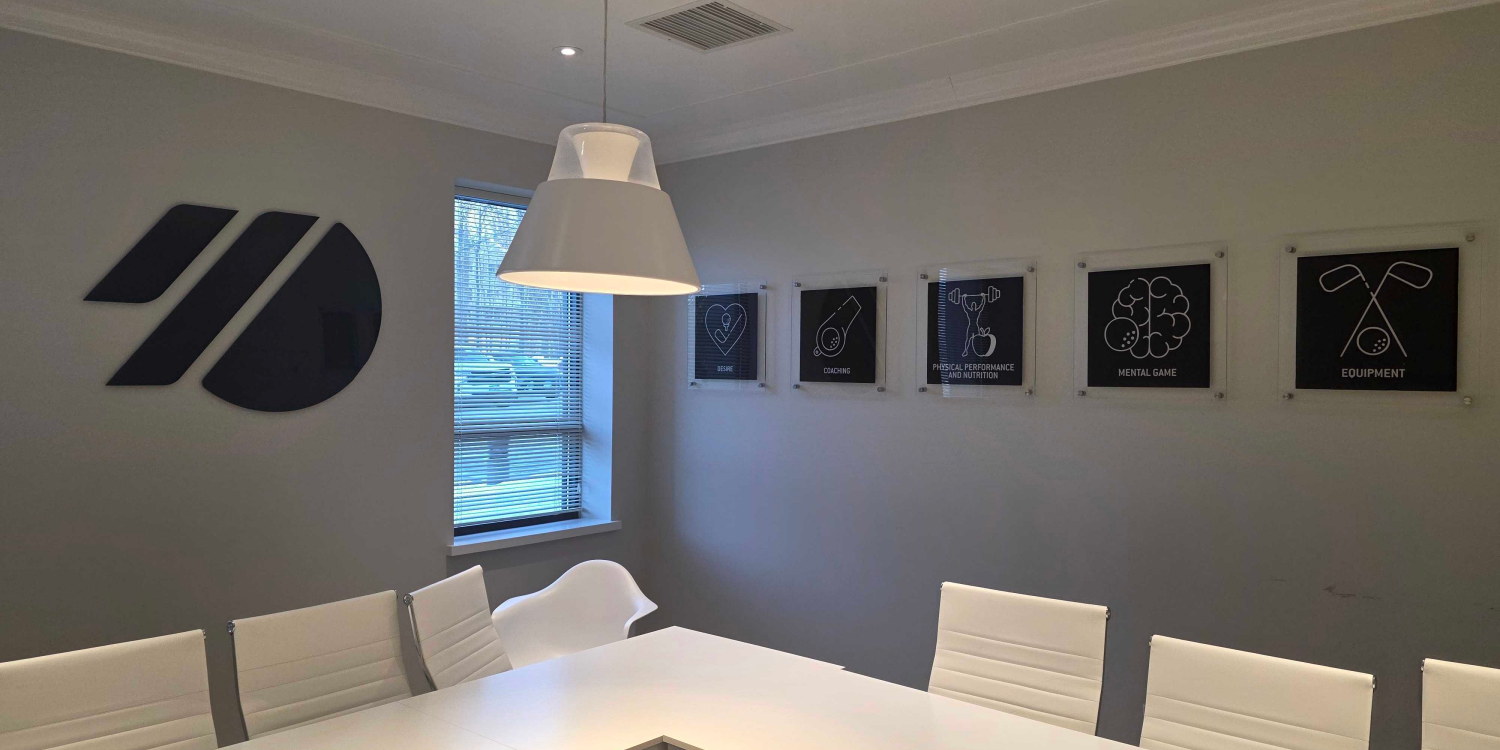
The main storefront sign should work with windows, doors, directional signs, parking signs, and interior branding. Consistent colors, typography, and logo use create a more unified customer experience.
What Should You Consider When Designing a Storefront Sign?
Prioritize Readability
Readability should guide every storefront sign design. Decorative fonts, thin letter strokes, low color contrast, and crowded layouts can reduce visibility and make the sign difficult to read from a distance.
Choose the Right Scale
A sign that looks balanced on a computer screen may appear too small once installed on a building. Accurate measurements and visual mockups help ensure the sign is appropriately sized for its viewing distance and location.
Use Strong Color Contrast
Color contrast should reinforce your brand while maintaining legibility. Light lettering typically stands out on dark backgrounds, while dark lettering is easier to read on light-colored surfaces.
Plan for Future Updates
Consider how your signage may need to change over time. Replaceable panels, modular components, and flexible window graphics make it easier to update branding, tenant information, or services without replacing the entire sign.
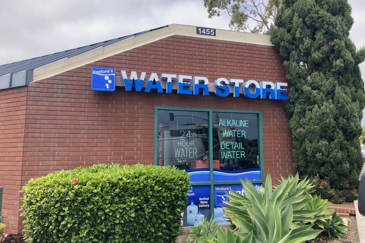
Which Design Mistakes Can Reduce Storefront Sign Visibility?
Adding Too Much Information
A storefront sign should communicate the most important information first. Limiting the message to the business name, logo, and a brief descriptor helps improve readability and overall appearance.
Choosing Low-Contrast Colors
Color combinations affect how easily customers can read a sign. Selecting colors with sufficient contrast helps the business name and branding remain more visible in different lighting conditions.
Using Hard-to-Read Fonts
Typography should remain clear from the intended viewing distance. Simple, well-spaced letterforms are generally easier to recognize than decorative or overly detailed fonts.
Overlooking Viewing Distance
The size of the sign and its lettering should reflect where customers will first see it. Considering viewing distance during the design process supports better visibility.
Making the Logo Too Dominant
A logo should complement the overall design without overpowering the business name. Maintaining a balanced layout helps create a storefront sign that is both attractive and easy to understand.
Mixing Inconsistent Branding
Storefront signs should align with the business's existing colors, typography, and visual identity. Consistent branding creates a more cohesive appearance across signs and marketing materials.
Ignoring Property Requirements
Many commercial properties have guidelines for storefront signage. Reviewing property standards and local requirements before finalizing a design can help prevent unnecessary revisions.
Frequently Asked Questions About Storefront Signs
What is the most common storefront sign?
Flat panel signs, dimensional letters, individual cut letters, window graphics, and projecting signs are all common. The right option depends on the building, viewing direction, brand style, and property requirements.
What information should appear on a storefront sign?
Most signs should feature the business name and logo. A short service descriptor may help when needed. Hours, contact details, and visitor information usually work better on doors or windows.
How large should a storefront sign be?
Size depends on viewing distance, facade dimensions, letter style, visual obstructions, and applicable rules. Signs intended for drivers need larger letters and simpler messages than signs intended for pedestrians.
Can a business use more than one storefront sign type?
Yes. Many businesses combine a primary building sign with door graphics, window lettering, directional signs, or a projecting sign. The elements should follow one coordinated visual system.
Do storefront signs require approval?
Many projects require approval from a landlord, property manager, shopping center, or municipality. Requirements vary, so businesses should confirm them before production and installation.
Plan Storefront Signs for Your Danbury, CT Business
The right storefront sign should make a business easier to find, recognize, and remember. Flat panels, dimensional letters, projecting signs, window graphics, awnings, banners, and property entrance signs each solve different visibility challenges.
For businesses in Danbury, CT, the best choice begins with the site. Viewing direction, distance, facade materials, property requirements, and brand style should shape the recommendation.
Signarama in Danbury helps businesses plan, design, produce, and install custom non-electrical signage for commercial spaces. Contact Signarama Danbury to discuss your signage needs, compare storefront sign options, and start your sign project.


Signarama Danbury, CT
contact
Signarama Danbury, CT