Signarama Santa Rosa, CA
Your local team for quality signs in Sonoma, Marin, Napa and Lake Counties


Preserving Tradition While Improving Visibility: A Monument Sign Transformation for VJB Cellars
Jul 6, 2026 by Matthew Vella
How a Monument Sign Refresh Helped a Sonoma Valley Destination Better Tell Its Story
In Sonoma Valley, a monument sign often serves as a guest's first introduction to a winery. Long before visitors enjoy a tasting flight, order a wood-fired pizza, or experience the hospitality that makes Wine Country special, they encounter a sign.
For destinations located along busy roadways, that first impression matters.
Recently, our team had the opportunity to work with VJB Cellars in Kenwood, California, on a monument sign renovation project that demonstrates how thoughtful design, premium materials, and strategic messaging can dramatically improve visibility while preserving the character of an established brand.
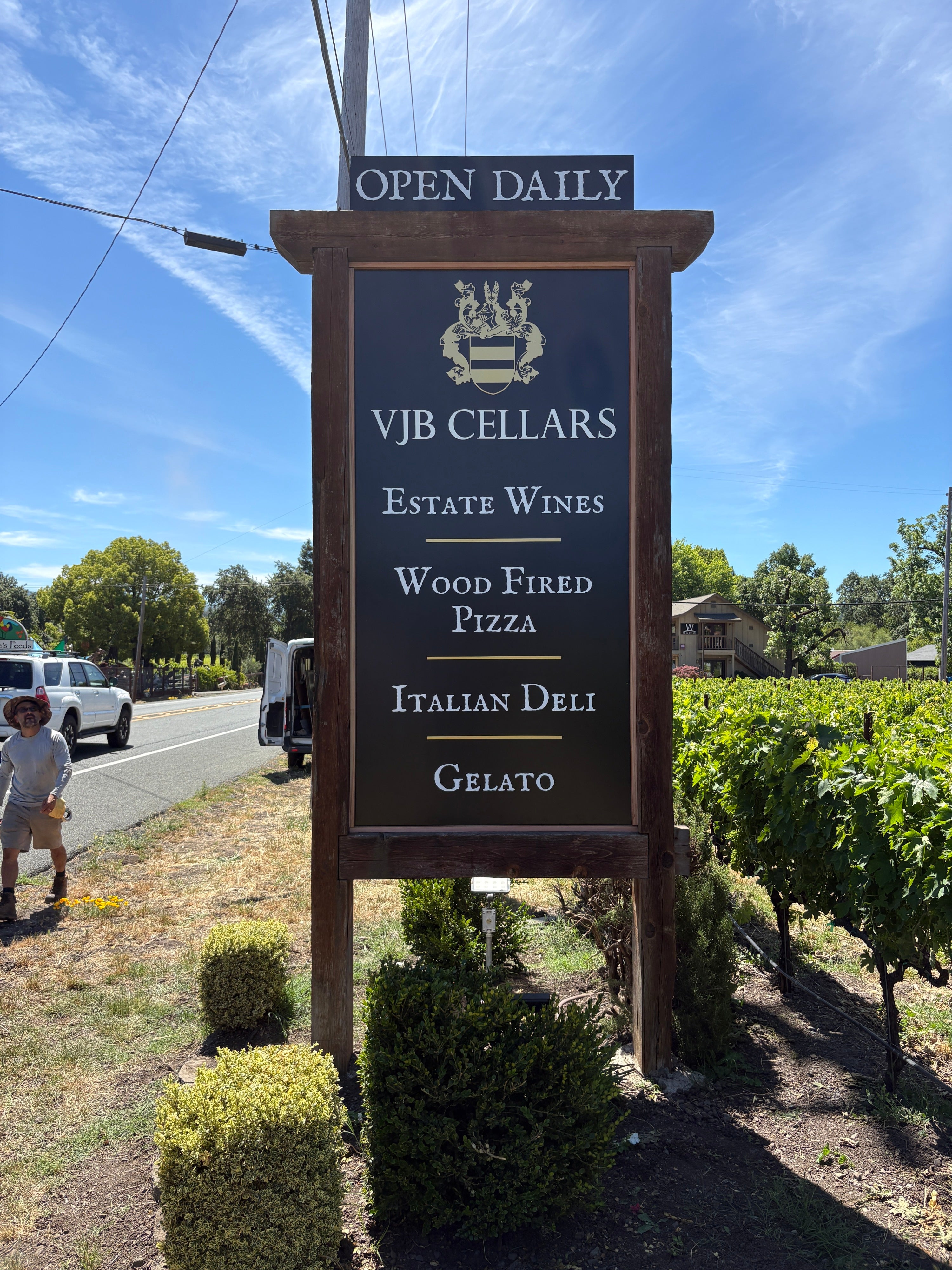
Rather than replacing the entire structure, we refreshed the existing monument sign by preserving the beautiful redwood frame and completely redesigning the sign faces. The result is a more elegant, readable, and durable monument sign that helps VJB Cellars stand out along Highway 12 while remaining true to the property's Italian-inspired heritage.
A Family Legacy Rooted in Italian Tradition
To understand the significance of this project, it helps to understand the story behind VJB Cellars.
VJB Cellars was founded by the Belmonte family as a tribute to Victor Joseph Belmonte. What began as a dream shared by brothers Henry and Victor eventually became one of Sonoma Valley's most recognizable Italian-inspired destinations.
Today, VJB Cellars offers far more than wine.
Visitors can enjoy:
Estate wines
Italian varietals
A traditional Italian deli
Wood-fired pizza
House-made gelato
A Tuscan-style villa experience
Family-centered hospitality
Every aspect of the property reflects the Belmonte family's commitment to sharing authentic Italian traditions with Sonoma Valley visitors.
That sense of authenticity was something we wanted to preserve throughout the monument sign redesign.
The Challenge: A Sign That Had Seen Better Days
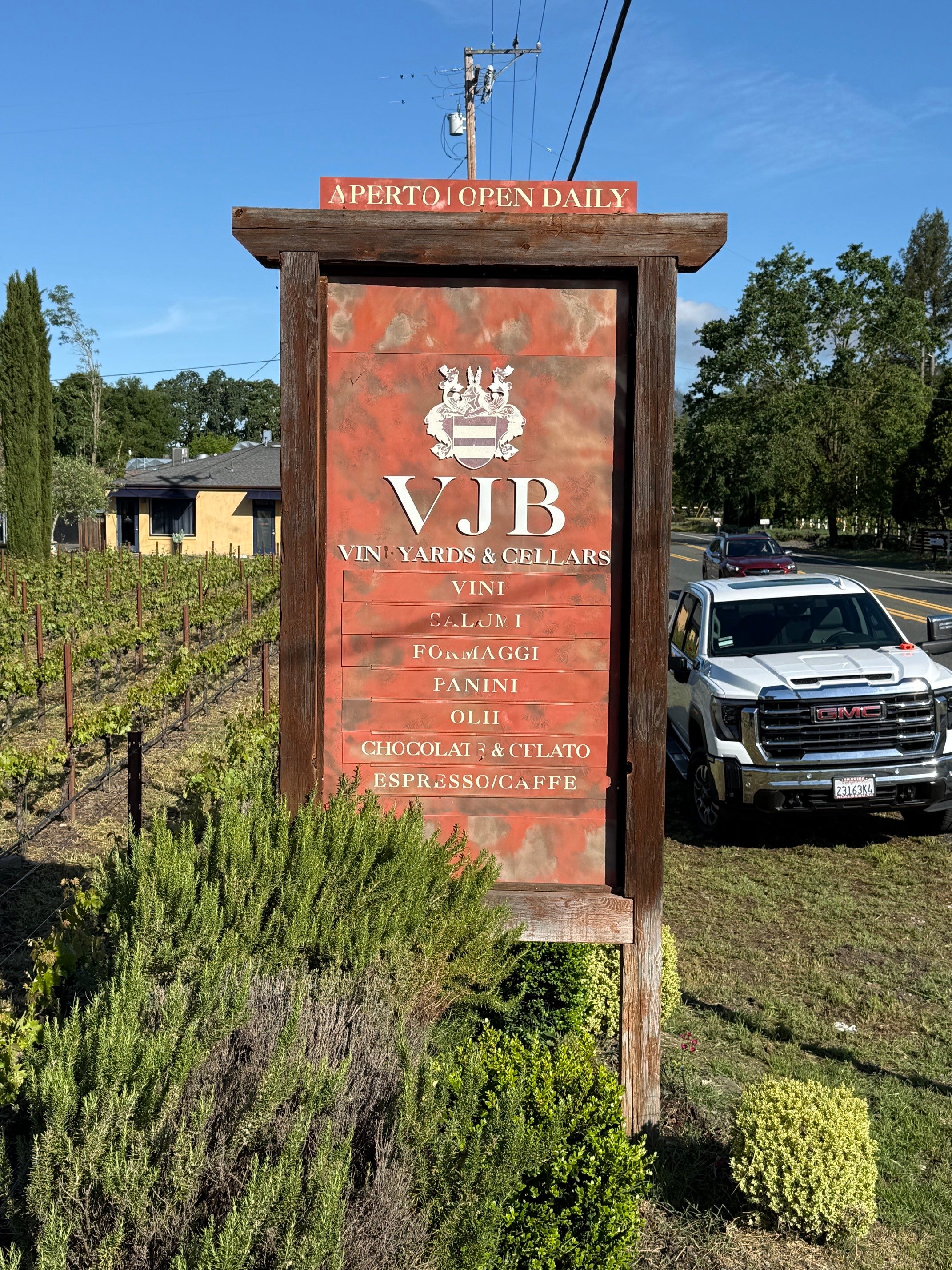
Like many outdoor signs in Sonoma County, the existing monument sign had spent years enduring intense UV exposure, seasonal weather changes, and constant visibility demands along Highway 12.
While the original sign had served the winery well for many years, several issues had become apparent.
The sign face showed signs of age and deterioration.
The graphics had become increasingly difficult to read.
Most importantly, the messaging had become difficult for passing motorists to process quickly.
The previous sign attempted to communicate numerous offerings individually, including wine, salumi, cheese, panini, oils, chocolate, gelato, and espresso.
While all of those products remain an important part of the VJB experience, the amount of information presented created a challenge for drivers traveling at highway speeds.
A monument sign only has a few seconds to communicate its message.
Every word matters.
Why Highway Visibility Matters for Winery Signage
VJB Cellars sits along Highway 12, one of Sonoma Valley's most traveled corridors.
Unlike signage located in a shopping center or pedestrian district, roadside winery signage must communicate quickly and effectively.
Drivers have limited time to absorb information.
Successful winery monument signs typically answer three questions:
Who are you?
What do you offer?
Why should I stop?
If those answers aren't communicated clearly, potential visitors may drive right past.
One of the primary goals of this project was improving readability and visual impact without sacrificing the property's distinctive character.
Preserving What Was Already Working
One of the biggest misconceptions about monument sign projects is that every aging sign requires complete replacement.
In reality, many monument sign structures remain perfectly functional even when the sign faces themselves have reached the end of their useful life.
At VJB Cellars, the existing redwood frame remained structurally sound and visually appropriate for the property.
The weathered timber structure contributed to the rustic Wine Country aesthetic that guests associate with Sonoma Valley.
Rather than discarding that character, we chose to preserve it.
By maintaining the existing monument structure, we were able to:
Preserve the property's established appearance
Reduce unnecessary waste
Streamline installation
Focus the investment on the most impactful improvements
Maintain the authentic Wine Country feel
This approach allowed us to modernize the sign while respecting the history and atmosphere of the property.
Simplifying the Message Without Losing the Experience
One of the most important aspects of effective monument sign design is hierarchy.
Not every piece of information deserves equal attention.
For the redesigned monument sign, we worked to simplify the messaging while highlighting the experiences most likely to resonate with visitors.
The updated sign now focuses on:
Estate Wines
Wood Fired Pizza
Italian Deli
Gelato
These four categories immediately communicate the essence of what makes VJB Cellars unique.
Instead of listing numerous individual products, the sign now tells a clearer story.
It invites curiosity.
It creates intrigue.
And most importantly, it helps passing motorists understand the experience waiting just beyond the vineyard rows.
This strategic simplification dramatically improves readability while reinforcing the property's identity.
Designing a More Elegant Monument Sign
While readability was a major objective, aesthetics were equally important.
The Belmonte family has created an environment that blends sophistication, hospitality, and tradition.
The monument sign needed to reflect those same values.
The redesign retained the winery's crest and branding while introducing a cleaner visual hierarchy and more refined presentation.
The dark background creates strong contrast.
The dimensional elements add depth.
The typography feels timeless rather than trendy.
Together, these elements create a sign that feels premium, approachable, and authentic to the VJB Cellars experience.
Material Selection for Long-Term Durability
In Sonoma County, material selection matters.
Outdoor signs are exposed to:
Intense UV radiation
Heat
Rain
Seasonal temperature fluctuations
Daily exposure to the elements
For this reason, premium materials were selected throughout the project.
The new sign faces were fabricated using durable matte black ACM (Aluminum Composite Material).
ACM has become one of the most trusted materials for monument signs because it offers:
Excellent durability
Resistance to warping
Weather resistance
Long-term dimensional stability
Professional appearance
To enhance the visual impact of the sign, we incorporated a custom 1/2-inch gold-painted acrylic crest and dimensional lettering.
These dimensional elements create depth and sophistication while helping the branding stand out against the dark background.
Premium exterior-grade vinyl graphics were also utilized to ensure long-term performance and color retention.
Together, these materials create a monument sign designed to withstand years of Wine Country weather while maintaining its appearance.
Custom Fabrication and Installation
The project included the fabrication of new double-sided sign faces measuring 48 inches by 96 inches.
Because the sign is visible from multiple directions along Highway 12, both sides needed to deliver the same level of impact and readability.
Our team handled the design, fabrication, production, and installation process to ensure consistency throughout the project.
The finished monument sign combines:
Existing redwood framing
Matte black ACM faces
Dimensional acrylic branding
Premium vinyl graphics
Double-sided visibility
The result is a monument sign that feels both timeless and contemporary.
The Finished Result
The transformation is immediately noticeable.
The refreshed monument sign now provides:
Improved visibility from Highway 12
Enhanced readability
Stronger brand presentation
Better message hierarchy
Long-term durability
Greater curb appeal
Most importantly, the sign now communicates the experience that has made VJB Cellars a beloved Sonoma Valley destination.
The redesign respects the property's history while positioning it for years of continued success.
Why Monument Sign Refreshes Are Often Better Than Complete Replacement
Many business owners assume an aging monument sign automatically requires complete replacement.
In many cases, that's not true.
If the existing structure remains sound, replacing the sign faces can often provide significant benefits while preserving existing architectural elements.
A monument sign refresh can:
Improve visibility
Update branding
Increase durability
Enhance curb appeal
Extend the life of existing structures
Reduce project costs compared to full replacement
For businesses with strong existing monument structures, a strategic refresh may provide the best return on investment.
Frequently Asked Questions About Monument Sign Renovations
Can a monument sign be refurbished instead of replaced?
Yes. If the structure remains in good condition, replacing sign faces and updating graphics can often deliver dramatic improvements without requiring complete replacement.
What causes monument signs to fade?
UV exposure, weather, age, and material deterioration can all contribute to fading and reduced visibility over time.
What is ACM and why is it used for monument signs?
Aluminum Composite Material (ACM) is a durable, weather-resistant substrate commonly used for outdoor signage because of its stability and longevity.
How long do monument signs typically last?
The lifespan varies based on materials, environment, and maintenance, but premium monument signs can remain effective for many years when properly constructed.
Why is readability important for roadside signs?
Drivers have only a few seconds to process information. Clear messaging and strong visual hierarchy improve comprehension and visibility.
What are the benefits of dimensional lettering?
Dimensional letters create depth, improve visual interest, and often increase visibility compared to flat graphics alone.
Are double-sided monument signs worth it?
Yes. Double-sided signs maximize visibility from multiple directions and increase exposure for businesses located along busy roadways.
How often should winery signage be updated?
There is no universal timeline, but businesses should evaluate signage whenever branding changes, visibility declines, or materials begin showing signs of deterioration.
What materials work best for winery monument signs?
Durable materials such as ACM, dimensional acrylic, aluminum, and premium exterior graphics are commonly used because they perform well in outdoor environments.
Is replacing sign faces more cost-effective than replacing an entire monument sign?
In many situations, yes. When the structure remains sound, updating the sign faces can provide a significant visual upgrade while preserving existing infrastructure.
Helping a Sonoma Valley Destination Tell Its Story
For VJB Cellars, this project was about more than replacing an old sign face.
It was about creating a monument sign that better reflects the experience guests will discover once they turn into the property.
By preserving the existing redwood structure, simplifying the messaging, utilizing premium materials, and improving visibility from Highway 12, the refreshed monument sign now serves as a stronger introduction to the hospitality, tradition, and Italian heritage that define VJB Cellars.
Sometimes the best sign projects aren't about starting over.
They're about honoring what makes a place special and finding a better way to share that story.


Signarama Santa Rosa, CA
contact
Signarama Santa Rosa, CA