
Custom Wayfinding Solutions in Santa Rosa, CA
May 11, 2026 by Matthew Vella
Custom Wayfinding Signs for Sonoma County Library: Helping Visitors Find Their Way with Professional Interior Signage
When someone walks into a public library, they should not have to stop, scan the room in confusion, and wonder where to go next. A library should feel open, welcoming, and easy to understand. Visitors may be looking for the reference desk, restrooms, self check-out, children’s books, public computers, meeting rooms, or a quiet place to read. Some are regular patrons who know the building well. Others are visiting for the first time. Some are in a hurry. Some are helping children. Some may be navigating in English, Spanish, or both.
That is where effective wayfinding signs become essential.
The Sonoma County Library needed custom interior signs that could be seen from a distance, installed at height, designed in their brand colors, and finished with a professional look. Their goal was not simply to add more signs to the building. They needed a clearer, more reliable wayfinding signage system that would help visitors move through the library with confidence.
To solve this challenge, we fabricated and installed a variety of dimensional lettering and blade signs throughout the space. These signs were designed to identify key destinations, improve visibility, support bilingual communication, and create a more consistent experience for library visitors.
The finished result is a polished interior signage solution that feels intentional, easy to read, and right at home in the library environment.
The Challenge: Making Important Library Areas Easier to Find
Libraries are no longer just rows of bookshelves and a checkout counter. Today’s public libraries are active community spaces. They offer research support, digital resources, self-service checkout, events, public programs, study areas, children’s sections, technology access, and more. With so many services in one building, clear library signs are not just helpful. They are part of the visitor experience.
For the Sonoma County Library, the main challenge was visibility. Important destinations needed to be easier to find from a distance and from different angles within the building. In a large public interior, signs have to compete with lighting, shelves, furniture, architectural features, bulletin boards, glass, posters, and people moving through the space. A sign that looks clear up close may disappear when viewed from across the room.
The library needed interior wayfinding signs that could rise above that visual noise.
The signs also needed to work at height. High-mounted signs are especially useful in busy public spaces because they can be seen over bookcases, counters, displays, and foot traffic. However, signs placed higher on a wall or suspended from a structure must be designed carefully. Letter size, contrast, color, orientation, and placement all affect readability.
Another important requirement was brand consistency. The new library signage needed to use the library’s brand colors and look professional within the existing interior. Public buildings often contain many different types of visual information, including temporary notices, flyers, safety labels, posters, printed announcements, and room signs. Permanent wayfinding signage needs to stand apart from that clutter while still feeling like it belongs to the building.
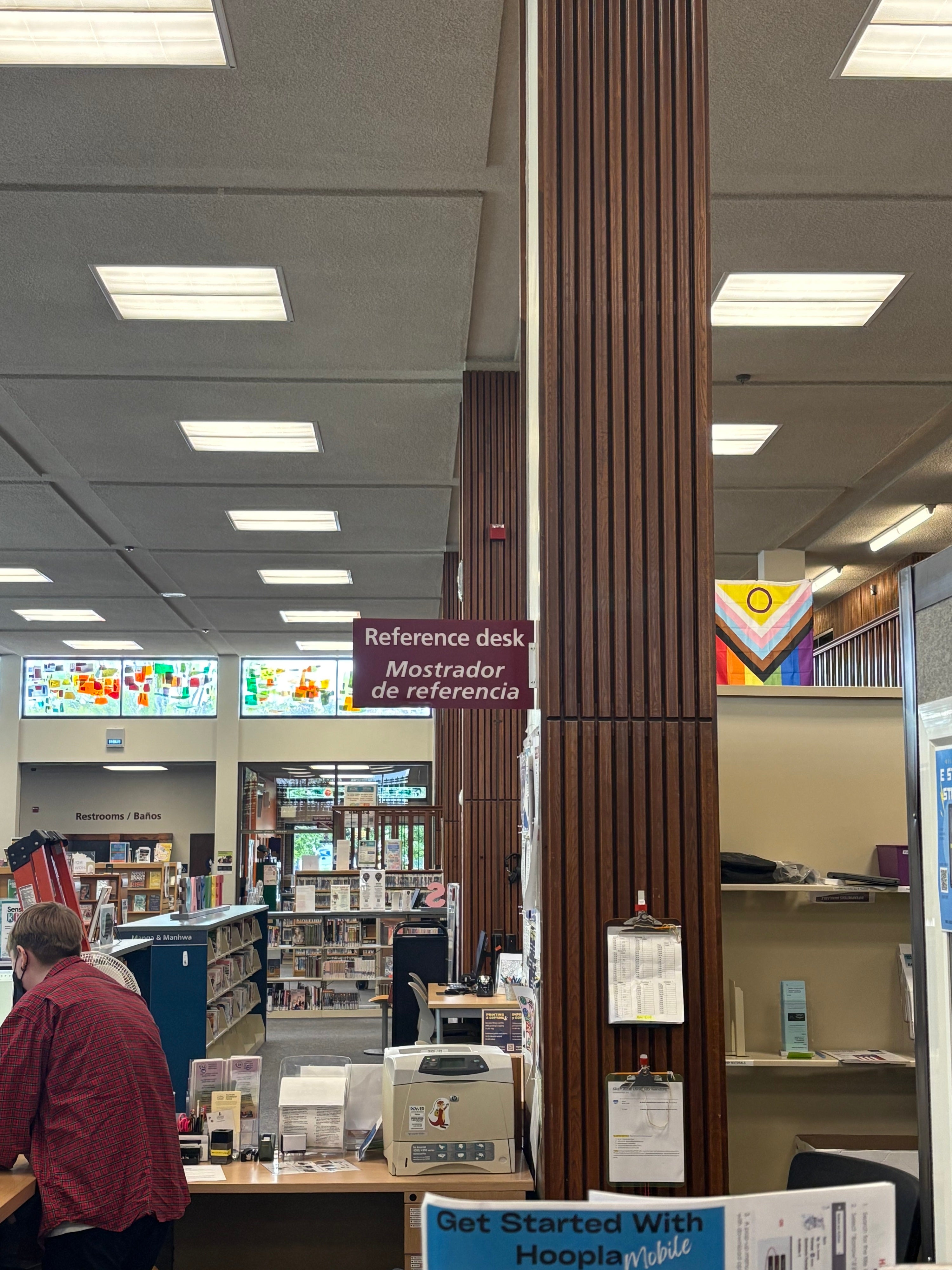
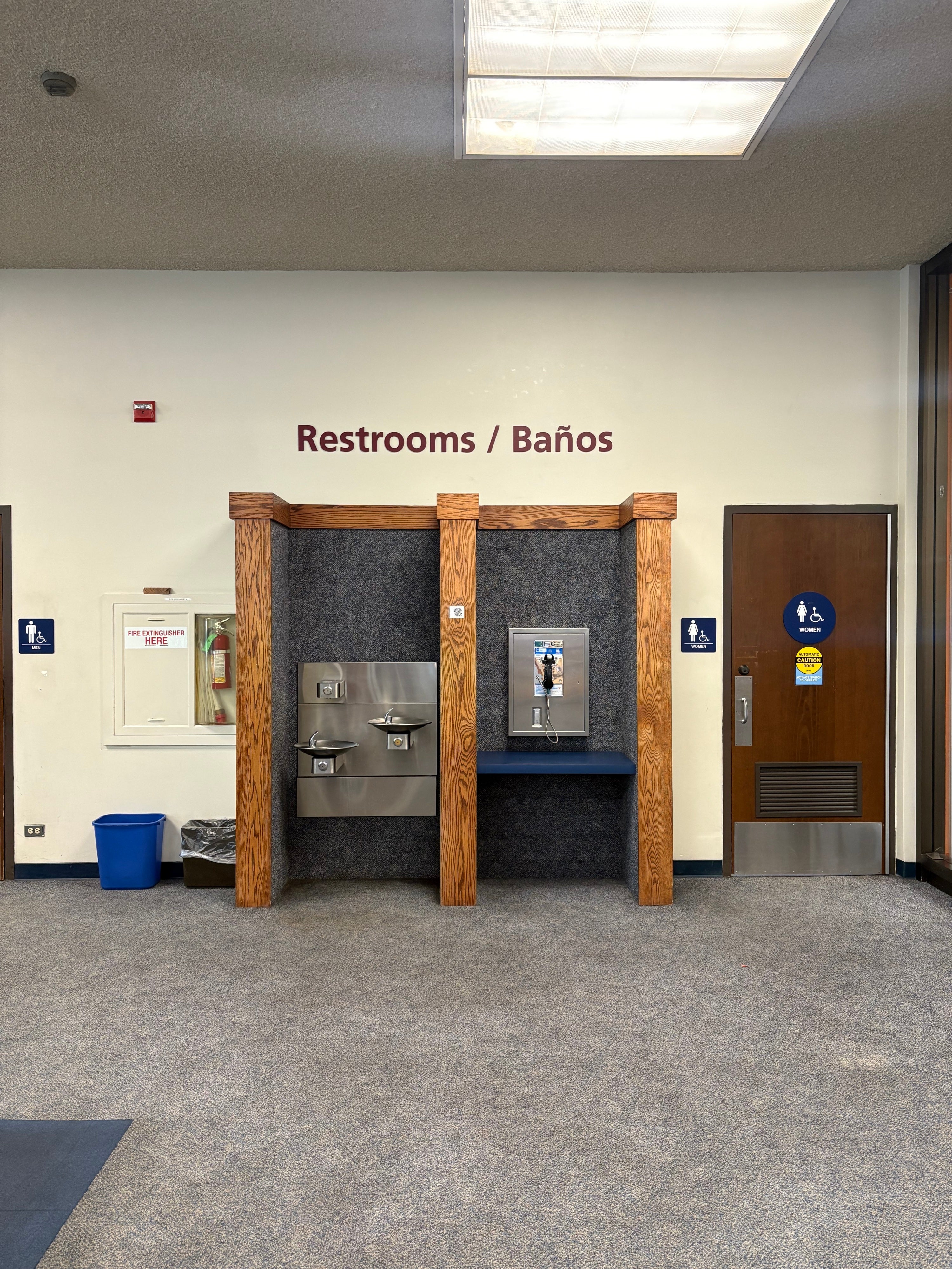
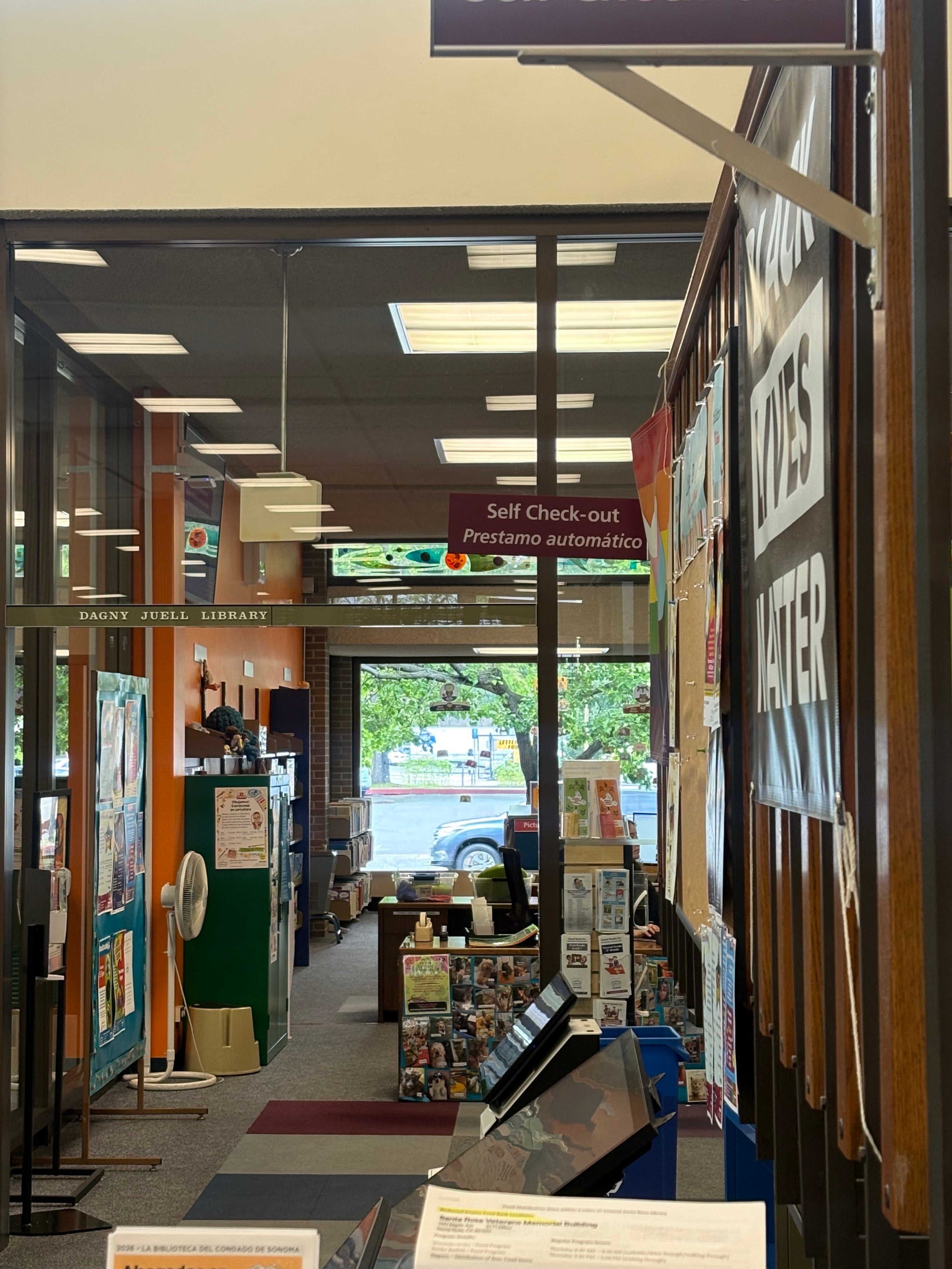
The Sonoma County Library also serves a diverse community, so bilingual signage was an important part of the project. Clear English and Spanish text helps more visitors navigate the space independently. Signs like “Reference desk / Mostrador de referencia,” “Restrooms / Baños,” and “Self Check-out / Préstamo automático” make key services easier to understand and locate.
The problem was not simply that the library needed signs. The problem was that the library needed custom wayfinding signs that were visible, branded, bilingual, durable, professional, and strategically placed.
The Solution: A Custom Interior Signage System Built for Visibility
To help solve the library’s wayfinding challenge, we created a combination of dimensional lettering and blade signs. This gave the space a layered signage system, with different sign types serving different navigation needs.
Dimensional lettering was used to clearly identify important destinations on the wall. Dimensional letters give a space a more finished, architectural look than flat printed graphics. They add depth, shadow, and permanence while keeping the message clean and direct. For a location like the restrooms, dimensional lettering was an ideal solution because it created a strong destination marker that visitors could see before reaching the doors.
Blade signs were used to improve visibility from multiple directions. A blade sign projects outward from a wall, column, or other mounting surface, making it easier to see while walking through a space. This is especially useful in libraries, schools, offices, hospitals, and other public buildings where people approach service areas from different angles.
For the Sonoma County Library, blade signs helped identify key areas such as the reference desk and self check-out station. These are high-traffic destinations where visitors often need quick visual confirmation. By installing blade signage at height, we helped make these areas easier to spot from farther away.
Together, the dimensional lettering and blade signs created a more complete wayfinding system. Visitors walking directly toward a destination can read the wall-mounted dimensional letters. Visitors moving through the library at an angle can see the projecting blade signs. Visitors scanning the room from a distance can identify high-mounted signs more easily. The result is interior signage that supports the way people actually move through a public space.
Why Distance Visibility Matters in Wayfinding Signage
A wayfinding sign only works if people can see it when they need it.
In a library, visitors often make decisions from across the room. They may pause near the entrance and look for the reference desk. They may need to find the restroom quickly. They may be returning materials, checking out books, asking for help, or looking for a specific area. In those moments, clear library signs reduce hesitation and help people move naturally through the building.
For this project, distance visibility was one of the most important goals. The signs needed to stand out without overpowering the space. They needed enough contrast to be readable against the surrounding walls, wood, glass, and shelving. They also needed to be large enough and high enough to remain visible above furniture, displays, and foot traffic.
The reference desk sign is a strong example of this approach. Mounted high and projecting from the surrounding structure, the blade sign can be seen from across the library floor. The sign’s brand color helps it separate visually from the wood column and surrounding interior details. The bilingual text is clear, direct, and easy to recognize as official library wayfinding signage.
The restroom dimensional lettering serves a similar purpose in a different way. Installed above the restroom area, the large wall lettering makes the destination easy to identify from a distance. It provides a clean visual anchor without adding unnecessary clutter to the wall.
Good distance visibility improves more than navigation. It also improves confidence. Visitors do not want to feel lost in a public building. They want to know where they are going and feel comfortable moving through the space. Custom wayfinding signs help provide that quiet reassurance.
Brand Colors Create Consistency and Professionalism
One of the most important parts of this signage project was making sure the signs matched the library’s visual identity. The Sonoma County Library needed branded interior signage that looked professional and consistent throughout the building.
Brand colors play a major role in wayfinding. When signs use a consistent color palette, visitors begin to recognize them as part of the same system. Once someone sees one maroon-toned library sign identifying a service area, they can more easily spot similar signs elsewhere in the building. This creates a visual rhythm that helps visitors process information quickly.
Consistency also helps separate permanent wayfinding signage from temporary notices, posters, flyers, and other visual distractions. In a library, there is often a lot to look at. Bulletin boards, event announcements, book displays, safety information, and community notices all compete for attention. Branded wayfinding signs need to be clear enough to stand out as navigational tools.
The signs we fabricated for Sonoma County Library use the library’s brand colors in a way that is visible but not overwhelming. They feel integrated into the environment while still drawing attention to key destinations. This balance is important. Effective interior signs should be noticeable, but they should not make the space feel crowded or chaotic.
A professional wayfinding system should feel like part of the building’s design. For this project, the brand-colored blade signs and dimensional lettering helped create that sense of intention.
Dimensional Lettering Adds a Clean, Permanent Look
Dimensional lettering is one of the best options for professional interior signs because it gives a wall depth and presence. Instead of relying on a flat panel or printed paper sign, dimensional letters are fabricated as individual elements and installed directly onto the surface. This creates a crisp, finished appearance.
For the Sonoma County Library, dimensional lettering was used for the restroom area. The “Restrooms / Baños” sign is simple, readable, and placed where visitors can see it easily. The lettering adds a polished look while making the destination clear.
Dimensional letters are especially effective for permanent destinations like restrooms, reception areas, departments, meeting rooms, lobby walls, and service counters. They can be fabricated in different sizes, colors, and finishes to match the building’s style. In this case, the color connects the lettering to the rest of the library signage system.
The dimensional wall letters also work well with the other signs in the area. Smaller accessibility signs remain near the restroom doors, while the larger dimensional lettering provides the primary destination identification. This creates a smart hierarchy. The large sign tells visitors they have found the restroom area. The smaller signs provide specific room and accessibility details once they arrive.
That kind of sign hierarchy is a key part of effective interior wayfinding signage. Every sign should have a job, and the most important information should be the easiest to see first.
Blade Signs Improve Navigation from Multiple Angles
Blade signs are a powerful option for wayfinding because they are designed to be seen from the side. Unlike flat wall signs, which are easiest to read when someone is standing in front of them, blade signs project outward and catch attention as people move through a space.
This makes blade signage especially valuable in libraries and other public buildings. Visitors rarely approach every destination from a straight-on angle. They move through aisles, past shelves, around counters, through glass partitions, and across open areas. A projecting sign can help guide them before they reach the exact location.
At Sonoma County Library, the blade signs help identify important service areas from a distance. The reference desk sign is mounted high above the service area, making it visible from different points in the library. The self check-out blade sign helps visitors locate a key service point even in a visually busy area with glass, reflections, posters, displays, and equipment.
The advantage of a blade sign is that it can serve multiple sightlines at once. One well-placed blade sign can guide people approaching from different directions, reducing the need for several additional wall signs. That keeps the space cleaner and more organized.
For this project, the blade signs also reinforced the library’s brand. The consistent color, professional finish, and bilingual messaging helped create a unified wayfinding signage system across multiple areas of the building.
Bilingual Library Signs Help Serve the Whole Community
Public libraries serve everyone. That is why bilingual signage can be such an important part of an effective wayfinding system.
The Sonoma County Library signs include both English and Spanish, helping more visitors understand and navigate the space independently. This is especially important for high-use destinations like restrooms, reference services, and self check-out. These are areas people may need to find quickly and confidently.
Bilingual wayfinding signs are not only practical. They also help create a more welcoming environment. When visitors see their language represented in permanent interior signage, it sends a message that the space was designed with them in mind.
For bilingual signage to work well, layout matters. The text needs to be readable and organized. The hierarchy should be clear. The sign should not feel crowded. On this project, the English and Spanish wording is arranged in a straightforward way, allowing visitors to quickly understand the message.
The result is library signage that is more inclusive, more useful, and better suited to the community it serves.
Fabrication and Installation Make the Difference
A successful signage project depends on more than design. Fabrication and installation are just as important.
For Sonoma County Library, we fabricated the custom signs and installed them in the finished space. That meant paying attention to materials, color, scale, mounting methods, alignment, spacing, and visibility. Each sign needed to look professional up close while also performing well from a distance.
Dimensional lettering requires precision. The letters need to be cut cleanly, finished consistently, and installed with accurate spacing. Even small alignment issues can make dimensional letters look unfinished. When done correctly, dimensional lettering gives a space a refined, permanent appearance.
Blade signs require their own planning. Since they project from a mounting surface, the sign panel, bracket, weight, placement, and viewing angle all matter. A blade sign must be secure, durable, and attractive from more than one side. It also needs to be positioned so it improves navigation without interfering with building operations or sightlines.
Installation is where the wayfinding strategy becomes real. A sign can be beautifully fabricated, but if it is placed too low, too high, too far from the decision point, or in a visually crowded area, it may not solve the problem. For this library signage project, placement was a key part of the final result.
The signs were installed where visitors would need them most. The reference desk sign helps people identify a central service point. The restroom dimensional lettering marks a necessary destination clearly. The self check-out blade sign helps visitors locate an important service area. Each sign supports a specific moment in the visitor journey.
Better Signs Create a Better Visitor Experience
The finished wayfinding signs help make the Sonoma County Library easier to navigate. Visitors can identify important areas more quickly. Staff may receive fewer basic directional questions. The interior feels more organized and professional. The bilingual signs support a broader range of visitors. The brand colors create consistency across the space.
That is the real value of custom wayfinding signage.
Good signs do more than label rooms. They shape how people experience a building. They reduce uncertainty. They create a sense of order. They help visitors feel comfortable and capable. In public spaces, that matters.
For a library, clear interior signs can support every kind of visit. A parent can find the restroom faster. A student can locate self check-out. A first-time visitor can identify the reference desk. A Spanish-speaking patron can navigate key destinations with more confidence. Staff can focus on deeper service instead of repeatedly answering basic directional questions.
These are small improvements that add up to a smoother, more welcoming environment.
Custom Library Signage for Public Spaces
Every public space has its own navigation challenges. Libraries, schools, city buildings, hospitals, offices, campuses, and community centers all need signs that fit the way people actually use the environment.
For Sonoma County Library, the right solution was a mix of dimensional lettering and blade signs. Other spaces may need wall signs, directories, ADA signs, window graphics, hanging signs, room identification signs, or exterior signs. The best signage system depends on the building, the audience, the viewing distance, the brand, and the problem that needs to be solved.
That is why custom signage is so valuable. Off-the-shelf signs may identify a room, but they rarely address the full wayfinding experience. Custom interior signs can be designed for the exact location, using the right colors, scale, materials, language, and mounting method.
For this project, the signs needed to be visible from a distance, mounted at height, aligned with the Sonoma County Library brand, and professional enough for a busy public setting. By fabricating and installing custom wayfinding signs for those specific needs, we helped create a clearer and more polished library environment.
A Clearer Way Forward
The Sonoma County Library came to us with a practical problem: visitors needed signs that were easier to see, easier to understand, and more consistent with the library’s brand. The solution was a custom interior signage system using dimensional lettering and blade signs.
The completed signs now help guide visitors to important destinations throughout the library, including the reference desk, restrooms, and self check-out area. They are visible from a distance, installed at height, designed in brand colors, and finished with a clean, professional appearance.
This project is a strong example of how thoughtful wayfinding signage can improve a public space. The signs do not just decorate the library. They help the building work better.
When signs are designed, fabricated, and installed with purpose, they become part of the visitor experience. They guide people quietly and clearly. They make spaces easier to understand. They help organizations look more professional. Most importantly, they help people feel welcome from the moment they walk in.


Signarama Santa Rosa, CA
Contact
Signarama Santa Rosa, CA








Contact Us
Contact the team at Signarama Santa Rosa, CA
707-523-0606Signarama Santa Rosa, CA915 Piner Rd Ste C Santa Rosa California 95403
Follow Us
Select your country:
About Signarama
With the latest technologies and a wide range of available materials, there really is no end of choice and quality in the manufacturing of Signarama Signage. Images and logos belong to their owners and do not imply Signarama’s endorsement—shown only as examples of our work. Visit our corporate section to see more about: