

What Makes a Car Wrap Readable in 3 Seconds? A Design Guide for Danbury Service Businesses
Oct 7, 2026 by Signarama Danbury
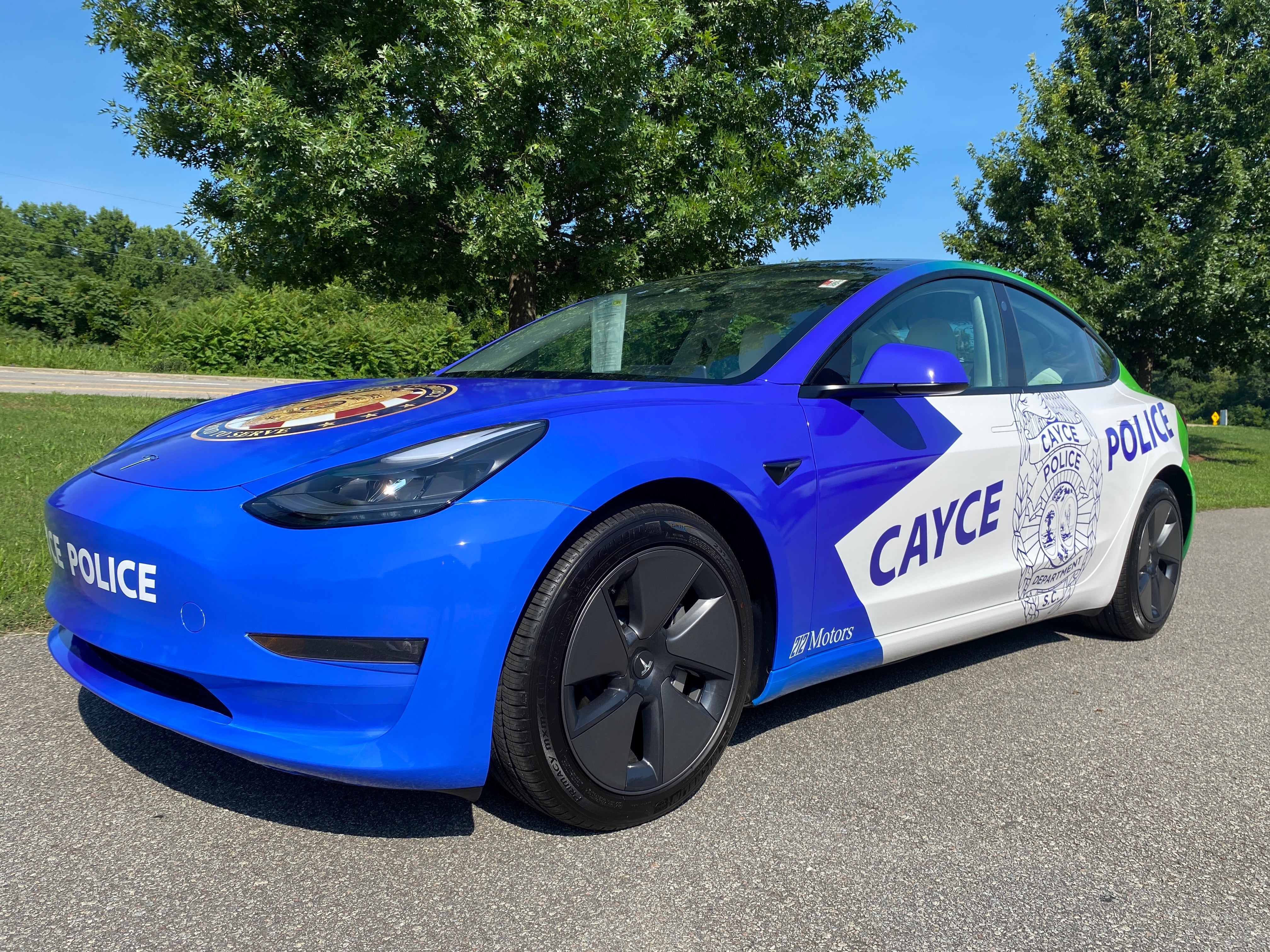
A service vehicle can pass a potential customer in seconds. That short window is the real design test for a car wrap. If the viewer cannot identify the company, understand what it does, and remember how to find it before the vehicle moves on, the wrap may look polished while still underperforming as advertising.
What Should Someone Understand From a Car Wrap in 3 Seconds?
In a short viewing window, a person should ideally be able to answer three questions: Who is this business? What does it do? How can I find or contact it later?
That means the primary content on most commercial vehicle graphics should follow this order:
Business name or logo
Core service or service category
Phone number, website, or another simple response path
Supporting details only if they remain easy to read
When every line is large, bold, colorful, and urgent, nothing feels important. Effective wrap readability comes from giving the eye a clear path through the design.
Start With Message Hierarchy, Not Decoration
The first design decision should be what viewers need to notice first, second, and third. Color, imagery, patterns, and special effects come after that decision.
A simple hierarchy for a Danbury service vehicle might look like this:
First: Make the Business Identity Unmistakable
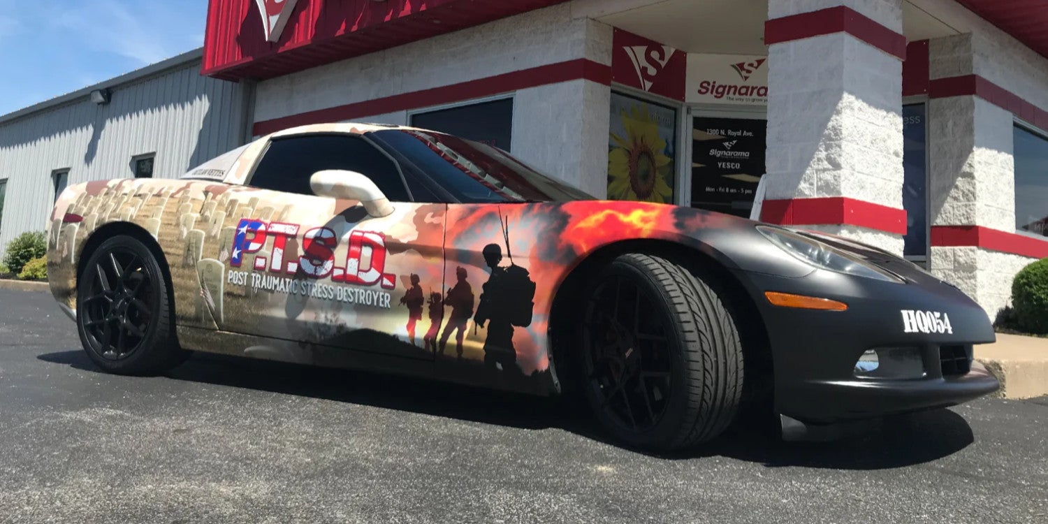
The business name or logo should be one of the fastest elements to recognize. It needs enough size, contrast, and open space around it to remain clear on a moving vehicle.
A detailed logo may need a simplified arrangement for vehicle use. Small taglines, thin outlines, tiny registration marks, or intricate icon details can disappear from normal viewing distances. The goal is not to redesign the brand. It is to reproduce the brand in a form that works on a large, moving surface.
Second: State the Service Clearly
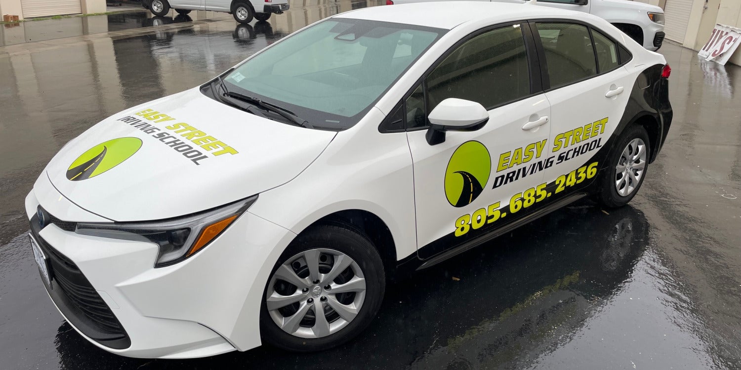
Do not force viewers to infer what the company does from a clever slogan. Use a direct service descriptor such as “HVAC,” “Landscaping,” “Roofing,” “Cleaning,” or “Pest Control” when the business name alone does not make the service obvious.
For companies with many offerings, choose a broad category or two high-value services rather than a long menu. The vehicle should create recognition, not function as a complete service page.
Third: Provide One Easy Next Step
A phone number or short website address is usually more useful than several competing calls to action. If the business has a memorable domain, it may be easier to process than a phone number at speed. If local customers primarily call for urgent service, the phone number may deserve greater emphasis.
Avoid making the viewer choose among a phone number, email address, five social media icons, a QR code, a physical address, and multiple web pages. Every additional response option consumes visual space and attention.
How Contrast Affects Wrap Readability
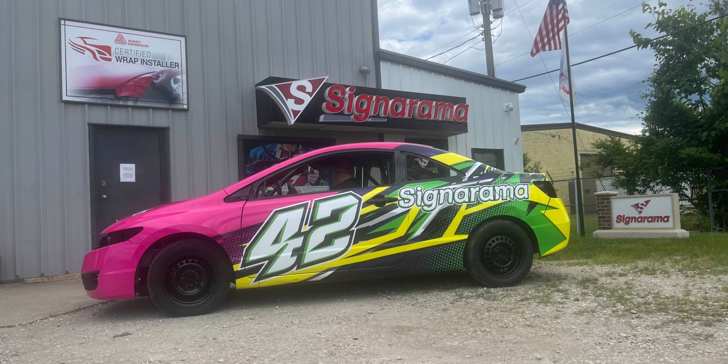
Contrast determines whether letters separate clearly from the background. Strong contrast helps the eye identify words quickly, especially when the vehicle is moving or seen from across a parking lot.
Dark lettering on a light field and light lettering on a dark field are dependable starting points. Problems often appear when a designer places text over photographs, gradients, textured backgrounds, or graphics with similar brightness levels.
For example, white lettering can disappear over a bright sky in a background image. Blue lettering can lose clarity over dark blue vehicle graphics. Thin gray copy may look elegant on a monitor but become difficult to read outdoors.
A practical test is to step back from the design or view it at a reduced size. If the core message becomes hard to separate from the background, the contrast needs work.
Whitespace Is Functional, Not Wasted Space
Vehicle wraps often become cluttered because businesses want to use every available inch. That usually reduces readability.
Whitespace is the open area around text, logos, and major graphics. It gives each element room to stand apart from the next one. On a car wrap, whitespace can also help prevent important content from colliding with door handles, wheel arches, body seams, windows, fuel doors, and other vehicle features.
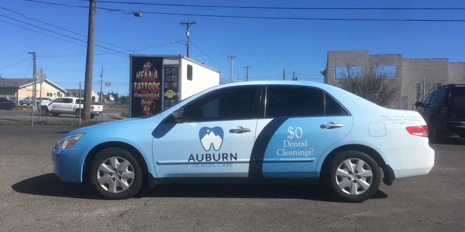
A clean side panel with a logo, service line, and contact point can be more effective than a panel packed with services and promotional claims.
Design for Viewing Distance and Vehicle Movement
Commercial vehicle graphics are rarely viewed under ideal conditions. A customer may see the van from two lanes away, from the opposite side of a parking lot, or at an angle while the vehicle turns through an intersection.
Federal Highway Administration sign research highlights the importance of legibility, letter size, contrast, and recognition time. A vehicle wrap is not a traffic-control sign, but the same human-factors principle applies: more distance and motion demand simpler, larger information.
This is why tiny body copy rarely belongs on the main advertising surfaces of a work vehicle. If legal or operational information must appear, place it where it does not compete with the primary marketing message.
Designers should also consider the vehicle’s actual shape. A message that looks balanced on a flat proof can be interrupted by sliding doors, windows, handles, bumpers, curves, and wheel wells. Critical words should not split across moving panels or wrap around corners where they become hard to read from a normal angle.
How to Build a 3-Second Car Wrap: 7 Steps
1. Define the One Message the Vehicle Must Communicate
Write the most important idea in a single sentence. For example, "This is a Danbury HVAC company that homeowners can call for heating and cooling service.” That statement helps determine what deserves visual priority.
2. Choose the Primary Identity Element
Decide whether the logo, business name, or a combined brand lockup should lead. Make it large enough to remain recognizable from realistic viewing distances.
3. Add a Direct Service Descriptor
Use short, familiar language. “Heating & Cooling” will usually communicate faster than a vague phrase such as “Comfort Solutions for Every Season.”
4. Select One Primary Contact Method
Choose the phone number or website that best matches how customers typically respond. Make it easy to read and avoid unnecessary prefixes or extra wording.
5. Remove Nonessential Copy
Review every remaining element and ask whether it helps someone identify, understand, or remember the business within a few seconds. If not, consider removing it or reducing its prominence.
6. Test the Design at Small Scale and From a Distance
Shrink the proof on screen, step several feet away, and look at it for only a few seconds. Ask what you remembered. If the answer is mostly decorative elements rather than the business name and service, revise the hierarchy.
7. Check Every Vehicle Side Separately
The driver side, passenger side, rear, and front are different advertising surfaces. A strong side design may not translate directly to the rear doors. Review each view based on how people will encounter it in traffic, parking areas, and job-site settings.
Common Car Wrap Design Mistakes That Reduce Readability
The most common problem is too much information. Long service lists, multiple certifications, full addresses, several phone numbers, social icons, and promotions all compete for attention.
Another mistake is using fonts that are too thin, condensed, decorative, or tightly spaced. Essential copy should favor readability over novelty. Low-contrast color combinations create similar problems.
Brand colors can still be preserved by adjusting backgrounds, outlines, spacing, or placement.
Imagery should also support the message rather than become the only thing viewers remember.
What Should Go on the Rear of a Service Vehicle?
The rear of a van, truck, or SUV deserves special attention because drivers may see it while stopped behind the vehicle. That can provide a longer viewing window than a side-by-side pass.
The rear can support a phone number, website, service line, or short call to action, but it should still remain uncluttered. Door seams, handles, windows, hinges, and license-plate areas can break up text, so the layout must account for those features.
When Is a QR Code Appropriate on Commercial Vehicle Graphics?
A QR code can work when the vehicle is likely to be parked and viewed by pedestrians. It is much less useful as the main response tool for people seeing the vehicle in motion.
If a QR code is included, treat it as secondary information. Keep the phone number or web address readable without requiring the viewer to scan anything. The primary wrap should still communicate the business identity and service on its own.
Frequently Asked Questions
How much text should a car wrap have?
There is no universal word limit, but less is usually better for moving vehicles. Prioritize the business name, service category, and one contact method. Add supporting text only when it remains easy to read without reducing the prominence of those primary elements.
Should a phone number or website be larger?
Choose based on customer behavior and memorability. Emergency-oriented service companies may benefit from a prominent phone number. Businesses with a short, memorable domain may prefer the website. Whichever option is primary should receive more visual weight.
Are photos good for vehicle wraps?
They can be, especially when an image quickly communicates the service. However, photos should not reduce text contrast or make the layout visually busy. Simple imagery usually works better than complex photo collages.
Should every side of the vehicle have the same design?
The branding should be consistent, but the layout may need to adapt to each surface. Door openings, windows, wheel wells, and vehicle proportions affect where important information can sit. Consistency comes from shared brand elements and message hierarchy, not from forcing an identical layout onto every panel.
How can a business tell whether a wrap design is readable before production?
Review proofs at reduced scale, test them from a distance, and limit viewing time to a few seconds. Check whether independent viewers can recall the business name, service, and contact path. Also inspect mockups for interruptions from doors, handles, seams, and body contours.
Plan a Readable Car Wrap for Your Danbury, CT Business
A successful car wrap does not ask viewers to study it. It helps them recognize the company quickly, understand the service, and remember what to do next. Strong commercial vehicle graphics achieve that through disciplined message hierarchy, clear typography, strong contrast, useful whitespace, and layouts designed for real viewing conditions.
For service businesses in Danbury, CT, those choices can make the difference between a vehicle that simply looks branded and one that communicates clearly while it works throughout the day.
If you are planning a new wrap or updating an existing fleet design, Signarama can help you organize the message, adapt the graphics to the vehicle, and prepare a design built for practical visibility.


Signarama Danbury, CT
contact
Signarama Danbury, CT