

Trade Show Booth Graphics for Danbury Businesses Preparing for Expos and Conferences
Aug 14, 2026 by Signarama Danbury

A trade show booth has only a few seconds to answer three questions: Who is this company? What does it offer? Why should an attendee stop? Strong graphics make those answers visible before a staff member begins a conversation. Weak graphics force people to study the booth, and most visitors will keep walking instead.
For Danbury businesses, the right display system should fit the assigned booth, travel safely, support the sales team, and remain useful across future expos, conferences, recruiting fairs, and industry gatherings. That requires more planning than placing a logo on a large backdrop.
Why Trade Show Graphics Need a Booth-Specific Strategy
General event signage helps people navigate a venue or recognize sponsors. Trade show booth graphics serve a narrower commercial purpose. They must identify the exhibitor, communicate a clear value proposition, and help start conversations within a limited footprint.
A trade show booth presents unusual design constraints. Visitors approach from different directions, nearby displays compete for attention, and objects can block lower graphics. A message that looks clear on a laptop may become unreadable from the aisle. Every graphic needs a defined purpose.
A coordinated booth often uses several visual layers:
A primary identity graphic that makes the company recognizable from the aisle
A concise value statement that tells the right attendees why they should stop
Supporting graphics that explain services, products, applications, or outcomes
Conversation aids that staff can reference once a visitor enters the booth
A clear next step, such as viewing a demonstration or speaking with a representative
When each layer has a purpose, the display feels organized. When every panel tries to communicate everything, the booth becomes difficult to scan.
Start With the Message Before Choosing the Display
Businesses often begin by asking whether they need a backdrop, banner stand, tabletop sign, or printed panel. The better first question is: What must an attendee understand before deciding to engage?
Conferences, local business expos, and recruiting fairs attract visitors with different priorities. The message should reflect the audience expected at that particular event.
Next, choose one main promise. The message may describe the problem the company solves or the outcome it helps create. Keep it short enough to read while walking. Detailed qualifications and service explanations belong on secondary graphics or in conversations with booth staff.
This message-first approach also prevents unnecessary production. One strong backdrop and two adaptable banner stands may communicate more clearly than several unrelated pieces. Another exhibitor may need modular panels because its message changes by market. The content should determine the format.
Choosing Graphics for Each Part of the Trade Show Booth
Backdrops and Media Walls
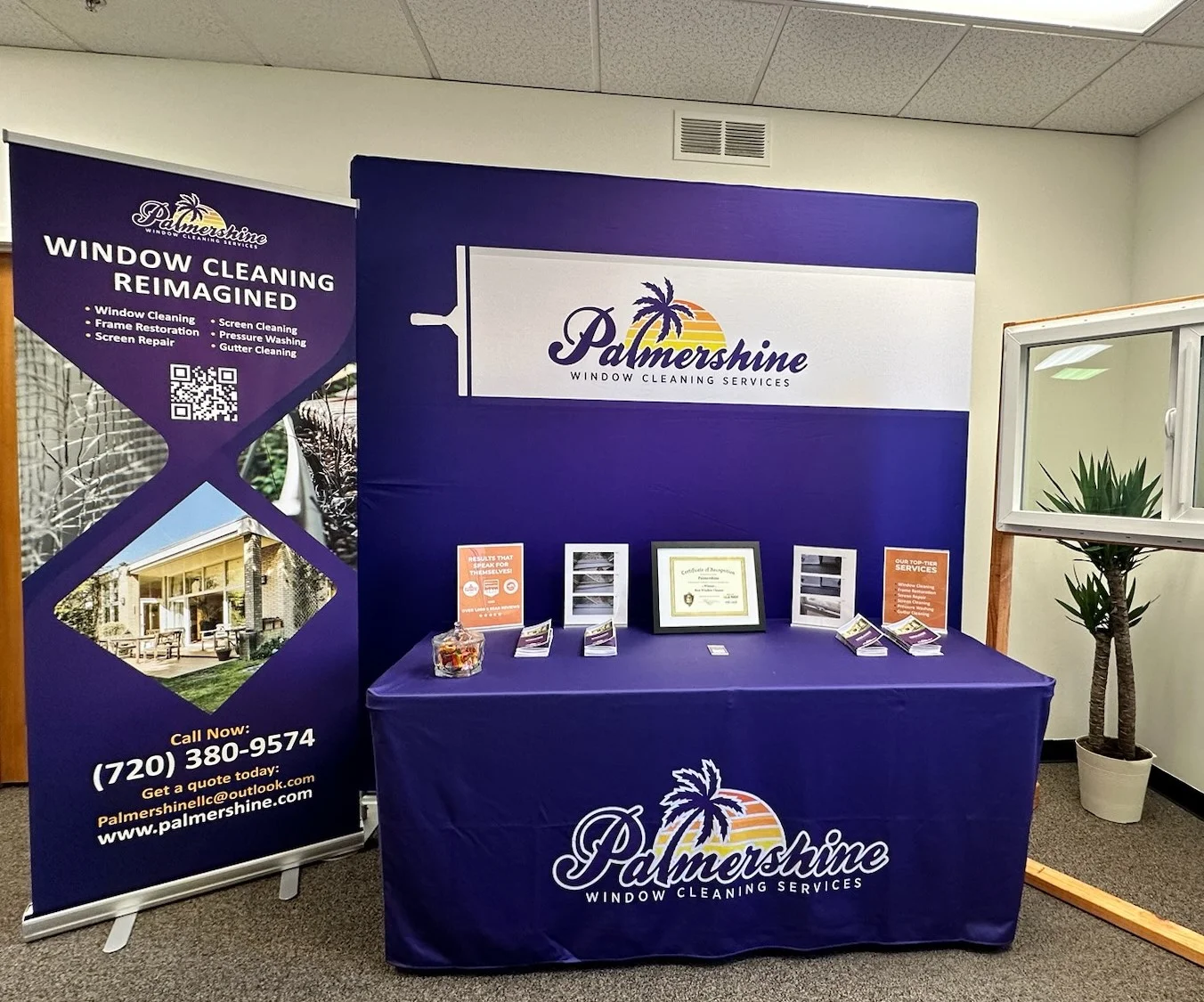
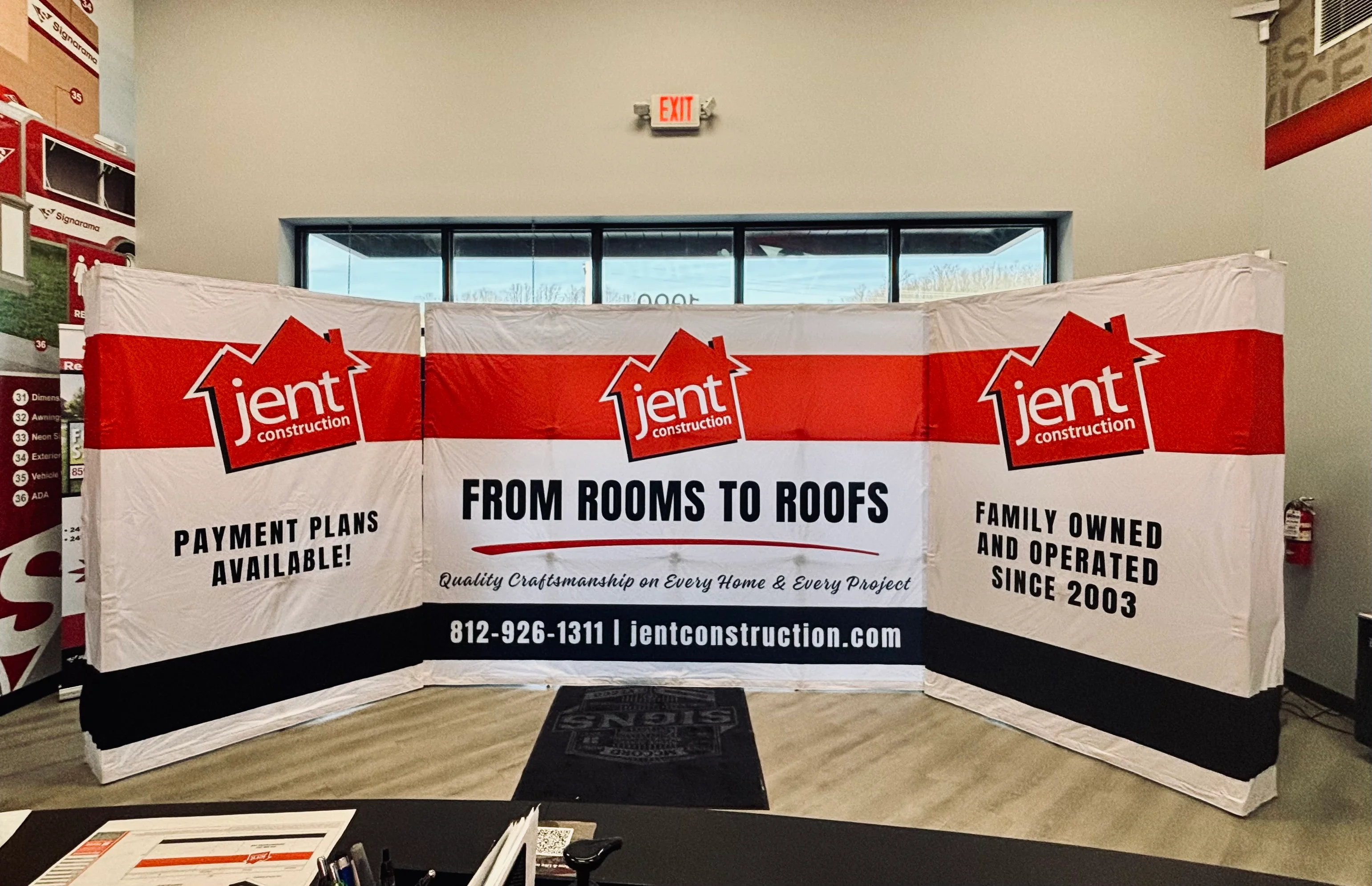
A backdrop establishes the booth's visual anchor. It can carry the company name, logo, main message, and a restrained image. Because staff and furniture often stand in front, important information should not sit near the floor.
Backdrops work best when they create recognition instead of explaining the entire offer. Long paragraphs, service lists, and competing calls to action make the display harder to read. Give the dominant message enough open space.
Retractable Banner Stands
Retractable banner stands can introduce a service line, support a product demonstration, or mark an open corner of the booth. They also provide flexibility between booth sizes and event formats.
Treat each banner as part of a coordinated set. One might present the core benefit, while another shows service categories or a process. Avoid repeating the same headline on every piece, but make sure each banner still works on its own.
Table and Counter Graphics
Tables and counters reinforce the brand at close range. A branded table cover or counter panel can complete the booth and keep the company identity visible in photos. Do not place essential copy on the front, where chairs, boxes, or attendees may block it.
Use table and counter graphics for branding or a short descriptor. Keep detailed information at eye level or provide it in a format visitors can review later.
Printed Panels and Product Graphics
Printed panels can show a product family, service comparison, project example, workflow, or market-specific message. Businesses can replace selected panels for different events while keeping the core display consistent.
Large-format printed graphics should be reviewed at their final output size. A photo that looks sharp on a screen may not reproduce well when enlarged. Reviewing artwork at scale helps identify problems before production.
How to Plan Trade Show Display Graphics in Seven Steps
Step 1: Define the Event Goal
Choose the primary result the booth should support. The goal may be to generate qualified conversations, introduce a service, book demonstrations, recruit candidates, or strengthen brand recognition. One clear objective determines what the graphics should emphasize.
Step 2: Confirm the Booth Size and Organizer Rules
Review the exhibitor materials before finalizing the design. Confirm the booth dimensions, configuration, height limits, sightline requirements, permitted display placement, and setup rules. Requirements can vary by event and venue, even when the reserved footprint appears similar.
Step 3: Map Visitor Approach and Obstructions
Consider where attendees will first see the booth and what may obstruct their view. Account for aisle openings, corner exposure, tables, monitors, sample products, and planned staff positions. Place the company name and primary message where they will remain visible under realistic show-floor conditions.
Step 4: Build a Clear Information Hierarchy
Rank the content by importance. The first layer should identify the company and communicate its value. The second should clarify the offer, while the third can provide proof, examples, or a next step. Do not give every line the same size or visual weight.
Step 5: Match the Display Mix to the Footprint
Select pieces that fit the booth and work together. A compact booth may need a backdrop, table treatment, and focused banner. A larger booth or one located on an open corner may need coordinated graphics that are visible from multiple directions. Leave room for people to enter and talk.
Step 6: Review the Design at Viewing Distance
Test the headline, logo, key image, and supporting copy at realistic sizes. Ask someone unfamiliar with the project what they notice first and what they believe the company offers. If either answer is unclear, revise the hierarchy.
Step 7: Test the Complete Booth Before the Event
Assemble the display before packing it. Confirm that every piece fits, critical content remains unobstructed, and the team understands the layout. Take reference photos and create a packing list for future setups.
Design Trade Show Graphics for Movement, Distance, and Conversation
Trade show visitors scan displays while walking, talking, and comparing nearby exhibitors. Effective booth graphics should communicate the main message within seconds.
Lead with a concise headline. Clever wording can attract attention, but it should not obscure the company’s offer. Visitors should understand what the company does without needing an explanation.
Use strong contrast. Busy photos, fine patterns, and low-contrast colors can reduce legibility. Keep key copy away from edges, seams, and likely obstructions.
Limit type styles. Consistent fonts and formatting help the booth feel more coordinated and make it easier to scan.
Choose purposeful imagery. Use product photos, project images, diagrams, or other visuals that clearly illustrate the product, setting, application, or outcome. Avoid generic images that take up space without adding context.
Support conversations. Graphics should help booth staff explain services, compare options, and point to examples. The display should not rely on dense paragraphs to communicate its message.
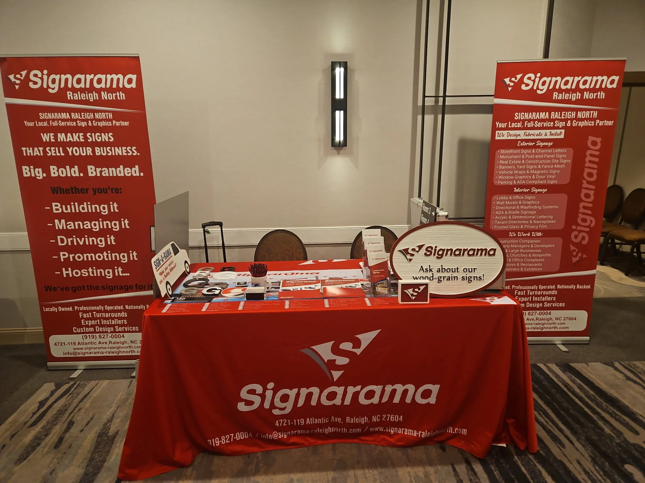
Build a Display System That Can Adapt to More Than One Event
A Danbury company may attend a local expo one month and a regional conference the following month. Although the venue and audience may change, the brand should remain consistent.
Build the display around evergreen content. Keep the company identity, core value proposition, and visual style consistent across events.
Use replaceable graphic components. Reserve interchangeable panels for promotions, product launches, recruiting messages, or seasonal campaigns.
Keep temporary content separate. Place event dates and short-term messages on components that can be updated without replacing the entire display.
Plan for logistics. Consider who will transport, assemble, repack, and store the display. A system that is easy to handle will be more practical across multiple events.
Common Trade Show Graphic Mistakes to Avoid
Several common mistakes can reduce the clarity and effectiveness of a trade show booth:
Using long paragraphs that no one can read from the aisle
Placing essential information low enough to be blocked by a table or visitor
Designing each display piece as a separate project with inconsistent colors or typography
Enlarging low-resolution images without checking output quality
Filling every open area instead of using space to strengthen hierarchy
Choosing a display before confirming booth dimensions and organizer requirements
Printing event-specific dates or offers on pieces intended for long-term reuse
Waiting until the show floor to assemble the full display for the first time
A preproduction review can help catch these issues. Evaluate the booth as a complete visual environment rather than as a collection of separate design files.
Frequently Asked Questions
What graphics does a basic trade show booth need?
Most booths need a clear identity graphic, a concise value statement, and supporting information. The exact mix depends on the booth footprint and event goal. One exhibitor may need a backdrop and a banner, while another may need interchangeable panels for several products.
How much information should go on a trade show backdrop?
Keep the backdrop focused on brand recognition. Include the company name or logo, one main message, and only enough imagery or copy to clarify the offer. Place service lists, specifications, and process explanations on secondary graphics or supporting materials.
Can the same graphics work for local events and larger conferences?
Yes, if the display system is modular. Core branding can remain consistent while selected banners or panels change for a particular audience. Always confirm the booth dimensions and display rules for each event before assuming that an existing configuration will fit.
When should a business use retractable banner stands?
Retractable banners work well for focused messages that need to remain portable. They can highlight a service, support a demonstration, or address attendees approaching from one side. They are also suitable for smaller events where a full backdrop is unnecessary.
How early should a company start planning trade show display graphics?
Begin planning as soon as the booth specifications are available, before the production deadline limits the design process. Allow time for message development, artwork review, production, and a complete setup test. The exact timeline will depend on the number, size, and complexity of the graphics.
Plan Your Trade Show Display Graphics in Danbury, CT
A strong booth gives attendees a clear reason to look, stop, and begin a relevant conversation. Signarama can help businesses coordinate backdrops, retractable banner stands, printed graphics, and other booth elements within one cohesive visual system. Consider your audience, booth specifications, event schedule, and reuse goals before selecting a display format.
Start your sign project with trade show graphics designed around how your team travels, sets up, and engages with attendees.


Signarama Danbury, CT
contact
Signarama Danbury, CT