

Top Colors That Make Real Estate Signs in Danbury, CT Stand Out
May 27, 2025 by Signarama Danbury
Item 1 of 1
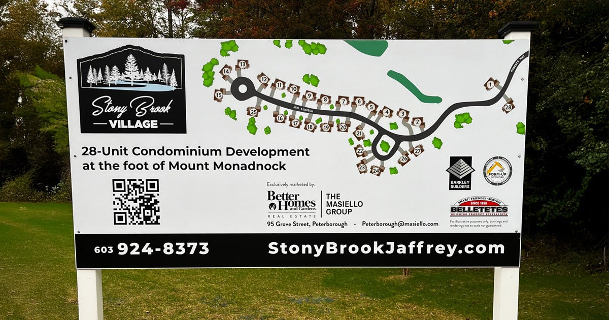
Real estate signs play a crucial role in attracting attention, generating inquiries, and ultimately closing deals. A well-designed sign doesn’t just provide contact information—it makes a powerful first impression. Among all the design elements, color is one of the most important. It influences visibility, perception, and even emotional response. Choosing the right color combination can mean the difference between a sign that gets noticed and one that gets ignored.
Here are the top colors that make real estate signs stand out and why choosing the right hues is essential for successful property marketing.
Why Color is Important in Real Estate Sign Effectiveness
Color is a silent but impactful communicator. It sends visual signals before a single word is read. For real estate signs, the right colors can determine whether a listing gets attention or goes unnoticed. Whether displayed on a busy urban sidewalk or a quiet cul-de-sac, signs must attract immediate interest. Strategic color use makes this possible by enhancing contrast, legibility, and emotional appeal. Here’s why color is more than just decoration:
1. Visibility in Busy Environments
Stand out from the surroundings: Real estate signs compete with traffic, landscaping, fences, and other advertisements. Bold, vibrant colors help ensure a sign is noticed quickly.
Eye-catching contrast: High-contrast color schemes guide the viewer’s eyes directly to key messaging, such as the agent’s name or property status.
2. Emotional Influence
Color affects mood and decision-making. Buyers may not realize it, but their brains process certain colors as more inviting, credible, or urgent.
3. Message Retention
People are more likely to remember signs with a strong visual impact. Color improves memory retention by:
Making a sign visually distinct from others
Associating colors with emotional or brand cues
Encouraging passersby to retain contact details or URLs
4. Brand Consistency
Real estate agents often operate under personal or brokerage brands. Color ensures consistency across yard signs, directional signs, banners, flyers, and business cards. Repeated color usage builds familiarity and trust.
5. Strategic Use of White Space
Color isn’t just about bold hues. Using white space or neutral tones prevents visual clutter, creates a balanced layout, and draws attention to key text like phone numbers or CTAs.
6. Professionalism and Trust
The right colors convey a polished, trustworthy image. In contrast:
Sleek, well-contrasted signs suggest attention to detail
Clashing or dull colors may appear unprofessional
7. Outdoor Functionality
Outdoor real estate signs must remain legible in sunlight, shadows, or rain. Effective color design combines bright backgrounds with dark fonts for visibility and uses UV-resistant inks to prevent fading.
Best Colors That Draw Attention
Certain colors consistently deliver strong performance in capturing attention. These hues are instantly recognizable, emotionally charged, and highly effective when strategically applied to real estate signs. They create an immediate visual impact and guide the viewer's focus.
Universal recognition
Color psychology alignment
Adaptable across styles
Red – High Urgency and Visibility
Creates urgency: Red is commonly associated with alertness, energy, and action. It sparks an instinctive reaction, making it ideal for “For Sale” or “Open House” signage.
Grabs attention instantly: The human eye is naturally drawn to red, especially when it's used in large areas or bold lettering.
Best uses: Calls to action, limited-time offers, or high-competition listings where grabbing attention is critical.
Design tip: Use white or black text on red for maximum legibility. Avoid pairing red with similar warm tones, which can reduce contrast.
Blue – Trust and Stability
Builds credibility: Blue is often used in corporate branding for its association with professionalism, trust, and dependability.
Creates a calming effect: Especially useful in luxury markets or with buyers making high-stakes decisions, as it helps reduce visual noise and communicates a sense of control.
Best uses: Agent names, brokerage branding, or directional information on signs.
Design tip: Navy or royal blue backgrounds with white or silver lettering provide an elegant, high-end appearance.
Yellow – Optimism and Energy
Elicits positivity: Yellow is uplifting and bright, which helps convey friendliness and openness.
Enhances visibility: Among the most luminous colors in the spectrum, yellow stands out exceptionally well in shaded or tree-covered areas where darker signs might disappear.
Best uses: Background color for open house signs, new listing banners, or directional arrows pointing to properties.
Design tip: Pair yellow with bold, dark colors (like black or deep blue) for text or borders to maintain legibility without overwhelming the viewer.
Best Colors That Add Contrast and Style
While primary colors lead in visibility, secondary colors serve as valuable tools for adding personality, balance, and contrast. They help real estate signs stand out without overwhelming the viewer and are ideal for accentuating key design elements. Used thoughtfully, secondary colors can complement primary hues and enhance the overall look of real estate signs, especially when targeting niche audiences or specialty listings.
Add depth and versatility
Support brand differentiation
Target niche markets
Green – Calm, Natural, and Sustainable
Symbolizes growth and balance: Green is often associated with nature, renewal, and environmental awareness, making it an ideal color for eco-conscious messaging.
Works well in suburban settings: Green resonates with buyers looking for family-friendly neighborhoods, gardens, and peaceful outdoor spaces.
Pairs with nature-oriented properties: Use green for signs promoting homes with large yards, parks nearby, or sustainable features like solar panels.
Design tip: White, beige, or deep gray lettering on green offers excellent readability while maintaining a calm, grounded aesthetic.
Orange – Bold, Warm, and Inviting
Blends excitement with friendliness: Orange communicates energy without the intensity of red. It’s perfect for drawing attention without overwhelming the eye.
Great for new or updated listings: Orange real estate signs subtly suggest “something fresh” and attract curious buyers looking for modern upgrades.
Improves callout visibility: Use orange for arrows, pricing highlights, or property status labels like “Just Listed” or “Under Contract.”
Design tip: Use sparingly. Accent usage (like borders or headers) ensures orange enhances rather than dominates a sign’s layout.
Purple – Unique, Elegant, and High-End
Conveys exclusivity and creativity: Purple is linked to luxury, imagination, and artistic appeal. It’s rarely used, which makes it ideal for standing out.
Ideal for luxury and custom homes: Purple real estate signs can project sophistication, especially when marketing upscale or architecturally distinctive properties.
Creates a strong visual identity: Because it's uncommon, purple can help differentiate a brand or agent from competitors.
Design tip: Use dark purples like eggplant or plum with metallic gold, silver, or white text to achieve a polished, premium look.
High-Contrast Color Combinations That Enhance Readability
No matter how attractive a design is, real estate signs fail in their purpose if people can’t read them instantly. Readability is directly tied to contrast—how well the text stands out from the background. High-contrast combinations make it easy for viewers to process information quickly, whether they’re walking by or driving past. Here’s how contrast improves effectiveness and which combinations work best:
Why Contrast Matters
Improves legibility from a distance: Signs are often read from 10–50 feet away. High contrast ensures that important details like phone numbers or property status remain visible.
Reduces cognitive load: Easy-to-read signs allow viewers to absorb key info without straining their eyes or slowing down.
Ensures accessibility: Good contrast benefits everyone, including those with visual impairments or color blindness.
Effective Color Pairings for Maximum Readability
These combinations offer strong visual separation between background and text, ensuring that signs are easy to scan in any environment:
White text on a red background: High contrast and visually stimulating. Ideal for calls to action (e.g., “For Sale,” “Open House”).
Black text on yellow background: Excellent visibility in shaded areas or against natural backdrops. Bold and attention-grabbing without being harsh
White text on a navy blue background: Professional and polished look. Perfect for branding and contact information.
Dark blue text on light gray background: Clean and modern feel. Works well for directional signs or understated properties
Poor Contrast to Avoid
Some combinations reduce legibility and should be avoided, especially in outdoor settings:
Light blue on white: Difficult to see in bright sunlight. Lacks the depth needed for strong text clarity.
Red on green: Causes visual strain and may confuse viewers with color blindness. Easily blends into landscape elements.
Yellow on white or light gray: Nearly invisible from a distance. Creates visual fatigue and lacks definition.
Use of Borders and Accent Blocks
Subtle design features can drastically improve readability without changing the main color scheme.
Borders: Create a separation between the text and background. For example, a thin white border around dark text can make it pop on a dark or complex background.
Accent blocks: Help isolate and emphasize key details like pricing, agent name, or phone number. Allow color segmentation without cluttering the design.
Shadowing or outlining text: Adds dimension and prevents text from blending into the background. Especially useful in sunlight or dim conditions.
Environmental Considerations
Contrast should be tested in real-world scenarios:
Check visibility at different times of day – Morning light may wash out colors, while evening shadows can reduce definition.
Account for sign location – A yellow sign near sandy landscapes may blend in; the same applies to green signs surrounded by trees.
Colors to Avoid and Why
Not all colors are created equal when it comes to real estate signs. While some hues enhance visibility and professionalism, others can backfire, weakening the message, creating confusion, or turning potential buyers away. Understanding which colors to avoid is just as important as knowing which ones to use.
Neon and Overly Bright Shades
Create a harsh viewing experience: Neon colors like lime green, electric blue, or hot pink may stand out, but not in a good way. They cause visual strain, especially in sunlight.
Undermine professionalism: These colors often appear flashy or gimmicky, which can damage the perception of the agent or firm.
Reduce trustworthiness: Buyers may associate neon signs with low-budget, high-pressure tactics rather than reliable, reputable service.
Muted or Low-Visibility Tones
Disappear in natural surroundings: Soft pastels like beige, pale pink, or lavender can blend into grass, trees, or fences, especially in well-landscaped neighborhoods.
Lack of visual impact: These colors fail to grab attention from a distance, reducing the effectiveness of roadside signage.
Offer poor contrast: When combined with light text, muted tones make real estate signs difficult to read under bright or changing light conditions.
Clashing Color Combinations
Cause visual discomfort: Certain pairings, like red text on green or purple on blue, make signs hard to look at and harder to read.
Create mixed messages: These combos send inconsistent signals that may distract from the actual content.
Negatively affect branding: Clashing colors can make signage appear uncoordinated or hastily designed, undermining a polished image.
Colors That Don’t Match the Property Type
Create buyer confusion: A bold, playful color scheme may work for student housing but not for a luxury estate.
Dilute messaging: Using colors that don’t reflect the home’s style or location weakens the connection between the listing and the audience.
Inconsistent branding: Straying too far from the intended visual identity can confuse returning clients and reduce sign recognition.
Seasonally Ineffective Colors
Lose impact during specific times of year: Certain colors perform worse in seasonal environments, like green signs during spring (when grass is bright) or white signs in snowy winters.
Blend with seasonal backdrops: If your signs aren't seasonally adjusted, they may be easily overlooked or mistaken for non-realtor signage.
Work with a Trusted Sign Shop in Danbury, CT for the Best Results!
Creating real estate signs is not just about choosing colors—it’s about executing a complete, polished design. A professional sign shop can bring expertise, precision, and customization to the process.
Expert Guidance on Color and Layout
Experienced sign shops understand which color schemes work best for visibility and branding. They offer insights on color combinations based on years of design practice. Rather than relying on trial and error, agents can benefit from professional recommendations backed by results.
Access to High-Quality Materials
Professional sign shops provide more than just design—they use materials that withstand the elements. Weather-resistant finishes, UV-resistant inks, and sturdy frames ensure that real estate signs remain vibrant and intact even in harsh outdoor conditions.
Customization for Branding
Every real estate agent has a unique brand. A trusted sign shop can match fonts, logos, and colors across different platforms—yard signs, banners, vehicle decals, and more. This consistency strengthens recognition and builds trust with potential buyers.
Print Accuracy and Production Speed
High-quality real estate signs require precise color printing. Cheap prints often result in dull or mismatched shades. Professional shops ensure color accuracy, which is crucial when matching brand colors or following a design guide. Many also offer fast turnaround times, which is critical in a fast-paced real estate market.
Support for Unique Sign Types
Whether it’s a sign with directional arrows, QR codes, or a brochure holder, a sign shop can create tailored solutions. They understand the practical needs of agents and provide options that go beyond the standard “For Sale” sign.
Frequently Asked Questions
What information should be included on a real estate sign?
A real estate sign should display the agent’s name, phone number, and brokerage logo. Including the property status, such as “For Sale” or “Open House,” helps grab attention and provide context. Adding a website URL or QR code can also enhance engagement and drive traffic to online listings.
What material is best for outdoor real estate signs?
Corrugated plastic is cost-effective and lightweight, making it ideal for temporary signage. Aluminum, on the other hand, is durable, weather-resistant, and gives a more professional appearance. Both materials are commonly used based on budget, duration, and environmental exposure.
How long do real estate signs last outdoors?
The lifespan of a real estate sign depends on its material and the weather conditions it faces. Aluminum signs with UV-resistant ink can last several years, while corrugated plastic signs typically last 6–12 months. Regular maintenance and placement out of direct sunlight can extend durability.
Do real estate signs need to include a broker’s information?
Yes, many states require real estate signs to include the broker’s name and contact information to meet compliance standards. This ensures transparency and protects consumers in property transactions. Always check with local real estate advertising regulations before printing.
Can QR codes be added to real estate signs?
Yes, QR codes are a smart way to connect offline signage with online property listings. They allow potential buyers to scan and view details, photos, or virtual tours instantly. QR codes enhance engagement and can increase lead generation for real estate agents.
Ready to Make Your Real Estate Signs in Danbury, CT, Stand Out? Partner with Signarama Today!
If you're a real estate agent or business owner in Danbury, CT, there's no better partner for professional signage than Signarama. With decades of experience and a reputation for quality, Signarama delivers expertly crafted real estate signs that are built to last and designed to impress. Whether you’re advertising a listing or promoting your brand, our team understands what it takes to catch your eyes and convert interest into action.
In addition to custom real estate signs, Signarama offers a full suite of signage solutions, including vehicle wraps, interior office signs, banners, ADA signs, and custom business graphics to elevate your brand across all touchpoints. Every sign is built with premium materials and designed for maximum visibility—perfect for outdoor durability in all of Danbury, CT’s seasonal conditions.
Don't settle for generic signs that blend in. Get started today with Signarama, your trusted local signage expert in Danbury, CT, and make your next real estate listing impossible to miss.
Contact Signarama to bring your signage vision to life with quality, speed, and local expertise you can count on!

Signarama Danbury, CT
35 Eagle Rd
Danbury Connecticut 06810
Opening Hours:
Monday
8:00 am - 4:00 pm
Tuesday
8:00 am - 4:00 pm
Wednesday
8:00 am - 4:00 pm
Thursday
8:00 am - 4:00 pm
Friday
8:00 am - 4:00 pm
contact
Signarama Danbury, CT
CLIENTS WE HAVE WORKED WITH: