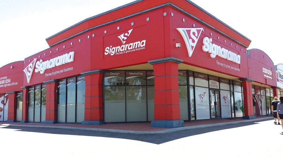

Storefront Signs in Brookfield, CT: A Visibility Checklist
Jul 20, 2026 by Signarama Danbury
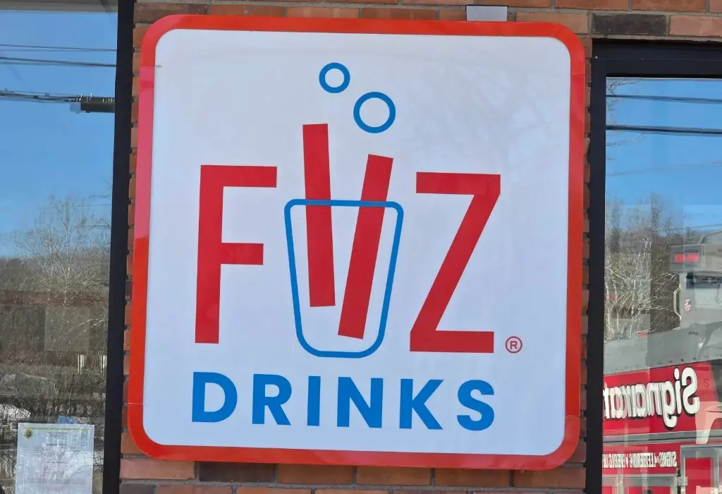
Drivers moving along Federal Road have a few seconds to notice a business, read its name, and decide whether to remember it. Storefront signs either win that moment or lose it, and most of the losses come down to fixable details: weak contrast, thin lettering, poor placement, or a sign that disappears after dark.
Here's a checklist for Brookfield retailers, restaurants, and offices covering the visibility factors that get a storefront noticed, plus the sign types, placement decisions, and planning steps that turn a facade into a customer magnet.
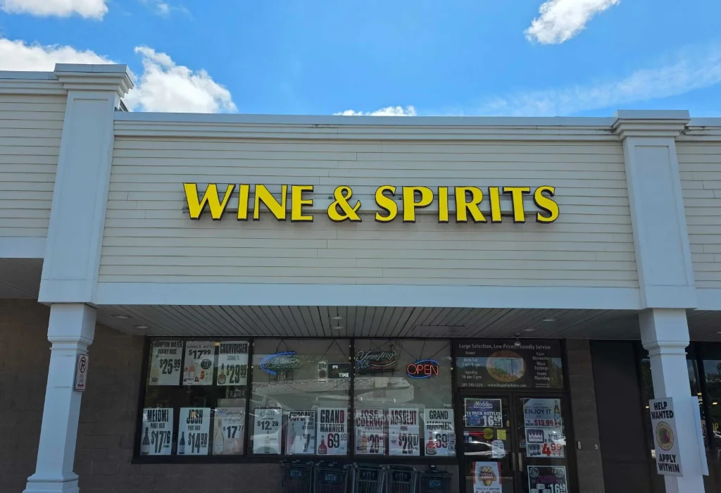
Why Does Storefront Visibility Matter So Much in Brookfield?
Brookfield's commercial activity concentrates along busy corridors where businesses sit side by side, competing for the same passing attention. In that environment, visibility is not a design preference. It is a revenue factor.
First Impressions Happen at Driving Speed
Most potential customers first encounter a business from a moving car, not a sidewalk. A storefront sign that reads clearly at 40 miles per hour reaches thousands of local drivers a day, while one that only works up close markets to whoever already arrived.
Signage Drives Walk-In and Impulse Traffic
For restaurants and retail especially, a portion of daily business comes from people who did not plan to stop. Clear, attractive storefront signs convert that spontaneous interest, particularly for lunch crowds, weekend shoppers, and new residents still learning the area.
The Sign Works When Nothing Else Does
Ads pause, social posts scroll away, and staff go home. The storefront sign keeps introducing the business around the clock, which is why underinvesting in it costs more visibility per dollar than almost any other marketing decision.
A Dated Sign Ages the Whole Business
Customers read the storefront as a proxy for what is inside. Faded panels, dark letters, and peeling vinyl suggest a business past its prime, even when everything behind the door is excellent.
What Should Be on Your Storefront Sign Visibility Checklist?
Run any existing or planned sign through these checkpoints. Each one is a common failure point, and most are inexpensive to get right during design.
Readable Letter Height for Your Viewing Distance
Letter size should match how far away your customers actually are when they look. A sign read from across a parking lot needs far smaller letters than one that must catch highway-speed traffic, and thin, decorative fonts shrink the effective reading distance even further.
Strong Contrast Between Text and Background
High light-dark contrast is the single biggest readability factor. A palette that looks refined in a design file can wash out against sunlight, snow, or shadow, so test the combination at real distance before approving anything.
Visibility After Dark
Brookfield winters bring early sunsets, and a storefront that goes invisible at 5 p.m. loses the entire evening. Illuminated options like channel letters and lighted cabinets keep the business present through dinner hours and the darker half of the year.
A Clear Sightline From the Road
Trees, utility poles, parked cars, and neighboring signage can block the view from the primary traffic direction. Walk and drive the approaches your customers use, in both directions, and confirm the sign stays visible for more than a passing glance.
One Message, Instantly Understood
The best storefront signs for business use say who you are and what you do, then stop. Phone numbers, slogans, and service lists belong on windows, doors, or interior signage, not competing for attention on the main facade.
Consistency With the Rest of Your Branding
The sign should match the logo, colors, and typography customers see on your website, vehicles, and windows. Mismatched branding makes even a new sign feel improvised.
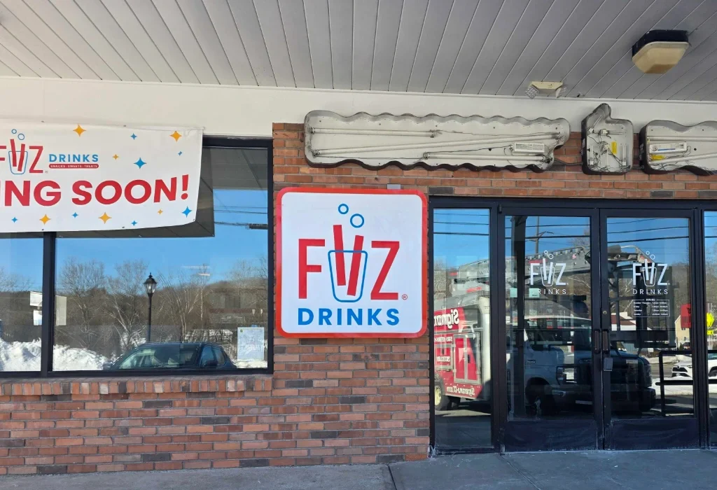
Which Storefront Sign Types Fit Retail, Restaurant, and Office Spaces?
Different businesses and buildings call for different formats, and the right choice depends on the facade, the landlord's rules, and how the space is used.
Sign Type | Best Fit | Consideration |
|---|---|---|
Channel letters | Retail and restaurants needing maximum day and night presence | Requires electrical planning and landlord approval |
Lighted cabinets | Plazas and multi-tenant buildings with standardized signage | Design must stand out within the cabinet format |
Dimensional letters | Offices and professional suites wanting a refined look | Visibility depends on contrast and external lighting |
Carved signs | Traditional and destination-style local brands | Needs finish maintenance outdoors |
Window graphics | Promotions, hours, and secondary messaging | Supports the main sign rather than replacing it |
How Much Do Custom Storefront Signs Cost in Brookfield?
Custom storefront signs in Brookfield may range from around $2,000 to $8,000 for standard commercial setups, with simple window graphics starting near $100 and premium illuminated displays exceeding $15,000. The final estimate depends on sign style, size, materials, permitting, and installation requirements.
Sign Type | Estimated Range (Installed) | Best Use Cases |
|---|---|---|
Vinyl graphics and decals | $100 to $1,000 | Windows, entry doors, budget branding |
Acrylic or metal flat panels | $500 to $3,500 | Clean non-lit looks, professional offices |
Blade or projecting signs | $1,200 to $4,000 | Pedestrian-heavy sidewalks |
Channel letters (LED lit) | $2,000 to $10,000 | Retail storefronts, strip malls |
Take note, pricing varies from one sign shop to the next, so it is best to confirm current costs with a reputable local provider. Signarama can prepare a personalized quote based on your storefront, sign type, and brand files.
How Can You Plan a Storefront Sign Project Step by Step?
A clear sequence keeps the project on schedule and prevents expensive changes after fabrication begins.
Step 1: Define the Viewing Angle and Traffic Path
Start with how customers actually approach: driving, walking, or both, from which directions, and at what speed. This single decision shapes size, placement, and letter height for everything that follows.
Step 2: Confirm Message, Logo Files, and Contrast
Lock in the exact wording, gather high-resolution logo files, and test the color contrast at realistic distances. Clean source files at this stage prevent delays and quality issues during production.
Step 3: Choose the Sign Type and Materials
Match the format to the business type, the facade, and the exposure. Storefront signs for business use need to match the site. A sign built for a north-facing wall under a canopy has different lighting and material needs than one in full sun on a busy corner.
Step 4: Review Landlord Rules and Permit Requirements
Multi-tenant plazas often have sign criteria governing size, style, and illumination, and municipal rules apply on top of them. Confirming both before fabrication avoids redesigns and delayed installations.
Step 5: Approve a Proof, Then Schedule Installation
A final scaled proof confirms spelling, colors, and dimensions exactly as they will be produced. Professional installation then handles mounting, electrical connections, and the finishing details that determine how long the sign performs.
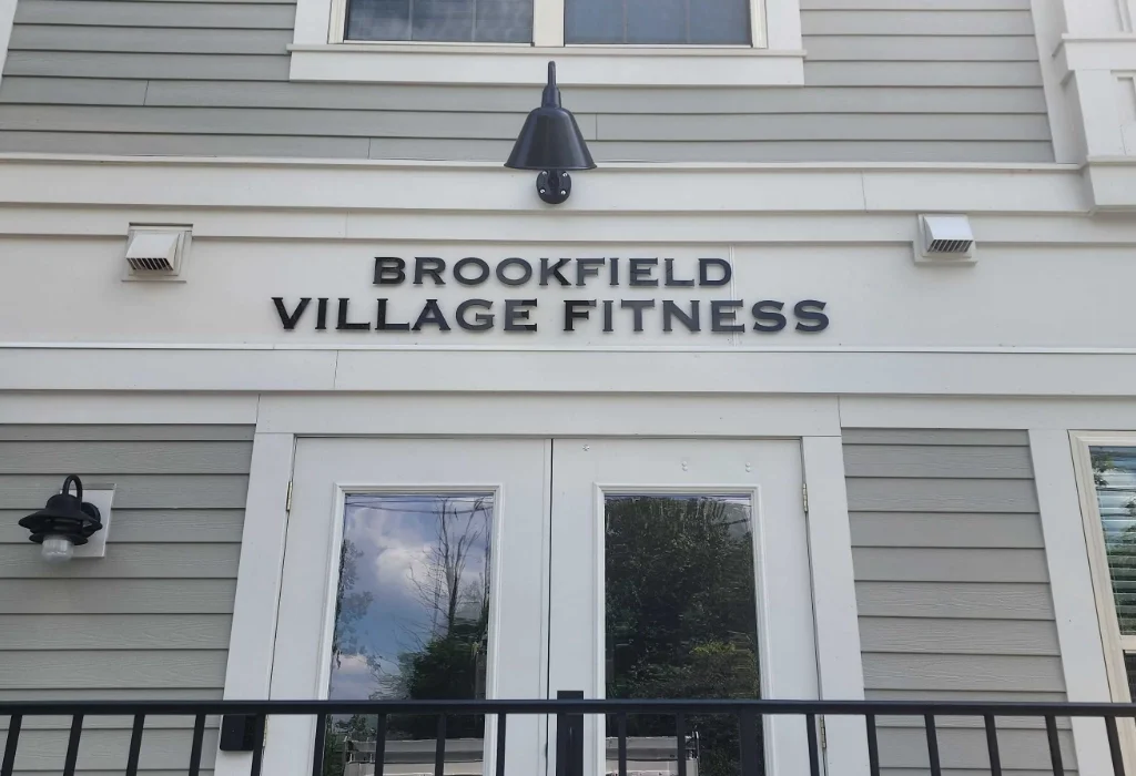
What Mistakes Undermine Storefront Sign Visibility?
Most visibility failures are decided before the sign ever goes up.
Designing at Arm's Length Instead of Street Distance
A sign approved on a laptop screen is being judged at the wrong scale. Always evaluate the design at the distance and speed your real customers will experience it.
Prioritizing Style Over Legibility
Script fonts, tight letter spacing, and low-contrast palettes can look elegant and read like a blur. Style and readability are not enemies, but when they conflict, readability pays the rent.
Ignoring the Nighttime Half of the Day
Skipping illumination to save on upfront cost trades away every evening impression, which for restaurants can mean the busiest hours of the day.
Letting the Sign Outlive Its Condition
Fading, dimming letters, and weathered panels accumulate slowly enough that owners stop seeing them. Customers notice immediately. Periodic honest assessment, or a photo taken from across the street, keeps the storefront judged by fresh eyes.
Treating the Sign as Separate From the Brand
When storefront signs for business drift from the colors and logo used everywhere else, recognition suffers. Every customer touchpoint should look like it came from the same company.
The Quick Storefront Sign Visibility Checklist
Use this as a fast pass-or-fail audit. If any box stays unchecked, that item belongs on the fix list.
Readability
Business name is readable within 3 to 5 seconds from a moving car
Letter height matches the real viewing distance, not the mockup
Font is clean and legible, with no script or condensed styles doing the heavy lifting
Contrast and Lighting
Text and background hold strong light-dark contrast in full sun and shade
Sign stays visible after dark through illumination or exterior lighting
No burned-out letters, dim panels, or uneven lighting
Placement and Sightlines
Sign is visible from both traffic directions on the primary road
No trees, poles, parked cars, or neighboring signs block the view
Sign sits high enough to clear snowbanks and parked vehicles in winter
Message and Branding
One clear message: who you are and what you do
No phone numbers, slogans, or service lists crowding the main facade
Colors, logo, and typography match the website, vehicles, and windows
Condition and Compliance
No fading, peeling, cracking, or weathered panels
Mounting hardware is secure and straight
Sign meets landlord criteria and local sign regulations
Frequently Asked Questions
How long does a storefront sign project take from design to installation?
Timelines depend on sign type, permit and landlord approvals, and fabrication complexity. Illuminated signs generally take longer than flat panels or vinyl, so build the full sequence into your opening or rebrand schedule rather than counting backward from a launch date.
Can an existing sign be updated instead of replaced?
Often, yes. Refacing a cabinet, replacing panels, or updating vinyl can refresh signs for storefronts at a lower cost than full replacement, provided the underlying structure and electrical components are still sound.
Do storefront signs need permits in Brookfield?
Sign regulations vary by town and by property, covering size, placement, and illumination. Landlord criteria in multi-tenant plazas add another layer, so confirm both early in the process.
What happens if the building facade limits where a sign can go?
Awnings, window graphics, hanging signs, and dimensional lettering open up alternatives when the primary wall space is limited. A site evaluation usually reveals more viable placements than owners expect.
Does a storefront sign need maintenance after installation?
Yes, even durable signs benefit from light upkeep. Periodic cleaning, checking illumination for dimming or outages, and inspecting mounting hardware after storms keep the sign performing and catch small issues before they turn into replacements. Illuminated signs deserve a quick check each season since a partially lit sign can hurt the brand more than no lighting at all.
Put Your Storefront to Work Before Customers Drive Past
Every business on a busy Brookfield corridor gets the same few seconds of attention. The ones that win it treat the storefront as their hardest-working marketing asset: readable at speed, visible after dark, and consistent with the brand behind the door.
Signarama has designed, fabricated, and installed custom storefront signs for western Connecticut retailers, restaurants, and offices for over 20 years, handling everything in-house from concept through installation.
Run your storefront through the checklist above, then bring the gaps to a team that can close them.


Signarama Danbury, CT
Contact
Signarama Danbury, CT







Contact Us
Contact the team at Signarama Danbury, CT
203-792-4091Signarama Danbury, CT35 Eagle Rd Danbury Connecticut 06810
Certified Wrap Installer
Follow Us
Select your country:
About Signarama
With the latest technologies and a wide range of available materials, there really is no end of choice and quality in the manufacturing of Signarama Signage. Images and logos belong to their owners and do not imply Signarama’s endorsement—shown only as examples of our work. Visit our corporate section to see more about: