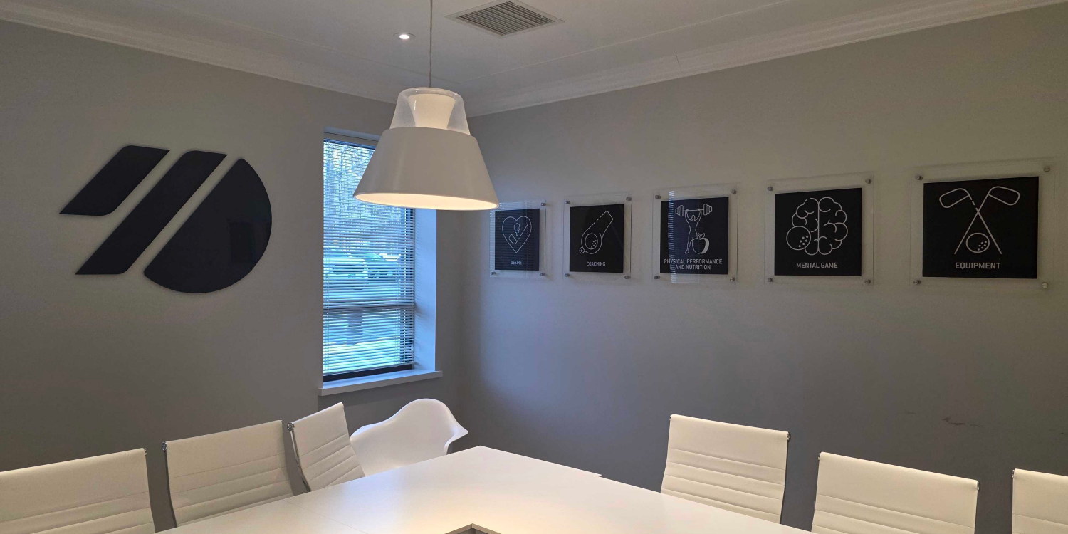



Lobby and Reception Signs for Danbury Offices, Medical Practices, and Schools
Aug 7, 2026 by Signarama Danbury
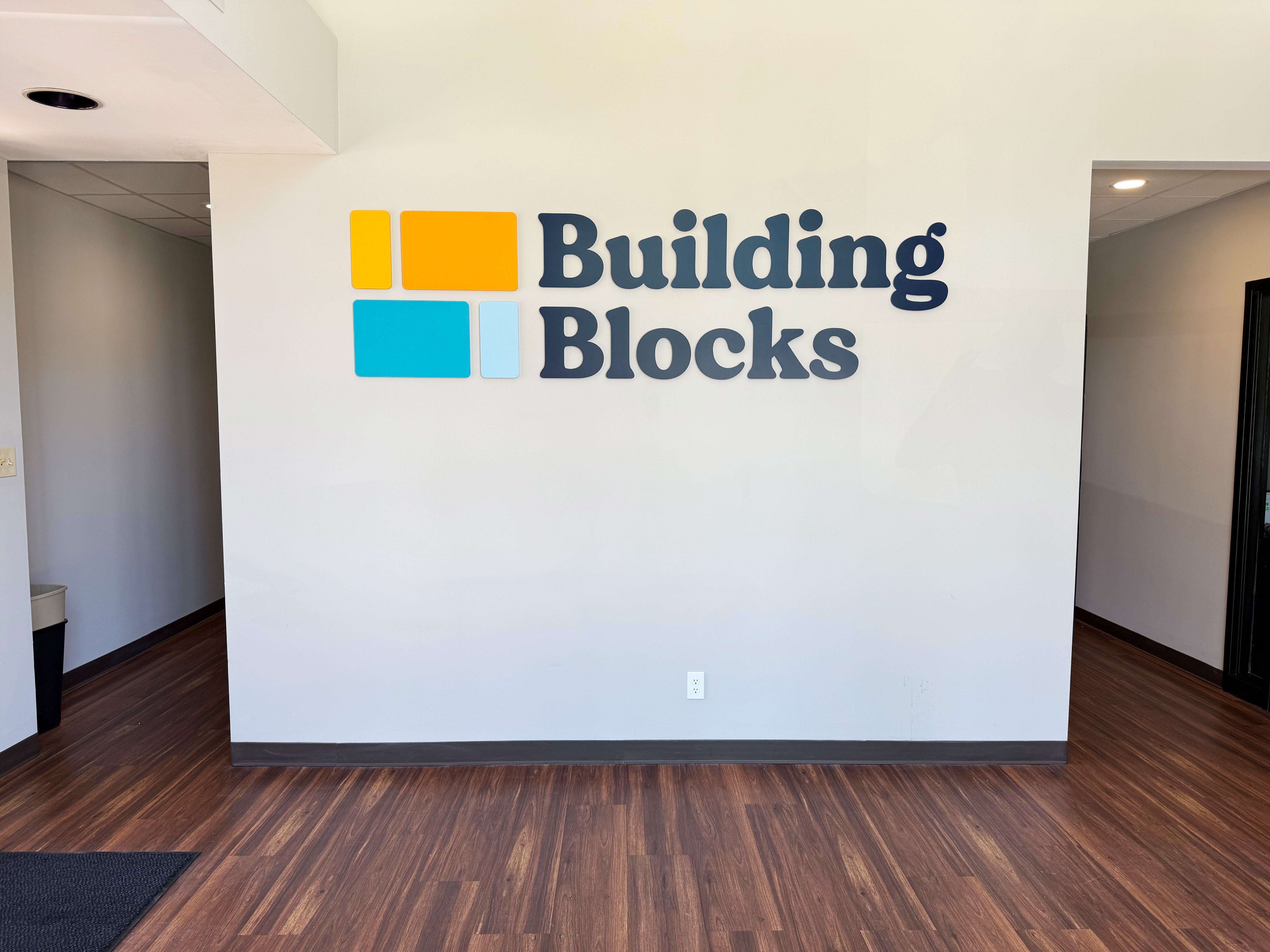
The first few minutes inside a building shape how visitors perceive the organization they have entered. A logo behind the reception desk confirms that they have reached the correct destination. A directory points them toward the appropriate office. Wall and window graphics provide context, privacy, and visual consistency. Together, these elements make the space easier to navigate while reinforcing the brand.
Planning corporate interior graphics in Danbury, CT, requires more than choosing an attractive logo sign. It means identifying what visitors need to see, where they need to see it, and how each sign or graphic supports the overall space.
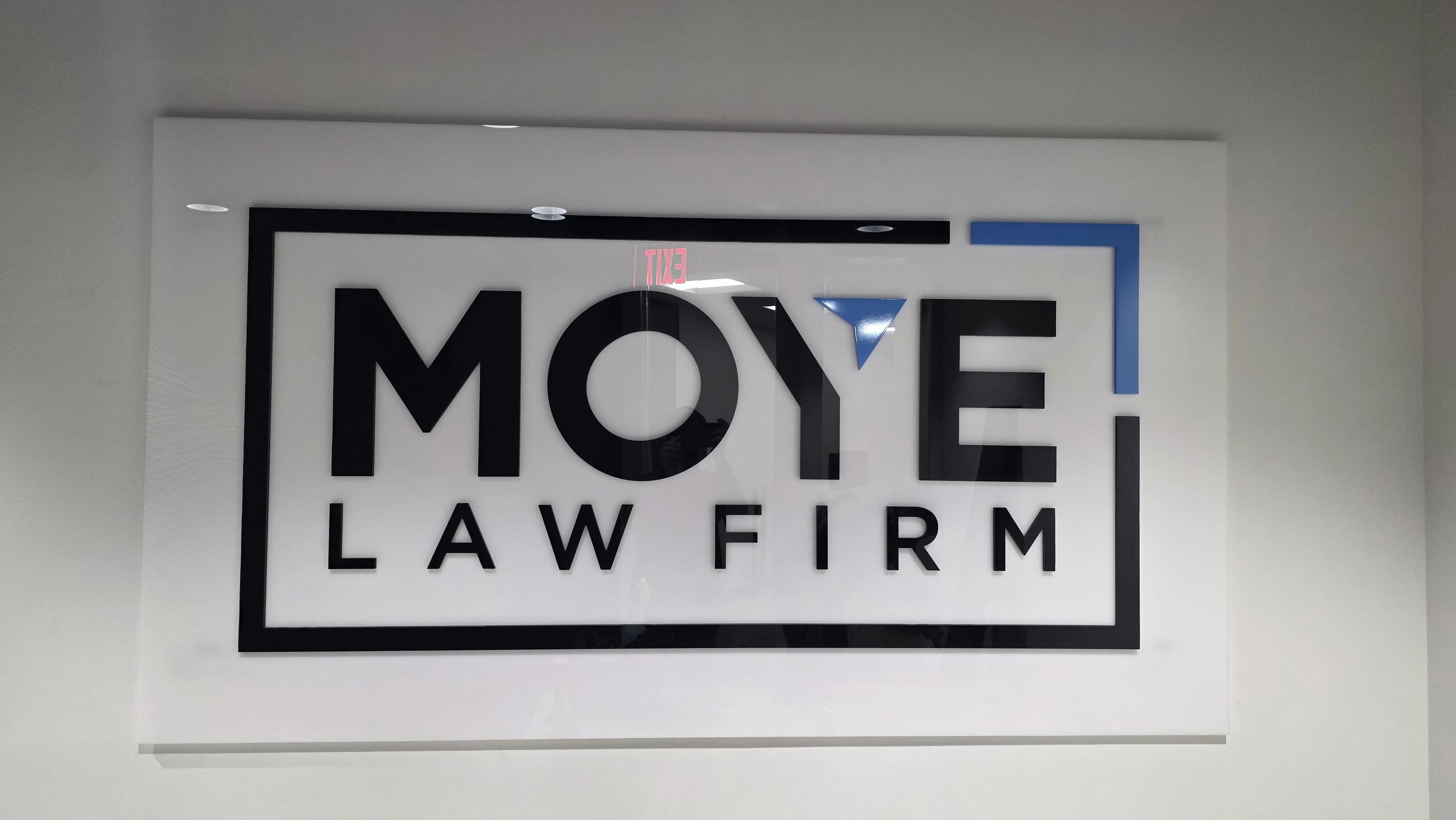
What Lobby and Reception Signs Need to Accomplish
A lobby sign often serves as the visual anchor of a reception area, but it should not work alone. The strongest interior sign systems support three practical goals.
First, they confirm identity. Visitors should know immediately that they have reached the right business, practice, department, or school office.
Second, they reduce uncertainty. Directories, room identification signs, and directional signs help people decide where to go next. This function becomes especially important in shared office buildings, medical suites, educational campuses, and facilities with multiple entrances.
Third, they create consistency. Repeating colors, typography, graphic style, and terminology connect the lobby to the rest of the organization. This consistency also makes information easier to recognize throughout the building.
Branding should not interfere with directions, and directions should not disappear into decorative graphics.
Core Elements of a Visitor-Facing Interior Sign System
Reception and Lobby Logo Signs
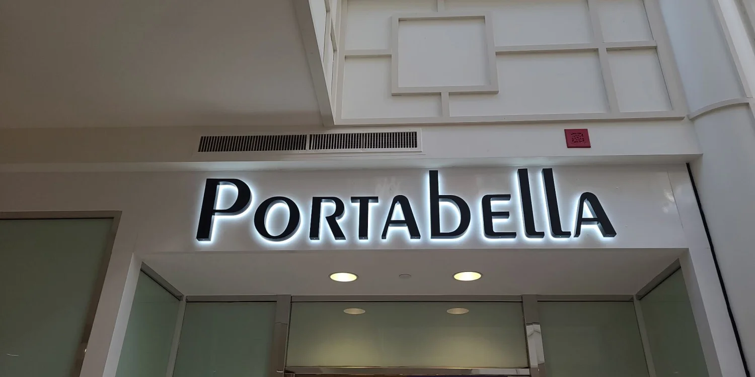
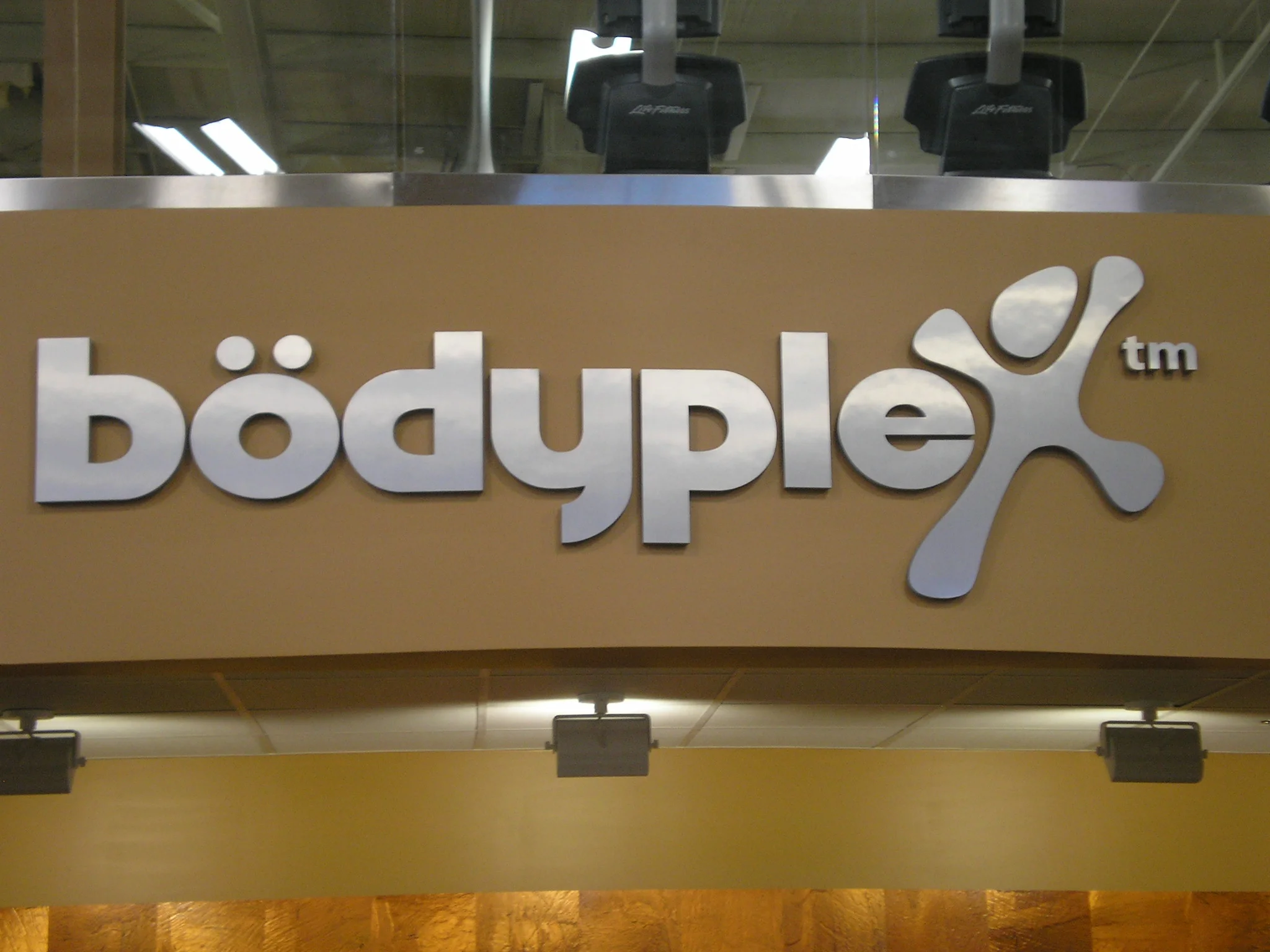
A reception sign places the organization’s identity at the main point of arrival. Common formats include dimensional letters, cut logos, acrylic panels, metal plaques, and layered signs. Material, finish, mounting method, and scale affect the final look.
The sign should fit the wall rather than simply fill it. A large logo can overwhelm a narrow reception area, while a small one may lose impact on a broad feature wall. Furniture, doors, artwork, cameras, and architectural details can also affect sightlines.
Contrast matters as much as size. A logo that appears clear on a screen may blend into a similarly colored wall. Testing the logo against the actual background can reveal whether it needs dimensional separation, a backing panel, or a different finish.
Custom Wall Graphics
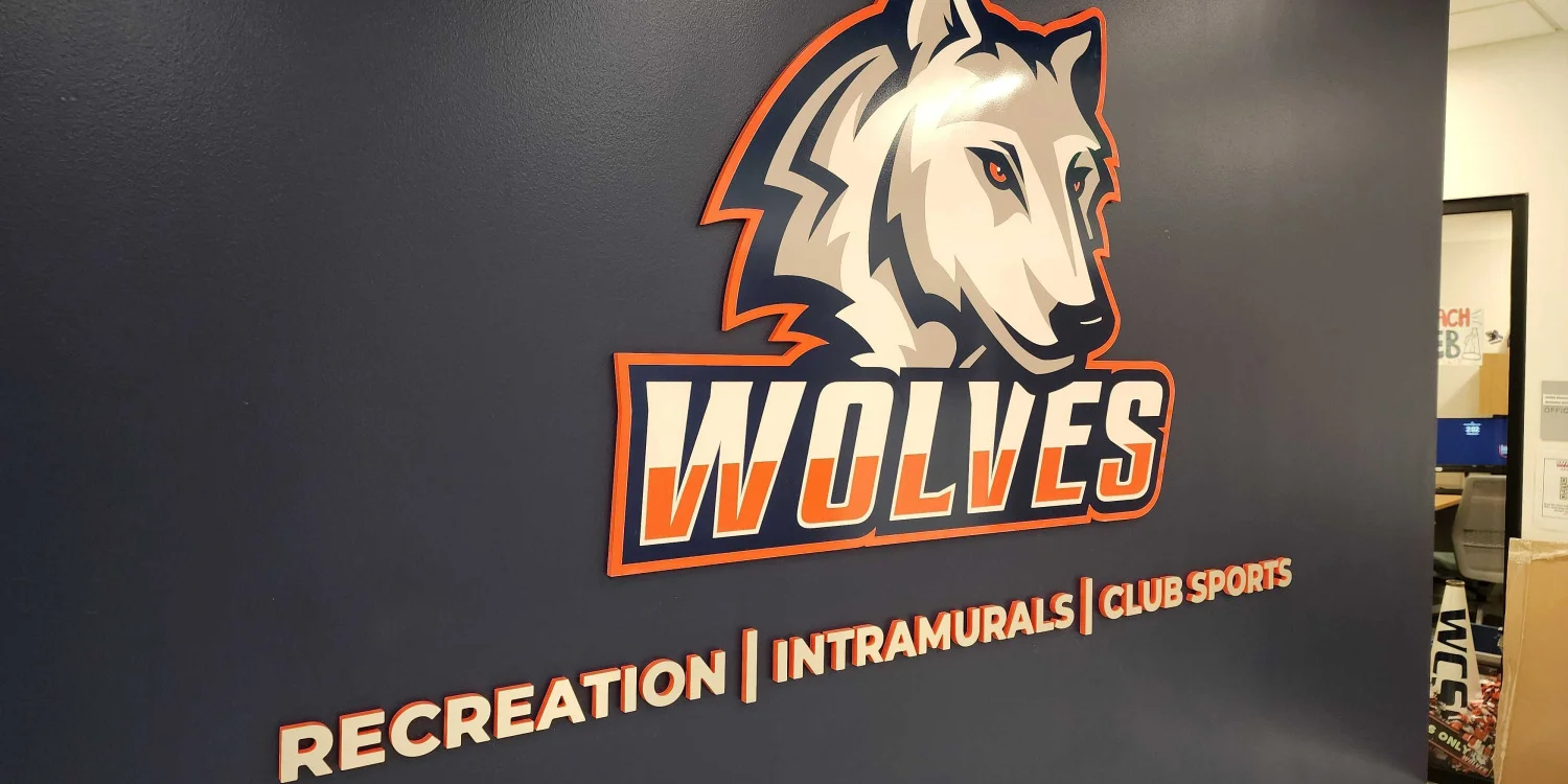
Custom wall graphics can extend the brand beyond the reception desk. They can communicate the organization’s mission, values, history, campus identity, services, or donor recognition while incorporating relevant environmental imagery. In a hallway or waiting area, these graphics can turn unused wall space into part of the visitor experience.
Match the amount of information to the time people typically spend in the area. A corridor needs a simple message that can be understood quickly, while a waiting room can support a more detailed timeline or illustrated display.
Surface conditions influence the plan. Wall texture, paint condition, seams, corners, and fixtures can affect material selection and installation. A site review helps determine whether a direct-applied graphic, mounted panel, or dimensional element is most appropriate for the space.
Directories and Directional Signs
Directories identify who or what is located in the building. Directional signs show visitors how to reach those destinations. Many facilities need both.
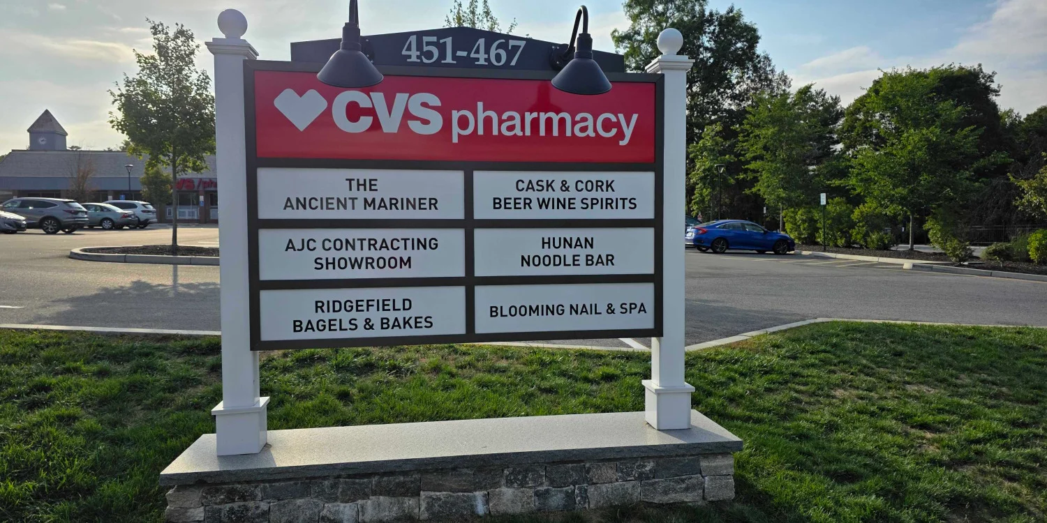
A directory near the entrance can list tenants, departments, offices, or destinations. Directional signs then guide visitors toward elevators, stairways, intersections, and hallway turns. Repeating names, colors, or symbols along the route makes the system easier to follow.
Plan directories around the facility’s actual operations. If tenants or departments change frequently, replaceable components may simplify future updates. Permanent information may be better suited to a fixed format. In either case, use consistent terminology rather than alternating among formal names, abbreviations, and internal nicknames.
Window Graphics for Branding and Privacy
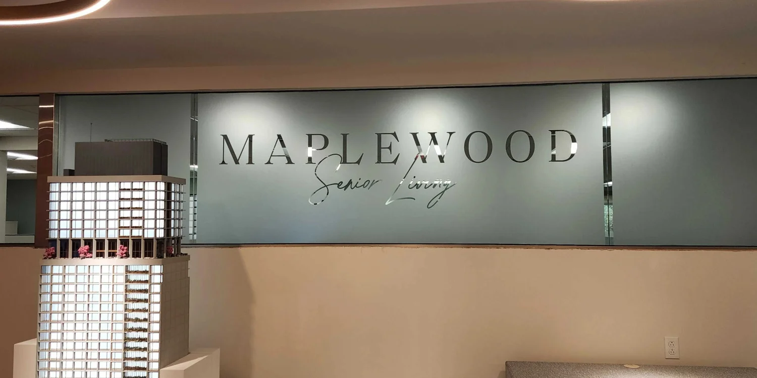
Interior glass creates openness, but it can expose meeting rooms, treatment areas, offices, or student spaces. Frosted films and patterned graphics can add privacy. Logos, stripes, gradients, and repeating motifs can also connect glass walls to the brand system.
Consider visibility and privacy separately. A design may obscure direct views at seated or standing eye level without covering the entire pane. It can also make clear glass more noticeable in circulation areas. Placement should reflect how people use and approach the room.
Matching the Signage Plan to the Facility
Danbury Offices
An office lobby may welcome clients, direct delivery personnel, orient job candidates, and help visitors distinguish among multiple companies or departments. A logo sign establishes identity, while a building or floor directory supports navigation. Custom wall graphics can highlight services, company history, values, or completed projects.
In shared buildings, confirm which walls and glass surfaces are included in the tenant’s space, which sign formats the property permits, and whether the building already has an established directory system.
Medical Practices
Patients are often focused on their appointments rather than the building layout. Signage should reduce uncertainty from the suite entrance through check-in, the waiting area, restrooms, clinical spaces, and checkout. Clear terminology and strong contrast usually matter more than decorative complexity.
Window graphics can help screen reception work areas, consultation rooms, or other interior spaces enclosed by glass. However, they should never replace the administrative policies and physical safeguards a medical practice uses to protect patient information.
Schools and Educational Facilities
Schools receive families, contractors, volunteers, and event attendees who may not know the campus. Lobby graphics can reinforce school identity, while directories and directional signs help visitors reach the main office, auditorium, gym, library, or meeting area.
Graphics may also highlight a mascot, mission, values, achievements, programs, or donor recognition. The design should remain readable for different age groups and function effectively during regular school days, special events, and community activities.
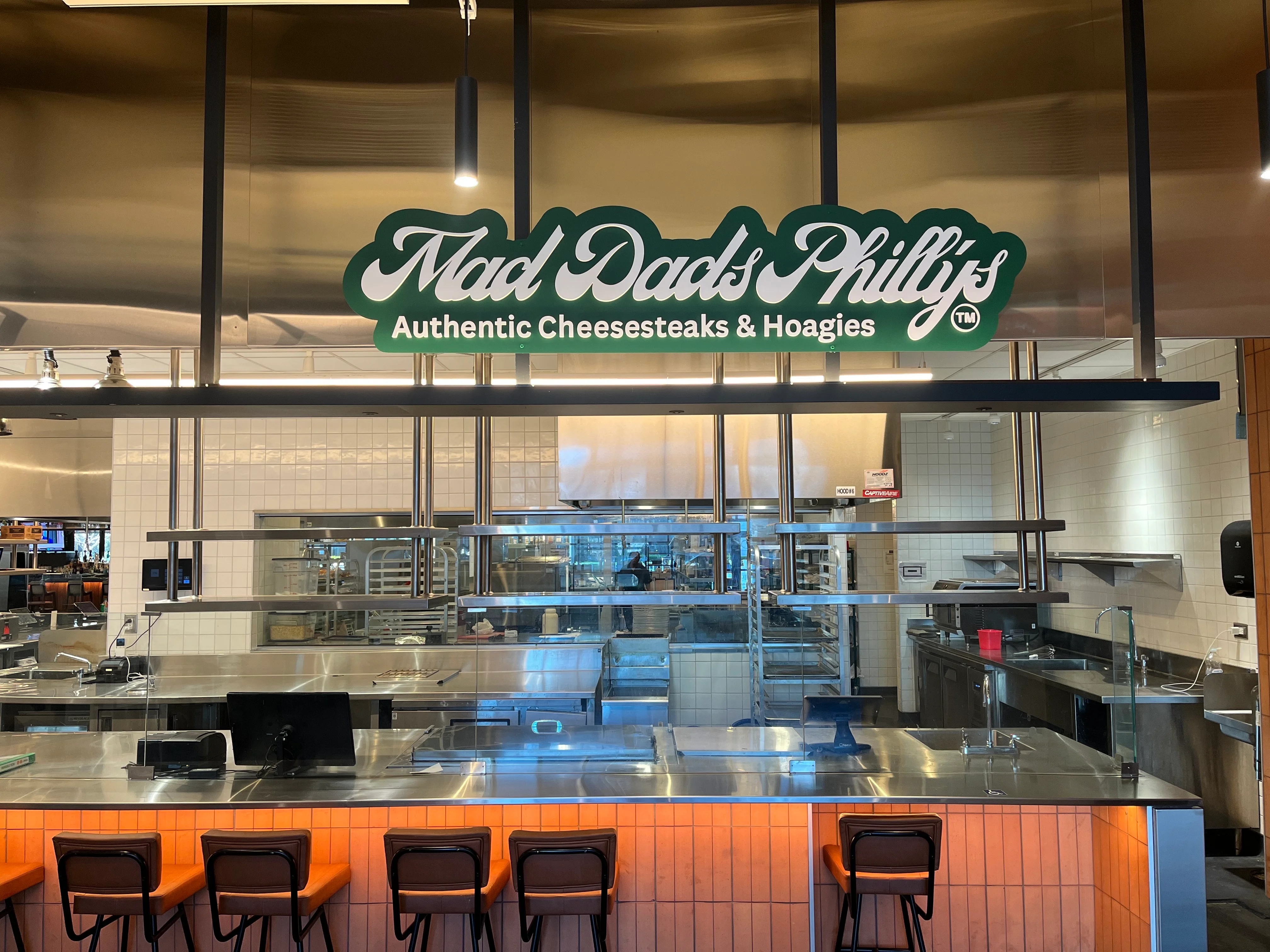
How to Plan Corporate Interior Graphics in Six Steps
1. Walk the Visitor Route
Start outside the main entrance and follow the path a first-time visitor would take. Note where people pause, make decisions, ask for help, or take a wrong turn. Include any secondary entrances that guests regularly use.
2. Define the Job of Each Location
Assign one primary purpose to each sign or graphic. A reception sign confirms identity, a directory lists destinations, a directional sign guides movement, a wall graphic communicates the brand story, and window film provides privacy. One element may support several purposes, but its primary message should remain clear.
3. Inventory the Content
Gather approved logos, brand colors, fonts, room names, department names, tenant lists, accessibility symbols, and required notices. Confirm all spelling and capitalization, then assign responsibility for final approvals and future updates.
4. Measure the Space and Check Sightlines
Record wall dimensions, glass-panel sizes, viewing distances, furniture placement, door swings, and nearby fixtures. Photograph each location from the direction visitors will approach it. These details help determine the appropriate scale and prevent installation conflicts.
5. Build a Visual Hierarchy
Decide what visitors should notice first, second, and third. Emphasize the organization’s name and primary destinations over supporting details. Use consistent arrows, terminology, colors, and placement throughout the building.
6. Review the Complete System Before Production
Evaluate the reception sign, directories, directional signs, wall graphics, and window graphics together. Check content, contrast, spelling, mounting locations, privacy coverage, update needs, and accessibility considerations. A system review can reveal gaps that individual proofs miss.
Design and Material Decisions That Affect the Result
Materials should support the brand, the surrounding environment, and the sign’s expected use. Acrylic can create a contemporary appearance, while metal can add an architectural feel. Dimensional letters create depth, printed wall graphics carry color, imagery, or text across a broad area, and frosted films support privacy and branding on glass.
The finish also matters. Glossy surfaces may reflect nearby windows or overhead lighting, while matte or non-glare finishes can improve readability under bright or variable lighting conditions. The appropriate choice depends on the viewing angle, background, surrounding materials, and amount of natural light.
For custom wall graphics, the paint type, surface texture, previous repairs, and overall wall condition influence material selection. For window graphics, glass dimensions, mullions, doors, handles, and required privacy zones shape the layout.
A graphic near a check-in counter or in a busy school corridor may experience more frequent contact than one installed behind a reception desk. Match the material’s durability to its expected use and maintenance requirements.
Accessibility Belongs in the Planning Conversation
Signs that identify permanent rooms and spaces may require raised characters and braille. Directional and informational signs may also need to meet specific visual requirements, while directories, company names, and logos may be subject to different standards. Applicable rules can address character style, contrast, non-glare finishes, mounting height, and placement.
No single design rule applies to every interior sign. A reception logo, tenant directory, restroom sign, and directional panel serve different functions and may be subject to different requirements. Identify applicable federal, state, and local standards early in the planning process.
Common Planning Mistakes to Avoid
Several problems appear repeatedly in interior sign projects:
Designing each sign separately, which leads to inconsistent terminology and styling
Choosing colors without testing contrast against the actual wall or glass
Adding too much copy to signs people must read while walking
Placing directions after a decision point instead of before it
Using internal department names that visitors do not recognize
Forgetting that tenant, staff, or department information may change
Treating privacy film as decoration without checking seated and standing sightlines
Approving artwork before confirming dimensions, obstructions, and installation surfaces
Assuming every sign follows the same accessibility rules
A coordinated survey and review process can address these issues before production.
Frequently Asked Questions
What should a reception sign include?
Most reception signs include the organization’s name, logo, or both. Some also include a short descriptor or tagline, but the primary identity should remain easy to recognize and appropriately scaled for the available wall.
How large should a lobby sign be?
The appropriate size depends on the wall dimensions, viewing distance, reception desk, ceiling height, logo shape, and nearby architectural features. Accurate measurements and a scaled proof provide a more reliable basis for sizing than a standard recommendation.
Can wall graphics work in a rented office?
Yes, but tenants should review their lease terms and obtain any required property approval before installation. The wall surface and expected length of use also affect material selection because not every wall is compatible with the same graphic material.
Can window graphics provide privacy for a medical office?
Frosted or patterned graphics can limit direct views through glass. The coverage should reflect the room’s use and the eye levels of both seated and standing occupants. Medical practices should use these graphics as one component of a broader privacy strategy.
What is the difference between a directory and a directional sign?
A directory lists people, tenants, departments, or destinations. A directional sign tells visitors which way to travel. Larger facilities often use both at different points along the route.
Plan Your Danbury Interior Sign Project
A well-planned lobby confirms that visitors have arrived at the correct destination, helps them navigate the space, supports privacy, and reinforces a consistent identity. Reception signs, directories, custom wall graphics, and window graphics should work together as one connected system.
Signarama helps offices, medical practices, and schools plan, design, produce, and install custom interior signage and graphics. When comparing local providers of custom wall and window graphics, consider how well each company accounts for the visitor route, the available space, and the information people need most.
Discuss your signage needs with Signarama and plan a clearer, more cohesive interior experience.


Signarama Danbury, CT
contact
Signarama Danbury, CT