


How to Keep Vehicle Wraps Consistent Across Vans, Pickup Trucks, Box Trucks, and Trailers in Danbury, CT
Oct 5, 2026 by Signarama Danbury
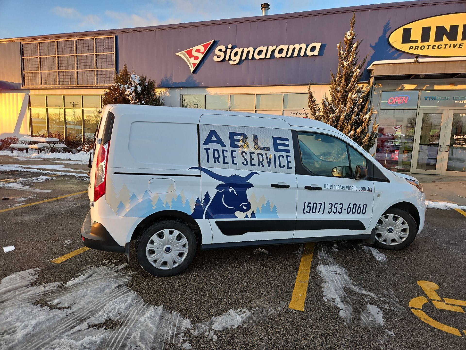
A mixed vehicle fleet creates a practical branding challenge. Vans, pickups, box trucks, and trailers all offer different proportions, doors, contours, and usable panels. If the same artwork is simply stretched or squeezed onto every vehicle, the fleet can look inconsistent even when the logo and colors technically match.
For Danbury businesses, effective vehicle wraps need a flexible system. The identity should stay recognizable while each layout adapts to the vehicle’s proportions and usable design zones.
The goal is not to make every vehicle identical. The goal is to make every vehicle unmistakably part of the same brand.
Why Brand Consistency Does Not Mean Identical Vehicle Wraps
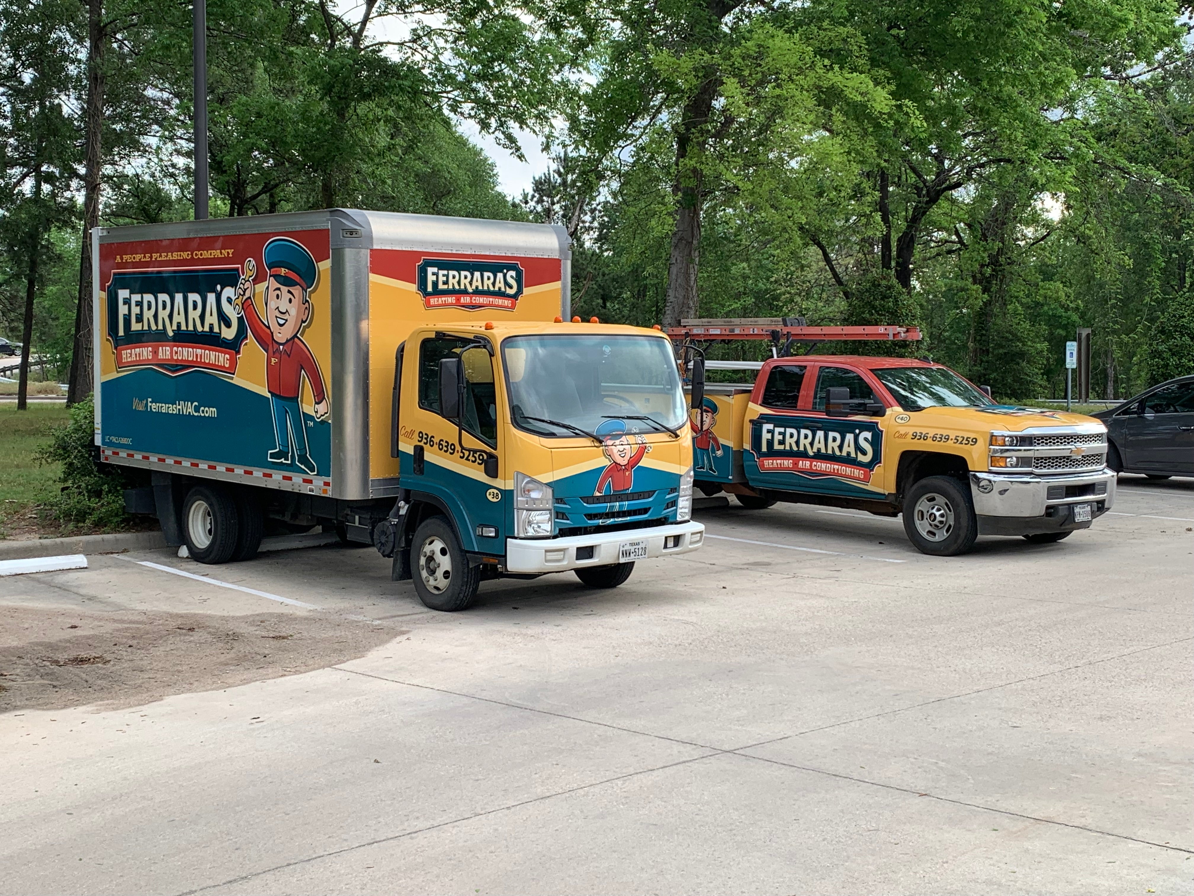
Brand consistency means that customers should recognize the same business whether they see a compact service van in a parking lot, a pickup truck at a jobsite, or a box truck moving along I-84. The logo, core colors, typography, message style, and visual character should feel connected. The exact size and placement of those elements can change.
A rigid one-layout approach often fails because vehicle bodies do not share the same visual geometry. A logo that fits a trailer may become too small on a pickup, while a service line that works on a box truck can collide with a van’s sliding-door track.
A stronger system separates fixed brand rules from flexible layout rules. Fixed rules define what must remain consistent. Flexible rules explain how elements can move, resize, simplify, or change orientation. Consistency should come from recognizable brand cues, not copied coordinates.
Build a Repeatable Fleet Branding Hierarchy
Before designing individual vehicle wraps, define the order in which information should be seen. A consistent hierarchy helps every vehicle communicate the same priorities, even when the available space changes.
A practical hierarchy for commercial fleets is:
Business name and logo
Primary service or short positioning message
Call to action
Website or phone number
Supporting service details, only when space allows
Secondary graphics or imagery
Keep the Logo Visually Dominant
The logo should remain the anchor across all vehicle types, with similar visual weight relative to the available panel. It may sit behind a van’s front door, span a pickup door and bed-side zone, or scale much larger on a box truck or trailer. Avoid forcing it across handles, deep contours, wheel openings, or moving seams when a cleaner placement is available.
Standardize the Primary Message
Fleet branding becomes fragmented when each vehicle promotes a different idea. Choose one short primary message that can survive across the full fleet. For example, a contractor might prioritize the company name plus a concise description such as “Commercial Signs & Graphics” rather than listing every service on every vehicle.
Keep the wording stable, but allow line breaks and placement to change by vehicle.
Use One Clear Call to Action
Keep the call to action consistent, too. A website or phone number should use the same format and styling throughout the fleet. Avoid changing CTA language from vehicle to vehicle unless there is a deliberate campaign reason.
How to Adapt One Visual Identity to Four Vehicle Types
The most reliable process is to design the brand system first, then adapt it to each vehicle’s usable zones.
Step 1: Inventory Every Vehicle Before Designing
List the make, model, year, body style, and major surface features for each vehicle. Photograph both sides, the front, and the rear. Note sliding doors, hinges, handles, fuel doors, wheel wells, ladders, toolboxes, corrugation, rivets, roll-up doors, and other obstructions.
Accurate measurements and vehicle-specific templates matter because flat artwork behaves differently on a three-dimensional surface. Avery Dennison’s application guidance also treats the actual vehicle surface and preparation conditions as critical to wrap performance.
Step 2: Mark Primary, Secondary, and Restricted Design Zones
Divide each vehicle into three types of space. Primary zones are the cleanest, most visible areas for the logo and main message.
Secondary zones can hold contact information or supporting graphics. Restricted zones include handles, complex contours, wheel arches, seams, hinges, and other areas that can distort or interrupt critical content.
Step 3: Lock the Brand Constants
Create a short fleet branding specification that defines the elements that should not change without approval. Include the approved logo files, brand colors, typefaces, core message, CTA, contact information, and any required graphic motifs.
Color control deserves special attention. Brand consistency weakens when the same brand color drifts between vehicles or production runs. Use controlled files and approved production standards.
Step 4: Create Vehicle-Specific Layout Rules
Do not scale a van layout to 70 percent and call it a pickup design. Build a layout for each vehicle class using the same hierarchy.
The logo can move, a message can change from one line to two, and decorative shapes can crop differently. These changes are acceptable if the same brand system and priority order remain clear.
Step 5: Proof the Fleet as a Group
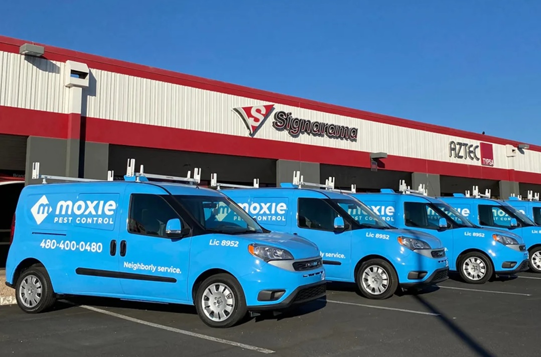
Review all vehicle designs side by side before production. Look for a logo that appears too small, color drift, an extra service list on one truck, or a CTA that has shifted to a low-visibility area. The fleet should look related when parked together, even if layouts differ.
Vehicle-Specific Design Zones for a Mixed Vehicle Fleet
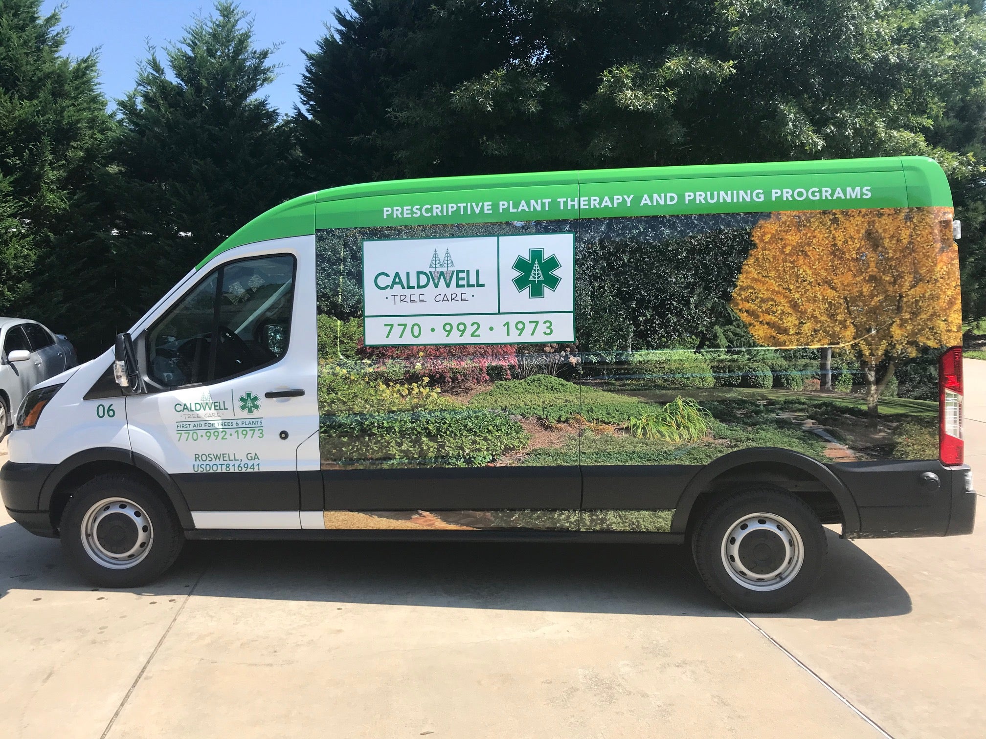
Each body style creates different opportunities. The brand hierarchy stays consistent, but the design should respond to the vehicle.
Vans: Use Broad Sides But Plan Around Doors
Commercial vans provide broad side visibility, but door seams and sliding-door tracks require planning. Keep critical text away from areas where it could split when a door opens. Treat rear doors as a separate viewing surface for the logo, website, or concise CTA.
Pickups: Coordinate the Door and Bedside
Pickup trucks have less uninterrupted space because wheel wells, bed lines, windows, handles, and trim divide the body. Prioritize the logo, a short service message, and one contact method. Use the door and bedside as coordinated zones instead of forcing one continuous graphic across the truck.
Box Trucks: Treat the Box as a Billboard, Not a Menu
Box trucks offer large rectangular panels, which makes them tempting to overload. Larger space should usually mean larger communication, not more communication. Use the box side for a strong logo and clear service message, while keeping critical details away from rivet rows, corrugation, roll-up door gaps, and cab-to-box transitions. Craftsmen Industries specifically recommends planning around these physical features.
Trailers: Scale for Distance and Long Viewing Angles
Trailers offer the largest canvas but also create long viewing distances. Scale the logo and main message for recognition from adjacent lanes and farther back in traffic. Avoid essential content too low, where other vehicles or road spray can obscure it. The trailer should feel like the largest expression of the same fleet system, not a separate campaign.
How to Maintain Brand Consistency as the Fleet Changes
Fleet branding needs ongoing management after the first wrap is installed. Businesses add vehicles, replace models, update contact information, and refresh logos. Without a clear system, small changes can create noticeable differences across the fleet.
Keep a Centralized Set of Brand Files
Maintain current logo files, approved colors, fonts, messaging, and vehicle-specific layouts in one organized location. Label outdated artwork clearly so older versions are not reused by mistake.
Adapt Designs for New Vehicle Types
When a new vehicle joins the fleet, start with the established brand elements and message hierarchy. Then adjust the layout for that vehicle’s dimensions, contours, doors, and usable design areas instead of forcing an older template to fit.
Review the Fleet for Visual Consistency
Compare new wrap designs with existing vehicles before production. Check logo treatment, color use, typography, messaging, and CTA placement to make sure the fleet still feels visually connected.
Common Fleet Branding Mistakes to Avoid
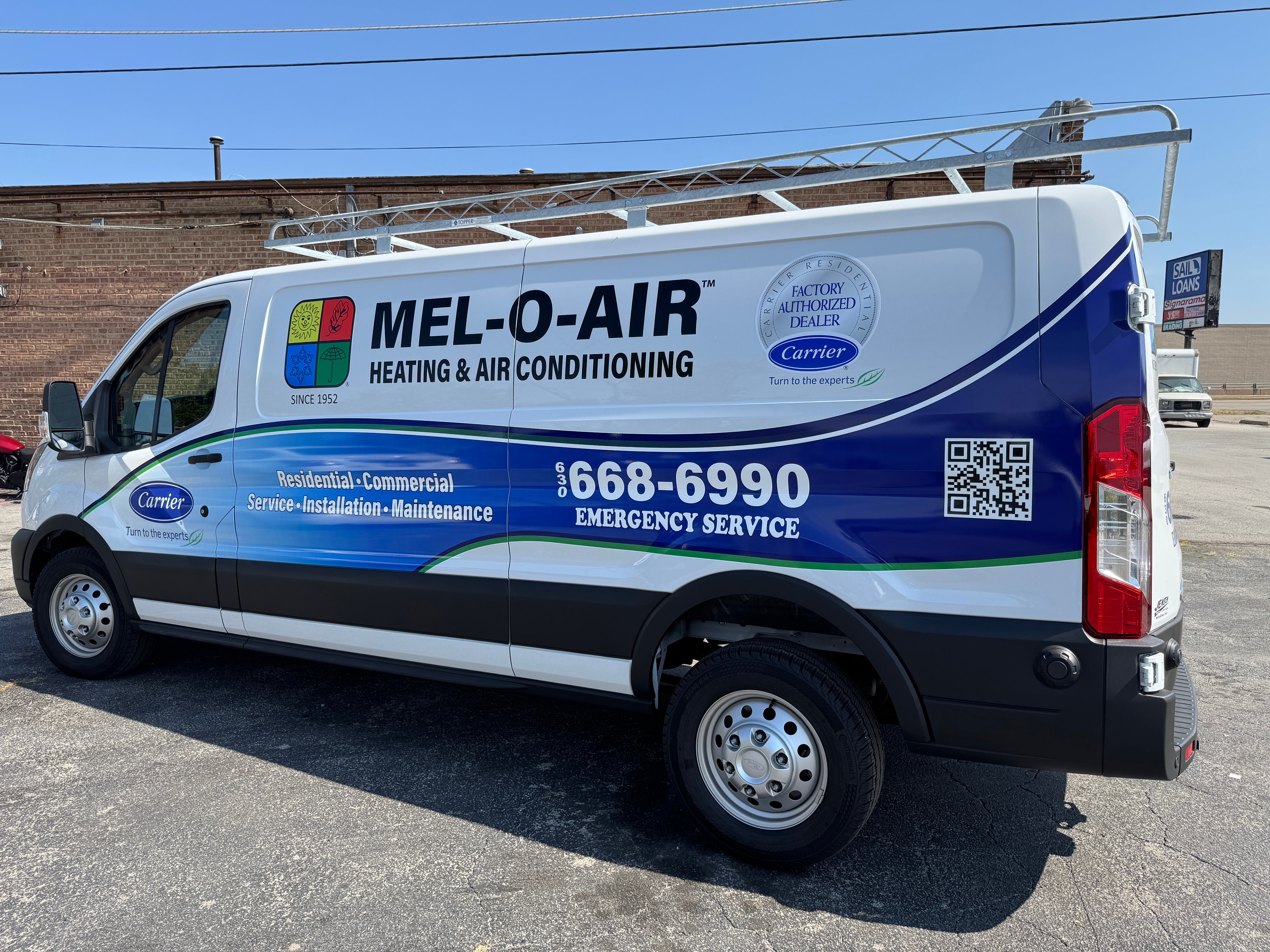
Even small inconsistencies can weaken fleet branding over time. A clear design system helps reduce errors and keeps every vehicle recognizable as part of the same business.
Using Identical Artwork on Every Vehicle
Consistency does not require the exact same layout. Vans, pickups, box trucks, and trailers have different proportions, so each design should adapt while preserving the same visual identity.
Giving Every Message Equal Emphasis
Too much information can make vehicle wraps difficult to scan. Prioritize the logo, primary service message, and call to action instead of giving every service or detail the same visual weight.
Changing Logos, Colors, or Typography
Using different logo versions, color values, or fonts across vehicles can make a fleet look disconnected. Approved brand assets should remain consistent across every design.
Ignoring Vehicle Geometry
Doors, wheel wells, handles, seams, and contours can interrupt important graphics or text. Vehicle-specific layouts should account for these features before production.
Reviewing Vehicles Individually
Approving each design in isolation can allow inconsistencies to slip through. Review the fleet as a complete system so every vehicle supports the same brand identity.
Frequently Asked Questions
Should every vehicle in a fleet use the same wrap design?
No. Every vehicle should follow the same overall brand system, but the layout should adapt to the vehicle’s size, shape, and available surface areas. The logo, colors, typography, and core message can stay consistent while placement and scale change.
How do you keep colors consistent across different vehicle wraps?
Use approved brand color values, controlled design files, and consistent production specifications. Keeping a centralized brand guide also helps reduce color variation when new vehicles are added or existing wraps are replaced.
What information should appear on every fleet vehicle?
Most fleet vehicles should include the business name or logo, a short service message, and one clear contact method or call to action. Additional details should only be added when there is enough space to keep the design readable.
Can a pickup truck match a box truck without using the same layout?
Yes. A pickup can match a box truck through shared colors, typography, logo treatment, graphic elements, and message hierarchy. The pickup may need a simpler layout because it has less usable space.
Why should vehicle wraps be designed from vehicle-specific templates?
Vehicle-specific templates help designers account for doors, handles, wheel wells, seams, hinges, and contours. This reduces the risk of important content being distorted, divided, or placed in low-visibility areas.
Plan Consistent Vehicle Wraps for Your Danbury Fleet
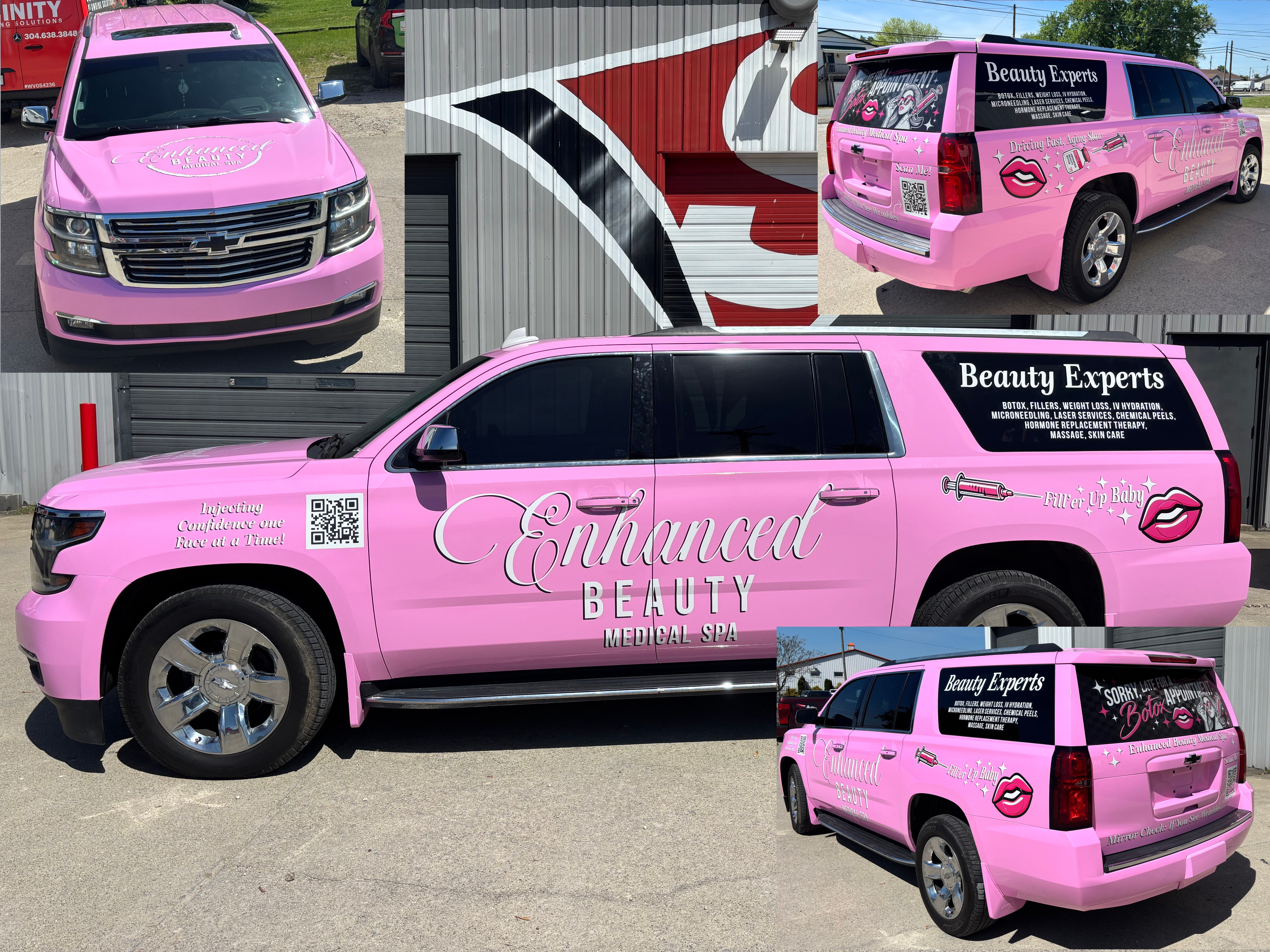
A mixed fleet does not need identical graphics to look unified. It needs a repeatable visual system that protects the same brand priorities across every vehicle type. Start with clear brand constants, establish a fixed message hierarchy, map usable design zones, and adapt the layout to each van, pickup, box truck, or trailer.
Signarama can help businesses plan custom vehicle wraps and fleet branding that stay recognizable across different vehicle shapes and sizes.
If you are adding vehicles, updating an existing fleet, or building a new visual system from the ground up, request a quote or discuss your signage needs with Signarama.


Signarama Danbury, CT
contact
Signarama Danbury, CT