

How to Design Eye-Catching Custom Yard Signs for Your Business in Danbury, CT
Mar 24, 2025 by Signarama Danbury
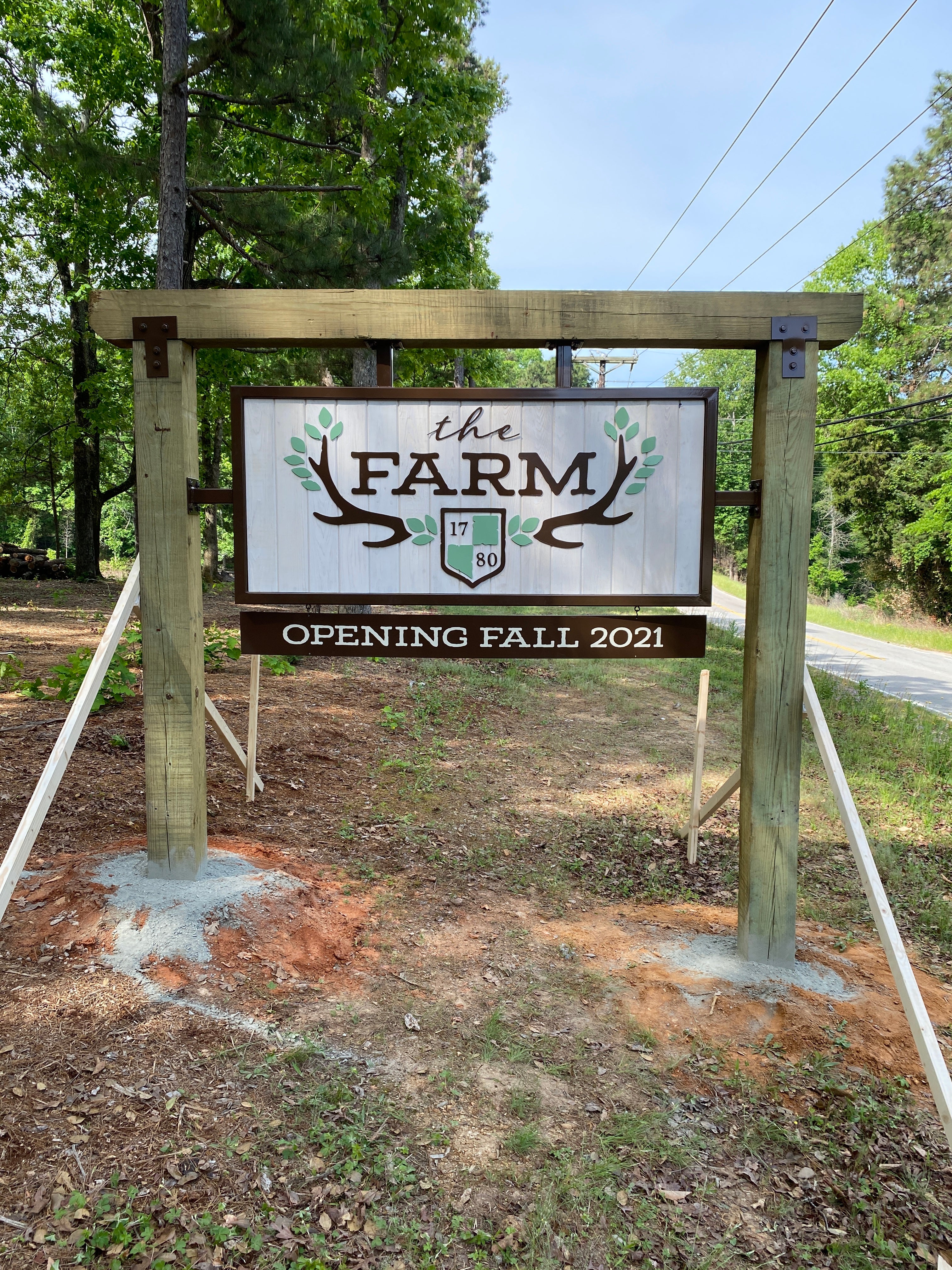
Creating eye-catching custom yard signs is an effective way for businesses in Danbury, CT, to attract attention, promote services, and increase brand recognition. A well-designed sign should be visually appealing, easy to read, and strategically placed to maximize visibility. From choosing the right colors and fonts to ensuring proper placement, every design element plays a crucial role in making a lasting impression.
Here are key tips to design custom yard signs that stand out and drive results.
1. Choose Bold and Readable Fonts
Custom yard signs are an effective way to attract attention, but their impact depends on how easily people can read them. The right font choice ensures that potential customers quickly understand the message, even from a distance.
Use Large, Easy-To-Read Typography
The size of the text on a sign significantly affects its visibility. Large, bold letters make a sign easier to read, ensuring that people passing by can quickly absorb the information.- Prioritize Legibility: Fonts should be clear and well-spaced, allowing people to read the sign effortlessly, whether they are walking or driving past. The goal is to convey the message in seconds.
- Use Sans-Serif Fonts: Sans-serif fonts, such as Arial, Helvetica, and Futura, provide a modern and clean appearance. These fonts are easier to read because they lack decorative strokes that can make text look cluttered.
- Consider Font Weigh: Thicker, bolder fonts enhance readability, making the text stand out against the background. Thin or lightweight fonts may blend in, reducing visibility, especially under different lighting conditions.
- Ensure Proper Spacing: The spacing between letters and words (kerning and tracking) should be balanced to prevent text from appearing cramped or too spread out. Proper spacing improves readability and makes the design look polished.
Avoid Script Or Overly Decorative Fonts
While script and decorative fonts may look stylish, they often reduce readability. A sign’s effectiveness depends on how quickly and easily people can read the message. Choosing the wrong typeface can make the sign difficult to understand, reducing its impact.- Limit Cursive Styles: Script fonts are often too intricate for signage. Their flowing strokes and connected letters make them challenging to read, especially at a distance. They work best for decorative purposes rather than for conveying key information.
- Avoid Excessive Embellishments: Some fonts have unnecessary flourishes, thin lines, or highly stylized elements that make words difficult to distinguish. These details can blur together, making the sign less effective.
- Stick to Professional Typography: Custom yard signs should look professional and easy to read. Simple, clean fonts enhance credibility and ensure that the message reaches as many people as possible.
2. Use High-Contrast Colors
Custom yard signs should be designed with colors that not only attract attention but also ensure the message is easily readable. High-contrast color combinations enhance visibility, making it easier for passersby to absorb important information at a glance.
Select Colors That Stand Out in Any Environment
The colors used on a sign determine its effectiveness in capturing attention. A strong contrast between the text and background enhances readability, ensuring the sign remains visible in different settings, such as residential neighborhoods, busy streets, or commercial districts.- Bold Color Combinations: Using high-contrast color pairings ensures the text is clear and easy to read. Combinations such as black on yellow, white on red, or dark blue on white provide excellent readability and visibility, even from a distance.
- Avoid Low-Contrast Colors: Colors that are too similar, such as light blue on white or dark gray on black, make the text difficult to distinguish. Signs with poor contrast can go unnoticed, reducing their effectiveness in attracting attention.
- Consider the Surrounding Environment: A sign should contrast with its background to avoid blending in. For example, a green sign placed in a grassy area may become invisible, whereas a bright yellow or white sign would stand out. Similarly, a sign near a red brick building should avoid red tones to ensure it remains noticeable.
Ensure Readability From a Distance
A sign's primary purpose is to convey information quickly. Whether placed along a roadside, in front of a storefront, or within a community, a well-designed custom yard sign must be readable from a reasonable distance to be effective.- High-Contrast Text and Background: Text should always be a contrasting color against the background to ensure it stands out. For example, black text on a white or yellow background provides high visibility, while white text on a dark blue or red background offers a sharp contrast that is easy to read.
- Limit the Number of Colors: Using too many colors can create visual clutter, making the message harder to process. A design with two to three contrasting colors maintains clarity while still looking professional and visually appealing.
- Adjust Contrast for Large and Small Signs: Larger signs may allow for slightly lower contrast, as viewers have more time to process the information. However, smaller signs should prioritize strong contrast to ensure quick readability.
3. Include a Clear Message
A well-designed custom yard sign should communicate a clear and concise message that is easy to understand at a glance. Passersby often have only a few seconds to read the sign, so the wording must be direct and to the point.
Keep Text Short and Impactful
LED and neon are the primary lighting choices for channel letter signs, but they differ in performance, maintenance, and appearance. Understanding these differences helps businesses make an informed decision.- Limit Word Count: The most effective yard signs have a message that can be understood within seconds. Aim for 5 to 7 words to keep it concise while still delivering the essential information.
- Prioritize Key Information: Focus only on the most important details. Avoid extra words or unnecessary descriptions that may distract from the main message.
- Avoid Overcrowding: Too much text or excessive design elements can make the sign look cluttered. A clean layout ensures that the message stands out and is easy to read, even at a quick glance.
Focus on Essential Information
A custom yard sign should include only the most necessary details to inform potential customers without overwhelming them. Keeping the message focused ensures that people can quickly understand what is being offered and how to respond.- Business Name: The name of the business should be prominently displayed in a bold, easy-to-read font. This helps with brand recognition and makes it clear who is providing the service or promotion.
- Service or Promotion: Clearly stating the purpose of the sign is essential. Whether it is advertising a specific service, event, or promotion, the main message should be front and center. Simple phrases like “Lawn Care Services,” “Now Open,” or “50% Off Sale” instantly inform viewers of what the business is offering.
- Contact Details: Providing a way for potential customers to get in touch is crucial. A phone number, website, or QR code should be displayed in a readable size. This makes it easy for people to take action, whether by calling, visiting a website, or scanning for more details.
4. Incorporate a Strong Call to Action
A strong call to action (CTA) is essential for making custom yard signs effective. It encourages potential customers to take immediate action rather than simply noticing the sign and moving on. A well-crafted CTA should be clear, persuasive, and easy to follow.
Use Action-Oriented Language
The wording of the CTA should be direct and encourage an immediate response. Passive phrases may not grab attention, so using active, compelling words is essential.- "Call Now": This phrase prompts potential customers to take action immediately rather than delaying. Including a phone number makes the CTA more effective and provides an easy way to connect with the business.
- "Visit Today": This message creates a sense of urgency, encouraging customers to stop by the business while they are nearby. It works especially well for physical locations such as retail stores, restaurants, and service providers.
- "Learn More": This CTA is ideal for businesses offering complex services or products. It invites customers to gather additional information before making a decision, increasing engagement.
Create a Sense of Urgency
Encouraging quick action increases the likelihood of customer response. A sense of urgency makes potential customers feel that they must act immediately to avoid missing out.- "Limited Time Offer": This phrase informs customers that they have a short window to take advantage of a special deal. It can be effective for seasonal promotions or discounts.
- "Spots Are Filling Up": This message is ideal for service-based businesses, such as event planners or fitness trainers, to create demand. It suggests that availability is limited and encourages customers to act quickly.
- "Call Before It’s Too Late": This CTA works well for businesses that want to prompt immediate decision-making. It implies that delaying could result in missing out on a valuable opportunity.
5. Add Branding Elements
A well-branded custom yard sign helps businesses in Danbury, CT, create a lasting impression. Consistency in design reinforces brand recognition and makes marketing efforts more effective.
Feature Company Logo And Brand Colors
A company’s logo and brand colors play a crucial role in making a custom yard sign visually appealing and instantly recognizable. These elements help potential customers connect the sign with the business.- Company Logo: Placing the logo in a prominent position ensures that people associate the sign with the business immediately. A high-resolution version should be used to maintain clarity.
- Brand Colors: Using official brand colors creates consistency with other marketing materials. This approach strengthens brand identity and makes the sign stand out.
- Contrast And Visibility: Selecting a background that contrasts well with the logo and text improves readability, even from a distance.
Maintain Consistency With Other Marketing Materials
A custom yard sign should reflect the same design elements as a business’s other promotional materials. Consistency across platforms makes marketing more effective and professional.- Matching Fonts And Styles: The fonts and design styles used on the sign should match those used on websites, business cards, and social media. This ensures a cohesive look.
- Unified Message: The wording and call to action should align with other advertisements to avoid confusion and reinforce branding.
- Professional Appearance: A polished and professional design builds trust with potential customers and ensures the sign looks credible.
6. Optimize for Placement and Visibility
Effective placement is crucial for maximizing the impact of custom yard signs. A well-placed sign ensures that potential customers can easily see and understand the message, even from a distance. Choosing high-traffic locations and maintaining clear visibility can help businesses in Danbury, CT, attract more attention and increase brand awareness.
Position Signs in High-Traffic Areas
To get the most exposure, custom yard signs should be placed where large numbers of people frequently pass by. Strategic placement increases visibility and enhances the chances of engagement.- Near Major Roads and Intersections: Busy streets and intersections receive constant vehicle and pedestrian traffic, making them ideal locations for yard signs. Signs placed along these routes can effectively capture attention and direct potential customers toward the business.
- Close to Business Locations: Positioning signs near a storefront or in surrounding areas reinforces brand recognition and helps guide customers to the exact location. This is especially useful for businesses in shopping plazas or areas with multiple stores.
- At Community Hubs: Placing signs near public spaces such as parks, libraries, event venues, or shopping centers ensures that they reach a wide and diverse audience. These areas attract local residents and visitors, increasing the likelihood of engagement.
- On Private Property with Permission: Gaining approval to display signs on privately owned high-visibility properties, such as neighboring businesses or residential lawns, can expand marketing reach. These locations provide additional exposure without the need for costly advertising space.
- Near Traffic Lights or Stop Signs: Areas where cars naturally slow down or stop giving people more time to read and process the message on a sign, increasing its effectiveness.
Ensure Signs Are Properly Exposed
Proper placement is not just about location—it also involves making sure that signs remain clearly visible and easy to read from a distance. A sign that is blocked by objects, too low to the ground, or positioned too high may fail to capture attention.- Keep Signs at Eye Level: Signs should be placed where they align with the average person's natural line of sight. If a sign is too low, people may not notice it, and if it is too high, the message may be difficult to read.
- Avoid Visual Clutter: Signs should be positioned away from trees, fences, poles, or other objects that could obstruct the view. A clear, open space ensures the sign stands out and remains legible.
- Ensure Proper Lighting and Visibility: In areas with limited natural light, using reflective materials or placing signs near streetlights can improve readability at night. Businesses that rely on after-hours visibility should consider illuminated signage.
- Angle Signs for Maximum Exposure: Positioning signs perpendicular to roads ensures they face passing traffic directly. This orientation makes them easier to read than signs placed at an angle or parallel to the street. >
Frequently Asked Questions
How do I clean my custom yard sign? Cleaning a custom yard sign is simple and helps maintain its appearance. Use a soft cloth or sponge with mild soap and water to wipe off dirt and debris. Avoid using harsh chemicals or abrasive scrubbers, as they can damage the print. If the sign has stubborn dirt, gently scrubbing with a soft brush should work. Let the sign dry completely before placing it back outside.
What should I do if my yard sign keeps blowing away? If your yard sign keeps blowing away, you might need to secure it better. Try using stronger stakes or adding additional support, like zip ties or weighted bases. Some people place their signs closer to fences or buildings to shield them from strong winds. If your area experiences frequent high winds, consider using a heavier material for the sign. Another trick is to slightly angle the sign so the wind doesn’t hit it directly.
How big are custom yard signs? The size of custom yard signs can vary depending on the purpose and preference of the person ordering them. The most common size is 18 inches by 24 inches, which is easy to read from a short distance. Some signs are smaller, around 12 inches by 18 inches, which works well for personal messages or small yards. Larger sizes, like 24 inches by 36 inches, are often used for events or high-traffic areas where visibility is crucial. The size you choose depends on how much text or imagery you want to include. Bigger signs may be necessary if you need to catch attention from a greater distance.
How long do custom yard signs last? The lifespan of a custom yard sign depends on the materials used and the weather conditions it is exposed to. If placed outdoors in a mild climate, a sign can last several months or even over a year without significant wear. Signs made from weather-resistant materials, like corrugated plastic, tend to last longer than cardboard ones. Sun exposure, rain, and strong winds can cause fading or damage over time. If taken care of properly, such as bringing them inside during bad weather, they can last even longer. Many people reuse their yard signs for seasonal events or annual celebrations.
Can I reuse my custom yard sign? You can reuse custom yard signs if they are stored and handled properly. If the sign is made of durable material and not damaged, you can bring it out again for future use. Some people store their signs indoors when they are not needed to prevent fading or weather damage. If you need to change the message but keep the same sign, you can sometimes place a sticker or overlay on top of the existing design. For general signs like "Happy Birthday" or "Garage Sale," reusing them every year is common.
Get Noticed with Custom Yard Signs in Danbury, CT! Stand out in Danbury, CT, with high-quality custom yard signs designed to capture attention and drive business. Signarama specializes in creating durable, eye-catching signage that helps businesses, real estate agents, and event organizers make a lasting impression. Whether promoting a special offer, directing customers, or increasing brand awareness, our expert team ensures your signs are professionally designed and strategically placed for maximum visibility. Let Signarama help you make an impact in Danbury, CT, with signage that delivers results.
Contact us today to get started!

Signarama Danbury, CT
contact
Signarama Danbury, CT