



Types of Storefront Signs in Millwood, NY, and How to Choose
Sep 10, 2026 by Signarama Millwood
A storefront sign needs to help people find the business, communicate the brand clearly, fit the building, and remain readable from the places customers actually approach. Choosing among the different types of storefront signs is therefore less about picking the most eye-catching option and more about matching the sign to the location.
For businesses in Millwood, NY, that decision also needs to account for local requirements. Millwood falls within the Town of New Castle, where sign regulations address permitted sign types, size, placement, illumination, maintenance, and approvals.
Comparing the Main Types of Storefront Signs
Each sign type solves a different visibility problem. Some are designed for drivers approaching from a distance. Others work best for pedestrians close to the storefront. Some add architectural depth, while others use windows, awnings, or freestanding locations near property entrances.
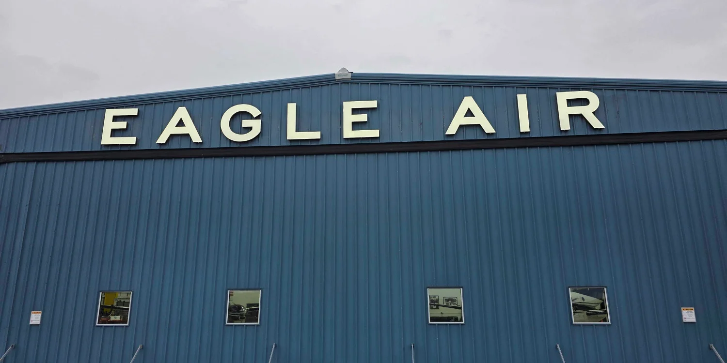
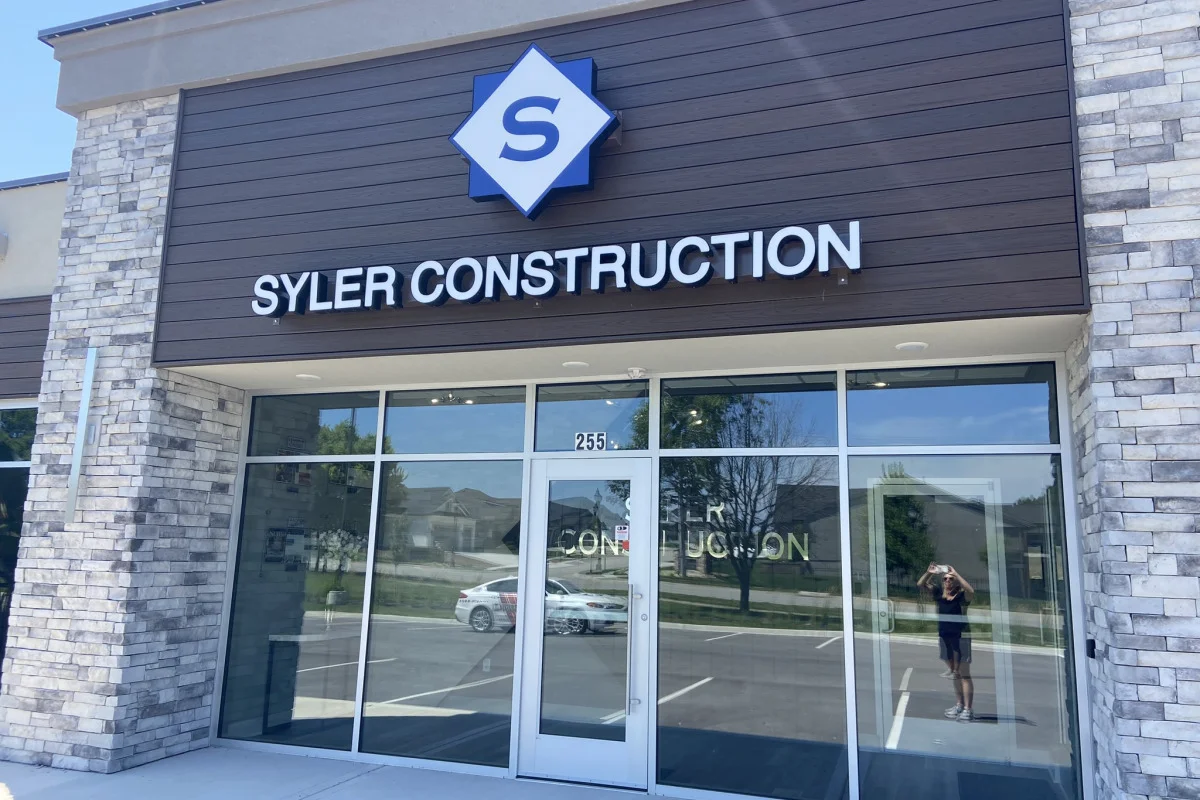
Channel Letters
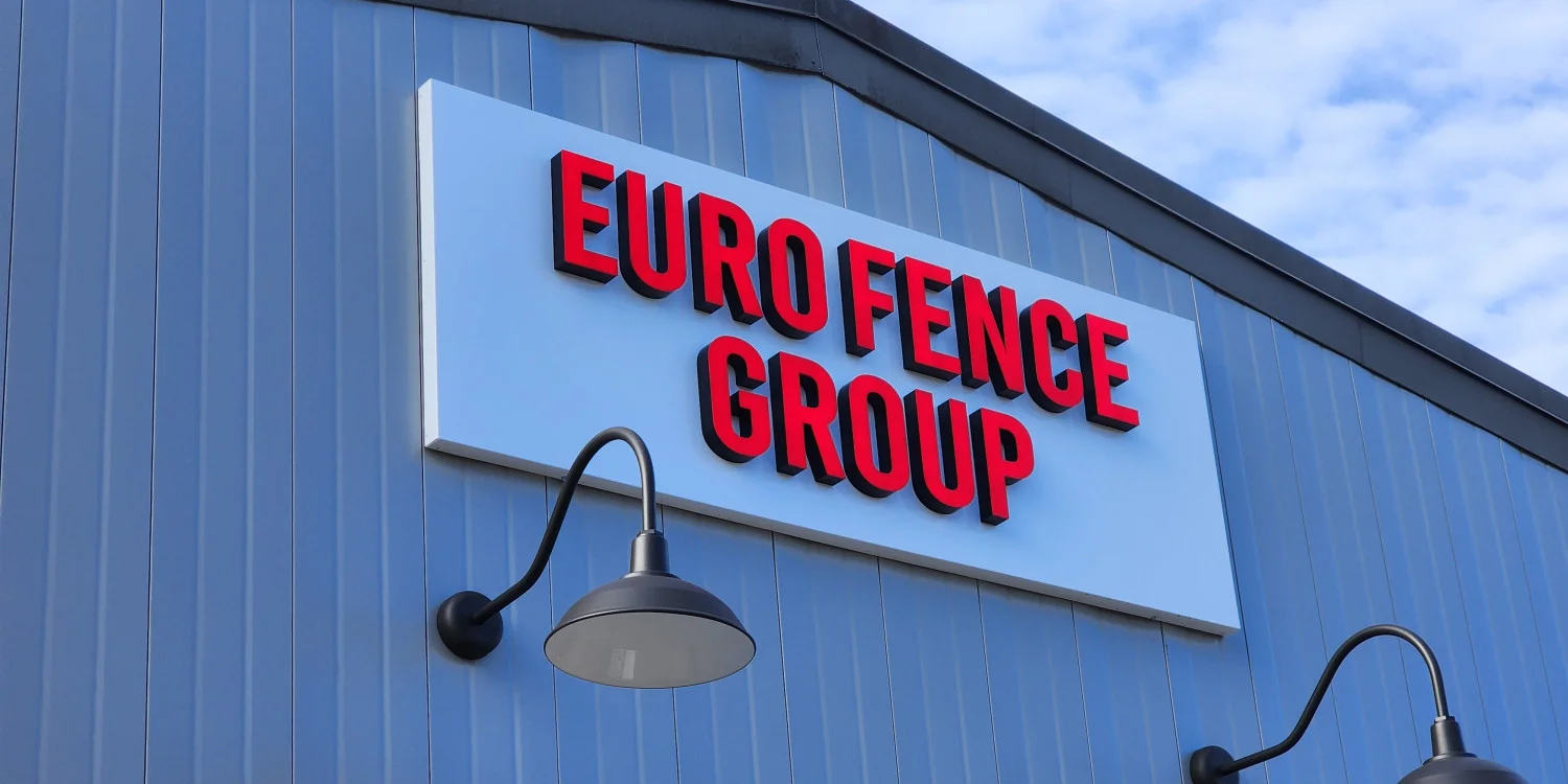
Channel letters are individually fabricated letters or logos mounted directly to a facade or onto a raceway. They add strong dimensional depth and work well for retail stores, restaurants, and shopping centers.
Channel letters excel at helping customers identify a location from across a parking lot or busy road. Built-in illumination options also enhance visibility after dark, subject to local regulations.
Highly customizable in shape, color, and design, channel letters closely align with brand guidelines. Maintenance varies based on materials, exposure, and lighting components.
Best fit: Businesses that need prominent building identification and have enough facade space for individual letters.
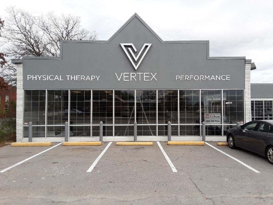
Dimensional Letters
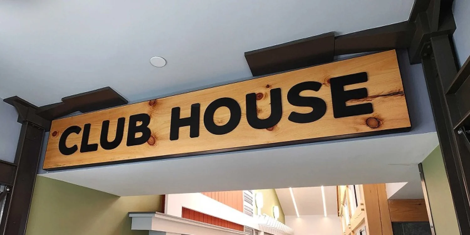
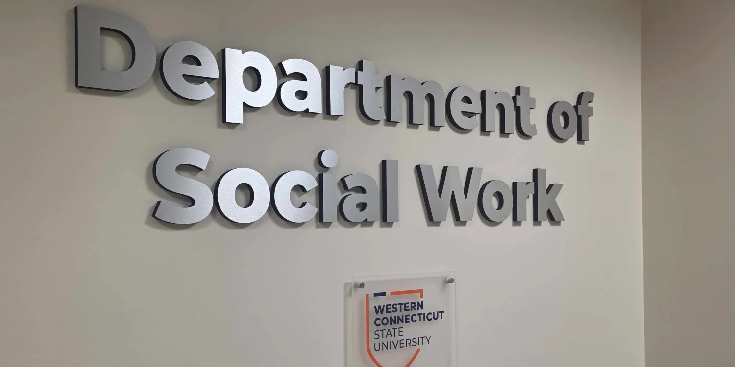
Dimensional letters deliver a raised, 3D appearance without the deep casing of channel letters. Common materials include acrylic, PVC, metal, and durable rigid substrates.
Ideal for professional offices, boutiques, and salons, these signs offer a clean, architectural look. They provide strong close- to medium-range visibility depending on size, height, and background contrast.
Non-illuminated options do not require lighting-component maintenance. To ensure readability, choose colors that contrast sharply with facade materials like brick, stucco, or stone.
Best fit: Businesses that want a polished dimensional brand presentation without the visual weight of a larger sign cabinet.
Cabinet Signs
Cabinet signs display text, logos, or complex artwork on a single enclosed frame. They are ideal for intricate designs that are difficult to produce as individual letters.
These signs consolidate messaging into one clear box structure. Available in illuminated and non-illuminated styles, they offer a traditional and organized presentation.
While practical and clean, their enclosed shape creates a more contained visual presentation than individual dimensional letters. Maintenance mainly involves servicing the face, frame, and optional internal lights.
Best fit: Businesses with compact sign zones, detailed logos, or a need to keep the full brand message within one defined panel.
Awning Signs
Awnings combine weather protection with brand identification. Custom lettering or logos are applied to the face or valance, integrating the sign into the storefront structure.
They work exceptionally well for cafes, restaurants, and street-level retail by placing branding directly above pedestrian entrances.
Fabric options require occasional cleaning to remove dirt and periodic inspection for fading or weather-related wear. Projection distances and sign dimensions must comply with applicable local sign and building requirements.
Best fit: Street-facing businesses that want identification plus an architectural element over windows or entrances.
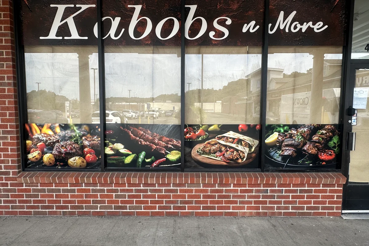
Window Graphics
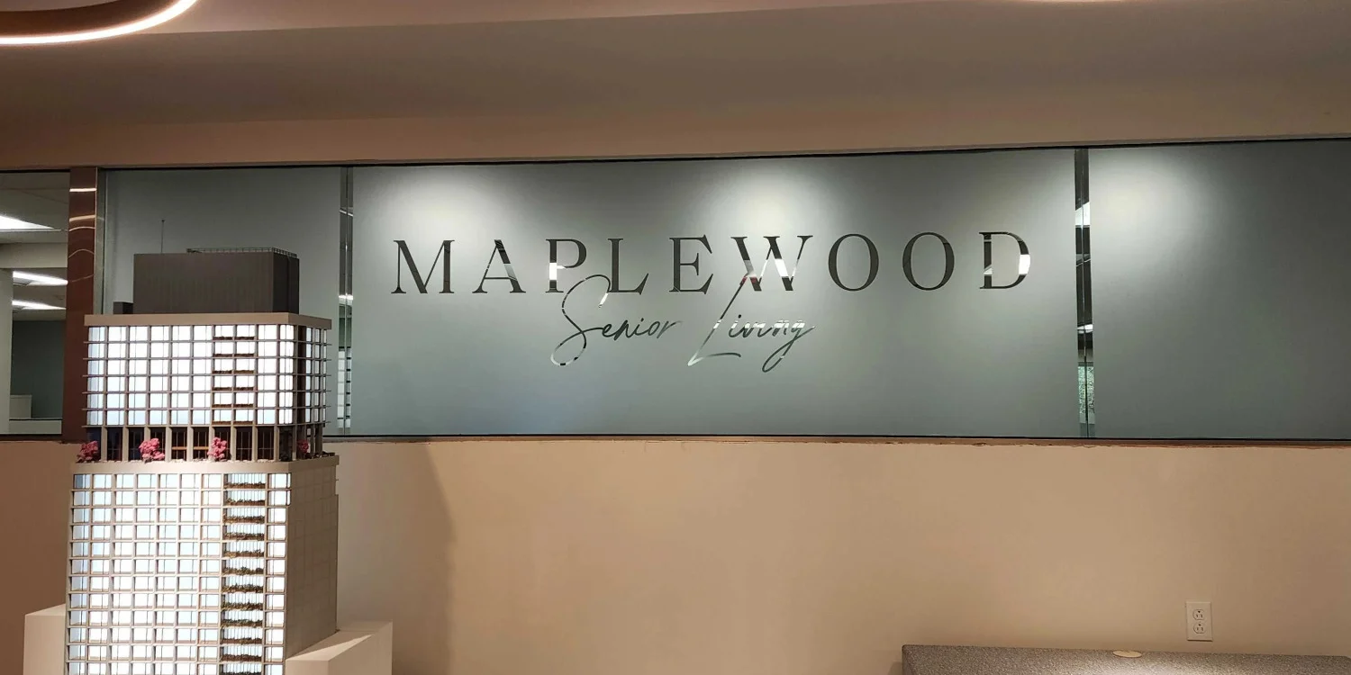
Window graphics transform glass surfaces into advertising space for logos, operating hours, service lists, and seasonal offers using cut vinyl or full-color prints.
They complement primary building signs without adding bulky hardware, making them ideal for heavy foot traffic and large glass storefronts.
Readability depends on high contrast, proper interior lighting, and uncluttered text. Vinyl graphics are easy to update or replace when messaging or branding changes.
Best fit: Businesses with usable storefront glass that need close-range identification, supporting information, or seasonal flexibility.
Blade Signs
Blade signs extend outward perpendicular to the building facade, maximizing visibility for pedestrians walking along the sidewalk from either direction.
They capture foot traffic that might miss wall-mounted signs until standing directly in front of the door. A compact blade sign effectively showcases concise names or icons.
Because blade signs project outward from the building, installation must account for required clearance, projection limits, mounting security, and restrictions on projecting over public rights-of-way.
Best fit: Pedestrian-oriented storefronts where side-angle visibility matters more than long-distance viewing.
Monument Signs
Monument signs are low-profile, freestanding structures placed near entrances, driveways, or road frontages rather than on the building itself.
They can be especially useful when buildings are set back from the road, providing early identification for drivers entering multi-tenant complexes or office parks.
Built from durable materials like stone, brick, or metal, monument signs should complement surrounding architecture and landscaping while meeting local ground-sign codes.
Best fit: Properties where customers need clear roadside or driveway identification before reaching the building.
How to Choose the Right Storefront Sign
Comparing sign types is easier when you work through the decision in order. These steps help prevent a design from looking good on screen but performing poorly on site.
1. Start With the Viewing Conditions
Identify where customers first see the business. Are they driving past, turning into a parking lot, walking along a sidewalk, or approaching from an angle? Viewing distance and direction should influence size, orientation, letter height, and placement.
A blade sign may outperform a wall sign for sidewalk traffic, while channel letters or a monument sign may work better for longer approach distances.
2. Evaluate the Building and Available Sign Areas
Look at facade width, wall materials, windows, awnings, rooflines, mounting surfaces, and existing architectural features. The building can eliminate some options and make others more practical.
A storefront with extensive glass may benefit from window graphics plus dimensional lettering. A business set back from the road may need property identification before customers can see the storefront.
3. Decide Whether After-Dark Visibility Matters
If the business operates in the evening, visibility after sunset becomes part of the comparison. Some sign types can incorporate illumination, while others rely on ambient or exterior lighting.
Lighting can affect design, maintenance, electrical coordination, approvals, and code compliance. In Millwood, illumination should be considered in the context of Town of New Castle sign regulations and the property's zoning.
4. Match the Sign to the Brand
A storefront sign is a physical version of the brand. The design should preserve recognizable colors, typography, logo proportions, and overall tone while staying readable at the intended distance.
Simplification often helps. A detailed logo may need adaptation for a blade sign, while a cabinet or window graphic can handle more complex artwork.
5. Compare Maintenance Requirements
Outdoor signs face weather, dirt, sunlight, seasonal temperature changes, and normal wear. Consider what will need periodic cleaning, inspection, refinishing, graphic replacement, or component service.
The goal is to choose a format whose upkeep is realistic for the business and property.
6. Confirm Local and Property Requirements Before Final Production
The Town of New Castle regulates signs within Millwood, including sign types, placement, area, illumination, construction, and maintenance.
Depending on the application, the approving authority may be the Board of Architectural Review, the Planning Board for the initial placement or relocation of a freestanding sign, or the Town Building Department for certain nonilluminated wall signs.
Landlords and shopping centers may also have their own criteria. Confirming requirements before final production can reduce redesign.
Storefront Sign Design Factors That Matter in Millwood, NY
Millwood includes commercial properties with different setbacks, facade styles, traffic patterns, and neighboring uses. A sign that works on a small street-facing storefront may not solve the same problem for a business located deeper within a commercial property.
Visibility should come first. The sign needs enough contrast and scale to be understood from the primary approach. Next, consider how it relates to the building. When planning storefront signs for business properties, the design should look integrated with the architecture rather than cover important details or compete with them.
Local compliance is another practical factor. The Town of New Castle Code addresses permitted sign types, sign area, projecting signs, illumination, safety, and maintenance. The code also establishes different approval paths for certain sign applications.
Because site conditions and zoning can change what is allowed, businesses should verify current requirements for the specific property before fabrication.
Frequently Asked Questions
Can an existing storefront sign be updated instead of completely replaced?
In many cases, yes. Depending on the sign's construction and condition, businesses may be able to update graphics, lettering, sign faces, lighting components, or other elements without replacing the entire structure. The best approach depends on the existing sign and any applicable property or municipal requirements.
What information should I have before requesting a storefront sign quote?
It helps to provide the property address, photos of the storefront, approximate sign dimensions, preferred sign type, logo or branding files, and whether illumination is needed. Landlord or property-management sign criteria can also help determine what options are practical.
Can a storefront sign be installed on a leased commercial property?
Potentially, but tenants should review their lease and obtain any required landlord or property-management approval before moving forward. Shopping centers and commercial landlords may have sign criteria in addition to municipal requirements.
Can an old storefront sign be repaired?
Some storefront signs can be repaired if the primary structure remains in usable condition. Repairs may involve replacing damaged faces, lettering, mounting components, electrical parts, or finishes. A site inspection can help determine whether repair or replacement makes more sense.
What design files are helpful when ordering a custom storefront sign?
Vector logo files are generally the most useful because they allow artwork to be scaled cleanly. Brand colors, fonts, logo specifications, storefront photos, and available measurements can also help translate existing branding into a physical sign.
Plan Your Custom Storefront Sign
The right storefront sign should make the business easier to find, easier to recognize, and more consistent with the brand. That starts with understanding how customers approach the property, what the building can support, which sign types fit the visual identity, and what local rules allow.
Signarama can help businesses evaluate custom storefront signs, develop a practical storefront sign design, and plan signage around property and brand requirements.
If you are comparing types of storefront signs for a business in Millwood, NY, contact Signarama to discuss your signage needs and start your sign project.


Signarama Millwood, NY
contact
Signarama Millwood, NY