



Business Sign Design Tips for Better Visibility in Millwood, NY
Sep 15, 2026 by Signarama Millwood
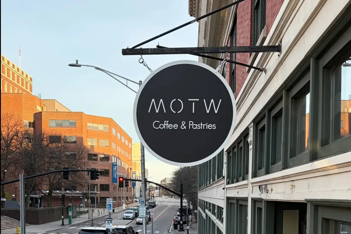
A business sign has only a few seconds to do its job. A driver passing through Millwood, a customer turning into a parking lot, or a pedestrian approaching a storefront needs to notice the sign, identify the business, and understand the most important message quickly. That is why effective business sign design starts with readability.
For businesses in Millwood, NY, thoughtful sign design matters because customers may approach signs from several directions and at different speeds. Commercial entrances, parking areas, and pedestrian approaches create different viewing conditions. The goal is to make the right information easy to see and understand.

Why Sign Readability Should Guide the Design
Readability is the ability to recognize and understand a sign’s message under actual viewing conditions. It depends on more than whether the letters are technically visible. A viewer also needs enough time and visual clarity to process the message.
Sign legibility relies on several key factors, including letter height, color contrast, font style, viewing distance, and available reading time. Because faster vehicle speeds limit the time drivers have to process text, roadside signs require simpler messaging and a clearer visual hierarchy compared to indoor signs intended for foot traffic.
How to Design Signs for Better Visibility
1. Start With Viewing Distance and Viewer Speed
A pedestrian sign can include more detail than a roadside sign viewed by drivers. Building signs mounted high require larger letters than window graphics at eye level, while directional signs at entrances must communicate quickly before a turn.
Primary signs should capture attention from moving vehicles, leaving details like hours or service lists for secondary door or window graphics. Attempting to include all information on a single sign overloads the sign with text and weakens the primary message.
2. Choose Letter Size for the Real Viewing Distance
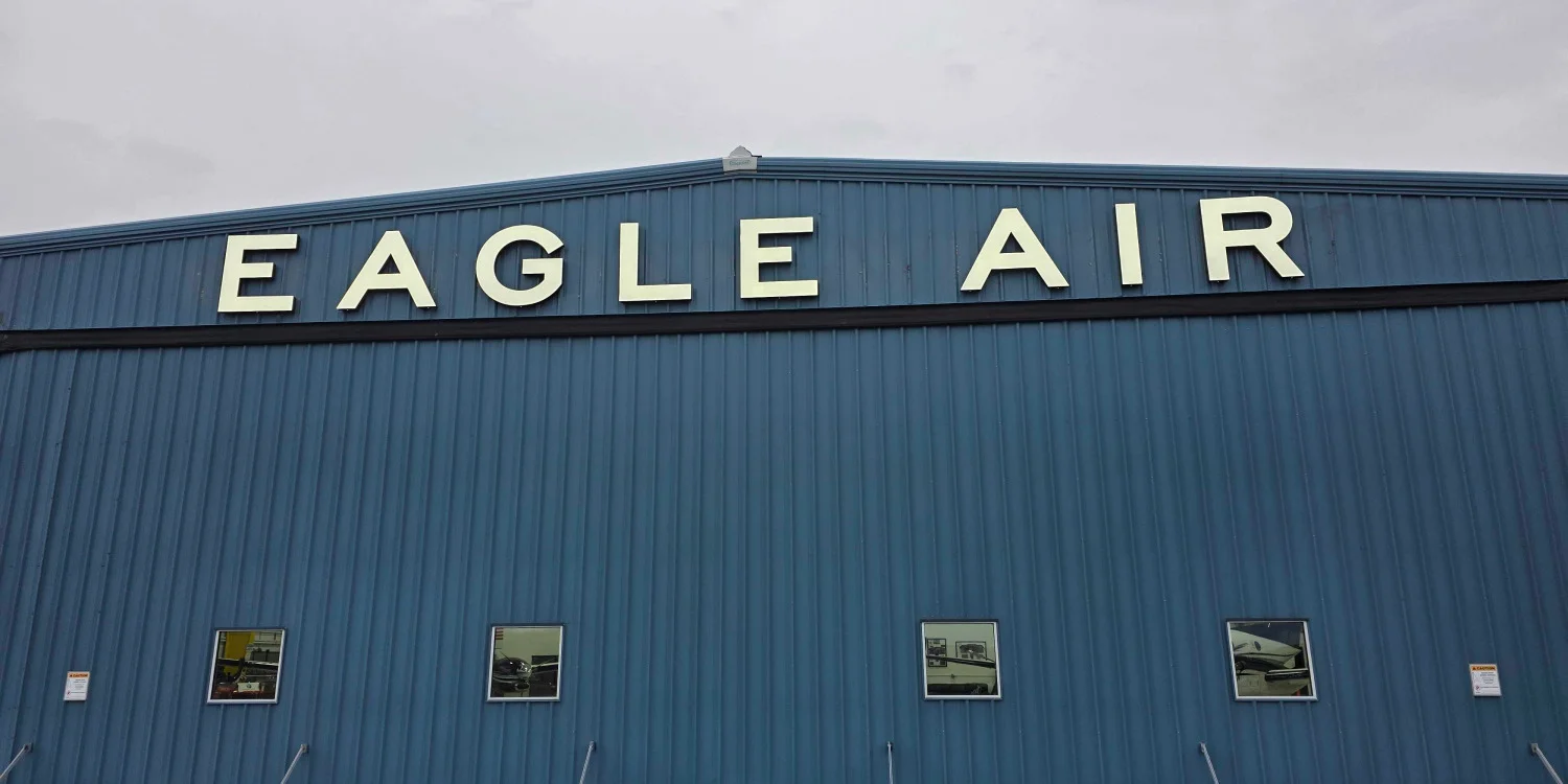
Letter height must increase as viewing distance increases to ensure legibility and give viewers enough time to process the text.
Do not size text based on screen mockups. Test full-scale designs from the actual approach distance.
A large primary name paired with a smaller secondary descriptor creates a clearer hierarchy. Primary branding should dominate, while supporting details can appear on secondary panels or window graphics where viewers have more time to read.
3. Use Strong Contrast Between Text and Background
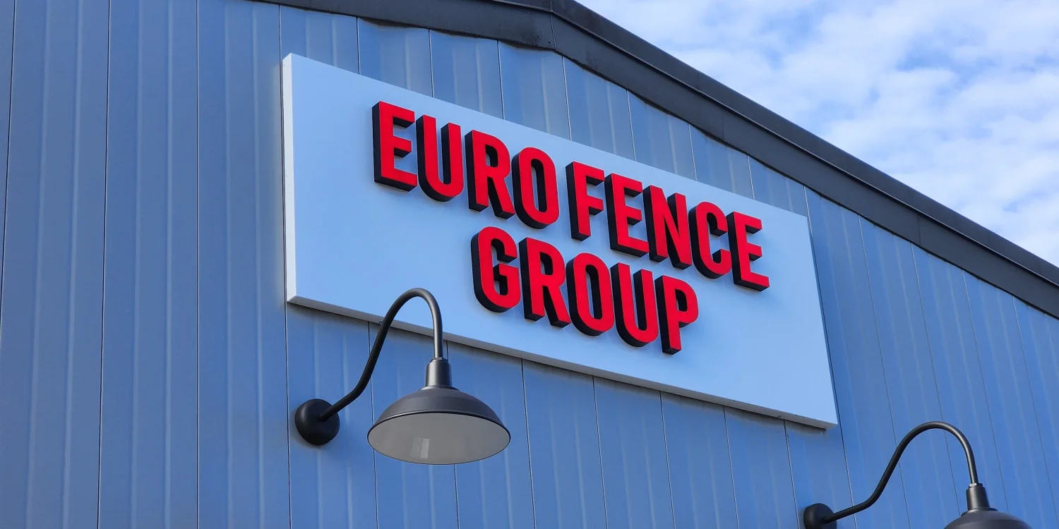
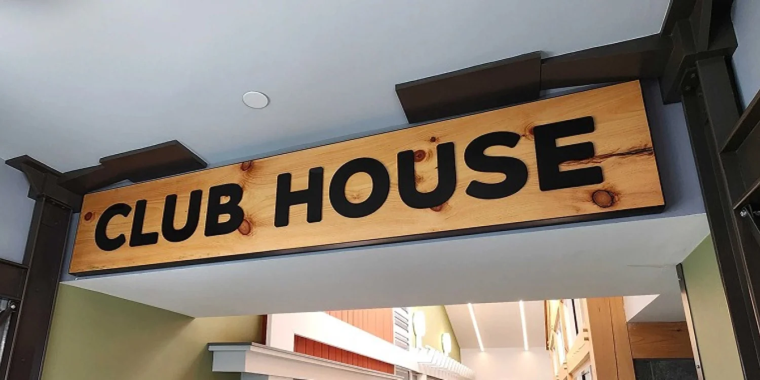
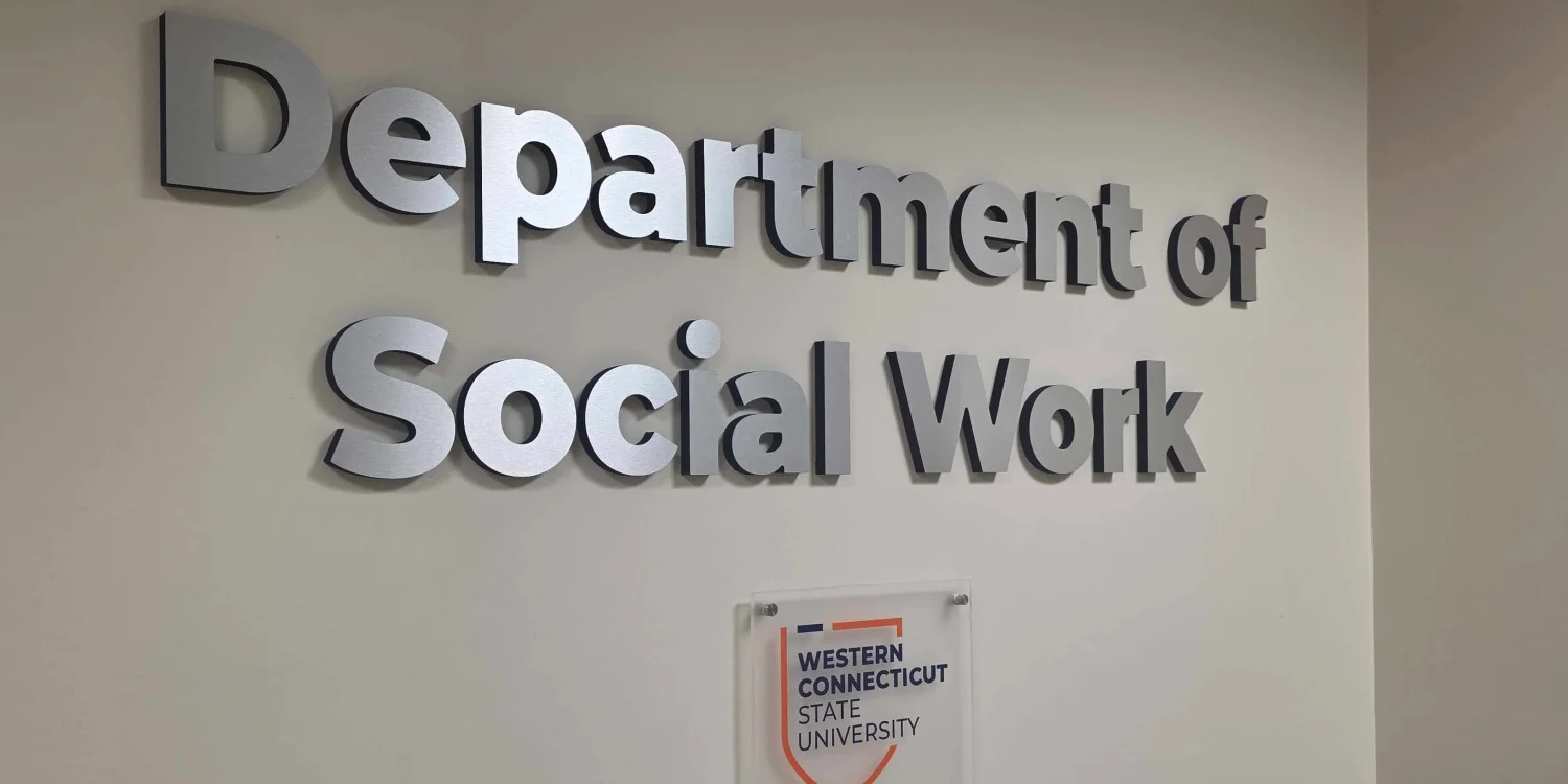
Characters should contrast sharply with their background using light text on dark backgrounds or dark text on light backgrounds. Glare, shadows, color tone, and surface texture also affect overall readability.
Brand colors may need adjustment for physical signage. Color combinations that appear distinct on digital screens may lose clarity when viewed from a distance. Avoid thin text over detailed imagery or low-contrast color combinations that become difficult to distinguish from afar.
4. Pick the Best Font for Signs Based on Clarity
The best font is usually the one that remains recognizable under the intended viewing conditions. Clean letterforms, open counters, adequate spacing, and sturdy strokes generally perform better than delicate or highly stylized types.
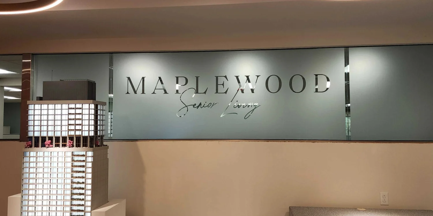
Decorative scripts, condensed styles, thin weights, and elaborate fonts can hinder quick recognition. Standard, clear letterforms with consistent stroke weight can improve legibility.
Distinctive brand fonts work well for short logos or wordmarks. For longer descriptions, directional details, or phone numbers, pair them with a simpler, highly legible typeface.
5. Build a Clear Message Hierarchy
The business name or primary directional instruction must take priority. Subtitles or descriptors come second, while minor details should only be included if viewing time allows.
Giving equal visual weight to business names, slogans, service lists, and contact information creates competition for attention, preventing any single message from standing out.
Before adding a copy, consider what the viewer must see first, what supporting detail helps next, and what information belongs on a separate surface.
Distributing details across dedicated surfaces reduces clutter. Storefront signs establish identity, window graphics highlight services, door signs list hours, and entrance signs provide directions.
6. Reduce Visual Clutter Around the Message
Excessive colors, icons, type styles, or graphics create visual clutter. Surrounding architecture, landscaping, glare, and nearby signage can also distract from the primary message.
For example, a storefront crowded with multiple photos, service lists, and badges buries the business name. Streamlining the layout with a high-contrast business name, concise service highlights, and entry details can make the business easier to identify quickly.
7. Place the Sign Where People Naturally Look
Assess placement from every customer approach angle, including driving directions, driveway entrances, parking spaces, and walkways.
Mounting height impacts readability. Higher placements increase long-distance visibility but require larger text. Lower placements suit pedestrian copy or directional cues. Window displays must account for lighting, reflections, and internal fixtures.
Locations serving both vehicle traffic and pedestrians benefit from separate primary and secondary signage elements rather than a single congested design.
8. Plan for Daylight, Shade, Glare, and Night Conditions
Select materials, finishes, and colors based on expected lighting conditions. Matte or low-glare finishes can reduce distracting reflections in bright sunlight, while window graphics should be evaluated against interior lighting and reflections.

Different Signs for Different Customer Touchpoints
One sign does not always need to communicate everything. Businesses with roadside traffic, parking areas, multiple entrances, or pedestrian activity may benefit from using several sign types with different purposes.
Use Primary Signs for Identification
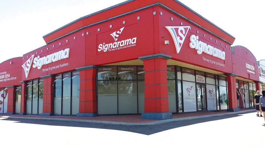
Building signs and monument signs can help customers identify the business from farther away. These signs should focus on the most important information, usually the business name or primary brand mark.
Use Directional Signs for Navigation
Directional signage can help customers navigate:
Driveway entrances
Parking areas
Shared commercial properties
Multiple building entrances
These signs work best when instructions are concise and positioned where customers can read them before they need to make a decision.
Save Detailed Information for Close-Range Signs
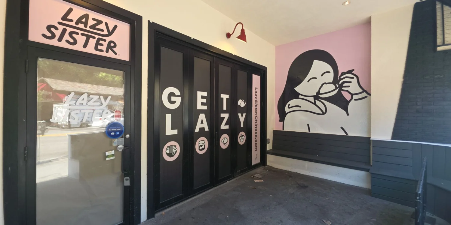
Window graphics, door signs, and smaller entry signs can communicate information that customers have more time to read, such as:
Business hours
Services
Suite numbers
Entry instructions
Promotional messages
Create a Logical Sign Sequence
A coordinated sign system should guide customers in stages:
Identify the business.
Find the correct entrance or parking area.
Confirm the destination.
Read detailed information closer to the storefront.
This approach reduces the need to overload the main sign with too much information.
Review the Full Customer Path
For Millwood businesses, evaluate the route customers take from the road to the door. If identification becomes unclear at any point, additional directional or secondary signage may improve both visibility and navigation.
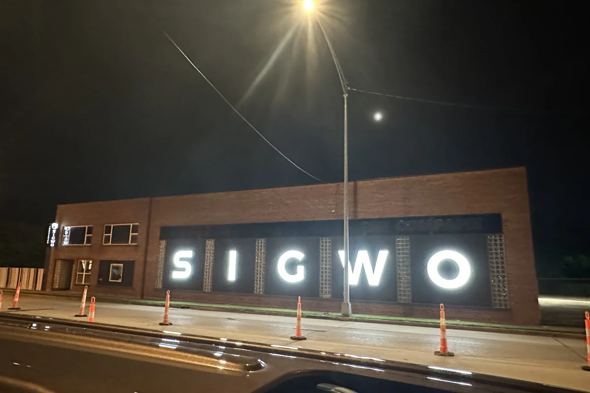
Sign Materials and Finishes for Real-World Conditions
A sign may use strong typography and contrast but still become difficult to read if the materials or finishes perform poorly outdoors. Glare, fading, dirt, weather exposure, and changing light conditions can all affect readability after installation.
Consider Surface Glare
Glossy finishes can reflect direct sunlight and make lettering harder to read from certain angles. Matte or low-glare finishes may perform better where strong sunlight or reflections are common.
Think About Long-Term Durability
Exterior signs should use materials suited to the property's weather exposure. Over time, visibility can decline because of:
Faded colors
Peeling graphics
Damaged sign faces
Cloudy panels
Worn finishes
Durable materials help preserve both readability and overall appearance.
Review Day and Night Performance
Materials can look different under:
Direct sunlight
Shade
Interior lighting
Exterior lighting
Nighttime illumination
For illuminated signs, the face material and lighting method should work together. Uneven brightness or poor nighttime contrast can reduce clarity instead of improving it.
Check Materials Before Production
Whenever possible, review material samples, finish options, and lighting conditions before fabrication. This helps confirm that the sign will remain readable in the actual environment, not just on a digital mockup.
Common Business Sign Design Mistakes to Avoid
Using text that is too small for the viewing distance is one of the most common sign design mistakes. Another is choosing a font because it matches the brand without testing how it reads at scale. Low contrast, excessive wording, weak hierarchy, and poor placement can also reduce readability.
Designers should also avoid treating every sign as a miniature advertisement. A permanent business sign often works best when it communicates identity or direction first. Promotional detail can live on banners, window graphics, posters, or other changeable surfaces.
Finally, do not judge a sign only by how it looks straight on. Real customers may see it at an angle, through a windshield, during rain or afternoon glare, or while navigating a turn. Those conditions should shape the design.
Frequently Asked Questions About Sign Design
Can an existing business sign be redesigned without replacing the entire sign?
Sometimes. Depending on the sign's construction and condition, it may be possible to update the face, graphics, lettering, finishes, or lighting components while keeping part of the existing structure. An inspection can help determine whether modification or full replacement is more practical.
What files should I provide when starting a custom sign design?
Useful materials include a vector logo, brand color specifications, approved fonts, storefront or property photos, and any existing sign standards. Measurements, landlord requirements, and examples of other branded materials can also help keep the finished sign consistent with the business's identity.
When should a business consider updating its existing signage?
A redesign may make sense after a rebrand, change in business name, relocation, property renovation, or noticeable decline in visibility. Businesses may also review signage when graphics become worn, information becomes outdated, or the current design no longer represents the brand accurately.
Can a logo be simplified for use on a business sign?
Yes. Detailed logos may need to be adapted so important shapes, lettering, and brand elements remain recognizable at the sign's intended size and viewing distance. Any simplification should preserve the key features that make the brand identifiable.
Should storefront signage match the architecture of the building?
Generally, the sign should work with the building rather than appear visually disconnected from it. Facade materials, available mounting areas, architectural details, and proportions can all influence the appropriate sign shape, scale, and installation method.
Plan a Sign That Customers Can Read Quickly
For a Millwood business, that may mean designing a primary sign for vehicle visibility, then using window, door, or directional graphics for closer-range information. The right solution depends on the building, customer approach, brand, and communication goal.
Signarama can help translate those conditions into a practical sign plan, from business sign design and graphics through production and installation.
If you are planning new signage or updating a hard-to-read design in Millwood, NY, contact Signarama to discuss your signage needs and request a quote for a solution built around real-world visibility.


Signarama Millwood, NY
contact
Signarama Millwood, NY