

Design elements in a channel letter sign
Nov 24, 2024 by Moothedath Ramachandran
Item 1 of 4
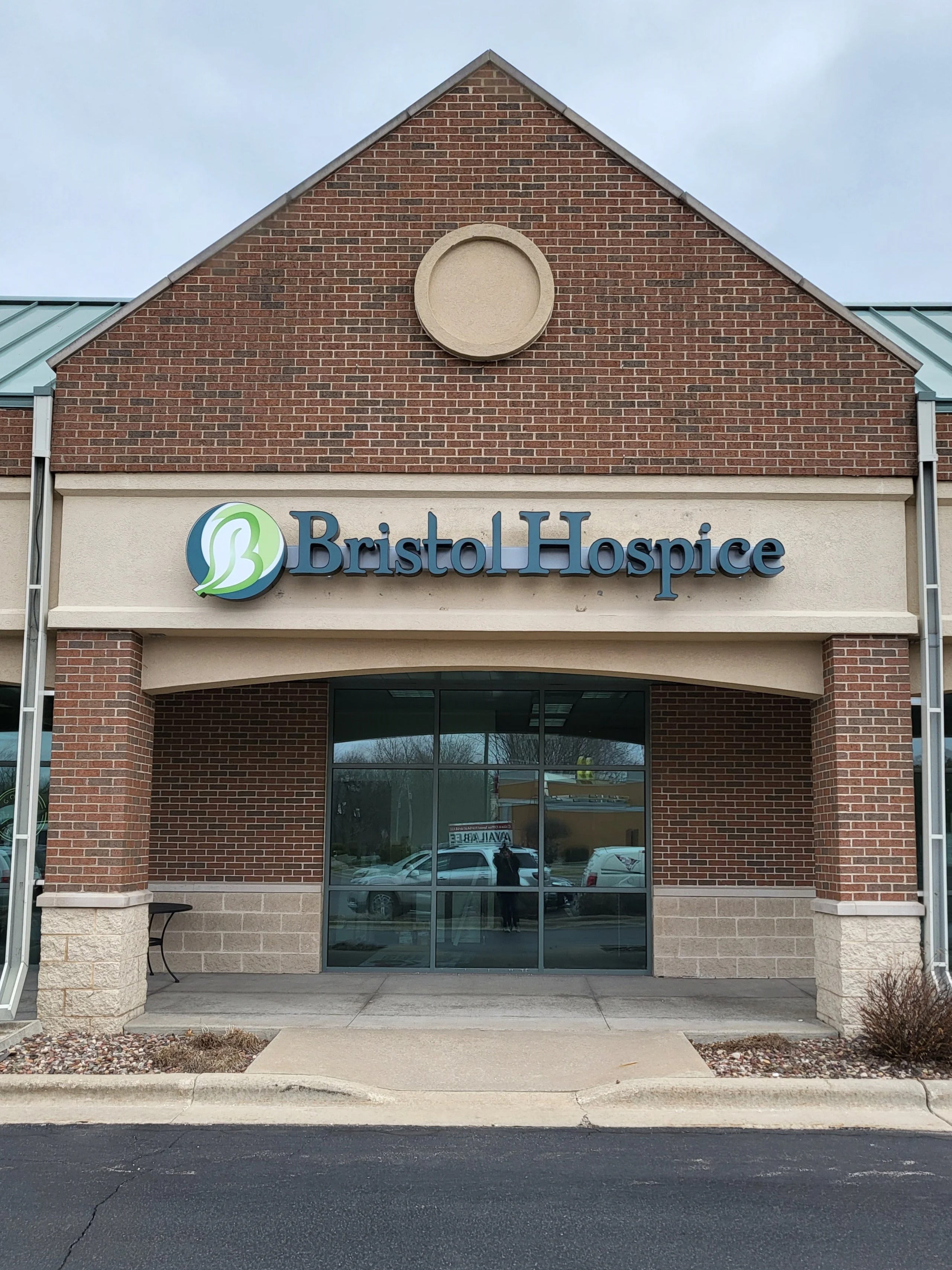
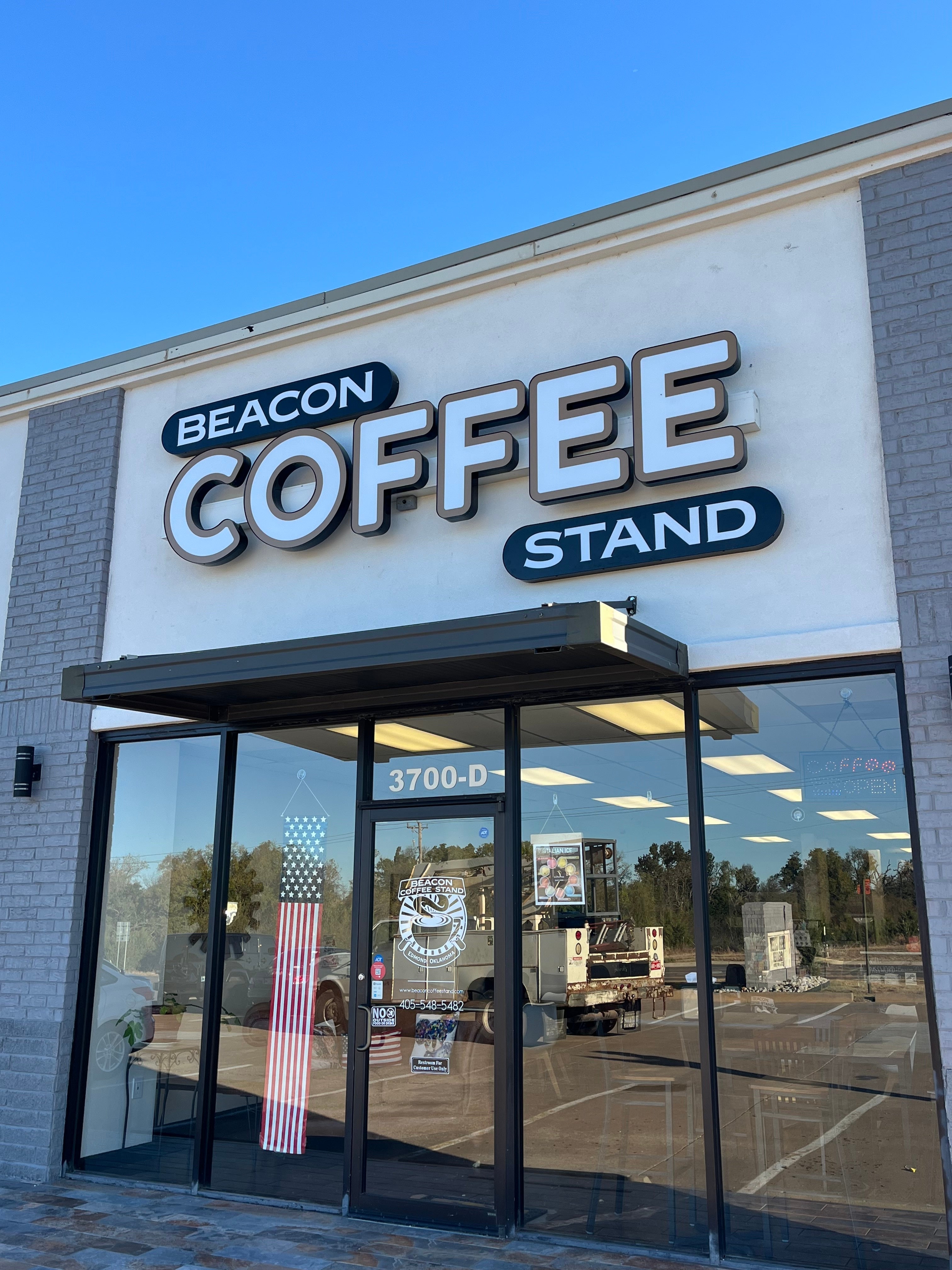
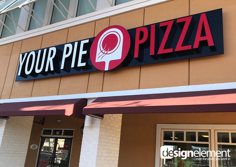
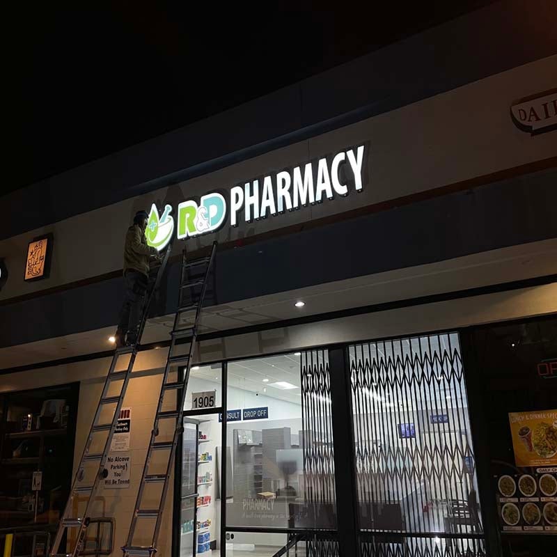
Designing a channel letter lit sign for a facade involves a series of key elements that combine aesthetic appeal with functionality and regulatory compliance. Channel letter signs are three-dimensional letters, typically illuminated, that are often used on building facades for visibility and branding. Below are the main design elements involved in the creation of a channel letter lit sign:
### 1. **Letter Style and Typeface**
- **Font Choice**: The typeface should align with the brand's identity and be legible from a distance. Sans-serif fonts are commonly used for clarity, but custom fonts or even hand-drawn letterforms can be chosen for a more unique or stylized look.
- **Letter Size and Proportions**: The letters should be large enough to be seen from a distance but also fit well within the space available on the facade. The proportions of the letters should create balance and harmony with the overall building design.
### 2. **Material Selection**
- **Letter Body (Channel)**: Common materials for the body of the letters include aluminum, stainless steel, or acrylic. The choice of material affects the durability, appearance, and ease of maintenance.
- **Aluminum** is lightweight and resistant to rust, making it a popular choice.
- **Stainless steel** offers a more premium look with high durability.
- **Acrylic** or **polycarbonate** is often used for the face of the letter (where the lighting shines through).
- **Backing**: The backing behind the letter channels can also be made from materials like aluminum or acrylic, depending on the design.
### 3. **Lighting Method**
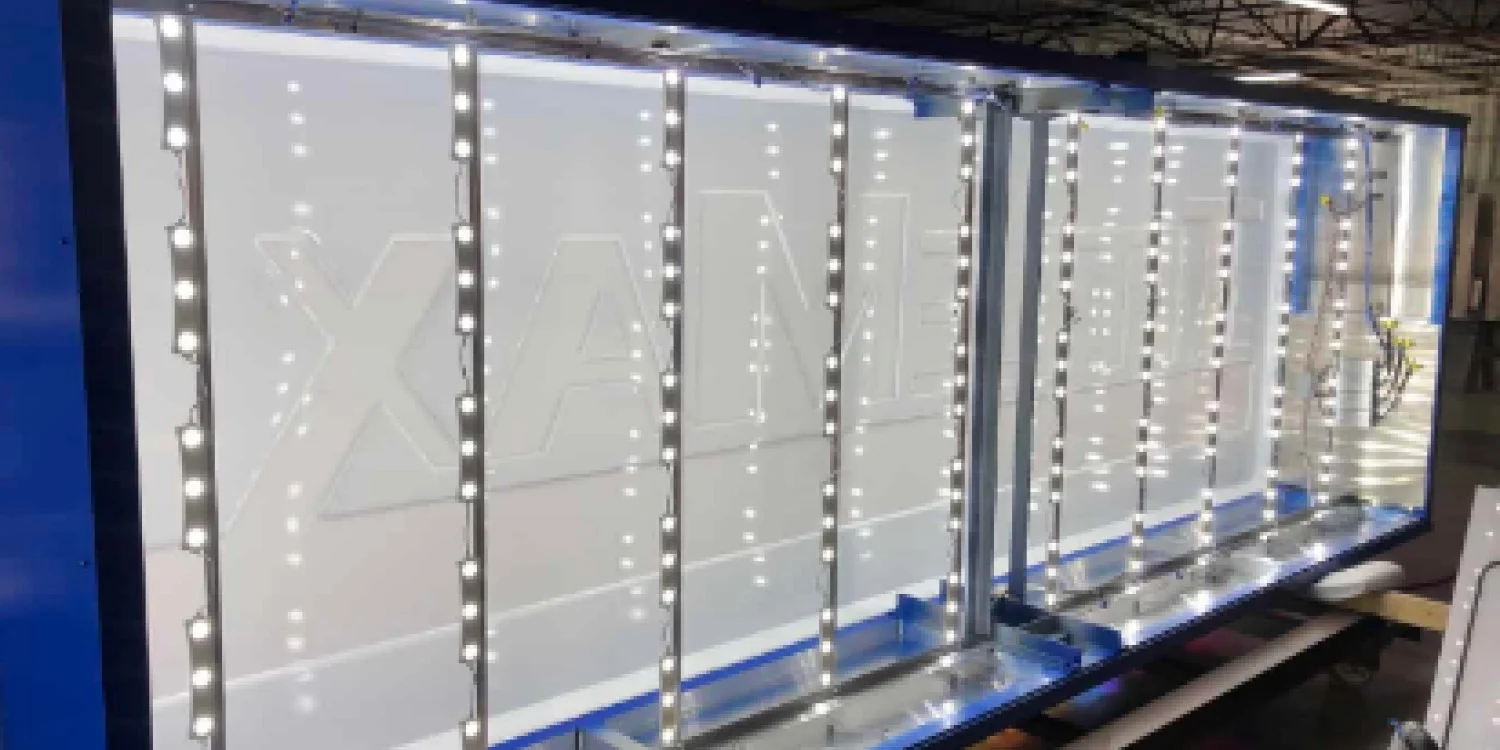
- **Front-lit**: A traditional and common design, where the letters are illuminated from within. This is typically achieved using LED modules or neon lighting.
- The light shines through the front of the letter, creating a glowing effect around the edges.
- **Halo-lit (Back-lit)**: In this style, the letters are mounted slightly away from the wall, creating a halo of light around each letter. The lighting is usually positioned behind the letters to cast a soft, ambient glow onto the building’s facade.
- **Combination (Dual-lit)**: Some signs combine both front-lit and back-lit effects to create a more dramatic, 3D effect, providing both direct illumination and a halo effect.
### 4. **Lighting Source**
- **LEDs**: The most popular lighting source for channel letter signs due to their energy efficiency, long lifespan, and low heat emission. LEDs come in different colors and can be tailored to the brand's needs.
- **Cool white, warm white, or color LEDs** can be used depending on the desired aesthetic.
- **RGB LEDs** can provide dynamic color-changing effects if desired.
- **Neon**: A more retro option, neon can give a distinctive, nostalgic feel, though it's less energy-efficient than LEDs and requires more maintenance.
- **Light Diffusers**: If acrylic or other translucent materials are used for the letter faces, light diffusers help distribute the light evenly across the surface of the letter.
### 5. **Mounting and Installation**
- **Surface Mounting**: The channel letters can be mounted directly to the facade using spacers or stand-offs, which ensures the letters stand out from the wall and allows for the halo effect (in the case of back-lit designs).
- **Flush Mounting**: In some cases, the letters may be flush-mounted to the surface of the building. This type of mounting is typically used when creating a sleek, minimal appearance.
- **Substructure**: For larger letters or more complex installations, a supporting framework (usually aluminum) might be required to anchor the letters securely to the building.
### 6. **Power Supply and Wiring**
- The power for the LEDs or other lighting sources needs to be properly routed and managed. This may include:
- **Low-voltage wiring** for LED lights.
- **Weatherproofing** of wiring and components, particularly for exterior signage that will be exposed to the elements.
- **Electrical Enclosures** to house transformers, drivers, and other components that control the lighting.
### 7. **Sign Shape and Layout**
- **Letter Arrangement**: The layout of the letters should be carefully planned to ensure readability and aesthetic appeal. The letters should have proper spacing, and the arrangement should fit proportionally within the available space on the facade.
- **Alignment and Height**: For signs with multiple lines of text or a logo, vertical and horizontal alignment must be considered, ensuring that all elements appear cohesive.
### 8. **Branding and Aesthetic Considerations**
- **Color**: The color of the letters and the light should reflect the branding and tone of the business or organization. A bold color scheme might suggest excitement and energy, while softer colors might convey professionalism or elegance.
- **Brand Logo**: If the sign includes a logo, it should be integrated seamlessly into the design of the letters. Sometimes, the logo is incorporated within the channel letter structure, or it may be a separate element adjacent to the text.
- **Finish**: Channel letters can have a variety of finishes, such as brushed metal, polished, matte, or even custom painted finishes.
### 9. **Permitting and Compliance**
- **Local Zoning Regulations**: Many cities have specific codes regarding signage, especially for illuminated signs. It’s important to ensure the sign adheres to local regulations regarding size, brightness, placement, and energy usage.
- **Building Codes**: Installation must comply with building safety codes, including securing the letters to the building and ensuring electrical connections are properly insulated and grounded.
### 10. **Maintenance and Durability**
- **Ease of Maintenance**: The design should consider ease of access for maintenance and potential repairs. This might include planning for removable panels, access doors, or designs that make replacing lighting elements (like LED modules) easy.
- **Weather Resistance**: Depending on the location, weatherproof materials and sealed connections should be used to prevent damage from moisture, extreme temperatures, and UV exposure.
### Conclusion
A well-designed channel letter lit sign can enhance a building's facade, making it more visible and reinforcing the brand's identity. The process involves thoughtful consideration of materials, lighting, mounting, and branding elements, as well as compliance with regulations and long-term durability. It’s a combination of aesthetics and functionality that, when done right, can significantly elevate a business’s visibility and curb appeal.


Signarama Freehold, NJ
23 South Street
Freehold New Jersey 07728
Enter through Market Yard Parking lot
Opening Hours:
Monday
9:00 am - 5:30 pm
Tuesday
9:00 am - 5:30 pm
Wednesday
9:00 am - 5:30 pm
Thursday
9:00 am - 5:30 pm
Friday
9:00 am - 5:30 pm
contact
Signarama Freehold, NJ
CLIENTS WE HAVE WORKED WITH: