

Common Sign Artwork Mistakes
Apr 14, 2023 by Mallory Lynn
What Artwork Do I Need to Provide a Sign Company?
Many people don’t realize that the artwork required for professional signage is very different from artwork used for websites, social media, or digital ads. One of the most common delays in sign production happens when a sign company does not receive the correct type of files.
Even experienced designers sometimes submit artwork that looks great on a screen but isn’t suitable for manufacturing. For signage, artwork must be clean, scalable, and production-ready. This guide explains the most common mistakes we see and how to avoid them.
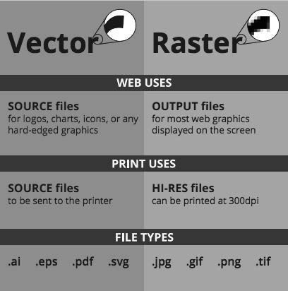
The Best File Type for Signage: Vector Artwork - Short answer: Always provide vector files when possible. Vector graphics are made from mathematical paths instead of pixels. This allows the artwork to be scaled to any size without losing quality — whether it’s a small window decal or a 30-foot building sign.
Common vector file types:
- -.AI (Adobe Illustrator)
- -.EPS
- -.PDF (vector-based)
If your logo or design is in one of these formats, you’re on the right track.
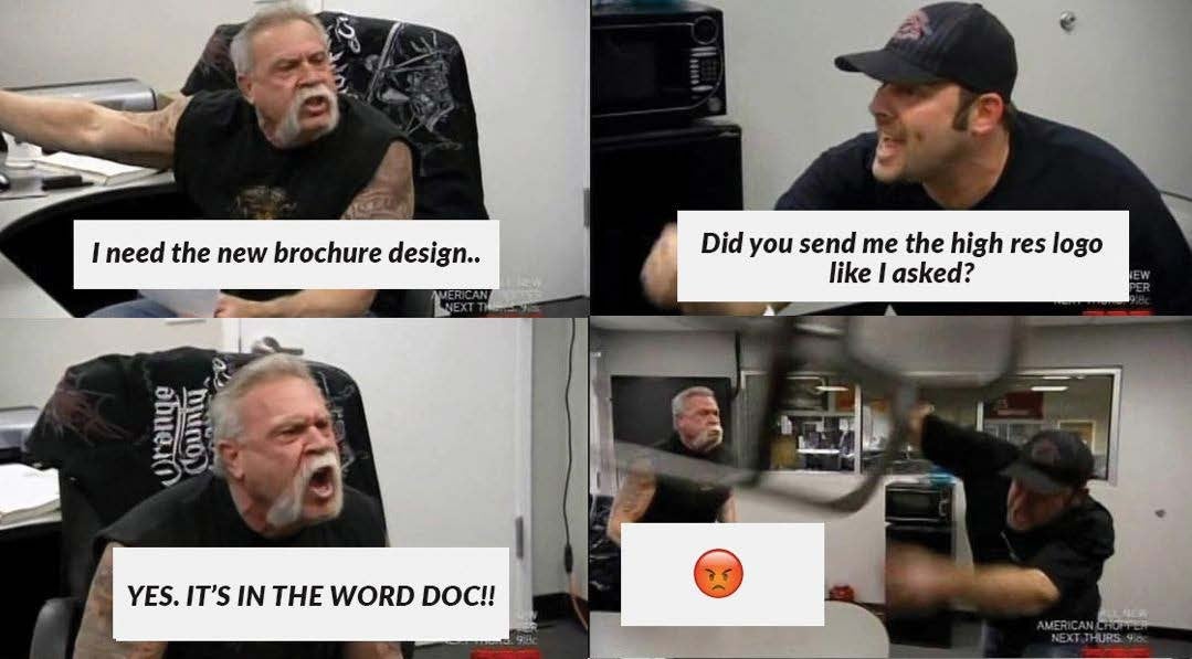
Mistake #1: Sending Artwork in a Word Document or PowerPoint
Files like: Word (.docx), PowerPoint (.pptx), Canva links, Google Docs are not production-ready formats. These platforms compress and embed images, which makes them unsuitable for printing or fabrication. A sign company cannot extract high-quality artwork from these files.
Vector vs. Raster: Why It Matters for Signs
Vector files (best): Infinite scaling, Crisp edges, Required for cutting, routing, and dimensional letters
Raster files (limited): JPG, PNG, GIF, BMP, Made of pixels, Lose quality when enlarged
Even a 300dpi image usually isn’t enough for large signage. Once pixels are stretched, there is no way to recover lost detail. Important: Images pulled from websites or social media are almost always too low resolution for signs.
Mistake #2: Saving an Image as a Vector File
This is one of the most common misunderstandings. Opening a JPG in Illustrator and saving it as a PDF or EPS does not convert it into true vector artwork. It’s still a pixel-based image inside a vector container. True vector artwork must be originally created as vector or professionally redrawn (vectorized).
Mistake #3: Not Having Clean Artwork
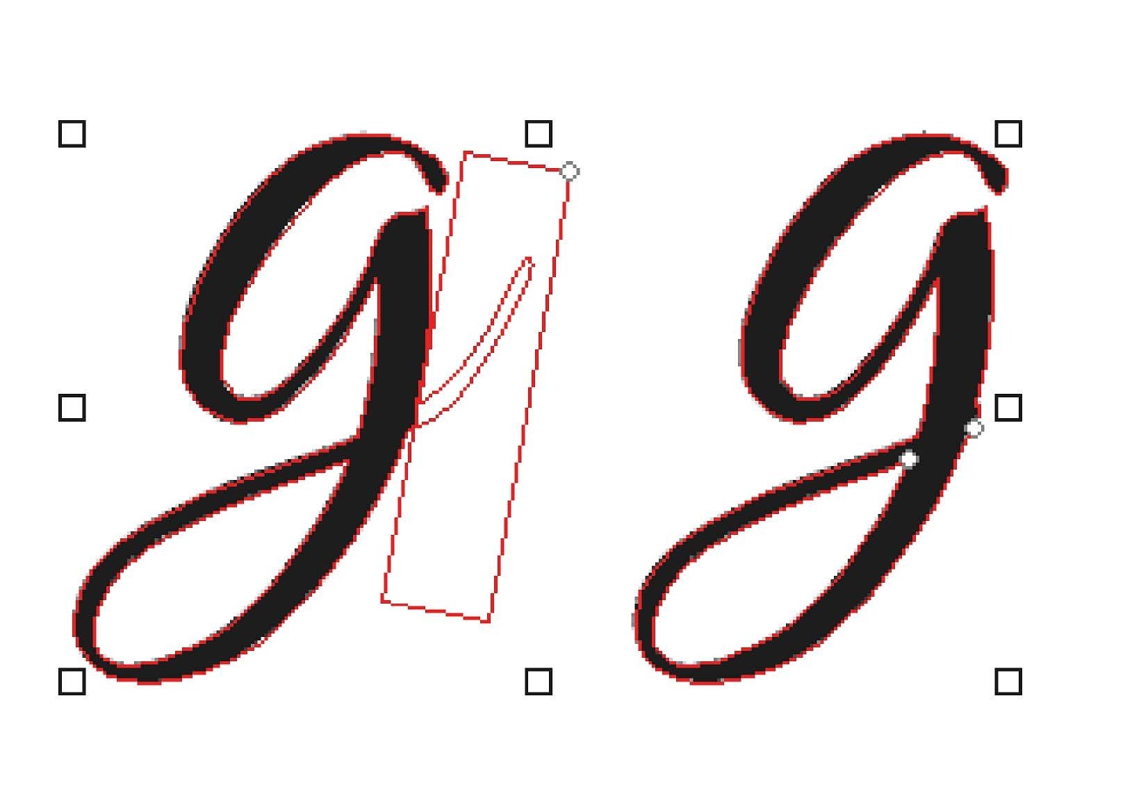
Digital designers sometimes use visual shortcuts that work on screens but fail in manufacturing. Examples include: White boxes covering parts of letters, Overlapping shapes, Hidden layers, and Masks and effects
Cutting machines and CNC routers read every path, including invisible ones. If the artwork isn’t clean, the equipment will cut exactly what it sees — including mistakes. This is why sign designers often need to “rebuild” artwork before production.
Mistake #4: Not Using Pantone (PMS) Colors
Pantone colors ensure consistency across all materials: Vinyl, Paint, Print, and LED lighting
If colors were chosen only by “eye dropper” or RGB values, there is no universal standard. The same logo may appear different on: Business cards, Building signs, and Vehicle graphics. Pantone colors eliminate this problem.
What If I Don’t Have the Right Files?
That’s extremely common — and completely normal. A professional sign company can:
- -Vectorize your logo
- -Clean up poor artwork
- -Build brand files
- -Create a complete branding package
You should always receive. These become your long-term brand assets:
- -Vector files
- -Print-ready PDFs
- -Web versions (PNG/JPG)
The Bottom Line is the best artwork for signage is:
- -Vector-based
- -Clean and layered properly
- -Built with Pantone colors
- -Created specifically for manufacturing
Artwork made only for digital use is rarely suitable for professional signs without modification. If all of this sounds overwhelming, that’s exactly why sign companies exist. Our job is to take your fonts, colors, and ideas and translate them into real-world materials — using the right file formats, manufacturing methods, and production standards.
Whether you need your logo vectorized or a full brand created from scratch, working with experienced sign designers will save you time, money, and frustration — and ensure your signage looks professional at any size.
Quick Summary: Choosing the Right Files for Your Signage Sending the wrong artwork is the #1 cause of sign production delays. To ensure your business sign looks crisp, professional, and perfectly scaled, your artwork must be production-ready. Digital files meant for websites usually won't work for physical manufacturing. Key Takeaways for Fast Production: -Always Use Vector Files: Provide formats like .AI, .EPS, or vector-based .PDF. Unlike pixels (JPG/PNG), vectors use mathematical paths that stay sharp at any size. -Avoid "Container" Files: Simply saving a low-res JPG as a PDF does not make it a vector. It must be originally created or professionally redrawn. -Color Consistency: Use Pantone (PMS) colors to ensure your brand looks the same on a building sign as it does on your business cards. -Clean Your Paths: CNC routers and cutters read every line; ensure your files have no hidden layers or overlapping "white box" masks.

Signarama Brighton, CO
Sales by Appointment Only. Pick-up/Deliveries Monday-Friday 8:30am-5pm.
contact
Signarama Brighton, CO